To measure personalization success, you decide to keep track of a certain metric. But the metric tells you about the progress in weight lifting, and there is no clue about the improvement in cycling time. Without any idea of your cycling performance, you enter the race. Do you think you will win the competition?
While it’s a no-brainer that the situation and your chances of winning will be odd, this example teaches the importance of tracking the right metric. The right metric navigates you toward your goal and prevents you from getting lost on the wrong path.
Download Free: Website Personalization Guide
Metrics measurement has the same importance when it comes to the personalization of consumer experience. Each metric has its significance and contributes differently to personalization success. Thus, it’s important to know when to track a particular metric depending on the goal.

So, let’s dive into metric measurement and its relationship to the success of a personalization campaign. We will then look at ROI tracking of personalization because a positive ROI is the ultimate aim of any business, and it decides the continuation/repetition of the campaign.
Personalization and its significance
Before going forward, let’s understand personalization and its significance in your marketing strategy.
Personalization is customizing the experience of returning users to make them feel more connected. The whole process of this customization is based on data gathered from past interactions, behavior, and customer background.
The reason personalization is so important is that it makes the customer feel special and see things of interest at different touchpoints. Thus, making the customer stay for a longer time, increasing the lifetime value of a customer, and reducing the customer acquisition cost.
Now, let’s move on to the crucial part of measuring personalization success with the key metrics.
Key metrics to measure personalization success
Forrester conducted a survey that included 372 business decision-makers. The survey revealed that only 30% of firms have the right metrics to measure the success of their personalization program. The key metrics are equivalent to understanding your customer’s response to your digital communication effort. Some of these key metrics are as follows:
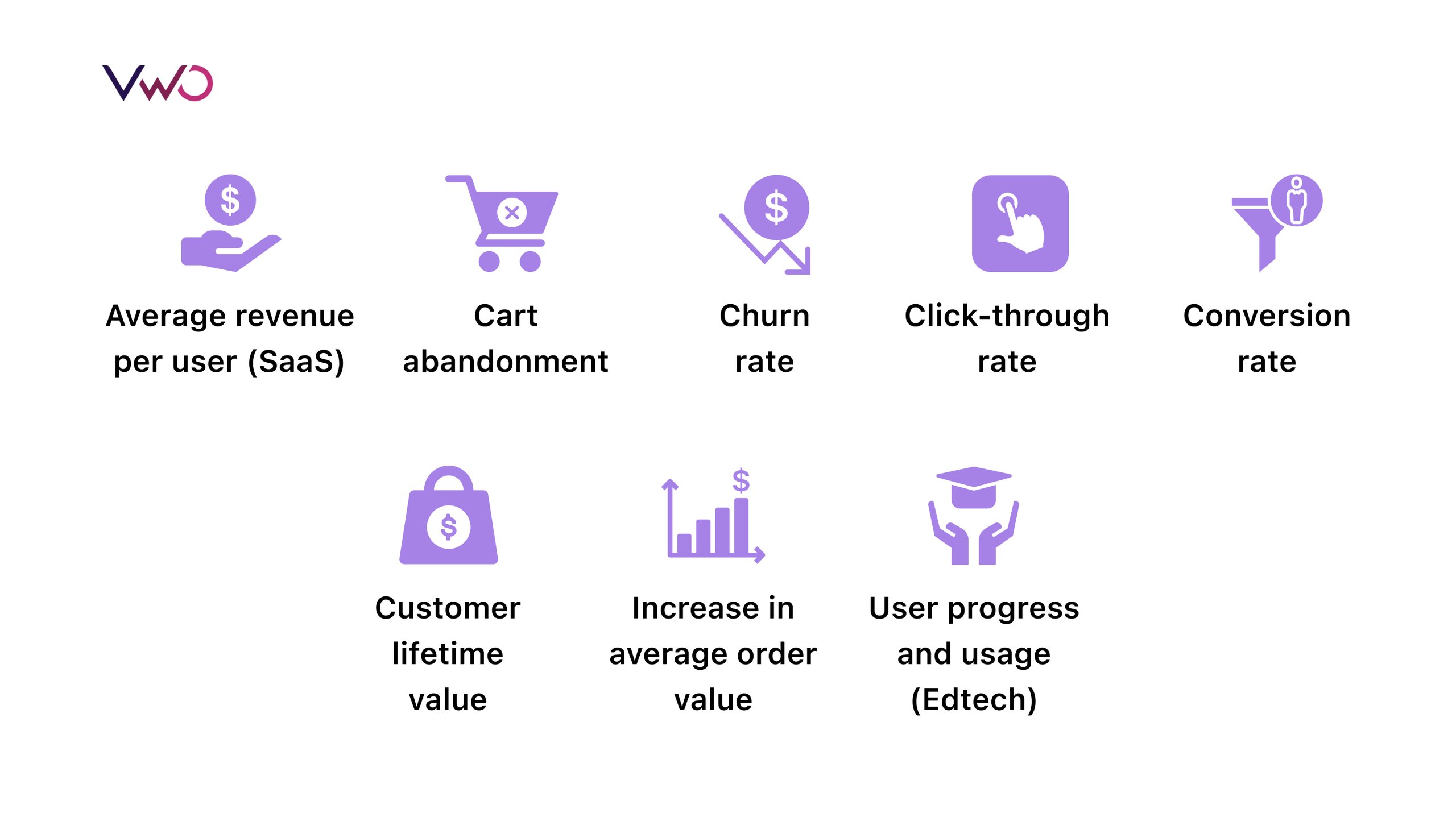
Here’s an explanation for each of the metrics –
Average revenue per user (ARPU)
It is one of the key metrics that is mainly used in the SaaS industry. This metric is tracked when you roll extensions and packages tailored for customer segments. For example, say a company offers a SaaS marketing tool with an off-page SEO analysis feature. Now, the company is rolling out an on-page SEO analyzer with a $5 increase in subscription for its loyal customer segments in the initial stages. In such a situation, tracking ARPU becomes crucial to know the effectiveness of the campaign to roll out the extension.
An increase in the average revenue per user means that the personalized campaigns to suggest extensions and packages have successfully aligned with the customer’s needs and interests. Thus, this metric summarizes the ROI of the marketing campaigns.
Here is the formula for ARPU calculation:

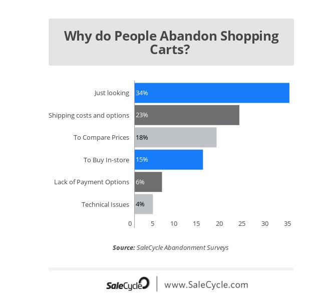
Cart abandonment
This metric combined with past customer behavior data helps understand your customers’ purchase behavior. For instance, say you have a group of regular customers that buy whenever there’s an offer discount, and in a recent buying journey, they abandoned the cart because there were no new promotions or offers. This particular behavior helps in segmenting the group as discount seekers. You can personalize the upcoming campaign with offers for this specific group and again track the cart abandonment rate to check the success of the personalization measure.
Also, sometimes due to a lack of payment options, users drop out at the last step. Thus, when you test your payment gateway page with new payment methods, tracking the abandonment rate helps in knowing their efficacy.
So, this key metric is vital when you enrich your customer’s experience with new favorable payment methods or offers on the product. Also, this data is required for segmenting users, who can be targeted with custom digital marketing ads and communication.
The equation to calculate cart abandonment is as follows:

Churn rate
Churn rate helps you gauge the dissatisfaction in customers while using your product or service in the follow-up interaction. When you want to increase the revenue from returning users, then tracking this metric is vital.
Churn rate tracking before and after personalization helps in knowing whether the tailored experience is keeping up with customers’ expectations.
Here is the formula for the churn rate:

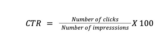
Click-through rate (CTR)
A website, whether a SaaS or eCommerce platform, has multiple call-to-action buttons which guide the customer to make a decision. Tracking the CTR of these buttons is essential when the goal is to understand the effect of UI/UX on the customer’s decision. CTR tracking of buttons like add to wishlist, add to cart, read details, etc. helps pinpoint where the customer is finding ease or difficulty in navigation.
CTR tracking in personalization becomes vital when the returning customer sees the product catalog based on interest and past purchases. Thus, tracking CTR buttons before and after personalization aids in making the UI/UX and product recommendation better, which in turn affects sales.
The formula to calculate CTR is as follows:
Conversion rate
Conversion rate gives you a complete picture of your sales cycle and its weak points. This metric helps in testing hypotheses related to gaps and personalization measures.
It also tells you about the impact of the product recommendation mechanism, especially when the revenue has a significant chunk from returning customers.
You must track this key metric for personalization when you see a stream of traffic but lowering/ stagnant sales and if you are testing new features for a custom experience.
Here is how you can calculate the conversion rate:

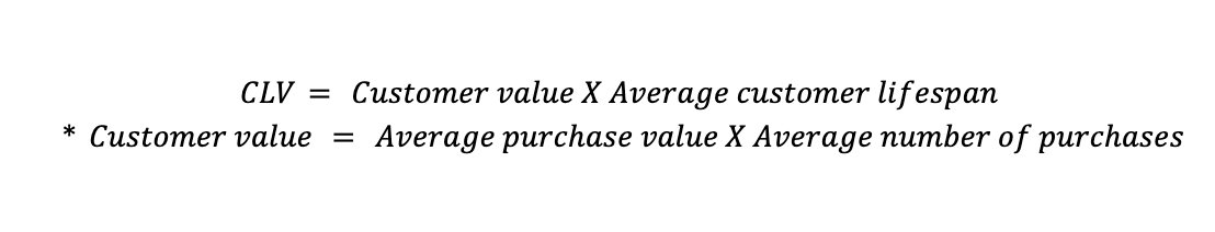
Customer lifetime value (CLV)
CLV is tracked when the long-term association is in view with multiple transactions between a customer and the company. Personalization success monitoring with this key metric determines whether the experience was as per customers’ needs. You track it not just for one campaign but for a larger picture.
The formula for CLV measurement is as follows:
Download Free: Website Personalization Guide
Increase in average order value
This metric is essential when you want to improve cross-selling, subscriptions, and related course sales. The success of the personalized products section on the webpage is known through this metric.
One example is Bear Mattress, which utilized VWO to redesign the cross-sell flow and personalize the recommendation based on purchase behavior history. The goal to increase order value and key metric tracking helped them increase revenue by 16%.
An increase in average order value is calculated as follows:


User progress and usage
A metric that is the heart of eLearning website analytics, you must measure it after the personalization of study material and courses for the user. It helps validate hypotheses for personalized course recommendations.
The formula to measure user progress and usage:

Now, that we know the importance of metric tracking in personalization success, let’s move on to an overview of the ROI of personalization measurement. Personalization is worthy only when it positively contributes to the ROI.
Keeping a check on the ROI of your personalization campaign
There is no doubt that personalization increases revenue. As per Deloitte, Starbucks once carried out a personalization campaign that included 400k personalized messages. The campaign saw a threefold increase in the offer redemption.
ROI from personalization must be checked on a dashboard with pre and post-personalization campaign results rather than in silos. To check ROI, go through the Conversion Rate, ARPU, and Average Order Value of the control group to whom you showed the personalization campaign and compare it with your previous data.
Also, it’s necessary to monitor human resource involvement, third-party tool usage, and disruption (if any) in the regular flow of work while measuring the ROI.
In the end, to improve the ROI of the personalization program, the foundation needs to be strong. This means you must have a robust data strategy that fills all the gaps and creates a strong visual of the consumer journey.
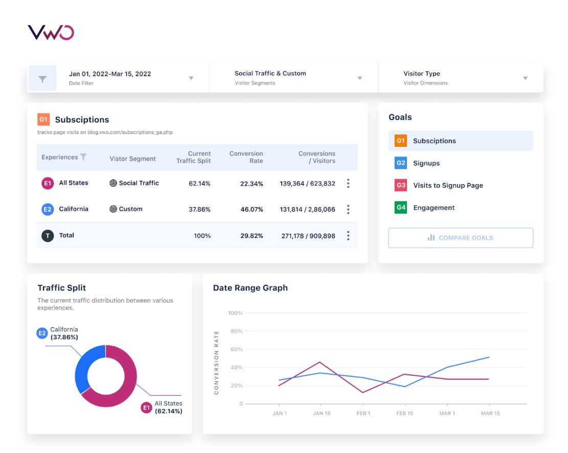
Measuring personalization success with VWO
VWO Personalize makes personalization easy and effective. It helps you trigger unique experiences for specific audiences at the right place and time by –
- Leveraging visitor data
- Prompting experiences via triggers that are based on visitors’ persona or events like when one refreshes a page
- Helping you create experiences via the visual editor without relying on developers each time
With VWO Personalize, you can track how your personalization campaigns impact the conversion rate for the metrics associated with the campaigns. Our platform allows you to track the following goals:
- Page Visits
- Form Submits
- Clicks on Link
- Clicks on Element(s)
- Revenue
- Custom Conversion
- Engagement
The VWO Personalize report dashboard shows real-time conversions and is easy to read, which assists in better business decisions. The ongoing personalization journeys can be optimized based on report observations.
Conclusion
The true potential of personalization is unlocked with the right metric tracking. It’s like becoming a pro in bike racing, measuring your cycling performance each time, analyzing faults, and making more personalized efforts to grab the competition trophy, while your competition is still measuring weight lifts or making efforts without any analysis.
In the growing business competition, your trophy is a loyal consumer base, and personalization measured with the right metric is your effort. Metric tracking will help you personalize and become the true server to a loyal consumer base.
Let VWO Personalize become a partner in your journey, and it will do the heavy lifting of bringing you accurate reports on your key metrics. Also, create 1000s of consumer journeys, run A/B tests, create variations with an easy-to-use visual editor, measure ROI, and get behavior insights on a single dashboard. Grab a free demo for all the VWO features and capabilities including personalization.
]]>This is where A/B testing comes in. It’s an amazing method that makes it possible to prove—with data—if a particular change has an impact and whether it’s positive or negative. In an A/B test, you can split your traffic between your page or element versions, and even define the audience that gets to view the variation. The version that gets the best results is the winner.
Download Free: Advanced CRO Program Guide

Once you know that you can test changes on your store before making a decision, it seems like a no-brainer to use that method moving forward.
Getting started
So where should you start testing? How do you come up with ideas to test?
You may have some ideas—probably even a document full of possible changes based on your opinions and experience. But that may not be the best way to come up with your tests.

We will show you a better approach—where to focus your attention and how to find tests that will increase your chances of getting meaningful, positive results.
The following process removes the guesswork and moves you closer to those great results you’re looking for.
Where to focus your attention
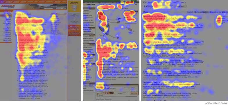
Google Analytics won’t tell you what to test, but it does indicate where you should focus your efforts, that is, which part of the funnel to test. Google Analytics provides a Funnel Visualization Report that shows how many visitors are dropping off your store at each stage of the funnel.

Every eCommerce store is different depending on the industry it’s in and other factors. But a funnel visualization combined with some benchmarking lets any eCommerce store owner know which part of the funnel is the weakest link. Once you know the most problematic step, you can improve it by performing tests aimed at it.
For example, in the image above, you can see that a lot of people abandoned the checkout. From 466 people that started the checkout process, only 131 people completed it. This indicates that you may have to work on your checkout. And because that’s a step where a lot of people abandon your store, improving it could yield the biggest results.
In the Dorado Fashion case, VWO found that there was a high drop-off on the checkout page. To address this and increase the Average Order Value, the VWO team tested a cart page variation that incentivized additional purchases for users who already had an item in their cart. This variation had a notice that said – “You are 1 product away to get Extra 30% Off”. The test ran for 26 days and the variation won with a 14.14% increase in clicks to the Thank You page. You can read the full case study here.
On the other hand, if you already have a very good checkout conversion rate, it’s harder to get significant improvements there.
Visualize your funnel as a leaking bucket. The more water you can keep in the bucket, the more money you get. By fixing the weakest steps of the funnel, you are effectively fixing the biggest holes in the bucket.
After fixing the big holes, concentrate your efforts on the medium holes and so on. To apply this to your online store, you want to find out which is the biggest hole and work on it.
Google Analytics helps you find the “what”—the step of the funnel that isn’t working—but it won’t tell you why it’s not working. You can determine why by using heatmaps, session recordings, on-page surveys, user testing, and other methods to help develop solutions to the problem.

What to test
Choosing what to A/B test is one of the most important decisions you can make:
- You can avoid wasting time you would otherwise spend testing things that make no difference.
- You can gain valuable insights that can then become test ideas.
Methods
We suggest you use a mix of methods to get the best results possible. Typically, the findings from one method overlap those from others. That’s a clear signal that you’re on the right track.
You can use the following four methods that employ these tools:
- Surveys and polls
- User testing
- Competitors and other big eCommerce stores
- Customer service logs
Surveys and polls
Asking questions that uncover concerns is one of the best ways to identify what you need to address on your eCommerce store. Posting surveys and polls on your store is a very effective method for gathering those insights. By asking your current and potential buyers multiple questions, you can collect very valuable responses. The value comes because these users are experiencing the store as would any real customer, so their insights are very pertinent.
There are multiple places to conduct surveys and polls. You can place a poll on your product page or homepage. You can also send surveys via email to people who’ve already bought from you. You can add an incentive to encourage them to answer.
My preferred method is to place a poll on the thank-you page. This placement is very powerful because users have just gone through the entire buying process just seconds before, so, if they have any questions or concerns, those will be fresh in their minds.
Each location in which you place a survey or poll can give you insights about different parts of the funnel.
Questions to ask
The best questions are those that uncover fears, uncertainty, and doubts (FUDs). Technical issues are relatively easy to find in your store. However, FUDs are the main factor in people opting not to buy from your eCommerce store. Here are a few examples:
- They may fear that your product isn’t of a high enough quality (for example, they’re looking for a specific grade of aluminum, but you don’t list which grade you use).
- They may be uncertain about a specific characteristic of your product (for example, they wonder if it’s waterproof, but there’s no mention of this on the website).
- They may have doubts about your warranty and returns policies.
Addressing FUDs is one of the most effective ways to increase your conversion rate. After discovering which FUDs aren’t addressed on your website, create tests that aim to solve those FUDs.
In the Moho case, for example, VWO improved Moho’s revenue by communicating their offer of a 2-year guarantee on the product. The primary web store of Moho is Horloges.nl, which they use to sell watches from various manufacturers. This guarantee increased user trust and improved the Average Order Value by 6%. You can read the full case study here.

Examples
You can place a very simple poll—even a single question—on just about any page:
- “Do you have any questions you can’t find the answer to?” Place this on a product page to tell you which information users feel is missing (doubts) or don’t find clear or detailed enough (uncertainty).
- “Was there something that almost stopped you from buying from us?” This poll question on the thank-you page has produced amazing insights. By definition, everyone who answers this is your target customer because they just bought from you, so their opinion matters.
Another way you can gain useful insights is to ask your customers why they bought from you. You may think you know your unique value proposition (the quality or qualities that set you apart from your competitors), but your customers usually know exactly why they bought from you.
If you can find out why people buy from you instead of the competition, you’ll have good content to apply to your store. Sometimes you’ll even discover unique value propositions you didn’t know you had (e.g., your product is of a higher quality than the competition’s or maybe you have the best prices overall)! Use these valuable insights to develop test ideas that better articulate your value proposition and increase your conversions.
Download Free: Advanced CRO Program Guide
User testing
User testing shows you how visitors perform particular tasks in your store. It’s especially useful because you get to see, first hand, how users navigate your store, revealing friction points in the user journey as well as store usability issues. Use these friction points and usability issues to develop solutions you can try in an A/B test.
User testers are often asked to navigate a site and add a product they like to the cart. Observing this process, you’ll see what path the user takes: maybe they use the filters, the search functionality, and/or the collections. It opens a whole new world because you are navigating an online store through the eyes of someone else. User tests can help you identify biases.
For example, your cart page may be confusing enough that some people don’t know how to continue to checkout. However, because you browse your site daily, you know how to take that step, so you think it is easy. The new perspective you gain from a user test can show you the barriers your users may encounter and help you brainstorm test ideas to address those barriers (e.g., you can A/B test a simplified cart layout that makes it evident to users how to continue to checkout).
Competitors and other big eCommerce stores
This one is controversial because you don’t know if your competitor’s store is performing better than yours, but I like looking at competitors’ sites. Look for interesting things you could bring to your store, like fit finders, money-back guarantees, comparison charts, wizards, and the list goes on and on depending on what you sell!
You don’t know if these have been tested by your competitors or if the concept will work on your store, so you get to test it on yours. Sometimes competitors find ways to solve customers’ problems, and you lose nothing by trying those out in your store. I’m not suggesting you copy your competitors’ websites. I am suggesting that you look for potential issues that your competitors have addressed that you have not.
What’s important here is that you do your research and find improvement opportunities for your store. Approach your research the way a customer does: they often compare products in multiple stores before buying. As a business owner, you should do the same and always assess how your eCommerce store stacks up against your competitors’.
You can also look at the big eCommerce websites like Amazon. Because almost everyone uses those websites, chances are good that your customers are already comfortable with that format and functionality, so something similar might work for your store. For example, trying out high-level changes (such as updating product page layouts, offering swatches, etc.) could be beneficial.

But, of course, not everything that Amazon does will work on your eCommerce store. Make sure your approach takes into account the unique context and particulars of your store. For example, Amazon can’t talk about the unique value proposition of a particular product or brand on the homepage because it offers so many brands. But, on your homepage, you probably should talk about your unique value proposition.
As always, these are all just ideas to test. You will know for sure if it works after you test it!

Customer service logs
Customer service logs are one of the best places to find FUDs to address. They’re very valuable because these are your customers directly reaching out to you and telling you their FUDs. This is one of the most direct and honest forms of feedback you can get.
There are multiple methods for collecting, organizing, and getting insight from your customer service data:
- Gather all customer service interactions and put them in one format.
- Categorize every interaction by topic.
- Determine which issues come up more often than others.
- Address those issues in your A/B tests.
Sometimes the main concern for potential customers is the warranty. If that comes up for you, that’s a strong sign that making your warranty more prominent or revising it in some other way would be a good thing to test, something that will yield results you can use.
On the other hand, if nobody is asking or complaining about the warranty, then maybe you shouldn’t focus your efforts on that area.
Conclusion
Good tests that yield useful results come from good ideas backed up by research and data. Start a 30-day free trial with VWO to focus on the weakest links of your funnel and the biggest points of friction in your user’s journey.
The methods described above can help you find those weak links and provide great insights so that you can develop meaningful tests to improve your metrics.
Without a cure and a vaccine, many are still choosing to live their lives at home as much as possible to avoid contracting the virus — or any other illnesses for that matter. Indeed, we are living in a day and age where eCommerce’s role in the lives of many is becoming increasingly significant.
However, this does not mean that all eCommerce categories are doing well at this time. Luxury brands, for example, are struggling and are forecasted to lose between $450 to $600 billion worldwide sales. This holds true, especially for non-essential brands.
Download Free: Cart Abandonment Guide
On the upside, eCommerce stats such as cart abandonment rate is said to have dropped significantly in the United States. Cart abandonment refers to the phenomenon wherein a visitor adds items to their cart but does not proceed with the purchase.
Before the pandemic, the average cart abandonment rate was 75.71%. At the onset of the lockdowns last March 2020, cart abandonment dropped to a low of 59.76% before inching higher to 64.98%.

With these in mind, there is pressure among eCommerce and online retailers to address the consumers’ changing behavior and shifting needs. Dan Fries, one of the founders of Blue Tree AI, a content marketing and PR agency that specializes in SEO, stresses the importance for businesses to know their purpose and place online.
“Since the end of pandemic isn’t in sight yet,” he says, “brands should be able to grow and gear their online presence to avoid being totally lost in the clutter. We’re all going to be competing in a limited online space, so imagine the effect that can have for consumers and moreso brands that need to sustain their sales.”
In this article, we show you one of the things to keep your business afloat in a time like today: focusing on reducing cart abandonment and encouraging your market to proceed with their purchase.
How to reduce cart abandonment in a crisis
Transparency is key
One way to gain the trust of your customers and reduce the chances of cart abandonment especially in the time of COVID-19 is to be extremely transparent on your store fees right away. Make sure that additional costs such as shipping fees and taxes are visible during their purchase experience, so there aren’t any surprises that might send people away from your store.
This also applies to any other details that are significant in their consumer journey, the likes of shipping details and return policies. How can users return items if they’re unable to visit your physical store? Are there new policies you must follow for door-to-door deliveries?
When your customers are completely informed about all the details of their orders, it becomes easy for them to proceed with their purchase.

Launch an abandoned cart campaign
If you’ve been in the eCommerce industry for a while, then you’ve probably created an abandoned cart recovery campaign.
There are plenty of reasons why your customers abandon their carts. For you to be able to know what strategy you’ll implement, you must be able to figure out the specific reasons why users leave items in their cart.
While it’s a valid reason that some shoppers might be experiencing pay cuts in COVID-19, that might not be the most prominent reason someone abandons their cart—after all, if someone knew they didn’t have the budget to buy right now, they likely wouldn’t have gone through the shopping process that far.
Having a high cart abandonment rate can usually indicate a poor user experience, a distorted purchase funnel, or a complicated checkout flow. Therefore, optimizing user experience can definitely lower your cart abandonment rate.
Once you’ve pinned down the plausible reasons and fixed the leaks, you include an abandoned cart recovery strategy that would essentially bring people back to your site and proceed with your purchase. In other words, converting visitors to actual paying customers. To do this, conversion rate optimization (CRO) is key.
Two impactful CRO practices that can give you an idea on how to help with cart abandonment avoidance during COVID-19 are:
- Cart abandonment software: A software that tracks your visitor’s journey on your website with the goal of capturing their emails and finding those who have abandoned their carts. With this, you can bring them back to your site through an enticing email, SMS, or a dynamic ad.
- A/B split testing: Running two versions of your website that are identical in intent but different in aspects like style or layout so that you’d be able to compare and contrast which version has a better conversion rate. Experiment with different messaging as well, such as emphasizing any new policies that shoppers might not know—do you offer contactless delivery now? Do you have new minimum order values for free shipping eligibility?
Offer flexible payment options
There’s no denying the financial impact that COVID-19 has had on some consumers and their income. Because of this, you’ll need to empathize and make it as easy as possible for shoppers to actually make a purchase on your store.
Having a limited number of payment options could be a reason buyers end up unwillingly abandoning their carts. If they don’t see their desired and trusted payment method on your website, they won’t probably proceed with their purchase. Or if they find that there are no flexible payment options, they might try looking for an online store that does.

The best way to avoid this is to offer flexible, customer-centric payment solutions that work best for your shoppers. Invest in services and platforms that let you support multiple payment methods but also payment plans. FreshBooks, for instance, lets business owners offer their clients and customers installment or partial payment options since they care about how brands show their support for their customers through invoicing and billing.
In a time like today, those who stockpile on essentials would find it very convenient if they won’t pay for the whole value at once. Having convenient payment options shows that you care.
Download Free: Cart Abandonment Guide
Optimize your checkout user experience
COVID-19 has forced many stores to go online, but many brands that may already have had eCommerce platforms might not have been prepared to take their entire buying experience on the web. Because you have to solely rely on your online properties in servicing your customers these days, it’s time to put the focus on a completely optimized online experience.
One of the ways for shoppers to have a wonderful experience buying from your online store is when you have a user-friendly website design and optimized checkout process.
Think about it: if it’s difficult to navigate through the different pages of your website, if it’s hard to review their cart or input information quickly, visitors won’t exactly be motivated to complete a purchase.
Having poor checkout experience can also come from how your website is designed: are the colors so striking that it’s hard to browse through your store? Are the product photos or fonts so small that it’s difficult to see product details? Are there too many unnecessary details on your checkout form?
In Brainstation’s 2020 Design Survey Results, it revealed that 75% of designers believe that additional design training to enhance their skills can make them more successful in their role. Similarly, 25% mentioned that their organization would be more successful if employees had better design skills.
Designing a streamlined checkout experience isn’t just for show — it actually helps you make sales.

Adding your logo and brand colors to your checkout page makes your business more trustworthy and puts your customer at ease to continue with their purchase.
Use push notifications
For many shoppers, reminding them of the items they left on their cart can push them to proceed with their purchase. It should be no surprise that COVID-19 has everyone a little more distracted than usual, so a friendly reminder might be all you need to give for consumers to check out their orders.
These reminders can come in the form of web push notifications, which prompt customers to engage with your brand even more on your site. Of course, simply reminding them of items abandoned in their carts won’t be enough. Your push notifications should ideally have elements that would attract your shoppers to reconsider buying from your business.
Signing up for a free trial with VWO gives you access to ready-to-use push templates, and you can customize these notifications according to what your market cares about.

Are they looking for the right opportunity to buy the items they left in their cart (a.k.a a sale or a discount)? Send them a personal voucher code they can use.
Do they want to know more about the product before buying it? Send them an email that explains how the product can benefit them and improve their lives.
Send follow-ups using Messenger apps
Because of COVID-19, almost everyone has had to rely on online means of communicating with one another—and that doesn’t exclude the way they engage with their favorite brands online.
Conversational marketing is becoming more relevant today when people have increased their social media usage due to home isolation.
Youtube, Facebook, and Instagram saw the highest rise in active users as a result of stay-at-home orders brought about by the COVID-19 pandemic.
Facebook Messenger has emerged as a highly effective and more personal automated channel for reaching out to customers who have abandoned their carts. Remarketing through Facebook Messenger chatbot allows you to deliver personalized, real-time messages and achieve higher open and click through rates.
Sending abandoned cart reminders through Messenger can deliver an average of 80% open rates compared to email’s 20%, and 35% click-through rates compared to email’s 2%.

Implement an omnichannel marketing strategy
The previous sections make it clear that you can’t just rely on one channel for your remarketing communication. As we are still in the midst of the pandemic, the role of digital in the lives of consumers will only grow more significant.
Using a combination of different channels such as push notifications, emails, SMS, ads, and Facebook Messenger to reconnect with your visitors about their abandoned carts can help you be present in their preferred channel, especially at the moment of their highest intent.
Find the right timing when to reach out to them on specific channels for the best results. Make sure you don’t spam them with reminders, but send out messages at the right time and place.
Another advantage of having a comprehensive omnichannel marketing strategy is that you’re assured of a series of backups. Take this opportunity to learn how your shoppers behave online to keep improving your remarketing strategy and convey the right message to them through the most relevant channel.
See this example of an omnichannel remarketing strategy below as it retargets abandoners using different channels while perfectly timing the messages to deliver the best results:

Key takeaways
Even if the cart abandonment rate dropped significantly during the pandemic, it doesn’t mean businesses should ignore abandoned carts. With or without the crisis, cart abandonment continues to be a challenge that the eCommerce industry is facing.
On the upside, there is now plenty of research and ways on how to reduce cart abandonment rate on your site. As long as you pay attention to how your customer behaves online and strive to keep improving your online properties, rest assured that you can systematically reduce cart abandonment.
]]>As an eCommerce player, your growth is dependent on conversion rates. Read on to develop an understanding of some crucial factors that drive the eCommerce conversion rates.
Download Free: Conversion Rate Optimization Guide
What is eCommerce conversion rate?
The eCommerce conversion rate is the ratio of transactions to sessions, expressed in the form of a percentage. For instance, a ratio of one transaction against every ten sessions would make for an eCommerce conversion rate of 10%.”
Used in conjunction with other critical metrics, conversion rate serves as an excellent barometer to measure the health, performance, and competitiveness of your online store. The higher the conversion rate, the better the customer value proposition and the lower the customer acquisition cost. To make any meaningful improvement in your eCommerce conversion rates, it is important to take an audit of your current conversion rate.
What is the average conversion rate for eCommerce websites?
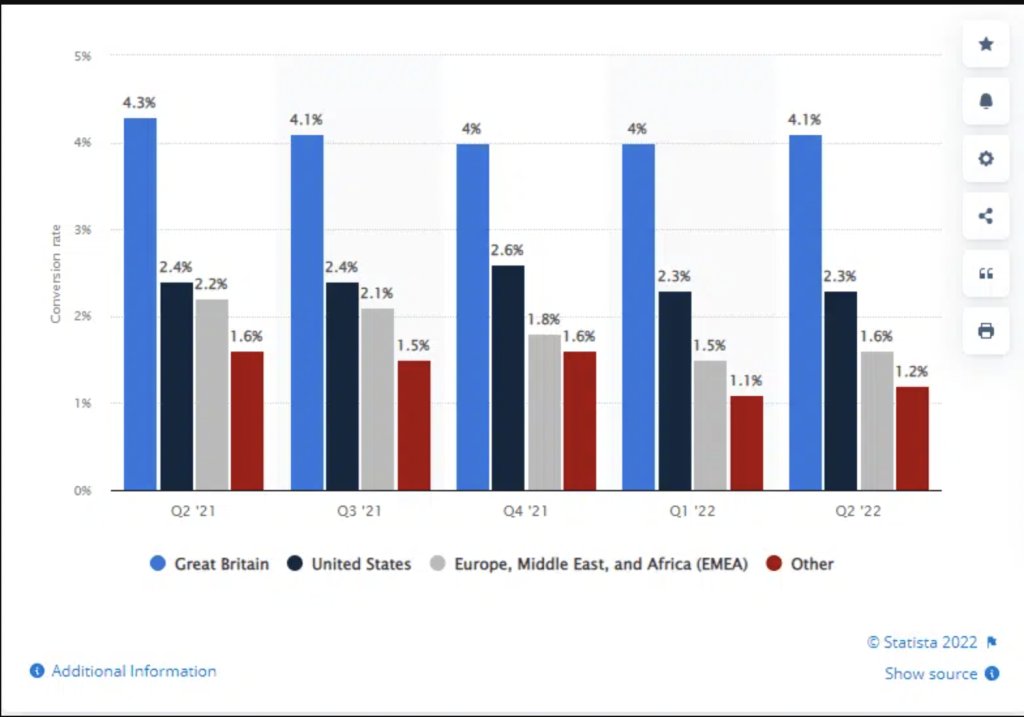
As per Monetate, the global average eCommerce conversion rate is 2.2% for Q1 of 2023. But, significant conversion rate disparity exists across industries, devices, sources, regions, and the like.
For instance, the average conversion rate for the health and wellbeing market was 2.8% in March 2023, as compared to 0.8% for the luxury kitchen and home appliances market. As per the report, Great Britain’s eCommerce sector has an average conversion rate of 3.4%, while the corresponding number for the EMEA is 1.1%.
Therefore, it’s important to develop your key eCommerce performance indicators (KPIs) as well as to take into account market-specific nuances while analyzing the average eCommerce conversion rate of your industry.
Similarly, if you’re comparing your eCommerce website’s conversion rate with competitors, be mindful that no two businesses can have the same conversion rate. Several factors come into play – your target audience, geographic areas of business, products or services sold, penetration in the market, and more. As per Recurly, Amazon boasts of a 13% conversion rate, which is nearly 7x the average industry standard.
eCommerce conversion rate by industry
When drafting in-house goals and benchmarks, referring to market-specific conversion rate standards can prove to be highly valuable, especially to gauge the general and overall performance of eCommerce stores.
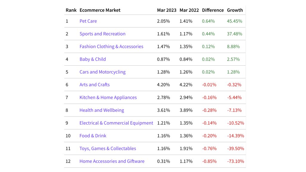
IRP Commerce is one of the best sites to study market data. The graph below shows the average eCommerce conversion rates of various industries as of March 2023 and the growth in conversion rate with respect to March 2022.
eCommerce conversion rate by country
When formulating your KPIs, it’s essential to consider benchmark conversion rates of leading commerce countries. The conversion rate you’d expect from Brazil, for instance, will be quite different from that of the US. This difference in average conversion rates is driven by many factors.
- Mature markets: Mature markets with well-established online brands generally have higher conversion rates, while those where eCommerce is still trying to penetrate and facing stiff competition from brick-and-mortar stores will naturally churn a lower conversion rate.
- Purchasing power parity (PPP): PPP is one of the primary differentiating factors. Besides a country’s inflation rate, its economic growth rates, consumption pattern, and demographic changes also significantly affect the conversion rate.
- Credit card penetration (CCP): The global dynamics behind credit card penetration (CCP) has been quite unpredictable. For instance, in Europe, credit card penetration in the Netherlands is significantly lower than in Nordics, Luxembourg, and the United Kingdom. Hence, the eCommerce conversion rate here ought to be correspondingly different.
- Logistics and distribution: Not all countries across the globe have the presence of a robust logistics and distribution network. That is why eCommerce businesses in many countries are unable to meet high-velocity demands. This again accounts for a low online store conversion rate in many countries as compared to some others.
Knowing the country-wise conversion rate serves well, especially when you’re planning to expand your market base. This kind of information helps make necessary amendments to your KPIs and prepare foolproof business strategies for sure wins. This is where developing an understanding of your conversion funnels can come in handy.
eCommerce conversion rate by channel/source
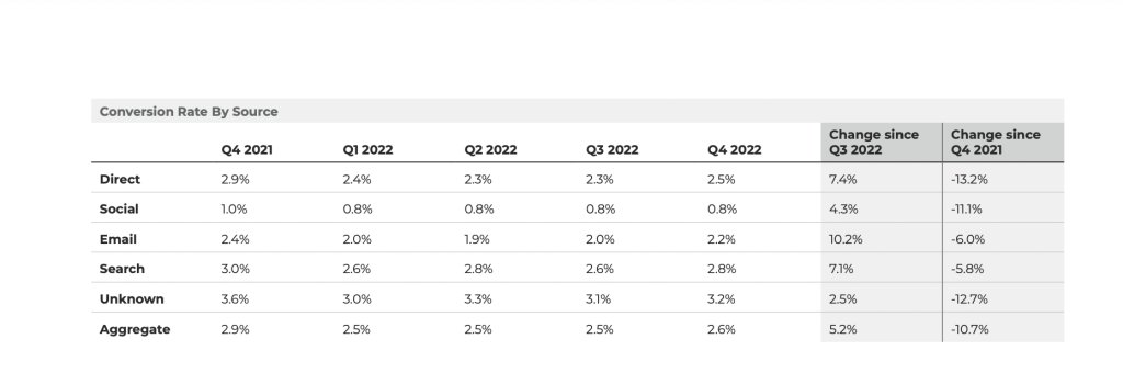
Besides the industry and country-specific conversion rates, segregating the eCommerce conversions based on traffic source is important. As per the latest stats gathered from industry-acclaimed statistical sources, except for social media, the conversion rate is between 2-3% for all traffic sources.
Every company, including eCommerce stores, run a series of initiatives to highlight their offerings – either through featured product roundups, guest posting on authoritative sites, social media campaigns, implementing SEO strategies, or running paid ads. The latest statistics show the need for data structuring and aggregation from most analytics tools on a customer data platform, as the highest conversion rate is coming from an unknown source.
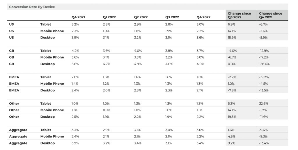
Average eCommerce conversion rate by device
eCommerce conversion rates related to specific devices, typically desktops, smartphones, and tablets, need to be considered when formulating KPIs for generating high conversions. As can be interpreted from the data below, the online store conversion rate for the desktop is approximately 2x as compared to the ones from mobile devices.
eCommerce conversion rate statistics in 2022-23
- The fastest-growing e-commerce countries based on online sales are the Philippines and India. [Statista]
- Best-performing websites usually showcase the strongest conversion rates of 11.45% and more. [Wordstream]
- In April 2023, the Ecommerce Market witnessed a notable rise in the average conversion rate, which surged by 6.89% from 1.70% to 1.82% when compared to the same period in April 2022. [IRP Commerce]
- 85% of shoppers expressed the importance of product information and pictures when making decisions about which brand or retailer to purchase from. [Think with Google]
- A website that is ranked #1 on Google usually has a click-through rate (CTR) of about 30%. This percentage drops to 20% if the website is ranked third and goes below 2% if it is positioned ninth or below on SERP. [Advanced Web Ranking]
- The baseline eCommerce conversion goal of an online store must be 2%+. [Big Commerce]
- Mobile devices are a much popular choice for in-store price comparisons among users. [Statista]
- One of the primary reasons why people shop online is the ability to shop 24×7. [Drip]
- Industry experts predict that by 2040 nearly 95% of purchases will be eCommerce purchases. [99firms]
- As per a survey in 2022, 54% of respondents utilized search engines to get more information about a product. [Statista]
Download Free: Conversion Rate Optimization Guide
eCommerce conversion rate optimization
A good eCommerce conversion rate is not just an outcome of one-time work. You have to continuously optimize your website to keep the conversion rate above your baseline conversion goal. Here are some ways to do it:
a. Increase the website’s speed
It is to ensure that site visitors don’t drop off just because of the delay in loading the web content. Proven techniques include compressing product images using G-zip, switching to a dedicated server and CDN, utilizing caching plugins on the CMS for HTML and CSS minification, and eliminating render-blocking JavaScript.
b. Analyze visitor behavior
Understand how many visitors are dropping at each stage of the purchase cycle. You can analyze each stage with behavior analytics tools like heatmaps, session recordings, and form analytics to pinpoint the areas of improvement.
c. Experiment with pages with huge visitor drop-offs
Behavior analysis can reveal many insights about weak-performing pages; you can then conduct A/B tests to validate the solution that is based on the analysis.
For example, Perfect Plants, a small business based in North Florida sells plants through its eCommerce store. The team there conducted an A/B test with the hypothesis of repositioning the plant image on the product section for visitors coming via mobile devices. The test ended with a 19.26% increase in the number of clicks on the add-to-cart button. The winning variation had no image on the product page.
Thus, A/B testing creates a website experience that is convenient for visitors, which in turn improves the conversion rate.
d. Personalize the website experience
In a highly competitive environment where companies are vying to attract more customers, personalization is a powerful strategy to keep existing customers engaged. By analyzing data on their past behavior, you can customize various aspects such as product recommendations, headings on landing pages, and additional product options.
Let’s say you have a group of customers who enjoy purchasing discounted items. The next time they visit your website, you can provide them with a special offer code or discount, but with a requirement to spend a certain amount on products. This approach ensures that you cater to their preferences and interests, leading to a higher likelihood of converting their visit into a purchase.
Conclusion
Tracking conversion rates can be quite challenging. For eCommerce, tracking the cart abandonment ratio is critical. Only then one can identify and take corrective actions.
At VWO, we believe it’s best to adopt a focused approach to eCommerce conversion optimization. Rely on well-researched studies and sources, including Statista and Baymard, or conduct your primary research to define your website conversion rate benchmarks and KPIs.
Remember, the role of benchmarks is to help you understand the current performance of your online store. They’re not gold standards that can be replicated. A more systematic approach is to run conversion optimization A/B tests and learn what works best for your online store. Such a well-informed approach has the potential to increase your conversion rates by as much as 90%.
Frequently asked questions (FAQs)
It depends on the industry, target audience, geography, product type, etc. Thus, there is no single number that can be a benchmark for a good conversion rate.
As of April 2023, the average conversion rate is 1.82% for the eCommerce market as per data from IRP Commerce website.
As per a study that involved 100 million data points for 14 different industries. the average B2B eCommerce conversion rate is 1.8%.

From welcome emails to replenishment and from verifying profiles and codes to saving purchase receipts, email marketing is what drives revenue for most businesses. And ecommerce couldn’t be out of the picture.
Download Free: Cart Abandonment Guide
Abandoned cart emails are one of these types of email automation techniques that can make conversion rates skyrocket! But what are those emails exactly?
Cart abandonment emails are sent automatically when a user does not move forward with a purchase, despite having added an item in their cart. They are light-hearted, fun and almost expected sometimes, as there are various reasons why a customer may not complete a purchase.
But why are they fun? Why are they expected? And why are they needed? Well, let me tell you a thing or two…
Why do businesses need to invest in Cart Abandonment Emails?
So, you’ve set up your ecommerce store, right? Design, brand tone, data at the ready, your layout and the products are there… So, you take the next step: Awareness. Or, in other words, ads.
You can take your team in endless brainstorming sessions, you can have your strategists rake their brains and your creative team work wonders, but there will be something missing, without a cart abandonment email automation plan. Cart abandoners are the most “expensive” tribe of them all, as failing to re-engage them could be a lot like leaving money on the table.
Luckily, there are tools to help you design and implement strategies that will make even the most stubborn turn around and give you a happy smile.
For example, Moosend, which is one of the best Mailchimp alternatives, can give you the opportunity to combine every email marketing action, such as sending newsletters and transactional emails, such as the cart abandonment emails we’re talking about, all from one place.
“And why would I need to do that?” You’ll ask. So, let me clarify the reasons why, with some visual aid:
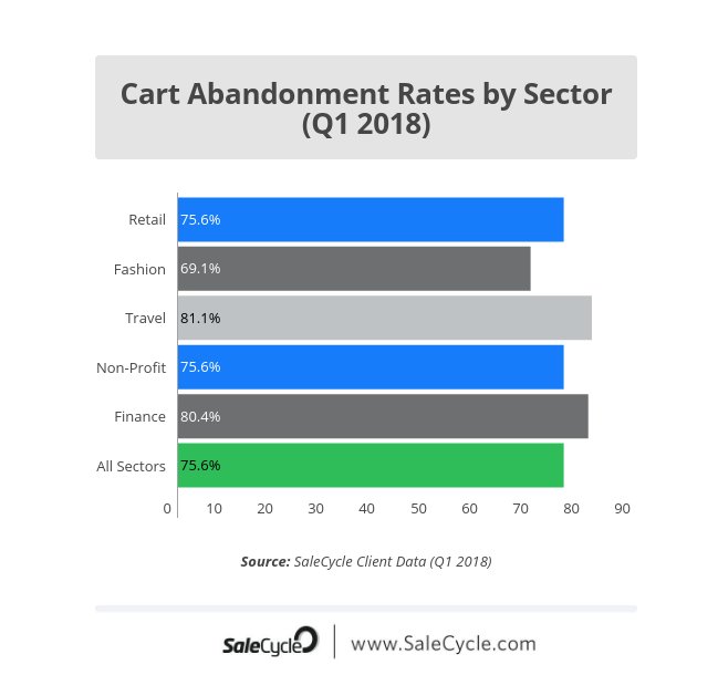
This statistic by SaleCycle, shows the cart abandonment rates by sector. Unsurprisingly, tourism is the first one to have been hit, which is completely normal, seeing as a booking can be impulsive but deciding on a destination cannot be which leads to customers abandoning their carts. The tourism sector is closely followed by online retailers at 75%.
Also, unsurprisingly enough, the cart abandonment rate for all sectors is very high. 75.6% high, to be exact. Which leads us to the following question: Why would a person be so quick to abandon their cart in the first place?
Pure, square logic indicates that since a visitor bothered with putting something in their cart, they want to buy, right?
Wrong!
Most users add items in their cart just to keep them in one place while looking around. Kind of being in a big department store and looking at a shirt you’re not exactly in love with but wouldn’t mind trying on.
I’ve done the same thing a billion times because an item was on sale and I wanted to have it in my cart so that nobody else could access it (silly me!). I’ve also done the same thing in order to calculate shipping costs.
These two facts don’t indicate an intention to buy. Hence the need for cart abandonment emails.
The cart, to be honest, was over and done with as soon as I could see that the shipping costs were too high for my liking. I belonged to that 23% the above stat shoes.
So, fellow marketer, how would you entice a customer like me? What kind of email would you make sure I received?
And before you claim that an email is not the product so why would anyone be convinced through that email if they weren’t convinced by the product, blah, blah, I’ve got more numbers for you:
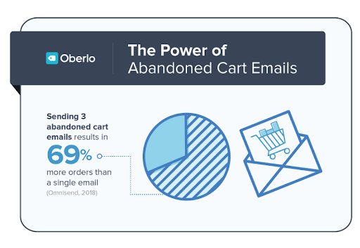
It seems like cart abandonment emails are doing pretty well, seeing as just three of them can result in a 69% increase of orders, as the stat above shows.
But this won’t happen just because you sent out a cart abandonment email and called it a day. You’ll need to stand out, do something that others don’t. Or perhaps, take a look at the best and steal their methodology!
Which is what I’m willing to help you do.
Examples and Tips
I’ve gathered some emails with high open-rates that I feel can back up the data I mentioned above and I will explain why, seeing as you’ll need some actionable tips to “study” (ie steal). So, let’s go:
Exhibit A
The first example for your “how-to” list:
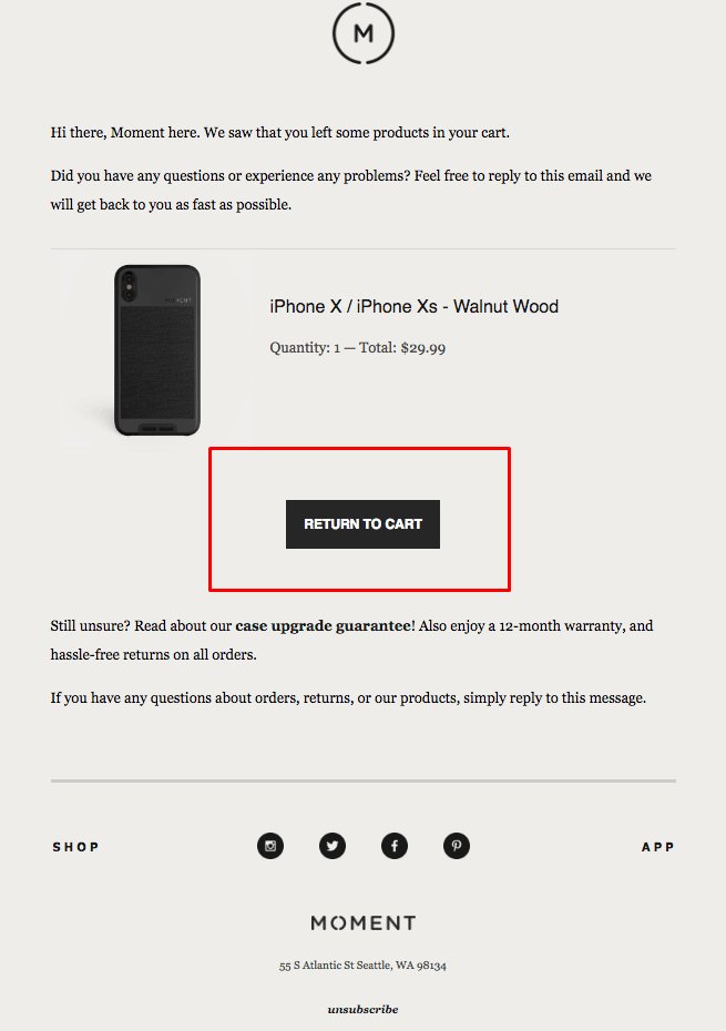
The Moment is an eCommerce store for anything and everything smartphone gear and a great example of a cart abandonment email with a tone consistent with the brand itself.
The questions in this particular email are the ones aiming to tell the customer how silly it was to abandon the cart just like that. Imagine the dialogue here:
-Did you have a problem with your purchase?
-No, I didn’t.
-Are you unsure about your order? Because we’ve got a solution for that.
-Oh why thank you!
-Let’s go back to your cart, then.
Easy, breezy, laid-back and friendly.
The first thing you should think of when coming up with content for a cart abandonment email should be a tactic that will make your call to action seem effortless, as if a friend was talking to another friend.
And our CTA here is doing exactly that: It’s made with a no-pressure, no-rush kind of logic, it’s effortless and friendly. Which really is the whole point, as we don’t want things to seem like a big deal. Baby steps.
The goal here is not to go for the hard sell, but to re-engage the customer by being the brand that misses them and wants to interact with them. Your copy doesn’t need to be too strong for something like that and there needs to be as little pressure as possible.
However, you’ll need to entice them a little, just to make them buy. Here, the enticing thing is that Moment has answers to your questions. Like so: “Are you feeling unsure? Well, fret not, cause we’ve got XYZ things to provide.”
Download Free: Cart Abandonment Guide
Exhibit B
The second example is none other than Adidas:
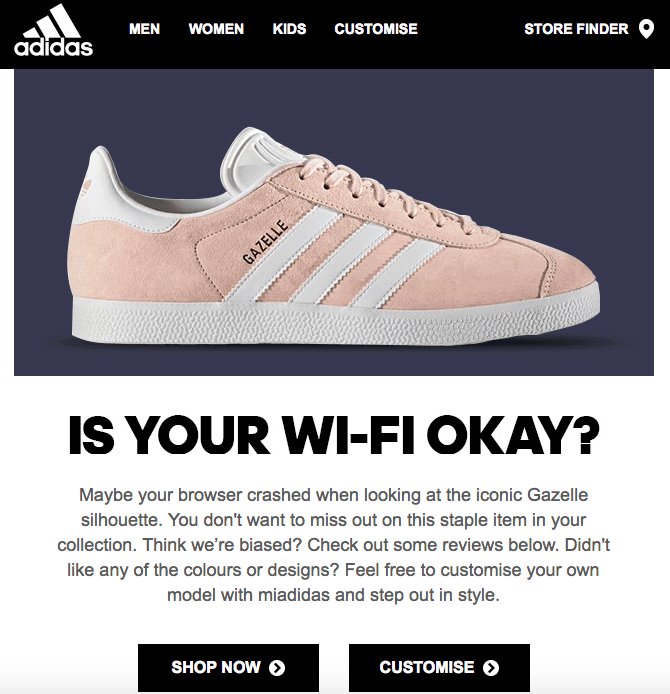
That brand goes and does it again! Of course, a multi-billion company like that one couldn’t have done anything less than perfect, but their strategy here is magnificent.
Not only are they showing the customer what they’ve left in the cart, but they also are pretty smart about it, with their friendly tone and their little joke.
They just don’t want you to miss out on this opportunity and they’ve got social proof on how good an opportunity that is, if we’re honest. “Just check out some reviews”.
-Oh but my friends at Adidas, I didn’t like the colors.
-You can make your own custom model, isn’t that amazing?
Go check the graph with the reasons why people abandon their online shopping carts again. You’ll see that this email has all the answers:
You weren’t ready?
Sure, check the reviews to make sure that you understand what you’ll be missing out on.
You weren’t too much into the design? Understandable.
Why don’t you try and make one of your own, that will be custom made only for you?
These itty bitty techniques make the user feel like they’re valued, cherished, as it seems like the company actually cares about their preferences.
And this can bring a whole lot of lost revenue in return.
Exhibit C
Let’s go for that cool, calm and fun California vibe, shall we?
This one is one of my favorites ever.
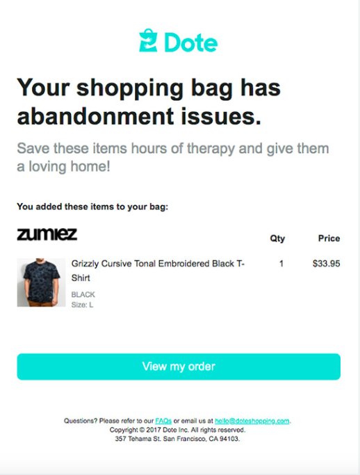
Dote is an eCommerce store that is colorful, youthful and has that classic San Francisco vibe about it.
Do you see that reflected in the email? Well, I’d say so. The email itself is colorful, light, happy and doesn’t forget to incorporate humor while we’re at it. Which is something you should do for your brand as well, if, of course, your brand and humor go together.
What is important is to keep your brand tone intact at all times and Dote is doing exactly that, thus not confusing the customer.
So, now we’ve got our data, we’ve got our examples and tips on what to do and what would benefit your brand… Let’s move on to the final category.
Things to avoid
Nobody’s perfect and the point is not just to write fun and engaging emails, but to know what to do and make data-driven decisions along the line.
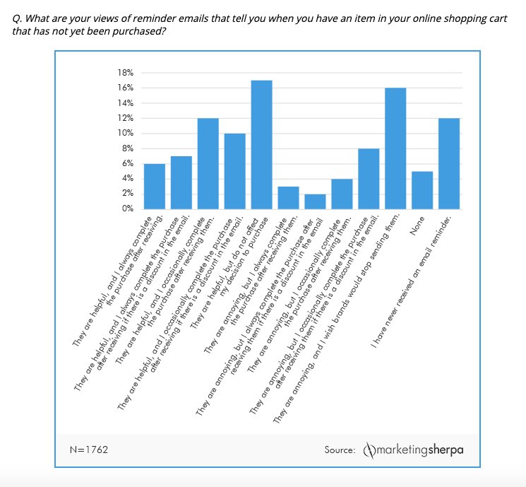
The graph above is more proof that cart abandonment recovery emails are helpful, but as you can see for yourself, there is a 38% that still finds them annoying. This is where my tips and tricks come in handy.
So, here’s the final list I’ve got for you: The basics on what to avoid, in order to make sure that your campaign will work and convert that 38% that was annoyed with your reminder:
- Don’t ignore your data
Everyone leaves a digital footprint, whether they’re a customer or a mere visitor to your website. You can use that footprint to extract data and make sure you understand which step of the purchasing process made your visitor drop out.
Once you’ve got that down, customize and optimize! Was the shipping cost too high? Offer free shipping or offer a discount to make it work!
Was the process too complicated?
Make it simple!
Whatever you do, just study your data like the gospel, if you want to reach your KPIs and make the most of your subscriber list. - Don’t ignore feedback
Let’s assume that your data doesn’t hold as much information as you would’ve liked, about the customer and why their cart was abandoned. Well, this is a sticky situation, isn’t it?
Here’s where you should send out a survey (or post it on your social media profiles, or both). This will make the customer feel cherished, unique, and you’ll establish an image of a brand that cares a lot about its customers and what they’ve got to say.
So, apart from trying to check your data each and every day, you can opt for a survey or some good ol’ “A dedicated agent is here for you, if you want to chat.”, of course including links to your customer service and/or social media pages.
The issue with many brands is that they don’t really try to change negative reviews. Therefore, the ones that do care about it, are the ones that stand out! - Don’t ignore the need to segment your list
I think this one shouldn’t even be here, seeing as list segmentation is one of the most tried-and-true techniques, up there with A/B testing. This pretty much means that if you haven’t done it already, you should.
Segment your list, in order to know where and how to send any and all kinds of emails in general and cart abandonment emails especially, seeing as not every user is the same and not every customer is at the same point in the sales funnel.
List segmentation, combined with your data, will give you endless potential when it comes to increasing sales, revenue and leading customers further down the sales funnel.
To sum up
There really is no need for you to go crazy with tactics, CPC ads and stacks full of data. You just need the proper tools to measure, segment and don’t forget a basic principle or two:
Always keep your brand tone and never forget that shopping cart abandonment emails can very easily look like they’re pestering people into buying.
But with a little humor and a little great copy and visuals, everything can happen!
]]>
Shopping cart abandonment is painful.
But there’s good news—recovering abandoned carts is relatively easy with web push notifications, and it’s definitely worth the effort.
Download Free: Push Notifications Guide
In this post, we’ll share action-oriented insights accompanied by ready-to-use push templates to retarget abandoned carts and nudge customers towards completing their purchases.
Let’s dive in.
1) Personalization
Today, customers demand personalization at every stage of their buyer’s journey. Using personalized details such as their first name, last name, location, etc., helps build a connection with the user and potentially results in higher sales.

2) Drive sales with emotions
Everyone needs a little reassurance every once in a while. A great way to convert users is by telling them that the product would look great on them! Encourage them to add the product to their wardrobe. Assure them that the product deserves to be a part of their collection.
Make them feel that the product would be their best buy ever! Nudge them with emotions to click on the buy button.
3) Attract with discounts
Discounts may take away a chunk of your total revenues, but they are a great way to capture price-sensitive buyers. Offering a 10% discount on price elastic products may work brilliantly for your business.
You can notch-it up with a level of personalization and watch your sales grow.

4) Boost sales with FOMO
Nobody likes missing out on a steal-deal! Create urgency by telling your customers that the product they’re interested in is fast running out of stock.
You could also run a time-bound sale on that product to persuade users to complete their purchase. Use FOMO to make users convert faster.

5) Convert with affection
Show some love! Tell them that you’re saving the product that they left in their cart, especially if it’s about to run out of stock. Make your customers feel special.
Do things for them that a great friend would. Build a stronger connection with them to increase your conversions.
6) Show some support
Sometimes people (especially the ones on the fence) just need an extra nudge to make a decision. Make them feel like they’re making the right choice. Tell them that they have a brilliant knack for beauty.
Appreciate their choice, make them believe that their purchase is going to make heads turn or make people stand up and notice.

7) Rekindle their purchase intent
8 out of 10 times, people browse through products on your website, add them to their cart and forget about them later. It’s quite common for customers to have high purchase intent and leave the website, hoping to come back later and buy the product.
This subset of customers needs a reminder of what they loved on your website. Awaken their lost desire and persuade them to complete their purchase.
8) Price slash 
Who doesn’t love an occasional price drop? Extend a special discount on the product they’ve left in their cart. Your customers will be delighted with this surprise.
Nudge them with a discounted offer and persuade them to come back and complete their purchase. Use words such as ‘Just for you,’ ‘Exclusively,’ ‘Special,’ etc., to entice them to take action.

9) Free shipping
Did you know, 56% of customers abandon their cart due to high shipping costs? One of the best ways to convert abandoned carts into sales is by providing free shipping! Surprise your customers with a free delivery option.
Keep it time-bound to ensure a higher success rate.

Download Free: Push Notifications Guide
10) Drive sales with BOGO
Entice customers by giving one item free with their purchase—give them a choice to select what they’d like to avail, for free.
You can also add a mystery gift or a special offer to the product left in their cart and entice shoppers to complete their purchase.
11) Lure them with hope
Like Alexander Pope once said, “Hope springs eternal.” Most people who leave products in their cart plan to come back later and buy them. Evoke their desire to purchase by showing them what it would be like to own the product.
Make them feel that it would be crazy on their part to miss out on such a sweet deal. Create urgency. Awaken the feeling that if they don’t buy the product now, they may lose the product forever.
12) Cross-sell
Show them products that will go with the product they’ve left in their cart. Create a product deal and give them a discount. Make them see how it would be a valuable purchase and potentially trigger purchase intent.
BONUS section
Always remember, abandonment doesn’t necessarily have to involve customers adding products to their cart and abandoning them later. There are other types of cart abandonment too.
Here are two BONUS templates to persuade customers that abandon your website while browsing it or from a product page.
Browse abandonment
Most often, customers may leave your website because of a variety of reasons. For example, they may bounce off because the website crashed or the UI/ UX was broken, the checkout process was complicated, or maybe the site timed out.
However, the fact that these customers came to your website and browsed through your collections is enough for you to persuade them back to your website.
Product abandonment
People process images much faster than text. Showing users the product they’ve left in their cart arouses interest and increases their intent to complete the purchase.
Using product images in your push notifications triggers a higher response. It’s simple, the more you show them the abandoned product, the higher the chances of them returning to your website to check out.

Final thoughts
With an average online shopping cart abandonment rate of 88.05%, web and mobile push notifications are a remarkably effective sales recovery strategy. We’re hoping these ready-to-use templates help you reduce card abandonment rate, get lost revenue, and build lasting relationships with your customers.

When selling online, cart abandonment is a fact of ecommerce life. Humans have a limited attention span (just 8 seconds long), as we are filled with deliberation, choices, distractions, and doubts. However, there are lots of tools out there to help you minimize cart abandonment, but we can’t eradicate it completely.
Download Free: Cart Abandonment Guide
However, all is not lost. Customers who have abandoned their carts can still be reengaged. And we’re here to help you with top conversion rate optimization tips that will turn those faltering customers into paying ones.
The Basics
Cart abandonment is when someone visits your website, adds items to their baskets, but for one reason or another, fails to finalize the purchase and leaves the transaction incomplete.
Conversion rate optimization (CRO) is a set of practices that helps you to convert visitors into paying customers and avoid, or turn around, cart abandonment.
Two impactful CRO practices that help with cart abandonment avoidance are:
- Cart abandonment software: Software that tracks a visitor’s journey on your website to: capture emails and track shoppers while they are on your site, watch for them to abandon a cart, and email them following their abandonment, enticing them back.
- A/B split testing: Running two versions of your website or page that are identical in intent (such as the checkout page) but different in style, allowing you to compare and contrast conversion rates between the two.
Power of Cart Abandonment Software and A/B Testing on Customer Conversions
Alone, these tools are impactful but together they can work in conjunction to produce much powerful results that will make your conversion rates soar and here’s how:
Cart abandonment software relies on shoppers (website visitors) entering their email addresses on your website form, while A/B testing provides you with the insight to optimize your website to ensure that shoppers (website visitors) input their email addresses.
Simply put, A/B testing converts visitors into leads and cart abandonment software converts leads into paying customers.
How to Use A/B Testing and Cart Abandonment Software to Get Email Addresses
There are lot of CRO tips for use when you are A/B testing to see what changes result in increased email conversions. We’ve put together our favorite tips here:
Where
Where you ask people for their email address, is hugely important and impactful. You can have a banner asking people to sign up. It can be part of a registration form, or you can use your cart abandonment software to produce exit intent pop-ups (displayed when visitors look as if they are about to leave). It is estimated that 35% of lost shoppers can be saved by using exit intent pop-ups, but test this for yourself to see if this is true for your customers.
Opt-In Changes
- Location
Visual tracking research shows that we browse websites following an F-shaped pattern, favoring the top and left-hand sides. Test your email address opt-ins at both these instances to see which captures more attention.
- Color and Font
Choosing the right color and font optimization for your call-to-action button is imperative. We’ll discuss color in a little more detail below. Testing background colors and contrasting text that can make your banner stand out, easy to read, and compelling to complete is a significant use of split testing.
- Lead Magnets
Lead magnets offer your customers something valuable in exchange of their email addresses. It can be a downloadable guide on this season’s fashions or a report on the top-rated headphones of the year. Test whether lead magnets work or not; and if they do, test many types. Opt-ins of this nature can see up to a 10% conversion rate.

Form-Based Changes
- Page Layout
As mentioned earlier, humans are easily distracted not only by outside sources but also by items on your website. For a particular VWO customer, removing the navigation menu resulted in a 100% increase in conversions. Try removing your navigation menu from the form page, to reduce distraction, and removing the option to leave the form, and see if these increase your conversions.
- Form Layout
Over 70% of online shoppers abandon their cart halfway through the checkout process, meaning that they are also halfway through filling out your form. Some cart abandonment software applications capture email addresses in real-time, even if the visitor doesn’t hit Submit. Therefore, test moving the email address field higher up on your shopping cart and checkout pages, to capture the email address before the visitors abandon the page so that you can send them a follow-up email reminder.
- Copy
Words are powerful and emotive: They can make people comply, offer, or turn away. Consider how you are asking for shopper’s email addresses and then test different methods, such as explaining why, using personable language, emotive words, or by using less number of words.
- Field Population
Do visitors respond better to form fields that are pre-populated with example text (such as [email protected]), blank fields, or fields compatible with Google Autocomplete. Understanding what makes your form easiest to complete should help enable you to tailor it accordingly.
Exit Intent Pop-Up Changes
- Color
A pop-up needs to grab visitor attention, and the best way to do this is with color. Split test different colors that contrast with your website brand colors and “pop out.” You may also want take into account well-known color connotations, which differ across countries, cultures, and genders, such as:
Blue: Security
Purple: Luxury
Red: Urgency
Yellow: Caution
While you can’t adapt your website for everyone, you can adapt it to your customer base by seeing what works best for them.
Download Free: Cart Abandonment Guide
- Offers
A great A/B testing idea can be of using different offers to see which offers appeal to your customers more. Research shows trends such as 90% of online shoppers being influenced by the cost of delivery and discount days such as Black Friday, leading to billions of dollars worth of online sales. Test percentage discounts, free delivery, and money off to see what works best for your target audience.
- Wording
Your exit intent pop-up wording is crucial. When issuing a pop-up window, you are walking a fine line between frustrating and enticing your customer. If you are interrupting them, test your wording to make sure it demonstrates a good reason.
- Fields
Another useful test for pop-up windows is to include the email address field in the exit intent pop-up itself. This will enable you to capture user email addresses in real time before they exit the pop-up screen.

- Size
Size matters when designing your exit intent pop-up screen. Should it take up the whole page or just the center? Should it be easy to click or difficult?
Results
A/B split testing is a great way to increase your email address conversion rates. It can be then directly used to fuel your cart abandonment software, with the ultimate aim of re-engaging customers who have abandoned their shopping carts.
There are many other tests that you can try for capturing email addresses before cart abandonment occurs. However, the following 12 are our favorites, because they work. Increasing the number of email addresses you capture before cart abandonment and using these addresses in your follow-up cart abandonment email campaign, you can convert over 20% of lost online sales.
Note: The author owns screenshots in the blog.
]]>Since there were many questions that Christian couldn’t address during the webinar from our live audience, he took out time to answer each one of them later and we’re extremely thankful to him for the effort. You can scroll down to see the Q&A.
Download Free: Cart Abandonment Guide
For those of you who couldn’t attend it, here are the quick details of the webinar:
Topic: 8 Checkout Optimization Lessons Based on 5+ Years of Testing

Presented by: Christian Holst, Baymard Institute
Christian Holst is the Co-founder and Research Director at the Baymard Institute. He’s the author of the E-Commerce Checkout Usability and Mobile E-Commerce Usability research reports. He’s a contributor at Smashing Magazine and is also a regular speaker at conferences, like Mobile Commerce World, Smarter Web Strategies, and many others.
Hosted by: Siddharth Deswal, VWO
Q&A from the Webinar
1. What is your opinion about proprietary checkout processes vs companies checkout processes like paypal, worldpay, etc.? Do these experienced payment services boost user confidence vs. in-house developments to accept credit cards?
Christian Holst: There are great regional differences in how users perceive 3rd payment gateways (like paypal or worldpay).
In some countries, such as Denmark, there’s historic and legal reasons causing 95+% of all local e-commerce stores to have their credit card payment page hosted by a 3rd party gateway. So here users have been trained for years that 3rd party is the most secure option – so be aware of any such dispositions on your key markets (typically local payment card enforce such rules).
The practice is changing (embedded fields, but still 3rd party payment processing) and onsite credit card payments is widely used at most major e-commerce sites, especially in the US.
That said, we in particular observe a sub-group of users that prefer 3rd party payment when paying on smaller sites and when purchasing “suspicious products”, in particular while placing international orders (e.g. a US customer buying at a Chinese site). If those cases are not dominant for your site, I’d always recommend an on-site credit card field implementation as it allow for a much more integrated and seamless checkout experience (e.g on handling errors)
2. Where is the best location to place the coupon field?
Christian Holst: During testing, we usually find that users with a coupon will look to apply it before initiating the checkout (i.e. in the cart) or at the payment step (some people see them as a way to bring down the order total, just as a gift certificate). If coupons are frequently used at your site, we recommend placing the coupon link (and never a coupon field, see lesson #2 in the webinar) at both these steps.
3. A lot of commerce sites are introducing credit card camera capture of the number so users don’t have to type in their card number – is there data on the effectiveness of implementing this feature? Do you have any separate data for mobile and desktop?
Christian Holst: We don’t have any data on this. But there are some points you should consider.
It’s important that you always have a text fallback. Some users will always be concern if the image is stored (like”snapchat promised temporary photos, but it turned out it wasn’t entirely true/secure. Will this be any different?”).
Cameras are a very integrated part of mobile, not necessarily on desktop. Many users will figure it out, but some will experience errors and might still require detailed guidance. That said it’s an interesting concept, which may prove effective, just bear in mind it’s still an unconventional concept for the vast majority of “normal” web users Track any implementations very carefully. Sites that target a web/mobile savvy audience may have earlier successful adoption than mass-market sites (Note that many of these points also apply for some of the “one-line credit card fields”).
4. What is you opinion on 1-step checkouts?
Christian Holst: They can be great, but isn’t a guaranteed path to success. It’s more important what you ask users to do and how you ask them (see lesson #1 in the webinar). Also see a detailed answer here and here for accordion checkouts.
5. Do you have any stats or tips on using social login, such as Facebook login, to get users through the checkout faster? Does this Facebook login also create a sense of security?
Christian Holst: I’ll answer for all 3rd party accounts in general. Less typing is always good, but over the course of the next 1-2 years (if not already) the issue of having a clear primary path/button from the shopping cart to the checkout will increase as sites want to support the myriad of 3rd party accounts. Paypal, Google Payment, VISA Checkout, Facebook, Amazon payments, Alipay, Apple Pay, and the list goes on.
We often see sites with 3-6 primary colorful buttons all screaming for users’ attention, competing with the site’s own “Checkout” button. Having a clear and logical flow to the checkout can then be very difficult, especially because some 3rd party services are only for user credentials and address information, others are only for payment information, and some are for all of it. Example, we recently helped a billion dollar e-commerce site that had great issues with the new VISA Checkout (which is account+payment). Users who had VISA credit card though the sites asked them to choose that option. In order to select between the options, users will often have to understand what each means, which is a problem for those new or unfamiliar with any of these. Sites that cater to an Internet savvy audience will see more demand, and less issues.
Lastly, if it’s a new service, note that you’ll loose some users who are intrigued by that “VISA checkout”/”Paypal”/… as they are often forced to sign up for an account at the new 3rd party solution + who “owns” the customer and the customer data can have crucial business implications in the long run (it differs from service to service, so read all of the small print).
6. Does mobile and desktop see different results in regard to the number of checkout steps?
Christian Holst: It’s even more nuanced. The upper limit of steps kick in earlier on mobile. On desktop, we found it to be 7+ checkout steps. On mobile, it’s a bit less but I don’t have an exact number yet as we’re still in the process of compiling a mobile benchmark study.
However, a short mobile checkout can also be problematic. As just a handful of form fields will take up multiple mobile viewports/screens, a 1-2 page mobile checkout will often make each step appear very intimidating (each step maybe 4-8 screens of text and form fields). Also, on mobile, you will often need a separate review step where it’s possible to get a decent overview.
Download Free: Cart Abandonment Guide
7. How do you rate Shopify’s checkout process?
Christian Holst: To remain unbiased, we try to avoid publicizing and test findings from specific vendors or platforms. With that said, I know a few of the people at Shopify and they seem very smart, so I’d be surprised if it was terrible – but I’m not going to comment if their checkout is better than the checkout found on other e-commerce platforms.
More importantly, very small design and form changes can have a tremendous impact on checkout performance (see lesson #2-#8 in the webinar), it’s therefore difficult to evaluate the exact performance of a platform as it depends on the individual site owners customizations of the checkout experience.
When choosing a platform closely inspect how much you can actually change yourself. Even if a vendor have a good checkout flow now, you will be locked to their future decisions of the checkout flow, design and code. If that is a problem, it very much depends on whether you believe you are smarter that the platform designers/developers and how many resources you actually have to make any changes yourself.
The thing with mentioning the shipping price early is potentially missing out on abandonment email sequences if they don’t want to pay in the first place. With abandonment emails we can at least offer them a coupon or free shipping to get them back.
While abandonment emails can be a great supplement tool, it shouldn’t cause you to design a checkout which increase abandonment in the first place (by hiding the total order cost). If you can afford free shipping, offer it the first time around.
8. Do the checkout pages need to be as clean as possible?
Christian Holst: To some extent, yes. We found that surrounding graphics and site-wide navigation cause issues. Although don’t remove everything – we’ve seen checkouts that spooked users who lost confidence in the site as they thought it looked “unfinished,” some even thought the site is “hacked”. It’s important that some of the sites overall look and feel is kept in the checkout, so it doesn’t become too “detached” from the rest of the purchase s´cycle. For more information on users perception of a “detached” checkout experience, read here.
9. What is the best ‘Add to Cart’ action – take customer to cart or display pop up confirmation?
Christian Holst: This is a generally overlooked topic, which is much more complex than it might appear. There’s also a 3rd very popular option and that’s showing a temporary drop-down cart. In our most recent tests, we’ve found that the best solution differs with the site’s specific context, we’re still finalizing those findings (for all of the approaches, the devil is in the detail and it can take multiple attempts to get it right – and was frequently observed to be the direct cause for site abandonment as some users were unable to initiate their checkout process).
10. What is considered a “good” cart conversion rate? Is there a standard benchmark that can be used? Just trying to see if this is the number one place to focus on improvement in overall business returns.
Christian Holst: Note that the cart abandonment/conversion rate also depends on other things than the checkout experience. Some sites can therefore have a very poor checkout experience, but still something that appears to be a decent cart conversion rate, with revealing any untapped potential.
Look at what users will have to do while going through your checkout process, and try to compare it to sites with a great checkout process. See the public part of our checkout usability benchmark database here. This will give you a decent way to gauge if there’s untapped potential before initiating a checkout redesign. Looking into your drop-off rates per checkout step (and even per form field) is also a cheap and effective way to see on which step you might have issues.
11. What could be the reason 6 steps checkout has better score than 4 and 5 steps checkout in your webinar?
Christian Holst: Answered in part during the webinar, although not as clearly as I’d like. First off, what the user is asked for during those steps greatly impacts the performance. Secondly, the graph shows that there’s actually almost no difference. This was not clear at the webinar as I forgot to explain that the difference between the individual sites’ checkout performance can be several hundred points, as you can see if you open the individual sites.
12. What do you think of quick checkouts that ask for only email or phone with stores that offer Cash on Delivery option? Sometimes right after the ‘add to cart,’ the user is provided with a quick checkout option under the ‘add to cart’ button?
Christian Holst: Excluding payment from the checkout process can generally be a good idea. Several countries (in particular in Scandinavia) offer both Cash on Delivery but also simply “invoice/bank transfer 5-14 days after delivery” – this provides an insanely fast checkout. The increase in conversion must offset the amount of payments which the site is not able to collect in the long run.
As far as I recall, the payment company, Klarna, have even specialized in taking on the sites/merchants risk by offering bank transfer after delivery to the customer (in exchange for a percentage cut). This can work well for impulse purchases and product types with only a single product ordered. But “Cash on Delivery” will still require address fields. Would love to test it more throughly in future studies.
13. Is placing a Sign In or Register function in between one of the checkout steps a good practice if it offers the user discounts or points?
Christian Holst: To be clear, you should still offer a guest checkout. Not all users will care about “collecting points”. But describing the benefits of the discount program near the optional password field is a great way to increase voluntary account creations.
14. Where should the shipping price be mentioned, as early as possible in the checkout process?
Christian Holst: Total cost estimate should be in the cart. During testing, most users would expect to know what would be their checkout cost. On sites which didn’t include estimated shipping cost in the cart, they would need to fill 10-20 form fields before being able to see the shipping cost. This is indeed the case at some sites. If you don’t have free or flat rate then give a lowest cost estimation in the cart. “Estimated ground shipping: $6”. You can also geo-target the state based on the users IP and say, “Ground shipping to CA: $7”. Especially sites which allow international order can benefit from including a shipping calculator at the cart step as users who frequently place international orders know that the shipping cost can often be more important than the product cost, and vary greatly from site to site.
15. Did you find any correlation between higher cart abandonment rates and higher cart amounts?
Christian Holst: No, nothing conclusive in general. But there might be site specific conditions. However, one conclusive test observation was that users placing an expensive order were much more through, often go to great lengths in ensuring every thing was correct, and often actually read descriptions and help text if in doubt. For sites with high order values, offering precise and detailed help can be extra important. Even basic fields, selections and information may warrant a tooltip explaining the details further. Also, consider an extra detailed order confirmation step. Note that these users will be extra vulnerable/sensitive to poor error message.
Feedback for the Webinar
I hope this webinar and the Q&A gave you great insights to improve your eCommerce checkout funnel. If you have any suggestions about VWO webinars or want us to cover certain topics in our upcoming webinars, feel free to write to me at marketing [at] vwo [dot] com
In case you missed the webinar, you can access the recording and slides anytime you want. Just click on the link below!
]]>