A poorly designed website could be limiting your conversions and revenues. In the digital age, the importance of a website for any business can’t and shouldn’t be underestimated.
But undertaking a website revamp can seem overwhelming considering the time, effort, and energy involved.
Download Free: Website Optimization Guide
Well, it doesn’t have to be that way – if you understand users, plan the key stages, stick to a plan, and follow best practices, you can take your website from zero to hero in one go.
Signs your website needs a revamp
Before we get into the stages of a website redesign, let’s take a look at the signs which indicate that your website needs a revamp:
- A high bounce rate – a consistently high bounce rate is one of the prime warning signs that it’s time to update things. It usually means that the user experience is poor and that visitors are not finding the information, product, or service they are looking for.
- Technical issues – if your site is taking too long to load, looks horrible on mobile devices, or has any other significant technical issues, it is time for a website revamp.
- Conversion rates are down – if the bounce rate is low, but conversion rates are down too, it’s a sign of issues. While there can be many reasons for that (price, missing CTAs, poor copy, etc.), a key reason is often poor UX.
- It’s old – if your website has not seen any major updates in years, it has probably fallen behind the latest best practices, particularly in terms of accessibility and responsive design. It’s time to give it an overhaul, even if the design is the only thing you need to address.
How to improve your website in one revamp
Before you begin putting ideas into action, it’s a good idea to take a closer look at your existing website and customers. This process will help you build a new website that solves known and unknown challenges.
1) Assess your current website
The good news at this point is that you might not have to overhaul everything on your website.
There may be a number of areas that are already working rather well, and which can either be left untouched or just tweaked a little. And chances are you already have a lot of content, which might need tweaking rather than starting from scratch.
However, this is the time to concentrate on things that need to be changed. Start by creating a list of what’s working and what isn’t. To help you figure this out, a good place to start is tools like Google Analytics and dynamic heatmaps.
- Google Analytics (GA) – This powerful, free tool gives you insights into which pages perform better than others, which have higher bounce rates, and which lead to more conversions. GA can also give you an in-depth insight into who your target audience is and how they are finding you online.
- Heatmaps – Heatmap tools are here to give you answers that GA can’t. While GA can tell you where the visitor has come from and how long they stayed on a particular page – it can’t tell you what they were (and weren’t) looking at and how they behaved – but heatmap tools can.
Review your target audience
Target audiences don’t always stay the same.
Now is the time to go back to your buyer personas that identify who your target audiences are today. Do some research and document their needs, pain points, and behaviors. Knowing what they like and dislike will allow you to design a website that gets them interested and engaged with your offering.
Perform a content audit
Content is the lifeblood of the website, so this is a perfect time to perform a content audit. This will give you insights into your best-performing content so that you can decide which type of content to focus on, and which type of content to either drop altogether or at the very least, modify.
A content audit will also highlight your content gaps, which is especially important if you are putting (or plan to put) a lot of effort into content marketing. Tools like BuzzSumo and Quora can help you to understand what kinds of content your audiences are looking for – both for your website and in content marketing.
Perform an SEO audit
Last but not least, it’s important that you conduct an in-depth SEO audit. Since you plan to do a website redesign, it is only logical that you want to end up with an SEO-optimized website. This will ensure your website ranks highly in search engines, attracts organic traffic, and maximizes the chances of referrals from other sources.
2) Completing your website revamp in seven steps
Armed with the data and knowledge gathered from your research, it’s now time to put together a website revamp plan. This is a to-do list based on your analysis of what is and isn’t working
Step 1: Platform or partner?
The biggest decision to make when undertaking a website revamp is whether to partner with a web development freelancer or agency or do it yourself using a platform.
There is a huge range of no-code website platforms such as Squarespace or Wix which provide easy-to-use templates that look great off the shelf while being customizable to your needs. All you do is select a template, add your content, and you’re good to go. These platforms even build in tools and have a myriad of integrations with eCommerce platforms such as Shopify.
However, if you have a more complex website or need it to look unique, engaging a provider such as an agency or freelancer might be the way to go. This is also a good time to consider whether to keep or switch your hosting provider especially if it lacks speed and reliability.
Step 2: Revisit your brand
A key element of your website revamp strategy is brand consistency. If you lose this, you will lose customers as customers look for brands they recognize and can connect to.
Therefore, it is key that typography, logos, color schemes, and images are in place so they can be consistent across all your pages. It’s also important to keep your brand consistent beyond the website too – from email and social media to business cards and brochures.
Remember that your branding doesn’t have to be loud and eye-catching. It can be simpler and understated – as long as it matches the desired brand personality.
Step 3: Plan the user experience
One of the most common reasons a website needs a revamp is that the user experience is poor – be it because the website is cluttered, difficult to navigate, or takes a long time to load. In this step plan how many pages, the Information Architecture, the categorization and navigation of your website, as well as how will users navigate between pages and sections of the website. Make sure you apply web design principles that work.
Some tips on UX:
- Exploit white space in order to make visitors feel more relaxed and at ease
- Organize your pages so that it’s easy for your customers to get from A to B easily
- Use data to optimize CTAs (heat maps can tell you if people are getting distracted by other elements on your page when their attention should be led to the CTA)
Step 4: Create the content
Write the copy or create the imagery that will be on your new website. Good copywriting can be a key driver of conversions. Now is also a good time to create a content marketing strategy that will help you create regular content that boosts your conversions.
You’ve probably well aware of the importance of SEO, so we won’t drill you with that. You know it is important and should be a key consideration in your website revamp. Planning which keywords to focus on, and how best to include these keywords in your content, images, videos, and data will ensure your website ranks highly in search engines and attracts audiences to your website.
Step 5: Pick the right host
Revamping your website into something you can be proud of is a great feeling. However, one technical difficulty is enough to ruin the user experience. Review if part of your current issues is related to your hosting provider.
If that is indeed the case, just switch your hosting – there are plenty of affordable web hosting providers you can choose from.
Download Free: Website Optimization Guide
Step 6: Design and develop
It is time to get to work. Do what you know you can, outsource what you can’t – don’t do things in half measures – you will just end up needing another revamp a year later. Whether using a team or DIY, create the website and apply your designs and upload content.
Step 7: Test and launch
You could begin with a soft launch and gather some feedback first. However you do it, make sure to test, test, and test before launch. This includes testing site speed using Google PageSpeed Insights, the navigation of your website, all links, and mobile responsive design. Test on different browsers, screens, and devices to check that things work and function.
Ask friends and colleagues to test the website too. It is always a good idea to have some fresh eyes that were not a part of the revamp process.
Step 8: Optimize
Once it’s done, you’ll have a fresh and clean website that attracts leads, instead of turning them away. From now on, it’s just a matter of optimizing your website and consulting your analytics for tweaks that can ensure your website performs better over time.
Watch the webinar to learn more about optimization:

Best practice website revamp examples
Before we go, let’s take a look at a couple of websites to revamp examples to showcase how transformative a good website redesign can be.
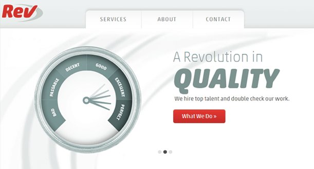
Website revamp example #1- Rev
Here’s Rev’s original website:
And here’s the new look:
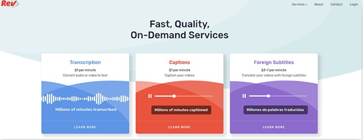
Rev’s original website looked dated with its retro graphics, while the latest version looks modern, crisp, and clean. Rev has replaced vague statements about the company with valuable information about its services, value, and pricing so the user can take action to learn more or sign up straight away. They have also introduced simple animations that give more dynamic to the page, but are low-key enough so as not to distract from the CTAs.
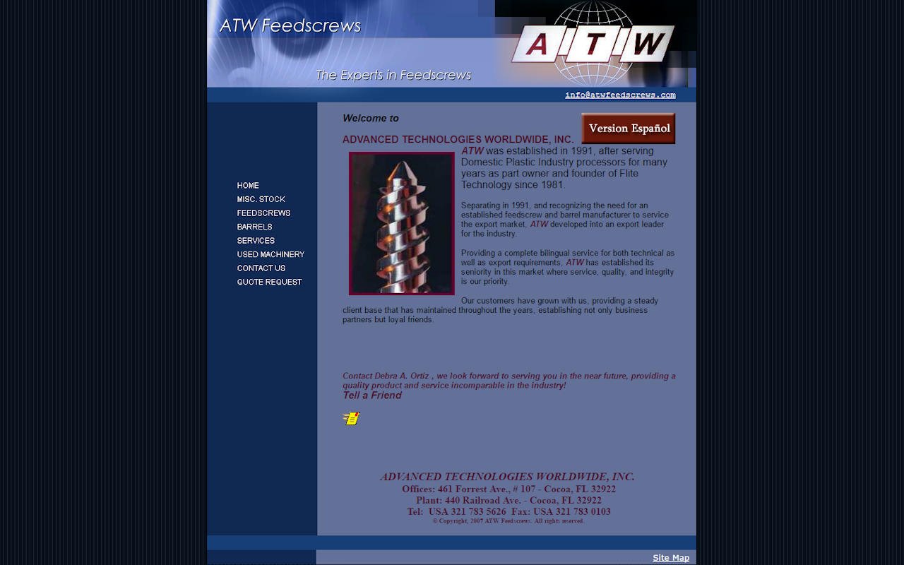
Website revamp example #2 – ATW
Here is ATW’s before website:
And this is their website after the revamp:
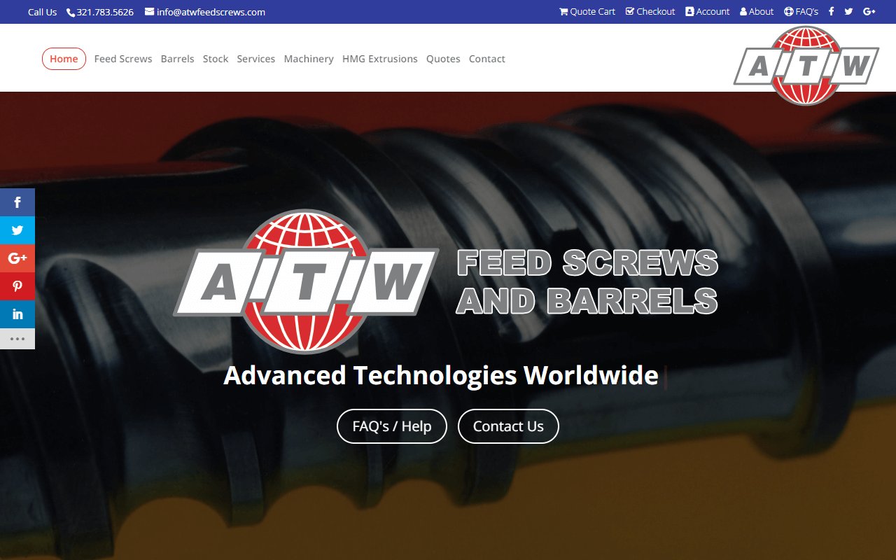
In one shift ATW has moved from a very outdated look to a modern, legitimate, and user-friendly website. The user is presented with options to quickly explore the website and take further action. ATW likely used analytics to identify the two most popular pages – FAQs and contact us – and present them both in the center of the page.
Conclusion
A website revamp doesn’t have to be super time-consuming. If you can get the right team on board and procure the right tools you’ll soon be on your way.
If you’ve ever tested your website, you’ve probably been in the unfortunate situation of running out of ideas on what to test.
But don’t worry – it happens to everybody.
That’s of course unless you have a website testing plan.
Download Free: A/B Testing Guide
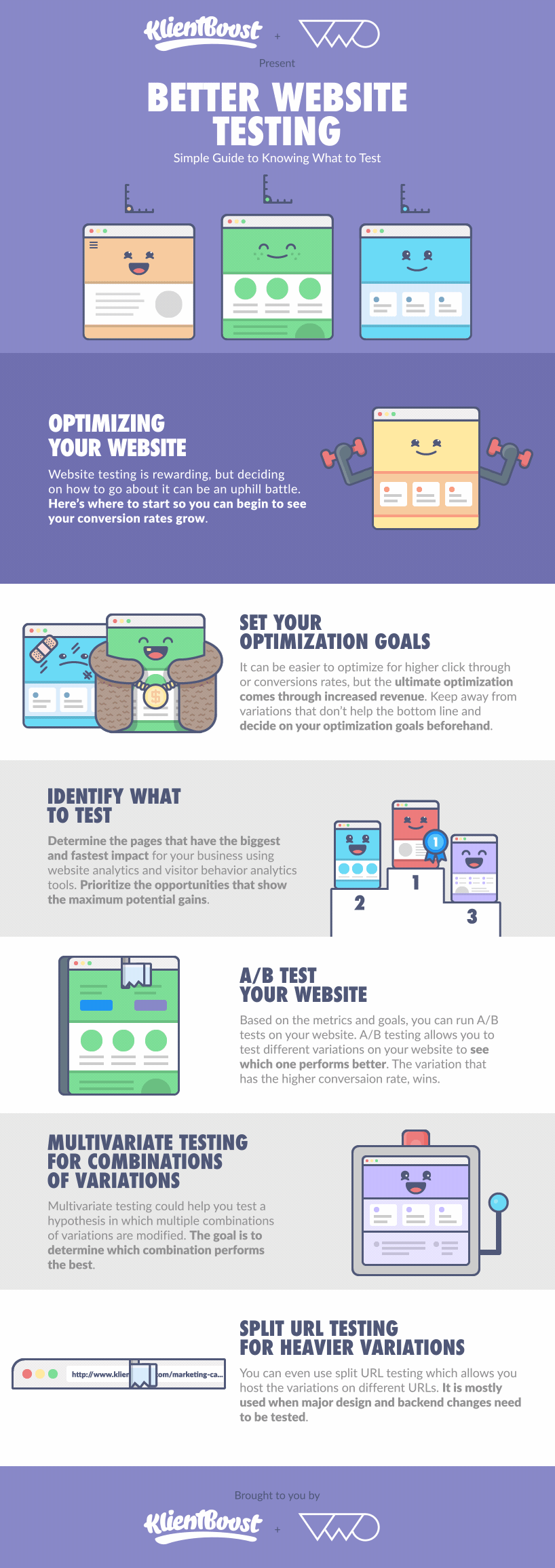
That’s why KlientBoost has teamed up with VWO to bring to you a gifographic that provides a simple guide on knowing the what, how, and why when it comes to testing your website.
Setting Your Testing Goals
Like a New Year’s resolution around getting fitter, if you don’t have any goals tied to your website testing plan, then you may be doing plenty of work, with little results to show.
With your goals in place, you can focus on the website tests that will help you achieve those goals –the fastest.
Testing a button color on your home page when you should be testing your checkout process, is a sure sign that you are heading to testing fatigue or the disappointment of never wanting to run a test again.
But let’s take it one step further.
While it’s easy to improve click-through rates, or CTRs, and conversion rates, the true measure of a great website testing plan comes from its ability to increase revenue.
No optimization efforts matter if they don’t connect to increased revenue in some shape or form.
Whether you improve the site user experience, your website’s onboarding process, or get more conversions from your upsell thank you page, all those improvements compound into incremental revenue gains.
Lesson to be learned?
Don’t pop the cork on the champagne until you know that an improvement in the CTRs or conversion rates would also lead to increased revenue.
Start closest to the money when it comes to your A/B tests.
Knowing What to Test
When you know your goals, the next step is to figure out what to test.
You have two options here:
- Look at quantitative data like Google Analytics that show where your conversion bottlenecks may be.
- Or gather qualitative data with visitor behavior analysis where your visitors can tell you the reasons for why they’re not converting.
Both types of data should fall under your conversion research umbrella. In addition to this gifographic, we created another one, all around the topic of CRO research.
When you’ve done your research, you may find certain aspects of a page that you’d like to test. For inspiration, VWO has created The Complete Guide To A/B Testing – and in it, you’ll find some ideas to test once you’ve identified which page to test:
- Headlines
- Subheads
- Paragraph Text
- Testimonials
- Call-to-Action text
- Call-to-Action button
- Links
- Images
- Content near the fold
- Social proof
- Media mentions
- Awards and badges
As you can see, there are tons of opportunities and endless ideas to test when you decide what to test and in what order.

So now that you know your testing goals and what to test, the last step is forming a hypothesis.
With your hypothesis, you’re able to figure out what you think will have the biggest performance lift with the thought of effort in mind as well (easier to get quicker wins that don’t need heaps of development help).
Running an A/B Test
Alright, so you have your goals, list of things to test, and hypotheses to back these up, the next task now is to start testing.
With A/B testing, you’ll always have at least one variant running against your control.
In this case, your control is your actual website as it is now and your variant is the thing you’re testing.
With proper analytics and conversion tracking along with the goal in place, you can start seeing how each of these two variants (hence the name A/B) is doing.
When A/B testing, there are two things you may want to consider before you call winners or losers of a test.
One is statistical significance. Statistical significance gives you the thumbs up or thumbs down around whether your test results can be tied to a random chance. If a test is statistically significant, then the chances of the results are ruled out.
And VWO has created its own calculator so that you can see how your test is doing.
The second one is confidence level. It helps you decide whether you can replicate the results of your test again and again.
A confidence level of 95% tells you that your test will achieve the same results 95% of the time if you run it repeatedly. So, as you can tell, the higher your confidence level, the surer you can be that your test truly won or lost.
You can see the A/B test that increased revenue for Server Density by 114%.
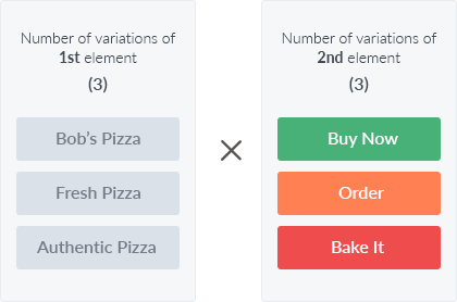
Multivariate Testing for Combination of Variations
Let’s say you have multiple ideas to test, and your testing list is looking way too long.
Wouldn’t it be cool if you could test multiple aspects of your page at once to get faster results?
That’s exactly what multivariate testing is.
Multivariate testing allows you to test which combinations of different page elements affect each other when it comes to CTRs, conversion rates, or revenue gains.
Look at the multivariate pizza example below:
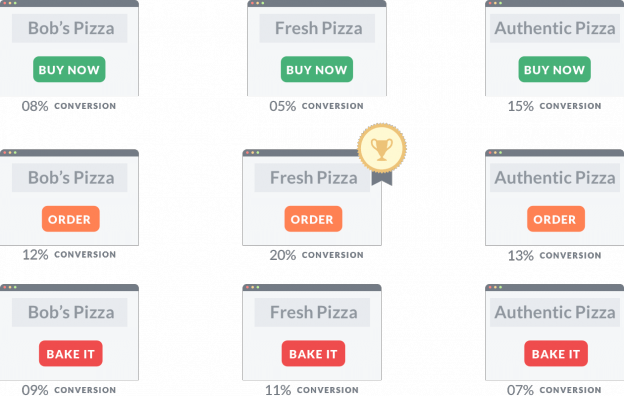
(Image source: Bestbatch)
The recipe for multivariate testing is simple and delicious.
And the best part is that VWO can automatically run through all the different combinations you set so that your multivariate test can be done without the heavy lifting.
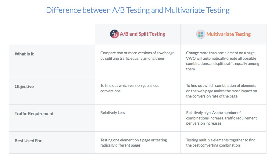
If you’re curious about whether you should A/B test or run multivariate tests, then look at this chart that VWO created:
Download Free: A/B Testing Guide
Split URL Testing for Heavier Variations
If you find that your A/B or multivariate tests lead you to the end of the rainbow that shows bigger initiatives in backend development or major design changes are needed, then you’re going to love split URL testing.
As VWO states:
“If your variation is on a different address or has major design changes compared to control, we’d recommend that you create a Split URL Test.”
Split URL testing allows you to host different variations of your website test without changing the actual URL.
As the visual shows above, you can see that the two different variations are set up in a way that the URL is different as well.
URL testing is great when you want to test some major redesigns such as your entire website built from scratch.
By not changing your current website code, you can host the redesign on a different URL and have VWO split the traffic between the control and the variant—giving you clear insight whether your redesign will perform better.
Over to You
Now that you have a clear understanding on different types of website tests to run, the only thing left is to, well, run some tests.
Armored with quantitative and qualitative knowledge of your visitors, focus on the areas that have the biggest and quickest impact to strengthen your business.
And I promise, when you finish your first successful website test, you’ll get hooked on.
I know I was.
Note: The author owns the screenshots used in the blog.
]]>The website redesign.
It is often the big money ticket for a business; the project upon which a lot of faith is placed, and improved numbers are expected across the board.
Ideally, it is expected to provide a significant improvement in sales and leads figures, based on a modern, seamless and intuitive experience for the visitors that is future-proofed for the constantly changing marketplace.
Unfortunately, the numbers from PRWD’s survey show that this is not always the case. In fact, a few businesses even find a decline in sales after undergoing website redesign.
Download Free: Website Redesign Guide
So if you’re currently in the middle of a website redesign (or planning one in the near future), have a quick look at the infographic below.
Following on from PRWD’s last infographic on the effectiveness of website traffic acquisition strategies, this infographic provides insight into why a website redesign for many of the UK’s biggest businesses don’t provide a jump in sales and leads.
At the end of the infographic, there are key takeaways that can help you get the most out of a website redesign.
Click here to get the full infographic
![[Infographic] Why-website-redesign-doesnt-always-work](https://static.wingify.com/vwo/uploads/sites/3/2016/06/infographic2.png)
Download Free: Website Redesign Guide
What Do You Think?
Have you ever done a website redesign? What would you do to ensure that a redesigned website improves the bottom-line?
We’d love to know your thoughts. Write to us at [email protected]!
]]>Well, it turns out that having an amazing tool is one of the first steps toward your goal of optimizing your website for conversions. Also, the process is not as simple as deciding where to place elements – let’s say CTA buttons – or what colors they should be. These decisions should be based on user behavior and design principles and not dictated by your whims or what your team thinks.
Download Free: Website Redesign Guide

So, if you thought getting a paid plan for a design tool was all that you would need, ask yourself – Do I know what it takes to design for conversions? Having professionals by your side can take care of the heavy lifting and help you implement a top-notch web design that brings results.
But let’s say you want to do it all on your own for some reason. In that case, it is important to understand the nitty-gritty of designing for conversions. Even if you have a professional designer handling everything, there’s no harm in learning a bit about it yourself. This way, you can contribute your ideas and play a role in optimizing conversions of your digital assets.
This blog answers all your questions about website design for conversion optimization. So, stick with us until the end and walk away with some valuable insights.
What is conversion-focused web design?
Suppose you have tasked one of your interns with creating a conversion-centered design of a landing page. What criteria should you base your feedback on? That it looks vibrant and beautiful is secondary in importance. Look if all the design elements visitors interact with are properly structured to help them take desired actions, resulting in higher conversion rates.
When analyzing web design, consider both aesthetics and usability. If you notice that there is not enough white space around the text description, communicate your concerns to the intern so they can revise the design for conversion. This is because when a design is crowded, it can increase a user’s cognitive load making it difficult for them to process information.
This is what we call conversion web design…. The practice of designing a website, particularly landing pages that lead visitors toward a specific conversion, by considering user psychology and behavior. Guided by proven design principles, a conversion-centered design aligns with the mental model of the majority of online users.
If you’re interested to know more about the role of psychology in optimization, this webinar is for you:
Consider you want to optimize your website for conversions. From the wording of headlines and CTAs to the findability of the navigation menu and search bar – everything can be and should be optimized to reduce friction and make the user journey seamless.
If they are in shambles, your site visitors will be confused and feel discouraged to complete the goal for which they landed on your website.
Put yourself in a user’s shoes for a moment. How would you feel if product images on a product page were too small to notice and the sale offer stood on your face? It would feel like the brand is trying to sell to you but does not care if the product images are inaccessible. In this example, the visual information hierarchy of the website is screwed up and puts a damper on customer engagement. And when you drop off, it’s a loss of sale opportunity for the brand.
3 more reasons why conversion web design is important
So, you must have already figured that improving user experience and conversion are the two most important reasons to go for a conversion-friendly design. Below we tell you 3 more reasons how you can benefit from this design approach.
Enhanced credibility
A conversion-centered design of your website empowers your visitors to take action to complete their goals (be it email signup, form submission, or purchase of a product). This instills confidence in your target audience, and builds trust, making them more likely to convert and even become a promoter of your brand.
Competitive edge
A conversion web design puts you ahead of your competitors by delivering a superior user experience. Continuous optimization is key to maintain the reputation you have built and continue being a top player in your industry.
Higher return on investment
You have a lot of money at stake if you drive traffic from paid ads to your website. When your website is optimized, the chances of paid traffic converting into customers become higher. This makes sure you get a higher ROI from your paid marketing campaigns.
8 web design tips to improve conversions
Put high-conversion elements in a container
Containment is a brilliant technique to draw your visitors’ attention to a particular element, thereby preventing it from wandering off to something less important.
Actually, the heading and content of a landing page are supporting elements meant to direct visitors’ attention toward your conversion goal typically represented by call-to-action buttons or forms.
Put these high-conversion elements in a container so that they stand out from the rest of the landing page. This will tell your audiences what they should do next to get one step closer to achieving their goal on your website or app.
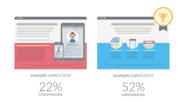
See the image below. Which one will catch your eye first? Obviously, the right one with the CTA in a container.

You may even do the squint test to see if your call-to-action buttons are really conspicuous. Like, you can definitely make out that the Mailchimp homepage passes this test:

Use the right color scheme and contrasting psychology
Ensure that design elements on your website adhere to your brand guidelines, creating a consistent experience for visitors as they interact with your brand.
CTA buttons, forms, or banners should be in contrasting colors so that they don’t sink within the background color of your layout. For example, if the primary background of the layout of your website is brown, you should pick orange or yellow as the color of the CTA buttons. This way the right color scheme will accentuate the conversion elements.
The whole idea of the contrast effect is to make your primary landing page element “pop” to instantly draw your visitors’ attention. See how MakeMyPersona uses the contrast effect to make their call-to-action stand out:

Hierarchize visuals and information in order of importance
A strong visual hierarchy, along with a perfectly-placed form or CTA, can help visitors process the necessary information in the right order to make decisions. In fact, following the framework of AIDA – Awareness, Interest, Desire, and Action – can be effective in maintaining the right sequence of information (including visual elements) when designing for conversion.
Moreover, the visual hierarchy should be a priority on all website pages and not just your landing page. For example, user drop-off from the cart is a common phenomenon. To address this problem, you can try improving the information hierarchy on the cart page.
Show an order summary along with a picture of the chosen product. Include links to continue shopping and options of recommended bundles. But in the midst of everything, make sure the CTA to proceed to checkout is more prominent to nudge visitors in the main direction.
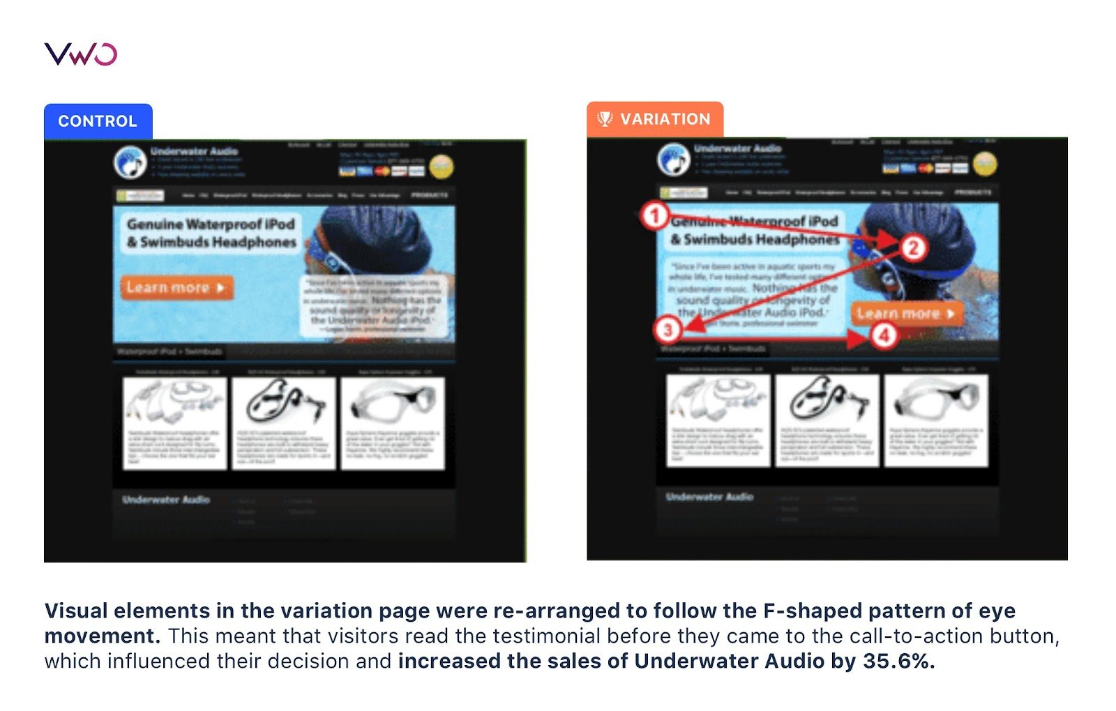
Underwater Audio improved the visual hierarchy of its homepage to see a 35.6% increase in its online sales. You can see the comparison image of their homepage below:
Just like this brand, you can also run tests on your website to make it more user-friendly and boost conversions. Give VWO a try and check out all the amazing features it has to offer.
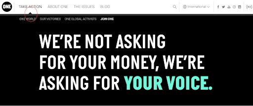
Use subtle visual cues to direct visitors to conversion goals
Visual cues are nothing but subtle hints for diverting visitors toward the most important element of conversion. Graphic elements like arrows or lines, subtle animations, micro-interactions with the CTA, or an illustration showing a person pointing toward the CTA can nudge users to take action.
Here are a couple of examples:
This one is from The Art Institutes:

Here’s another from One:
Keep enough breathing space on your landing page
If your visitors have to play hide and seek to find your call-to-action, they will not be amused. When designing for conversions, leave enough white space surrounding your web elements, especially CTA buttons so that they are easily noticeable. They must not look like they are trying to breathe down each other’s necks. It is repulsive.
Let’s look at Uber. They place their signup button where it is easily noticeable and with enough white space surrounding it:

Include trust elements to convince users to convert
Trust elements in design? It is an unexpected twist, but trust me, they are necessary inclusions for a website design for conversion optimization. Even if your landing page looks like a visual masterpiece, sprinkle in some trust boosters like badges, customer testimonials, and social proof.
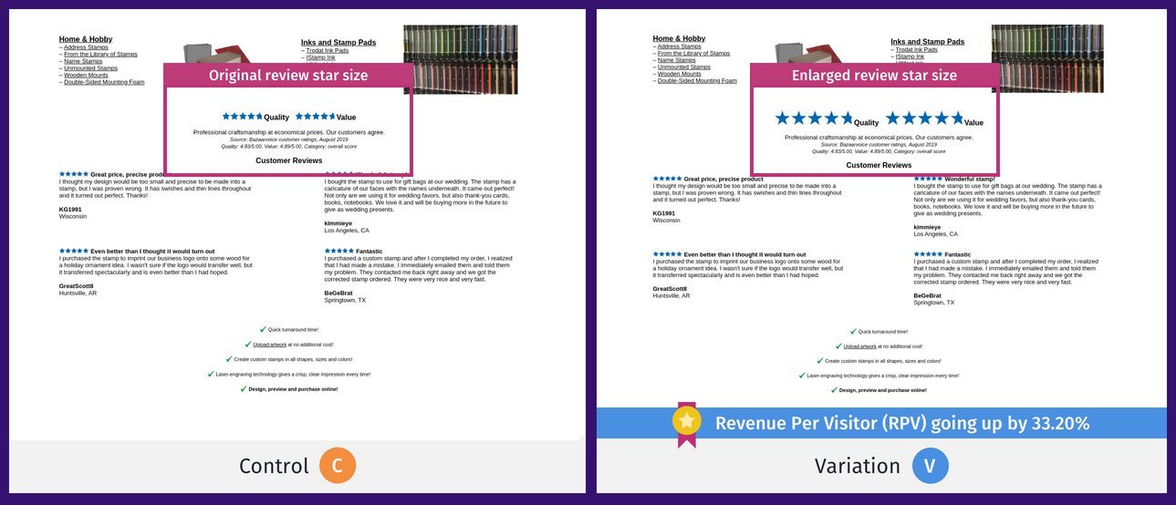
The US-based RubberStamps.net sold custom stamps and wanted to make changes to its website to appeal to first-time visitors. Through qualitative research, they gathered that the revenue per visitor on homepage landings was very low and only 25% of visitors scrolled down to read the reviews. They ran a test where they enlarged the review star size and it produced a 33.20% increase in revenue per visitor. See the magic of social proof?
Increase product exclusivity through urgency and scarcity
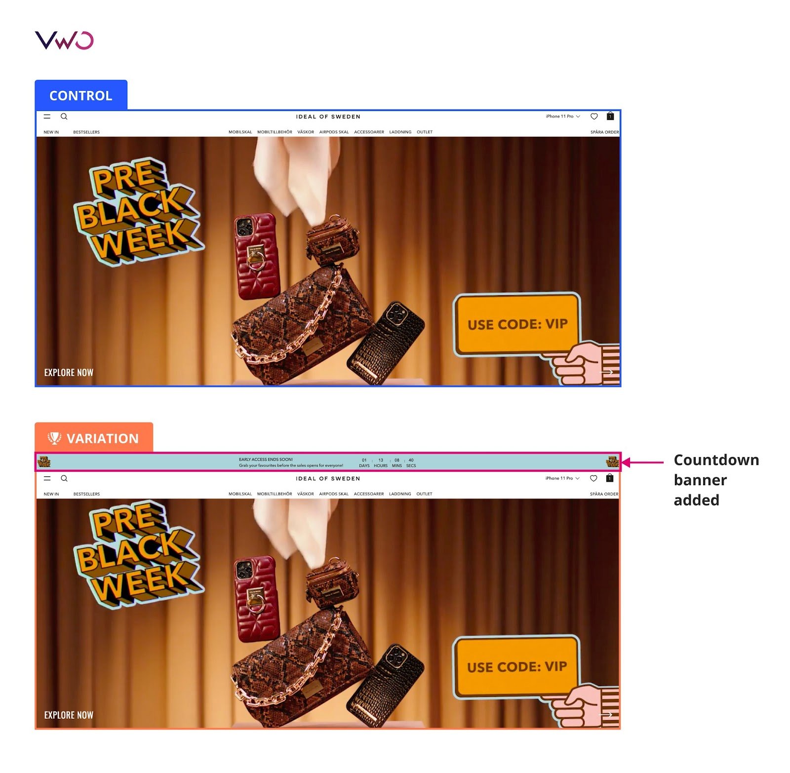
Urgency and scarcity messaging are no less important to motivate visitors to take immediate action instead of delaying it. While scarcity implies limited supply, urgency means limited time. These two techniques increase the exclusivity of your product, thereby creating higher demand for them.
For example, Ideal of Sweden, a Swedish lifestyle brand, increased clicks on add-to-cart by 5.6% by showing a countdown banner on their website. They wanted to increase purchases during Black Month from their online store. The team tested a sticky countdown banner across the website, generating urgency and informing more visitors about the sale during each phase of the black month campaigns.
Optimize for a smooth mobile experience
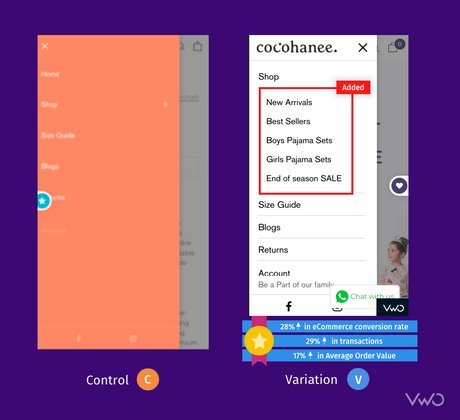
With over 50% of web visits now coming from mobile, it is crucial to design for conversions specifically on mobile devices. This means using a simple layout and concise copy to capture and retain visitors’ attention to your landing page.
Cocohanee, an Indonesian retail company, observed that many mobile visitors clicked on the hamburger menu icon, but their engagement with the menu was low. To address this, they created a variation where sub-categories were displayed upfront to encourage more visits to the listings page. The test ran for 22 days, causing a 4% increase in listing page visits and a 29% increase in transactions.
Download Free: Website Redesign Guide
Does user research help you with a conversion design?
Absolutely! Design principles and user behavioral analysis are the two pillars of your website design for conversion rate optimization. By understanding how users behave on your website, you can diagnose reasons for low conversions and reduce friction to make their journey seamless.
Let’s say you have a healthcare website that offers online appointment bookings for health consultations with doctors over audio or video calls. Through heatmaps and funnel analysis, you see that visitors frequently abandon the appointment booking process where they have to fill out a lengthy form with detailed medical history.
Based on these insights, you want to test and see if revamping the appointment process improves user experience and increases conversion rates. Now, you introduce a simplified initial step that captures only essential information like – the patient’s name, contact details, preferred date, and reason for the appointment.
After this step, you can provide an option to enter additional medical history details, either through a different form or during the actual appointment with the doctor. Through research and testing, you can alleviate user frustration and encourage them to convert (make bookings in this example).
Also, check out the VWO Podcast with Conversion Scientist Brian Massey to know how data-backed design can increase conversions and boost ROI.
Look what experts say…
“Abundance of research doesn’t remove a need for experimentation, in the same way that experimentation doesn’t remove a need for research.
It’s a yin and yang situation, where they are extremely similar in goals, yet different in how they accomplish them.
Experimentation is important for more quantitative validation but can help you with higher degrees of confidence toward decision-making (when done well with statistical principles in place). However, while it’s a good source of ‘research’, it isn’t the ONLY source of research you should be getting data from.
Research, in its many forms, helps you understand WHAT to test, and generally where to go. It augments your experimentation process to a whole other level. The limitation is, while pretty damn good at helping guide where to focus on / not focus on, it’s not a comprehensive validation of something.
Generally speaking, research deals with smaller sample sizes. Sometimes the research helps you identify problems, but not necessarily the exact proper solutions (which is where experimentation comes in and helps validate/invalidate solutions).
It doesn’t matter as much where you start, though I tend to prefer starting with research, even if it’s a few user tests or analytics data. What matters is the process – that both are used in conjunction with each other to forward and support the business.”
Shiva Manjunath, Experimentation Manager, Solo Brands
Visitors analysis + A/B testing platforms to optimize your website
VWO
With VWO’s visitor behavior analytics tool, you discover valuable insights into user behavior on your website. Starting from heatmaps and session recordings to conversion funnels and on-page surveys – you can arm yourself with tools to dig deep into user insights.
Further, you can switch to VWO Testing to test your hypotheses drawn from these insights to determine the best-performing variation. These joint capabilities will help you identify the most effective design that drives higher conversion.
Need to run complex tests to improve user experiences? Does drop-off from forms indicate room for improvement? Or do your visitors drop off during checkout? Server-side testing capabilities will let you run tests deep within your tech stack and fix even the most complex UI and functionality issues with ease.
Apart from VWO Insights, you can leverage VWO Data360 to collect customer data points from multiple sources to create single customer views and segment users to deliver highly personalized experiences. As it integrates with both testing and personalization, you can set experimentation and personalization campaigns, which is nothing but designing for conversion. Impressive, right? To discover more features on VWO, sign up for a free trial today.
SmartLook
SmartLook is a combined quantitative and qualitative behavioral analytics tool comprising heatmaps, session recordings, events to check user actions, and funnels to analyze user paths on any digital asset. While SmartLook allows third-party integrations with testing platforms, you cannot view heatmaps for your testing variations directly within this platform. Instead, you have to rely on a third party for that functionality.
FullStory
FullStory is a digital experience intelligence platform helping companies analyze visitor behavior on their websites and mobile applications. Its suite of products comprises session replays, heatmaps, journey mapping, funnels and conversions, and many more. The tool doesn’t have its own A/B testing capability but integrations with third-party testing tools enable you to leverage insights to run tests for more conversions.
Crazyegg
Crazyegg is an analytics platform that lets you track visitor behavior to improve user experience and conversions. It offers heat maps, session recordings, traffic analysis, and surveys. On top of that, the platform also supports A/B testing which means you can stay within the platform and use visitors’ insights for testing.
However, VWO no-code editor to create variations is superior with advanced features like mutually exclusive campaigns, multi-page testing, editing hover elements, and many more.
Zoho Pagesense
Zoho PageSense is a great platform combining visitor analytics and A/B testing capabilities. With its comprehensive visitor analytics tools including heatmaps, recordings, and funnel analysis, you can derive meaningful insights to optimize user experiences. The A/B testing feature allows for experimentation with multiple variations, while integration with Zoho CRM and other apps provides a holistic view of customer interactions.
5 Landing page builders to create optimized landing pages
Now let’s say you want to build a new landing page from scratch to improve your conversion rate. Luckily, there are landing page tools providing conversion-centered landing page templates helping you customize to improve your landing page conversion rates. Here are our top 5 picks.
Unbounce
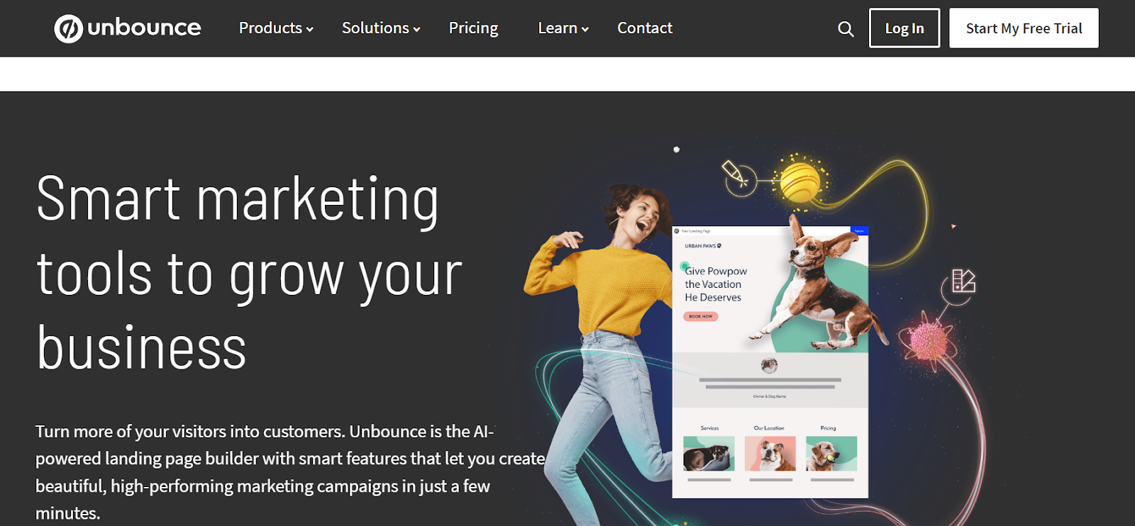
Unbounce is a user-friendly platform focused on simplifying the creation of high-quality landing pages. With its intuitive drag-and-drop editor and extensive library of mobile-responsive templates, users can easily design visually appealing pages without coding knowledge. Unbounce offers advanced features like A/B testing and dynamic text replacement to optimize landing page performance.
Instapage
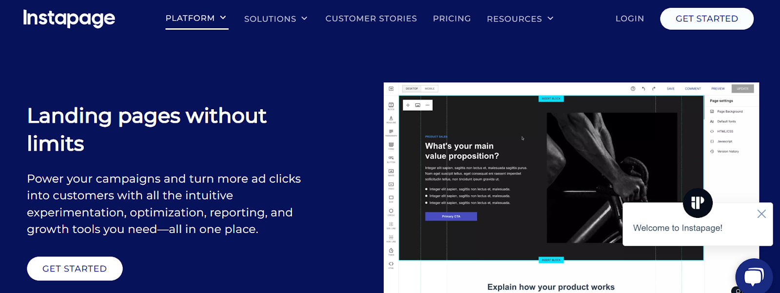
Instapage is a platform that offers a user-friendly interface, a drag-and-drop editor, and a variety of features to create high-converting landing pages. It also provides customizable templates and the ability to add and edit elements like text, images, videos, and forms, allowing for easy optimization. Instapage also supports A/B testing to compare different landing page versions and determine which one drives a higher conversion rate.
ClickFunnels
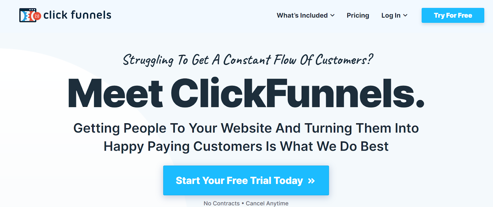
ClickFunnels is a comprehensive platform that simplifies the creation and optimization of sales funnels. It offers an intuitive drag-and-drop editor, pre-designed templates, and A/B testing capabilities to help businesses build high-converting funnels without coding. Apart from choosing a suitable landing page template and play around the editor, you can also leverage the platform’s analytics for tracking the performance of optimized funnels.
Leadpages
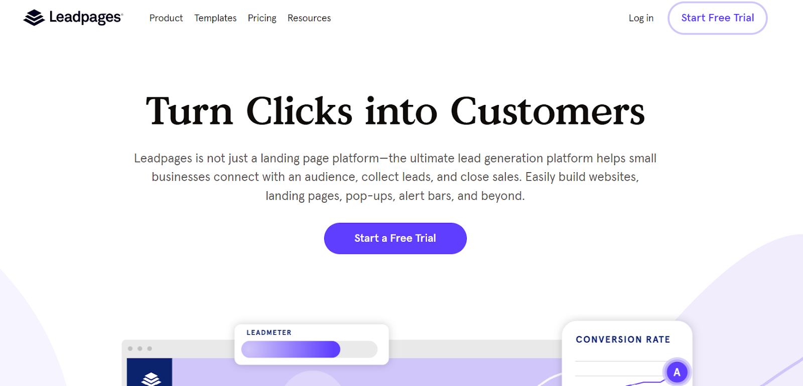
Leadpages is another easy-to-use landing page builder with a vast library of customizable templates and a drag-and-drop editor. Users can easily create visually appealing and conversion-focused landing pages without coding. Plus, Leadpages offers A/B testing capabilities for optimization. You can use its built-in analytics tools to track your landing page performance through metrics like page views and click-through rates.
HubSpot Landing Page Builder
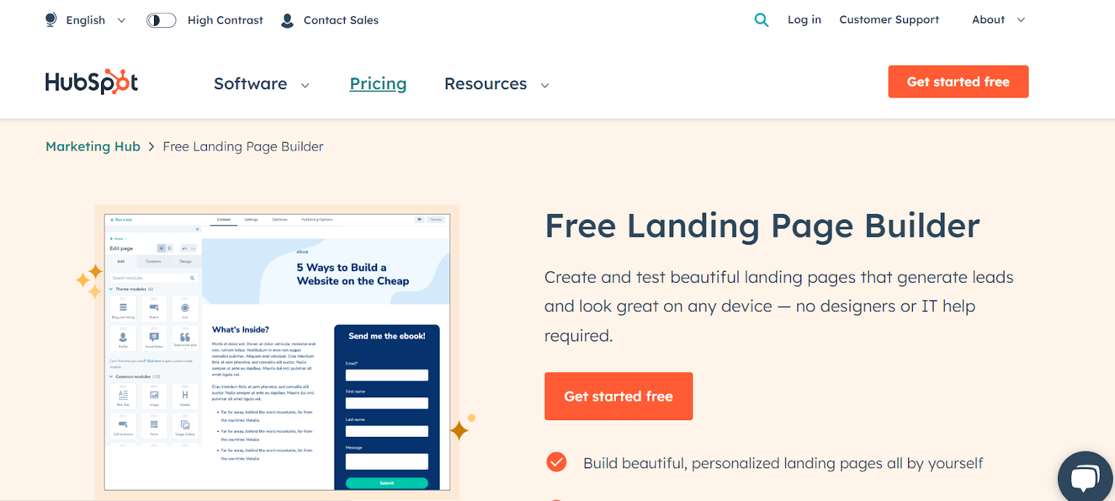
HubSpot’s landing page builder is a user-friendly tool that helps you create great-looking web pages without coding. You can choose from different designs and customize them easily using a simple drag-and-drop editor. It integrates well with other HubSpot tools and lets you personalize the content based on what your visitors are interested in. You can also run A/B tests on your landing pages and even optimize them for mobile devices.
Our word of wisdom…
Remember, although landing page builders have A/B testing tools in them, they may not be as advanced as the tools you find in full-fledged conversion optimization platforms. Building landing pages is the primary capability of these tools. You may want to use any landing page builder alongside an end-to-end conversion optimization platform like VWO.
As an integrated experimentation platform, VWO accommodates top capabilities like testing, behavioral analytics, personalization, and more for a holistic improvement in user experience and a higher conversion rate.
Look what experts say…
“Your opinion about your website is rubbish. So is mine. Anyone who has run a lot of experiments on websites knows this all too well, because you don’t have to run that many tests before the results start shocking you to the core. The things that seem like no-brainers can and will have a really negative impact.
The things that seem stupid can make you a tonne of money and/or improve customer experience. Using research and data instead of opinion is part of the solution, but even then you’re still using your opinion to interpret the data. Only when you start to test those ideas do you really get to see whether it works.”
Johnny Longden, Digital Experience Director, Journey Further
Embrace conversion-friendly web design
We’re hustling in a world where conversions can make or break the success of any business’s digital presence. At a time like this, designing for conversions becomes an absolute must for survival and growth. We hoped you liked reading our blog, filled with interesting tips and suggestions to transform your website into a conversion powerhouse.
But it’s now time for you to make a call. Choose a tool that suits your needs, and we suggest you explore the awesome capabilities of VWO, to begin with. Sign up for a free trial and tap into the potential of conversions on your digital assets. Happy designing, happy converting!

Frequently Asked Questions
Website conversions can be of different types based on the goals of your website or a landing page and the desired action you want visitors to take. Find below some examples:
1. Lead Generation – When visitors submit a form providing their contact details for requesting a quote, subscribing to a newsletter, or signing up for a free trial of a tool.
2. Purchases – When visitors purchase something on an online store.
3. eBook download – When visitors download resources such as eBooks, whitepapers, or guides to know about your product and services in detail.
4. Event Registration – When visitors sign up for webinars, conferences, workshops, or any other online and even offline events hosted by your brand.
5. Subscriptions – When visitors subscribe to receive regular content updates, newsletters, or some other type of exclusive content from your company.
Conversion designers typically have expertise in various areas such as UX design, UX research, UI design, information architecture, persuasive design techniques, and data analysis. They employ visual design techniques, strategic element placements, persuasive copywriting, and effective CTAs to prompt visitors to take desired actions, such as making purchases, submitting forms, or subscribing to newsletters on your landing pages. All in all, they are experts in website design for conversion optimization helping businesses meet their bottom line.
Implementing web design best practices like trust signals, streamlined layouts, prominent CTAs, and compelling visuals is essential for building an effective website. But simply following best practices is not enough. A/B testing allows you to gather real-time data and make data-driven decisions, and optimize your website further. A/B testing complements web design best practices by providing data for continuous improvement. It helps in building variations specific to your audience and delivering experiences according to their expectations and behavior on your website.