 DE
DE

Why is Mobile Optimization Important for Website Conversions?
With mobile phones now well outstripping desktop computers in sheer number as well as usage, mobile responsive design has shifted from being a ‘nice to have’ to becoming instrumental in web design.
Further, it’s clear that even responsive design is no longer enough. In order to convert more website visitors into customers, online retailers need to keep up with digital transformation, and make sure their sites are optimized for mobile.
Download Free: Mobile App A/B Testing Guide
Mobile optimization is the process of adjusting your website content to ensure visitors accessing the site from mobile devices have an experience customized to that device.”
Rather than simply compressing or rearranging content on a screen, a mobile-optimized site is designed entirely for a smaller screen user’s experience.
Why is mobile optimization important?
Retailers need to find out what’s involved in a seamless purchasing experience. This includes not only considering offline communication and its importance, but identifying and optimizing all online touchpoints – mobile being key to converting users into buyers.
Consumers are digital nomads and tend to browse and buy across a variety of devices. This creates the challenge of giving users a ‘frictionless’ experience across all the devices they use — and especially on mobile. Unless retailers adopt a ‘mobile-first’ approach, consumers will click away to another site.
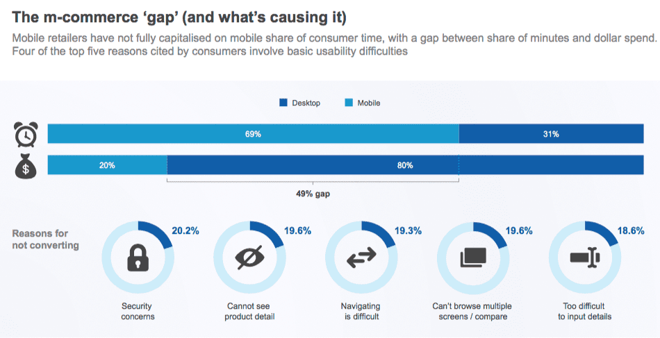
Barriers to conversion on mobile devices
The five top issues with mobile commerce cited by consumers involve basic usability difficulties:
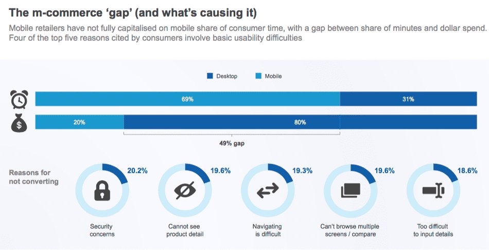
The mobile purchasing experience falls short
Accessing a website on a mobile device can be incredibly frustrating. Tiny buttons, hard to see links, and unclear forms make for a poor user experience. That’s not to mention the endless scrolling options. If users have to wait for slow pages to load, or can’t quickly add items to their carts, they will become stressed and impatient. The result: Abandoned carts and unfinished purchases.
This is clearly not what any online retailer wants.
However, it is an all too common scenario. Imagine you’re browsing an e-commerce site with the intent of buying a set of wireless headphones. You may try the search button and find it doesn’t work. Then, you attempt to navigate your way to your desired item via the top-bar menu.
Finally, you may actually find a list of headphones which tick most of your boxes. At which point, you’ll need to click each one to see the specifications. You may have to pinch, scroll, and manipulate the screen to access the information you require. And there may be no option to compare items, so you’ll have to keep tapping back and forward to view the information again.
If you make it to the checkout process after all this, you may then be asked to create an account before purchasing. If the form is difficult to fill out or you are then tasked with confirming your email address, etc. this could be the last straw.
Faced with a series of frustrating tasks, most potential customers abandon a purchase because they’ve lost patience and simply don’t have the time.

A mobile-optimized website affects your conversions
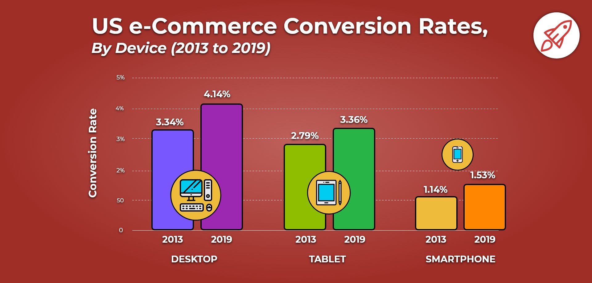
Mobile internet access has skyrocketed over recent years, with mobile market share now standing at over 55% compared to desktop at 41% (the rest going to tablets). However, the rate of conversions still remains lower than on desktop.
Knowing this, it’s clear that mobile optimization is essential for online retailers. They need to ensure the buying experience is as friction-free as possible.
Some features of a frictionless mobile experience include:
- Providing users with larger buttons
- Keeping images small
- Using auto-fill form fields and auto-detect location settings
- Giving users the option to checkout as a guest
- Offering multiple screens as an alternative to scrolling through
Start with responsive design
There are various ways to ensure your site is optimized for mobile and how you go about this will depend on the type of site you operate. In general, it’s best to use a clean, minimal design. That isn’t so easy, though, if you run an ecommerce site that’s packed with many products or services. In this case it’s important to choose a web design that’s 100% responsive.
Responsive sites adapt according to the screen size on which they’re viewed. Instead of a top bar, users often see a ‘hamburger’ menu, and images will become smaller.
Responsive design provides you with the building blocks enabling you to create a fully mobile-ready site. Your site will look attractive and be more easily navigable to users, and this will help to increase conversions. However, in order to achieve the highest conversion rates possible you need to further optimize for mobile.
Download Free: Mobile App A/B Testing Guide
A mobile optimized site gives users the best experience
Using mobile optimization technology, sites reformat themselves completely for that device, guaranteeing a better experience for the user. A mobile-optimized site looks different from a responsive site because it’s configured with the mobile user in mind and usually has a separate URL.
Features of a mobile optimized site
On a mobile optimized site, the images are lighter so the site loads more quickly, while buttons are sized to accommodate broader fingers. They’re usually designed to reduce the need for pinching and scrolling.
When optimizing for mobile, text is short and easy to read with minimal steps to conversion. Viewers need to be reassured that their details are safe, so optimized sites generally offer a range of payment options including ones which don’t require entry of credit card details such as PayPal, Apple Pay, or Google Pay.
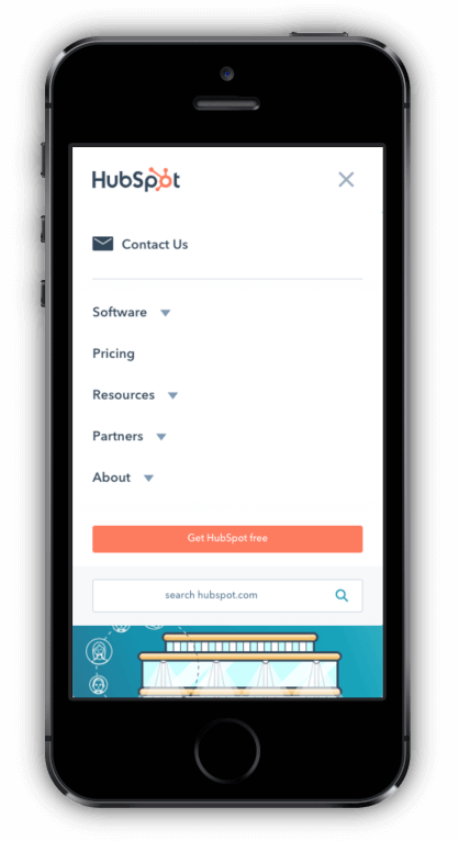
Mobile sites are also easy to navigate and offer a simple navigation menu, like HubSpot’s.
Mobile optimized sites have few if any, popups and reduced graphics in general. Icons are used effectively as well as ‘splash screens’ (the first screen that users see when they open an app).
Having just one call to action (CTA) per page is a recommended feature, too, because online screen real estate is so limited.
Even if your marketing strategy is strong—for example, if you’re using advanced SEO to drive traffic to your site, if your website is not mobile-optimized you’ll fail to turn that traffic into conversions. By implementing a ‘mobile-first’ mentality you will see tangible results when it comes to converting visitors into purchasers. While developing your mobile-optimized site, make sure you test changes regularly. Then, you can see what’s working and what’s not, and tailor your site to fit the needs of your customers—and keep conversion rates high.

Categories:


