You can see that advanced technology did not come out of the blue. It evolved with one advancement becoming the foundation for another.
For instance, the smartphone industry stands on the foundation of numerous technological breakthroughs. From the initial landline telephones, the concept of cordless phones emerged, followed by the integration of mobile communication with computing power.
Over time, we witnessed an evolution from personal digital assistants, such as BlackBerry devices, to the advent of the iPhone, which paved the way for the smartphone industry.
It’s like a loop, where each advancement created new opportunities that, in turn, lead to further progress. The loop has revolutionized our technology because we never left a loose end after an advancement.
What if we followed the same approach toward experimentation on digital properties?
Experimentation can sometimes lift your conversion rate beyond expectations and at times drop even for a promising hypothesis. It’s part and parcel of the process.
But if you stick to a linear approach of closing the test after getting results and move on to test something new, it will rarely give you breakthroughs. You’ll miss out on chances to improve conversion rates and overlook valuable insights for future success. In the best-case scenario, it will plateau your growth rate.
That is why it’s time to move on from the linear approach and take a strategic approach with the Experimentation Loop to realize the true conversion potential of your websites and mobile apps.
But what is an Experimentation loop? Let’s delve into this fascinating concept.

What is an Experimentation Loop?
An Experimentation Loop starts with identifying a problem through behavior analysis and creating a solution in the form of a hypothesis. Then, you run experiments to test the hypothesis. You either win or lose, but with a linear approach, you stop the experimentation cycle here. But with the Experimentation Loop, you investigate the test results to uncover valuable insights. The uncovered insights can derive new hypotheses, which lead to further experiments, creating a continuous cycle of learning and optimization.
Here’s a visual illustration of how the Experimentation Loop works:
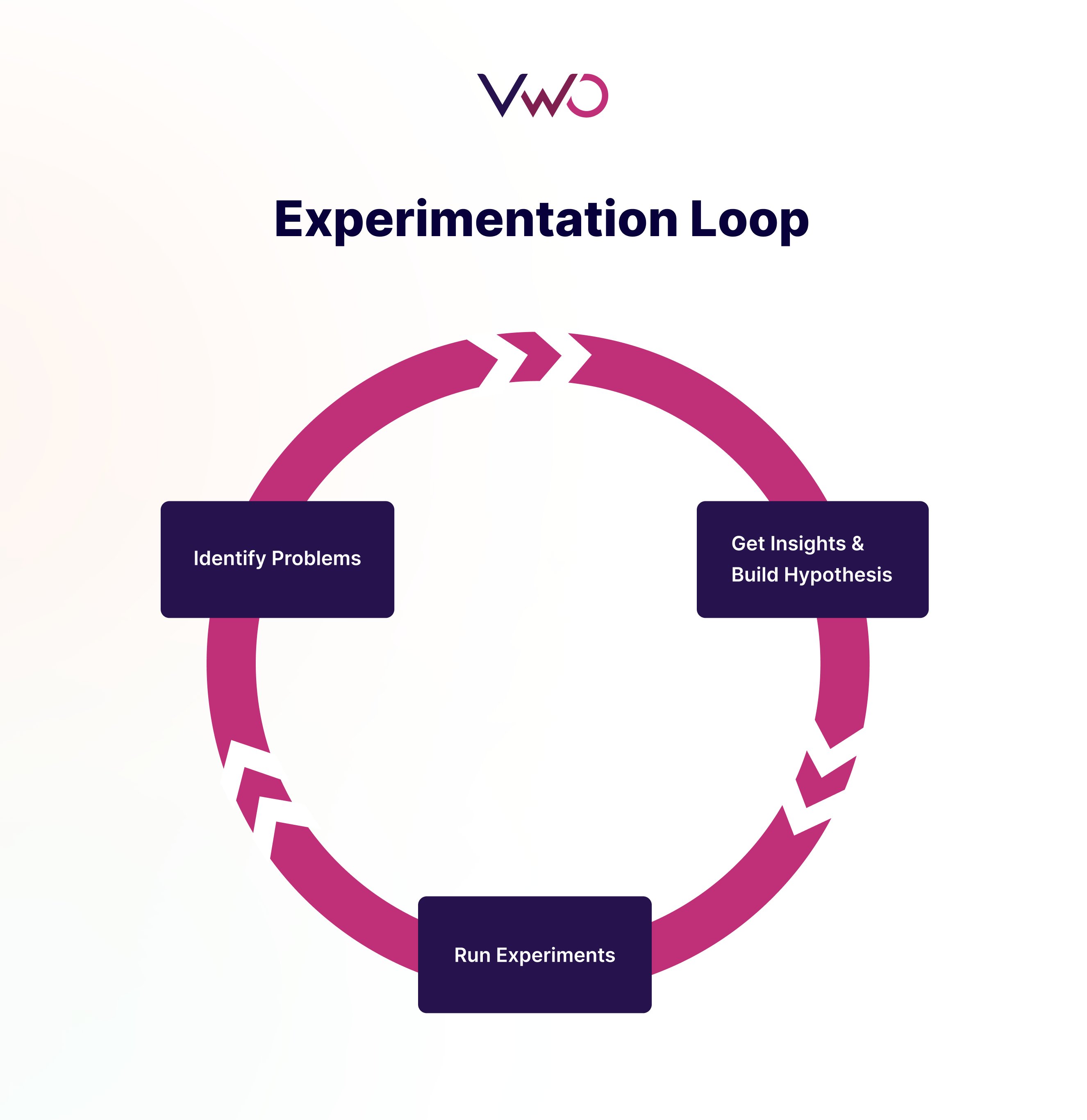
With Experimentation Loops, you are not just stopping at the results but diving deeper to understand the reasons behind the results, identifying anomalies, and discovering if particular audiences (or participants of the experiment) react differently from others. This becomes the foundation for your new hypothesis and experiments.
It is especially critical in today’s ever-changing digital landscape, where user behavior is constantly evolving. By embracing the continuous learning and optimization provided by Experimentation Loops, you can stay ahead of the curve and keep improving your conversion rate.
Understanding the Experimentation Loop with an example
Here is a hypothetical example that explains how the Experimentation Loop functions:
Consider a landing page created with the intent to generate leads. The original version of the page has a description of the offering in the first fold, followed by the call-to-action (CTA) button that will lead to the contact form.
Let’s say that the behavioral analysis of the landing page reveals many visitors dropping off on the first fold. This leads to the hypothesis of adding a CTA above the fold to improve engagement. This way, you create an A/B test to compare the original version and the variation with additional CTA above the fold.
Here is the visual representation of the original and the variation of the landing page:
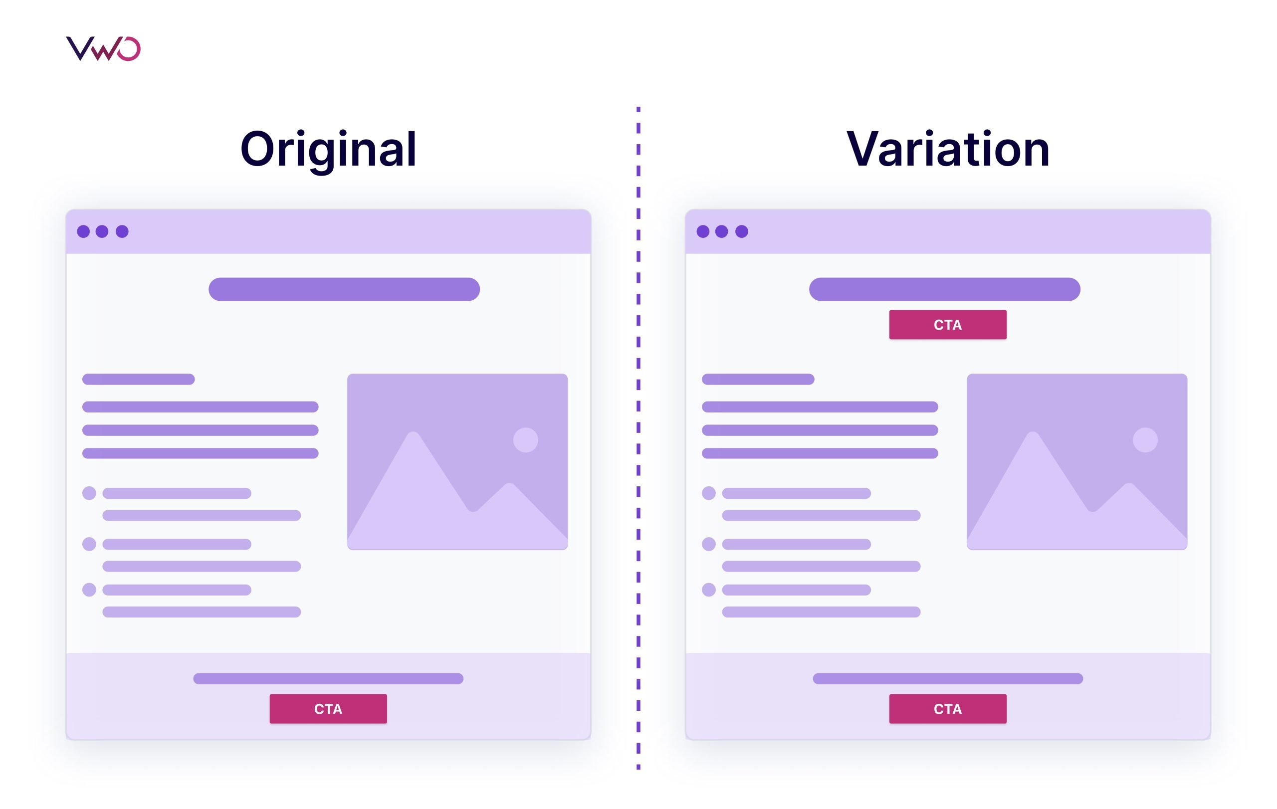
Let’s assume that the test ends with the variation outperforming the original in terms of the conversion rate (i.e. number of clicks on the CTA). Here, the traditional approach concludes the test. But with the experimentation loop, we will try to analyze the results to come up with more hypotheses and open up multiple opportunities for improvement.
Suppose, we zero down on the hypothesis that demands testing the CTA button. Then, the second round will involve coming up with multiple variations of the CTA text and CTA color to optimize the button. Here, to find out the best variation, we can run a multivariate test to compare the original version and multiple variations with different combinations.
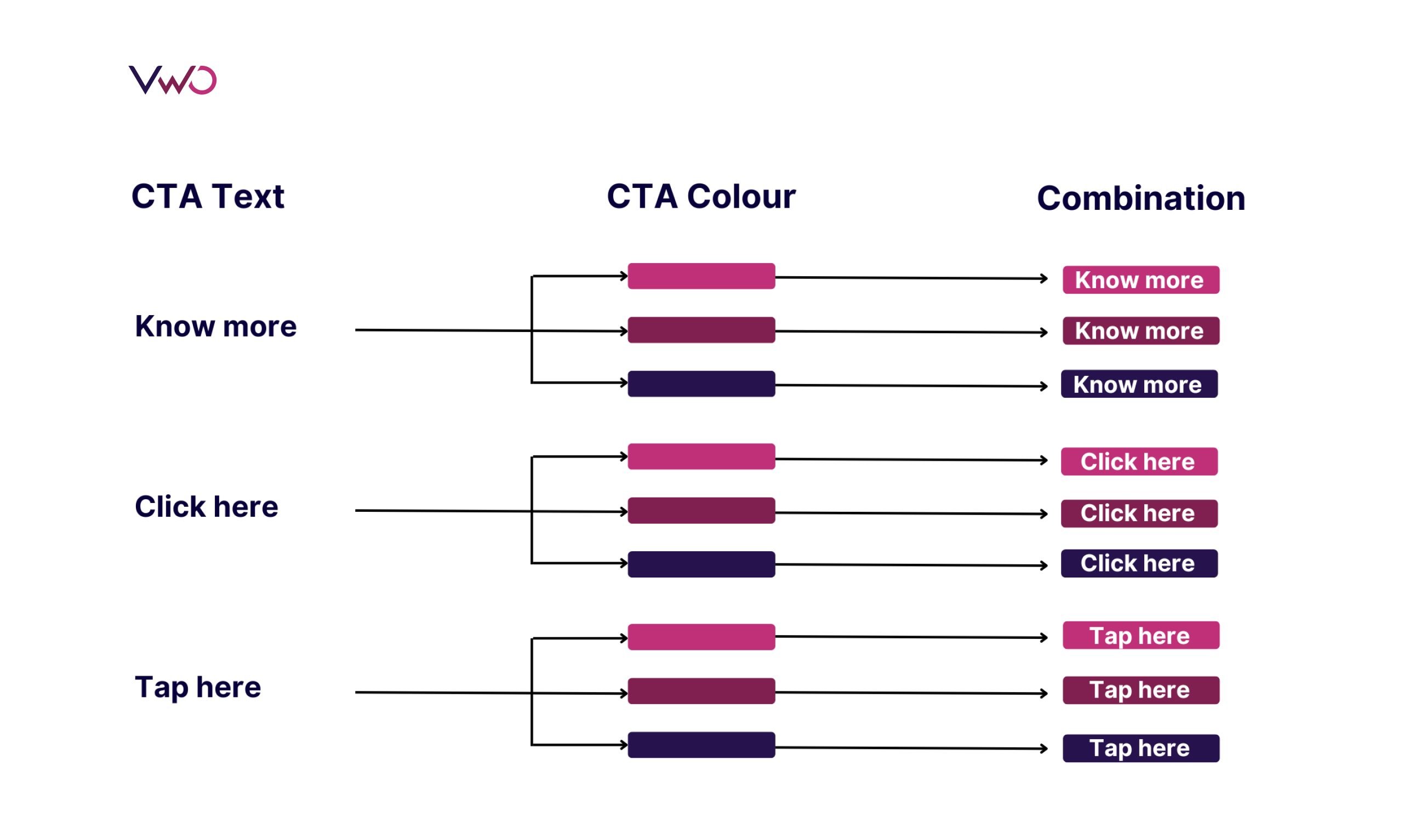
At the end of the test, there can be an uplift in conversion, which would have not been possible with the traditional approach. And if the test fails to get an uplift in conversion rate, it will lead to insights that can help in knowing more about the users.
Likewise, we can check the results to know if a particular audience segment engaged with the button more than others (and if they have common attributes) – in which case, it could lead to a hypothesis for a personalization campaign that includes personalizing the headings or subheading before the CTA as per behavior, demographic, or geographic attributes of the segment.
Thus, an Experimentation Loop opens up the opportunity to improve, which is not possible with a siloed and linear approach.
But how can you carry out the successful execution of the Experimentation Loop?
The experimentation loop consists of three steps, and we will delve into each of these steps in the upcoming section.
Three steps in the Experimentation Loop
Following are the three key steps in the Experimentation Loop for improving conversions.
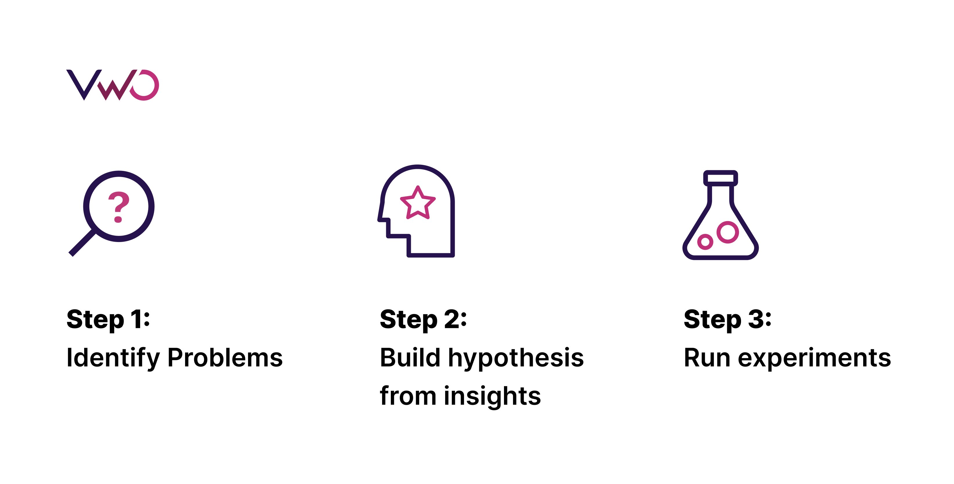
Step 1: Identify problems
The Experimentation Loop starts with identifying the existing problem in user experience. First, you do a quantitative analysis that involves going through key metrics like conversion rate, bounce rate, and page views to identify the low-performing pages on the user journey.
Once you zero down on the weak links, you can do a qualitative analysis to understand the pain points. You can check session recordings and heatmaps to know the performance of each element that affects the conversion rate.
Once you identify the problem associated with the elements, it can help draft a hypothesis.
Step 2: Build hypothesis from insights
After identifying elements that are affecting the conversion negatively, you can start digging into the insight data to make sense of it.
For example, you identified the banner image position as the reason for the high bounce rate of the blog after all the quantitative and qualitative analyses. Then you can build a hypothesis about the position of this image that offers a solution for the high bounce rate.
While framing the hypothesis, you should specify the key performance indicator (KPI) to be measured, the expected uplift, and the element to test.
Next, you move forward to run the experiment.
Step 3: Run experiments
Based on the hypothesis, you choose from tests like the A/B test, multivariate test, split URL, and multipage test. You run it till the test reaches a statistical significance.
The test may result in a change in the conversion rate, and the insights about the user behavior toward the new experience can open doors to identify areas for the second cycle of the experimentation.
Thus, the Experimentation Loop will constantly carve a path to improve conversion.
Experimentation Loop and sales funnel
Running Experimentation Loops at every stage of the funnel can substantially improve the conversion rate and provide a strategic framework for testing hypotheses rather than a haphazard approach.
To enhance the conversion rate of the same element, you can run an Experimentation Loop, as seen in the example of A/B testing to Multivariate testing.
Alternatively, you can analyze the insights from a test that improved a metric to see how it affected other metrics, which could lead to the second cycle of the test.
For instance, let’s take the awareness stage. The goal in this stage is to attract users and introduce them to products or services on a digital platform.
Suppose you ran an A/B test on search ads to get more users to the website and monitored metrics like the number of visitors.
Let’s say the test led to an improvement in traffic. Now, you can move on to analyze other metrics, such as % scroll depth and bounce rate for the landing page, and identify areas for improvement. To pinpoint the specific areas where users are leaving, you can use tools such as scroll maps, heat maps, and session recordings. The analysis can lead you to create hypotheses for the second leg of the experiment. It could involve improving user engagement by testing a visual element or a catchy headline.
Likewise, running the Experimentation Loop at other stages of the funnel can optimize the micro journey that the customer takes at each funnel stage. Moreover, the Experimentation Loop can lead to hypotheses creation from one funnel stage to another, resulting in a seamless experience that is hard to achieve with a siloed approach.
How Frictionless Commerce uses Experimentation Loops for conversion copywriting
Frictionless Commerce, a digital agency, has relied on VWO for over ten years to conduct A/B testing on new buyer journeys. They have established a system where they build new experiments based on their previous learnings. Through iterative experimentation, they have identified nine psychological drivers that impact first-time buyer decisions.
Recently, they worked with a client in the shampoo bar industry, where they created a landing page copy that incorporated all nine drivers. After running the test for five weeks, they saw an increase of 5.97% in conversion rate resulting in 2778 new orders.
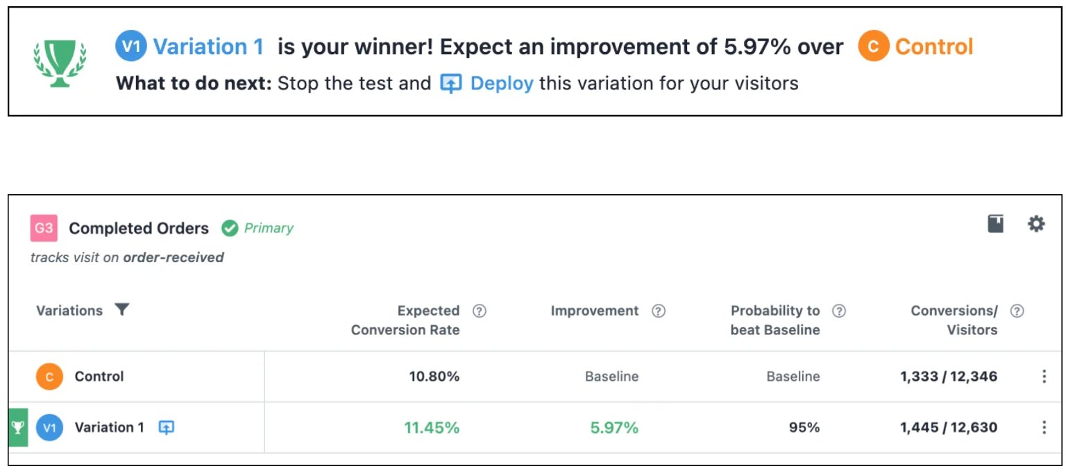
It just shows how Experimentation Loops can bring valuable insights and take your user experience to the next level.
You can learn more about Frictionless Commerce’s experimentation process in their case study.
Conclusion
Embracing the continuous learning and optimization provided by Experimentation Loops is crucial for businesses looking to stay ahead of the curve and improve their conversion rates.
To truly drive success from your digital property, it’s time to break the linear mold and embrace the Experimentation Loop. By using a strategic framework for testing hypotheses, rather than a haphazard approach, businesses can continuously optimize and improve their digital offerings.
You can create Experimentation Loops using VWO, the world’s leading experimentation platform. VWO offers free testing for up to 5000 monthly tracked users. Visit our plans and pricing page now for more information.
]]>We, therefore, bring you the blog series, A/B testing ideas for eCommerce, where we discuss testing ideas for the most impactful eCommerce web pages in each blog. For the first blog in this series, we discuss A/B testing ideas to improve your eCommerce homepage. So dive right in.
First impressions are not a hoax. They make or break our chances to make the right kind of impact.
We may cut fellow humans some slack, but we certainly can’t do the same for websites. Online shoppers take less than a minute to form opinions about websites as soon as they land on them.
This is especially true for your eCommerce website homepage. The homepage is the face of your eCommerce store, and if it falters to make the right first impression, your users are likely to leave unamused.
And what happens next is your brand loses the opportunity to resonate with users and win them over. As a result, it won’t matter how organized and effective the rest of your website is if the homepage, the door to your eCommerce presence, doesn’t make a mark in your visitors’ minds.
Hence, consistent testing is the key to understanding the needs and preferences of your visitors and ensuring that your eCommerce homepage is meeting their expectations. To enhance the user experience and address any gaps, we suggest starting with the following impactful ideas. Let’s begin.
1. Navigation bar
Visitors to your eCommerce homepage are often unsure about what they want to purchase from your website. They’re here to experience the look and feel of your website and then plunge into product exploration. This is where the navigation has to handhold customers and assist them in their buying journey. Poor navigation that complicates instead of simplifying product discovery will put a damper on the user experience of your website.
Test idea 1 – Clickable images of subcategories in the navigation
Let’s say you want to grow your homeware selling website but your product inventory is not very vast yet. Qualitative tools like session recordings and clickmaps tell you that users hovering on the mega menu are not clicking through the links to subcategories. In this scenario, you can hypothesize that the clickable images of subcategories (because they are fewer in number) can stir visitors’ interest and improve their engagement. Have a variation created based on this and pit it against the original version. Based on the result, you can release the most suitable experience to your users.
Next, lay out the subcategories as clearly as possible. Make sure you mention the main menu items first and list only relevant subcategories below them. This way, your users can navigate in an organized manner and avoid browsing aimlessly.
Test idea 2 – Subcategories under the right parent category
Is each of your product subcategories under the right parent category? Arranging them correctly could be another test idea to improve sales of certain products.
For example, yours is a baby shopping online store whose navigation menu reads – newborn clothes, kids clothes, maternity care, baby gear, baby care, and baby furniture.
Session recordings show that users expect to find baby tubs and bath stands under the baby furniture category, but they are listed under the baby gear category on your eCommerce website. This behavior is based on the common idea that baby gear refers to products like strollers, walkers, prams, and car seats.
You can test to see if moving tubs and bath stands from under the baby gear to baby furniture category helps people find the desired product and improve its sale.
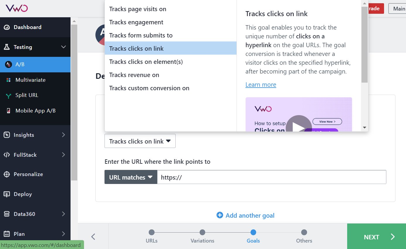
If you are using VWO Testing, you can easily count on its visual editor to move or rearrange elements. Not only can you preview the change before making it live, but you can also add a goal to track. In this case, your goal can be to track clicks on the baby tubs and bath stands subcategory link that takes users to the concerned product page.
2. Header or footer
Showing navigation in the header is the standard practice in eCommerce. While there is nothing wrong with it, you can also try utilizing the footer to accommodate and display your site’s additional areas. It can also boost your SEO efforts because enriching your footers with anchor links is rewarded by search engines with high SERP rankings.
Test idea 3 – Navigation links in the footer
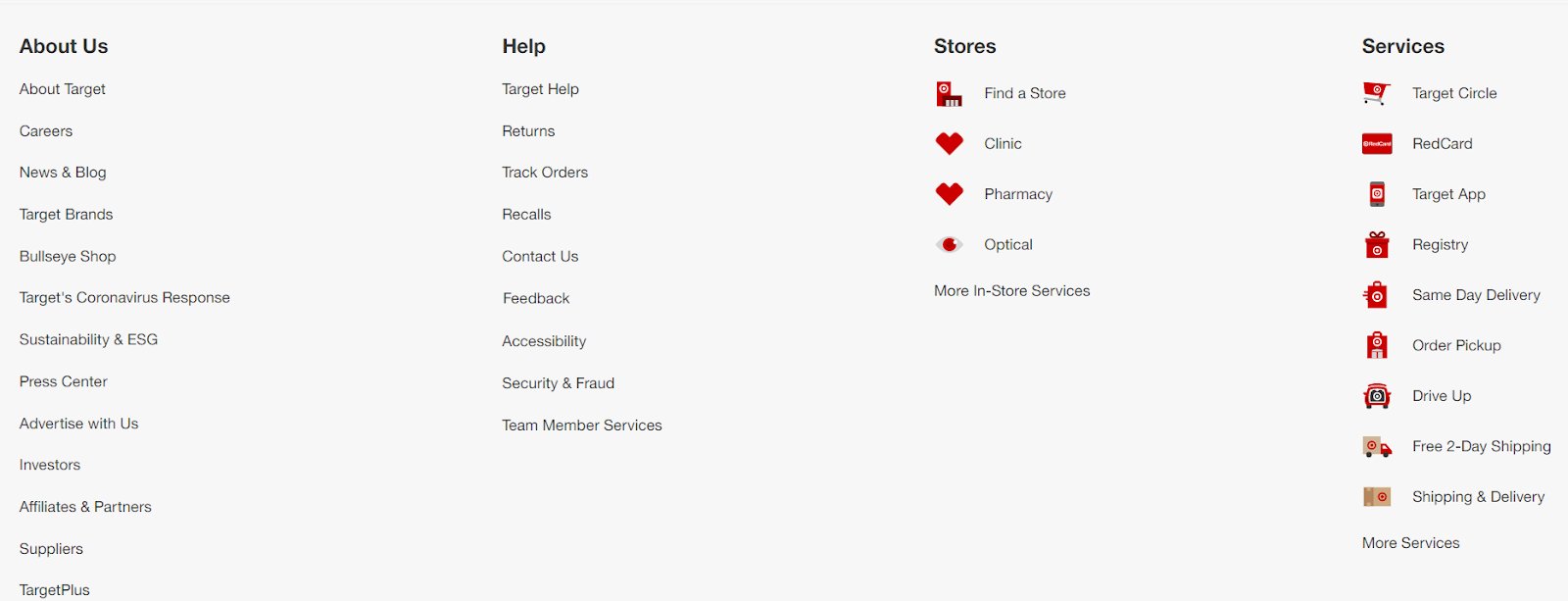
What does your homepage footer show other than your company’s contact details? Nothing? Test if adding links to different areas helps improve user engagement on your eCommerce website. See below how Target, one of the US’s leading grocery marketplaces, has shown links to different web pages like about us, help, stores, and services in its footer.
Test idea 4 – Social media icons in the footer
Social media icons may not be as important as other elements on your homepage conversion-wise but they help grow your following on different social media channels. And the footer is the best place to show them with 70% of websites already having social icons in footers. Create a variation using VWO where you add social media icons in the footer and see if users scrolling down to the bottom are clicking on them.
3. Sticky or moveable
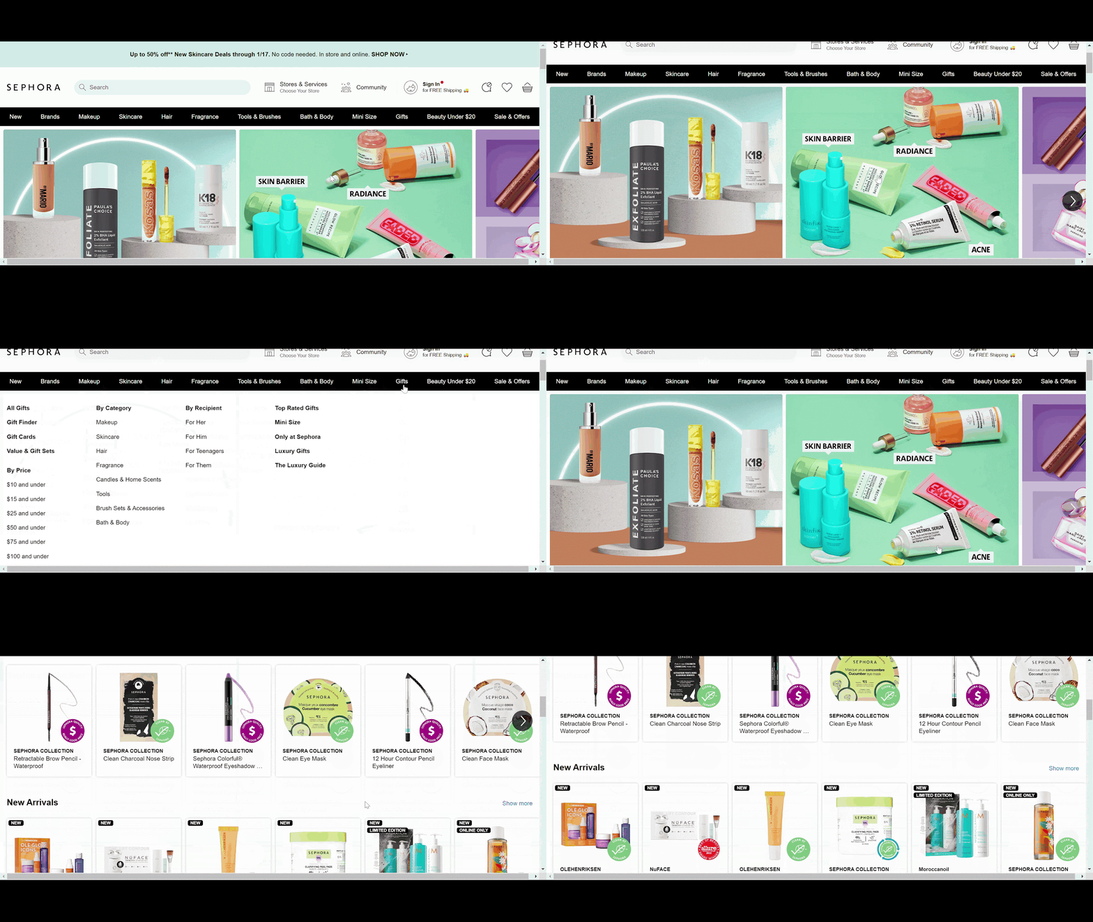
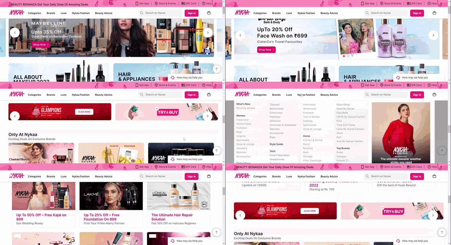
Does the nav menu disappear when users scroll down on your online store? If not, in its place, you can add a scroll to the top link and have it up and running using VWO Deploy. But if you have neither, you’re leaving your visitors in the lurch.
Test idea 5 – Sticky or moveable navigation menu
You can create two variations – one with a sticky nav and another with the scroll to the top link. Test and see how visitors respond to each of them. Once again, roll out the experience that drives higher engagement.
Sticky navigation is a fixed navigation bar that remains in its position even if users scroll down on the page. Stick navigations are a must-have for actionable websites that need customers to take an action like purchasing a product. The ‘stickiness’ makes users feel more confident when browsing an eCommerce website. It serves as an assurance that they won’t be lost in an ocean of choices and can switch to any product category they like as if they have control over their surroundings.
USP bar
Don’t leave it to customers to discover the positives about your brand. Your job is to make the job easy for them. Bring all the reasons to their fingertips, so they don’t have to wonder why they should buy from your eCommerce website. This is why brands add a USP bar to their website homepage to make a positive impression on potential buyers.
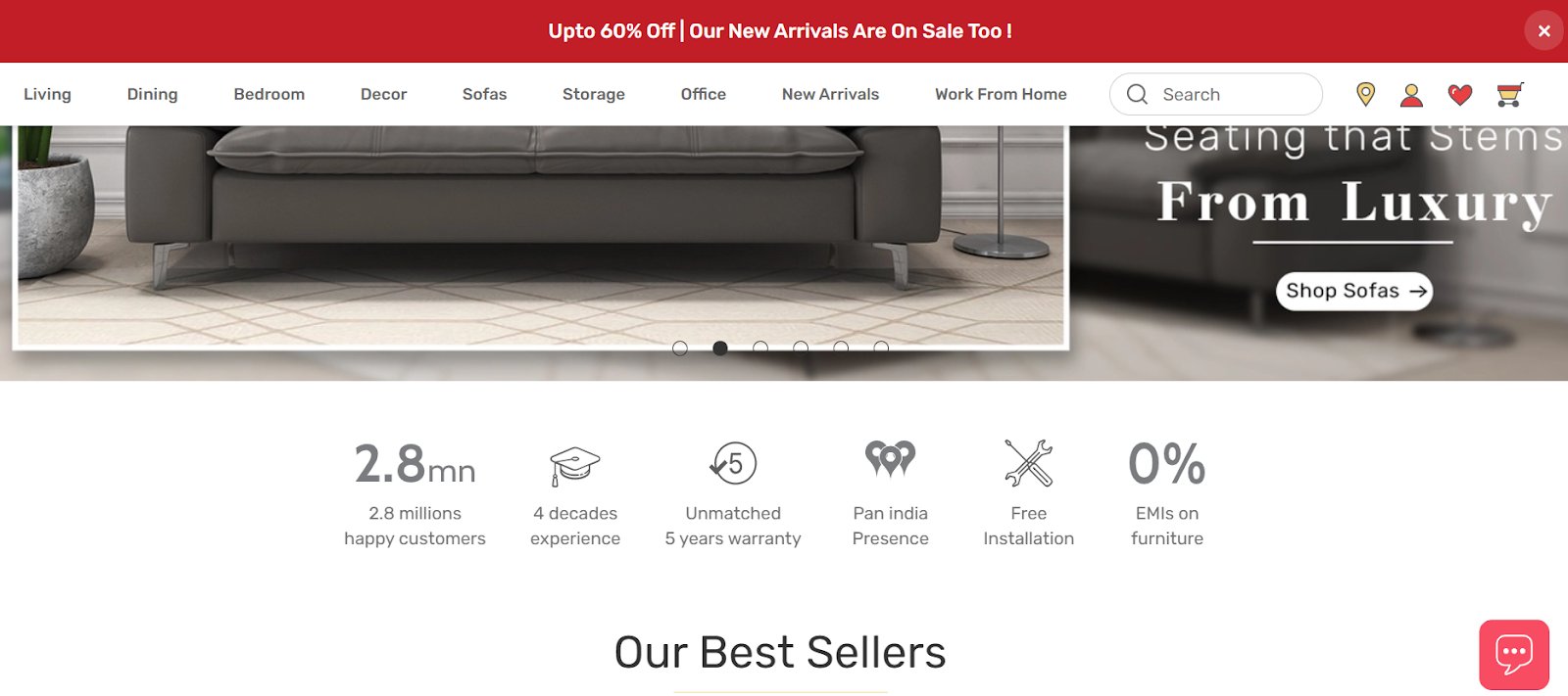
Durian, a top furniture brand in India, shows a USP bar just below the above-the-fold banner content. Whereas, Sabai, one of the leading furniture-selling brands in the US, shows the USPs of their products in the form of a full-screen image.
Test idea 6 – A USP bar or a full-screen image highlighting USPs
First, learn which type of USP display connects with your users. Qualitative tools can help you with that exercise. If you don’t have USPs on the homepage of your online store right now, create 2 variations – one with a USP bar (inspired by Durian) and another with a full-screen image, taking a cue from Sabai.

Test idea 7 – Moving up the position of the USP bar
Let’s say you already have a USP bar on your homepage but it’s at the bottom. Because heatmaps tell you that users are not scrolling so deep on your page, you want to test and see if moving it up can help improve users’ interaction with the section. For this, you can have a variation where you place the USP bar at the top and see how it performs against the control.
Test idea 8 – Visually-driven USP section
This test idea is about seeing if your visually-driven variation performs better text-loaded control.
Is your current USP section text heavy? Like a lot of lines and even paragraphs? Chuck it!

Instead, use icons to highlight what your USPs stand for. This can look super catchy and squeaky clean.
Here too, VWO Visual Editor allows you to make changes to the design layout because of which you can easily pull off these tests without having to resort to developers’ help (even if you need it’s really minimal). You can modify images, and videos, copy, move elements, change to the code editor, and add goals to track using this tool.
5. Images
Remember, unlike what happens in physical stores, customers can’t see, feel, or touch products when buying online. The closest they can get to that tangible experience is seeing (in fact scrutinizing) product images to make a buying decision.
It’s a no-brainer that you must add high-quality images relevant to what you offer on your eCommerce website. Avoid showing stock images because they lack authenticity and don’t represent your offerings in the best way. If you can, go for lifestyle imagery as it impacts the psyche of your target audience and makes them visualize how using your products might feel. When strategically placed on your homepage, videos can also do a killer job of engaging your website visitors.
Test idea 9 – Branded video to improve user engagement
Imagine you own an online coffee-selling shop and in one section of your homepage, you have text content explaining the specialty of your company in roasting coffee beans naturally. Do you know what can make this more interesting? Create a variable containing a video on this where you can use animations or have real people talk about their experiences.
VWO Testing can do all the heavy lifting so that you can easily embed videos on your homepage using the visual editor and get started. Set ‘Track engagement’ as your goal to see if this change motivates visitors to interact better with your eCommerce website.
6. Product recommendations
Users landing on your eCommerce homepage through direct search or organic search are still in the process of discovering your brand and its offerings.
Give them enough choices to explore. Let them have a glimpse of what they can expect from your brand.
Test idea 10 – Product recommendations for new visitors
New customers need to be told what sets your brand apart from the rest. To do this, you can display ‘Bestseller’, ‘Top picks’, and ‘New Arrivals’ product recommendation tiles to catch their attention and even encourage them to convert.
Test idea 11 – Personalized recommendations for returning visitors
What about your returning customers? Will they benefit from seeing the above product recommendations? Yeah, why not, but what can really stand out is offering personalized product recommendations on the homepage of your online store. Some product titles that are worth adding to your homepage are ‘Based on your search history’, ‘Curated for you this week’, ‘Continue browsing these brands’, and so on.
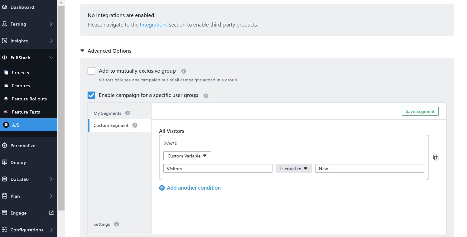
Using VWO FullStack, you can run tests on recommendation engines with help from your developers. Further, custom segments in VWO will allow you to target a specific segment for a test (new customers for the first test and returning customers for the second test). To see if this test is motivating new customers to purchase, you can track conversions and set add-to-cart value as a goal identifier.
7. Seasonal offers
No matter how fastidious customers are about sharing personal details when online shopping, 85% of them are ready to exchange data for discounts. Yes, you read that right. Nothing appeals to customers as much as discounts do. Whether you’re running a buy one and get one free deal or offering flash sales, make them known to your visitors through your eCommerce homepage.
The simple logic behind why discounts work is that it encourages more customers to purchase, which increases your profits. But beware that decreasing prices beyond a point can disturb profit margins.
Test idea 12 – Discounts to encourage more purchases
Let’s imagine this. You’re currently offering a 30% discount as a part of a clearance sales strategy to your customers. On seeing that not many customers are responding, you can create a variation with a 50% discount, which you test to check if a higher discount rate (agreed upon by the management) motivates customers to purchase. Set your goal to ‘Track revenue on’ on VWO to obtain the test result.
Test idea 13– Discount placements: carousel or horizontal bar
Now, where to place your offer banners so they grab customers’ eyeballs? Most brands highlight offers in carousels with attractive product or lifestyle images in the above-the-fold section on their homepage. Behemoths like Amazon and Walmart have pioneered the use of this style of offer display. For your case, you can have a carousel in the first variation and show a horizontal banner at the top in the second variation. The one that has a higher probability of improving your conversions should be rolled out to all.
Test idea 14 – Offer-based recommendations
Offer-based recommendation titles can also be a good testing idea to try out and see how it works for your online store. Amazon categorizes products on which attractive deals are available under a particular recommendation category on its homepage.

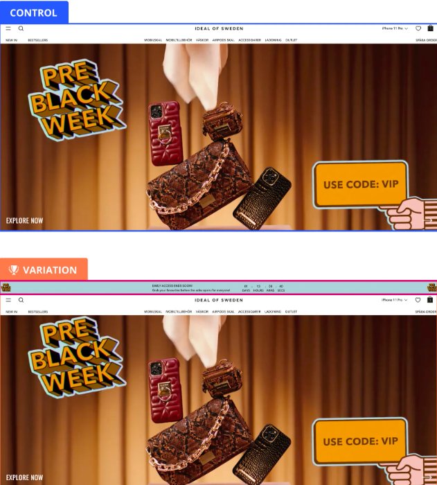
One of VWO’s clients, Ideal of Sweden, a Swedish lifestyle brand, wanted to make the most of the Black month to boost sales from their online store. So, the team aimed to encourage visitors to purchase before the sale was over, with discounts being the motivator. As a result, it was hypothesized that implementing a countdown banner would create fear of missing out in the minds of customers, thereby encouraging them to purchase soon. The variation was implemented throughout the website and led to a 5.6% increase in the primary metric of add-to-cart. To know more about their learnings from the test and the next roadmap, read here.
8. Pop-up form
A few days back, I found an interesting post by Johnny Longden, Director of Digital Experiment Services, where he called out an online kitchen appliance seller for showing an email pop-up 4 times within 15 seconds of landing on its website. And he believed that this could lead to a high drop-off from the online store.
As we near the cookie-less future, we understand your urge to collect first-party data to stay competitive. And asking visitors to share their email addresses by offering discounts, newsletters, and membership in pop-up forms is one of the effective ways to get there.
But pop-ups are two-edged swords. While showing them increases your chances of getting desired customer data, the premature display can be detrimental to user experience as it can distract visitors from deriving value from your eCommerce website.
Test idea 15 – Pop-up form display at the right time
Run a test where you increase the time between users landing on the website and showing the email pop-up. Say you increase the time from 15 seconds to 30 seconds, giving users a chance to consume some of your content. Using VWO, you can set the goal to ‘Track clicks on element(s)’ and see if more users are filling up the form in the variation.
Test idea 16 – Persuasive copy for your form
Think there’s scope to improve the copy of the form? Ask only what is required. Asking a lot of questions can raise suspicion among visitors and make them leave your website. Also, ensure the copy is persuasive and catchy. You can show something like – More than 20k visitors have already signed up. Now is your turn to get attractive offers in your inbox. The combination of a persuasive copy and numbers acts as great social proof that creates an urgency in the minds of visitors to take action so they don’t get left behind.
Test idea 17 – Minimized pop-up banner
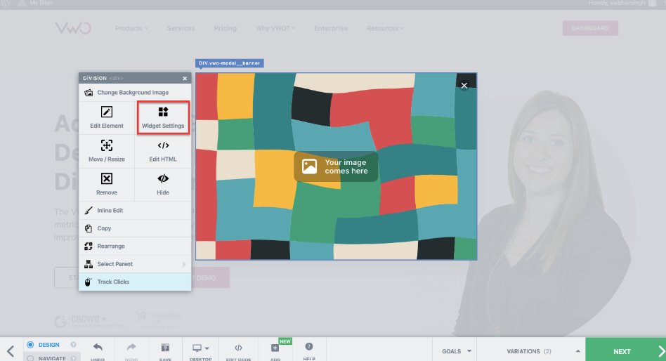
Is your email pop-up full page? It’s possible that your website visitors find it distracting. A high drop-off rate could be a testimony to that. You can try showing a minimized pop-up at the corner of the homepage and see if it is better received by audiences. Using our Visual Editor, you can add different types of widgets and adjust the shape and placement of the existing widgets. Take a full-featured trial to test these ideas today.
9. Call to Action Buttons
Inundating your homepage with a lot of words is not a great idea. Striking a balance between text and visuals (even whitespace) is super important to reduce cognitive load for users on your online store.
Test idea 18 – Call to action button copy
As suggested for the email pop-up form, you should see if there is scope to optimize call-to-action (CTA) buttons in different places on your homepage. If your current CTA ‘Browse products’ is not getting as many clicks as you’d like it to get, you can see if tweaking the copy to something like ‘Explore our collection’ improves user clicks on the button.
Test idea 19 – Colors of CTA buttons
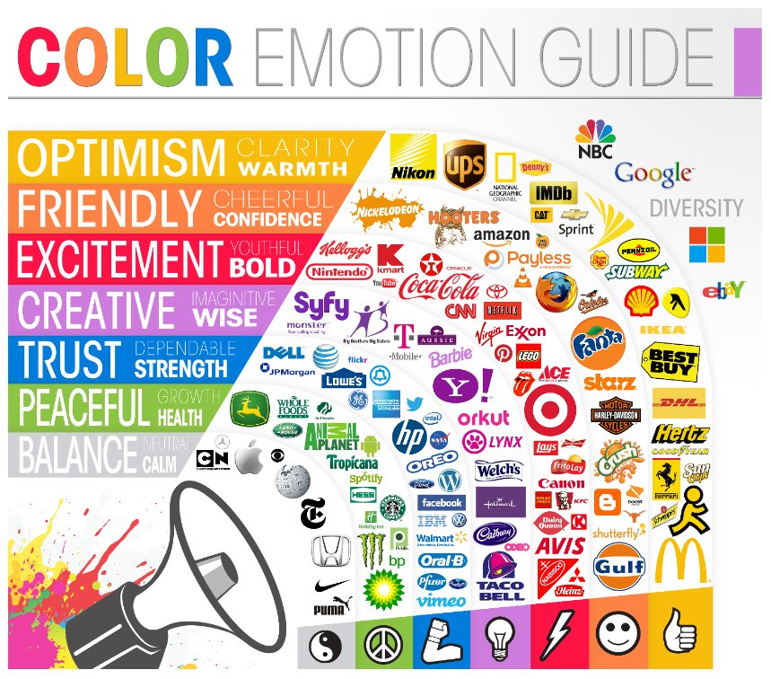
When you’re deciding the colors of your CTA buttons, consider the background hues, whitespace, and other visual elements on the homepage. Say your layout is made in light yellow. You can’t expect a similar shade to stand out when used for a CTA button. Instead, you may try other shades like honey, gold, fire, and dijon to make the CTA button stay at the top of the visual hierarchy and draw visitors’ eyeballs to it.
Test idea 20 – Above the fold placement of CTA buttons
Your homepage is not a maze that your visitors have to solve. If you want them to stay on your website, keep the interactive elements, especially CTA buttons, in predictable and prominent places. Is your main CTA button below above-the-fold? Move it up and incorporate it with the header image. You can hardly go wrong with this one. Still, test and see how it works for you.
The Chicago-based apparel company RIPT tested and found their best-performing CTA button using VWO. Not only did they add a discount but they also added a countdown timer that created FOMO (fear of missing out) among your visitors. As expected, the variation was a winner with a 6.3% increase in purchases. Read here to know the learnings from the test.
10. Search bar
No talk about the homepage is complete without mentioning the search bar. But then the search bar functionality in itself is a broad topic that deserves its own article. For this one, let’s stick to its placement on the homepage.
It goes without saying that the search bar should be positioned in a prominent place so visitors can easily see and access it. Here are some examples to inspire your test idea.
Amazon has split the top menu into two bars – it shows the search bar along with users’ account, return, and add to cart icons at the top and the mega menu and hamburger menu in the second bar.
Whereas eBay has split the top menu into three different bars – The first one shows add-to-cart and account sign icons, watchlist and My eBay dropdown, and so on. The second bar just houses the search box with a shop by category drop-down alongside. The third one lists and displays all main navigation menu items for users to explore.


Test idea 21 – Search bar design and placement
Let’s consider that visitors on your homepage are not clicking on the search box. But you’ve observed that visitors who search have better chances of converting. For the variation, you can make the search box more center-aligned and its border more prominent to raise its discoverability. Test this against the control where the search box is inconspicuous. See if the variation increases the number of visitors clicking and searching for products.
Best Choice Product, a California-based online store, found that 50% of traffic to its website were mobile users and visitors searching for products were converting 60% better than the rest. They used VWO to run a test where it was hypothesized that increasing the size of the search box and placing it in the center can help improve conversions. The test was a success with an increase of 30% in click-through rate on main CTAs.
Wrapping it up
The homepage offers a window for users to take a peek at your brand and what it offers. You need to experiment and see what helps keep users on your eCommerce website, prove that your online store is worth spending time on, and gradually move them down the buying funnel.
Hope you enjoyed reading the first blog on A/B testing ideas for your eCommerce homepage of this series. You might be tempted to try these testing ideas, hoping to skyrocket user engagement and conversions. But bear in mind that any test you run should be backed by research that is contextual to your website and users.
Take advantage of the integrated experimentation platform VWO to dive into user behavior analytics, unified customer data, and full stack to inform your website testing roadmap. Sign up for a free trial to take the first step toward your homepage revamp!
]]>Such a business will not flourish because as a customer, you need to buy into the experience before you pay for the product. In this digitally dominant world of business, you will judge the product based on the website’s experience and leave instantly if it is not up to the mark.
Download Free: A/B Testing Guide
The foundation of a high-performing website with the finest experience is based on three pillars: Optimization, Personalization, and Testing. Most of us understand these terms in theory, but their impact on the website depends on the correct execution.

Although optimization, personalization, and testing techniques should align with your business objectives, here are common best practices that can be utilized as a reference regardless of industry or business size.
Best practices in website optimization
Website optimization is about improving the performance of the website in terms of speed, traffic, and design using various strategies and tools. It involves reviewing, experimenting, and optimizing areas like SEO, copywriting, UI, analytics, CRO, and web development. Let’s explore some of the best practices:
Reducing website loading time
A fast-loading website creates a smooth user experience, which leads to a higher conversion rate and higher ranking on the SERPs. You should aim for 2 seconds of load time; the reason being the threshold set by Google for dynamic websites like an eCommerce store.
Although using cache plugins and minifying HTML and CSS is common, you can speed up the website with advanced measures. Following are some suggestions in this direction:
- Work on reducing redirects for the landing page
- Upgrade the hosting to reduce server response time
- Remove rendered-blocking JavaScript
- Enable G-zip compression
Studying visitor experience with heatmaps and session recording
Everybody with a website uses some analytics tool to understand user interaction. But, to create a strong position in this cut-throat competition, it’s crucial to use advanced tools like dynamic heatmaps and session recordings.
A basic analytics tool will point out a high bounce rate or low duration on a particular page. But, a heatmap and session recording will tell you at what point on the webpage users are leaving and how the website elements are performing on the heatmap. They will give precise information on the visitor’s experience with different elements, content, and media on the website. These advanced tools answer what to optimize.
Making it user and intent-friendly
The practice to create a landing page stuffed with keywords is obsolete. The user intent has taken center stage, and targeting the motive behind the search will ensure success in contemporary times. One of the simplest ways to understand the intent is to analyze the top 10 SERPs for a particular keyword as search engines have evolved to understand intent and rank pages.
For example, if we search for second-hand cars on Google, we get SERPs with “used cars” in the title, and the content of the pages intends for transactions rather than sharing knowledge.
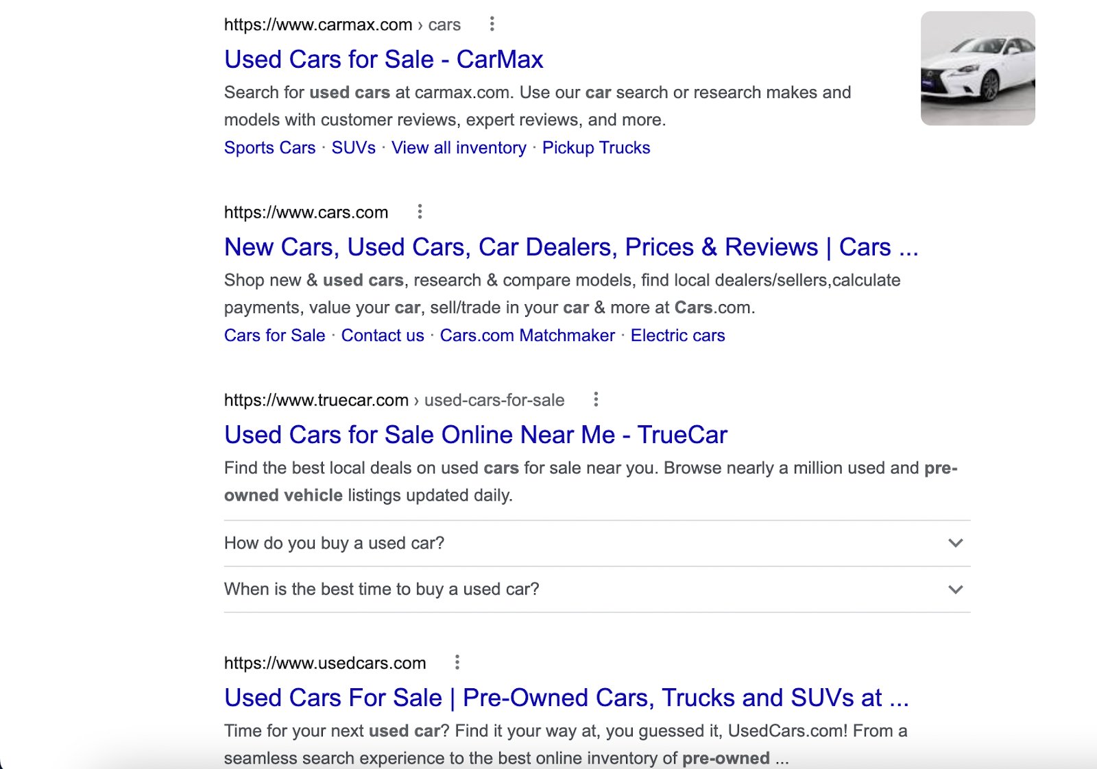
Thus, before creating content to target any keyword, a simple analysis of SERP can help understand the intent. Also, including modern features like text-to-speech, and voice search will keep you ahead of the curve.
Focusing on conversion rate optimization (CRO)
A website owner in these modern times must run CRO campaigns that intend to analyze and optimize each stage of a conversion funnel. CRO helps in making data-driven decisions when optimizing content, web design, and elements such as calls-to-action (CTAs). The focus of CRO should be to optimize the complete user journey rather than just the landing page or the website. On top of it, the future is all about customer data platforms (CDP), and it’s something to explore to scale up the website optimization process.
Regularly SEO auditing your website
High-growth brands audit their websites at regular time intervals. Visitor behavior is dynamic and changes quickly with time; regular SEO audits help keep your website up to the mark. Here are some tips to do an SEO audit:
- Check for indexing issues, mobile friendliness, and core web vitals on the website’s search console.
- Look for duplicate versions of your website.
- Analyze keyword queries on the search console or any SEO tool such as Semrush and Ahrefs. Check low CTR/impressions ratio and low rankings.
- With tools like Semrush, analyze and remove broken and low domain authority internal and external links.
- Analyze your site’s speed on different devices. You can use Google’s Pagespeed Insights to get suggestions to improve speed and core web vitals.
Example of website optimization
Yelp, a crowd-sourced business review platform, saw a decrease in page speed due to an increase in the number of steps in the ad purchase flow. The development team at Yelp did some initial optimization and found that an increase in page speed lifts the conversion rate by 12%.
Thus, the team started with tools like ChromeDev to find frontend development issues and Google Lighthouse to get suggestions on the speed. After a series of front-end and server-side optimization, the browser rendering of the content improved by 45%. The whole optimization effort led to a 15% improvement in conversion rate.
It just shows how website optimization improves the user experience and positively impacts the conversion rate.
Best practices in website personalization
Website personalization tailors visitors’ experiences based on preferences and past interactions. Here are some practices to ace website personalization.
Collecting data on user behavior and creating groups based on similar characteristics
Collecting data on the visitor journey is essential for creating a successful website personalization campaign. It allows you to understand how visitors perceive your website and what factors influence their decision to convert. The data should yield insights into conversion factors such as offers, product quality, or customer support. The insights can be used to create a hypothesis and visitor segments that guide the creation of a personalized journey.
For example, consider an eLearning platform that gathered customer information using a customer data platform (CDP). The data showed that some current learners visited a newly launched course, browsed the offers section at the checkout page, and left the platform. These learners can be grouped as discount seekers, to be targeted laterwards with a tailored campaign that informs them of discounts for the new course.
Gathering and using customer feedback to improve personalization
Collecting customer feedback can provide valuable insights for your next website personalization campaign. While behavioral analysis can reveal user behavior, direct communication with customers can give a more precise understanding of their needs and preferences. Surveys, email campaigns, and chatbots are all effective ways to gather customer feedback.
One of the good practices is to deploy surveys based on specific trigger conditions, such as an exit survey to understand what users expected at different stages of the journey. Here is one example, a survey gets triggered when a user intends to close the tab.
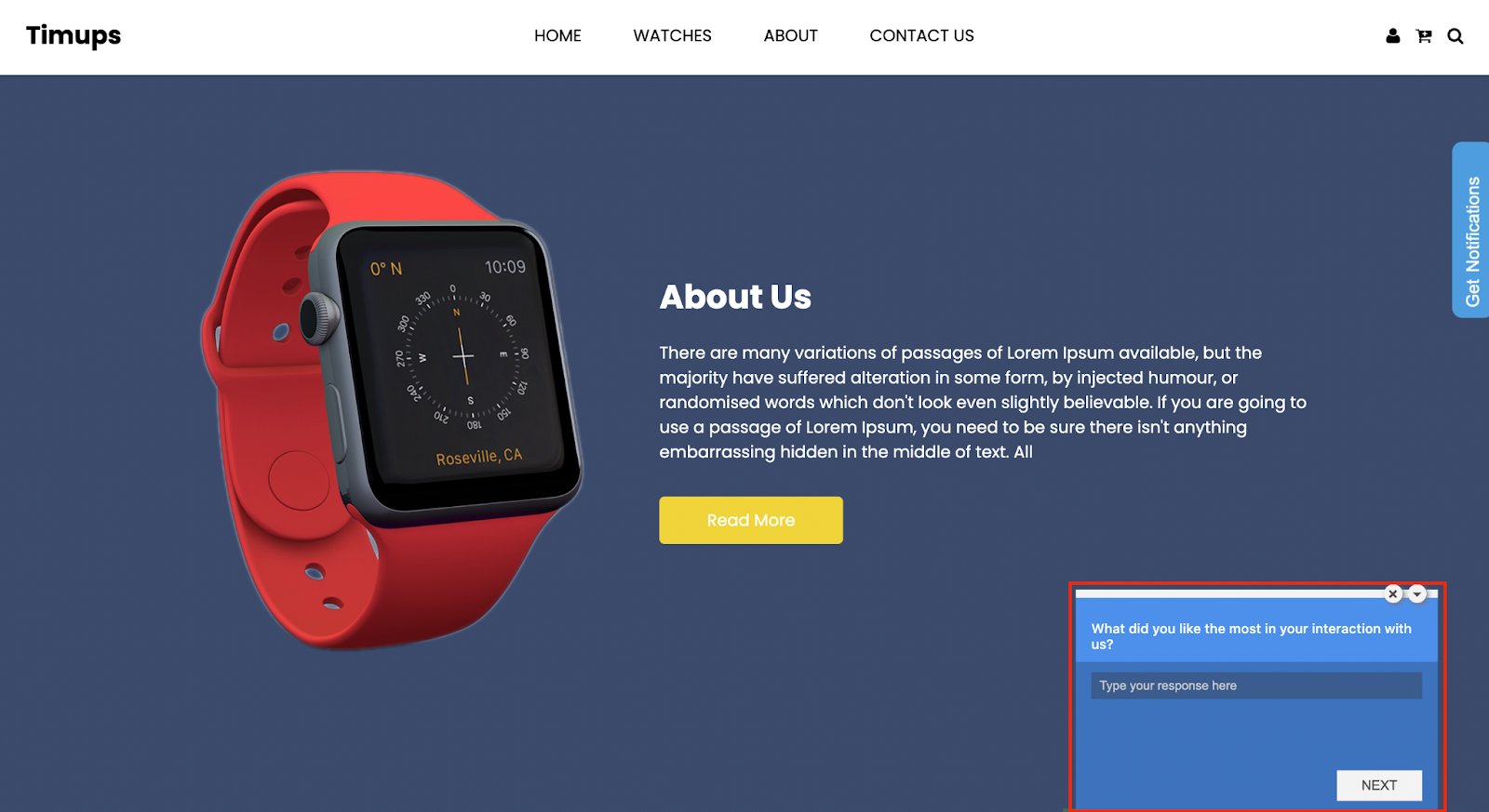
The feedback from the user helps in formulating a hypothesis for the next personalization campaign. Also, you can segment users based on their responses and target them laterwards.

Experimenting with different versions of personalized experiences
Combining experimentation with website personalization is like pairing milk and chocolate; they complement each other well. Experimentation can boost the performance of website personalization.
For example, you have a personalized floating widget on your eCommerce store that recommends new deals on products that are frequently bought by a customer. A/B testing the widget’s headline, image placement, and color of CTA can further improve the conversion rate.
Understanding the significance of personalization metrics
Tracking the right personalization metrics is a challenge for many firms. A key metric is like a signal that tells whether personalization campaigns are giving a fruitful output or not. So, it’s important to study the significance of each key metric before delving into website personalization.
For instance, consider a firm that provides an on-page SEO analysis tool. They have now introduced a technical SEO checker with a $5 increase in the subscription fee. The company initiated the rollout with a targeted campaign aimed at its loyal customer base, detailing the new feature.
In this scenario, measuring metrics such as Average Revenue per User (ARPU) is vital to assess the campaign’s effectiveness. A rise in ARPU indicates that the personalization campaign aligned with the customer’s needs and preferences.
Complying with the regulations
Ensuring data privacy and cybersecurity is a top priority in today’s dynamic digital environment. Personalization requires access to customer data, and there are regulations in place to protect this information. It is crucial to secure customer data for website personalization, not only for ethical reasons but also to comply with laws. When selecting a third-party tool for personalization, make sure it meets the standards and regulations set forth by organizations like GDPR, CCPA, HIPAA, and PCI DSS.
Example of website personalization
VWO is a trusted platform around the globe for experimentation. Here is how the landing page looks:
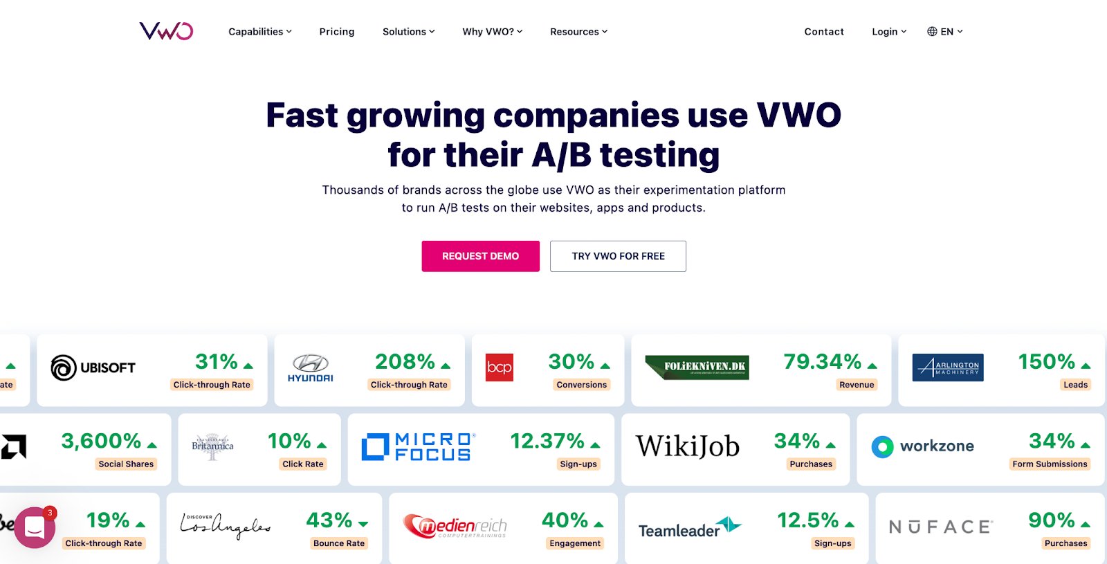
Prospects from various industries visit the homepage of VWO. These prospects can be segmented based on their industry, and a tailored experience can be created. Suppose, we personalized the homepage for an eCommerce lead with VWO Personalize. Here is how it will look:
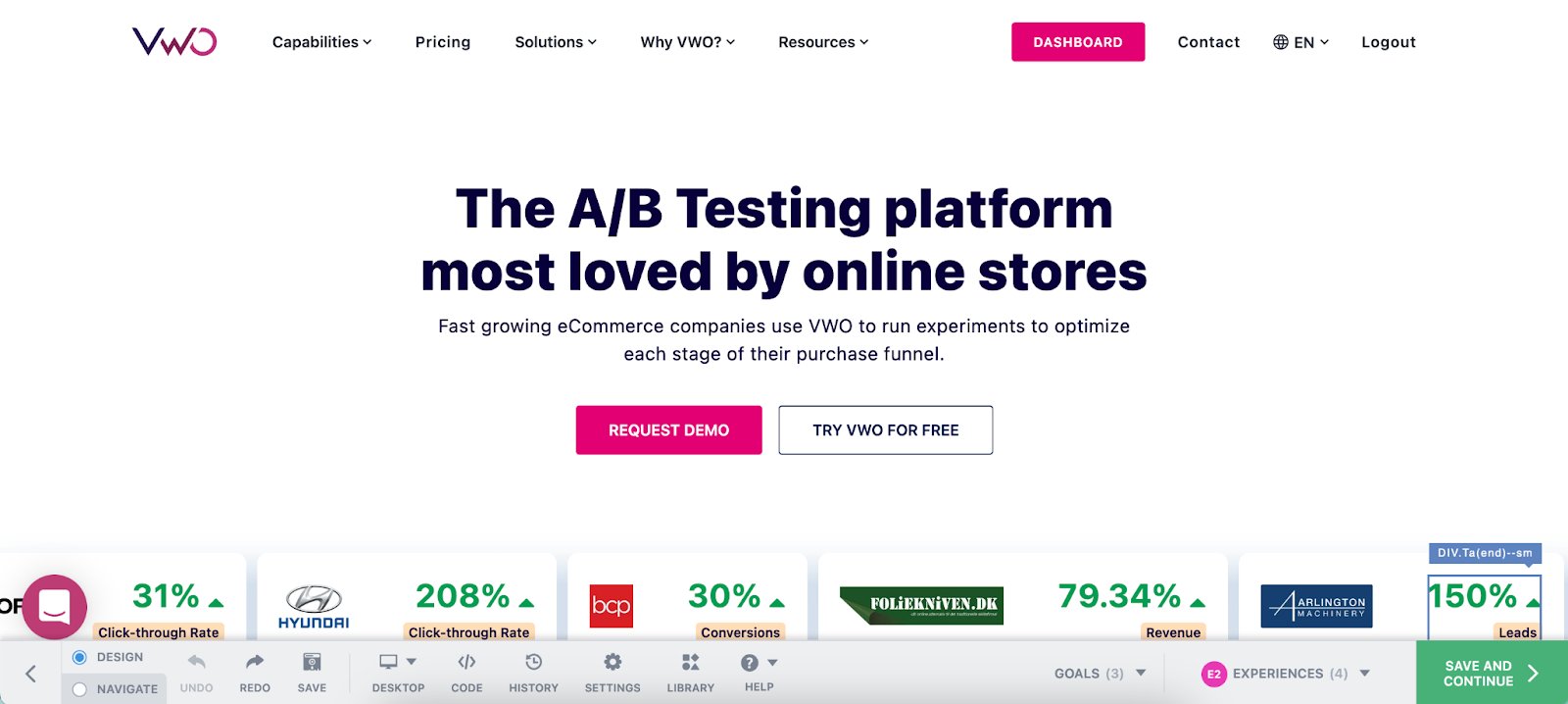
Image source: VWO Product Updates
Notice the personalized headline. Likewise, the headline will change for a SaaS, Edtech, or any other prospect. Personalization enhances brand positioning with such tailored communication.
Download Free: A/B Testing Guide
Best practices in website testing
Website testing is the process of comparing two or more versions of the webpage to find out a better-performing variation in terms of conversion rate, engagement, or any other metric. A/B testing, Split URL testing, and Multi-variate testing are widely adopted methods of website testing. Here are some of the best practices for website testing:
Testing based on data-backed hypotheses
Website testing should not be an output of a hunch but a data-backed hypothesis. Before testing, you should do an extensive analysis of visitor behavior with real-time analytics tools.
The analysis helps understand the leaks in the sales funnel, baseline conversion, and information on the non-converting user segment. The dataset then leads to a hypothesis, which guides the testing campaign.
Create an experimentation roadmap
You just don’t show up at work and start experimentation. It should be a planned, ongoing activity that is part of your organization’s culture. After an extensive study of visitor experiences, and hypothesis creation, it’s good to prioritize test ideas based on easiness, impact, and confidence in getting a result. Your roadmap should be available to all stakeholders within the organization for accountability and cross-team collaboration of ideas.
Don’t make changes to a running test
It is not recommended to make changes to a running A/B or split URL test, as doing so can skew the results and make them less accurate. It is best to let the test run its full course and, if the results are not satisfactory, start a new test with the desired changes.
Create mutually exclusive groups while running multiple tests
When running multiple tests on a homepage for visitors, it is important to ensure that the tests do not overlap or conflict with one another. For example, if one A/B test is offering a discount on a specific product, and another test is offering a flat discount on all products, a visitor becoming part of both tests could get confused. To ensure the accuracy of the tests and avoid confusion, it is crucial to create mutually exclusive groups so that a visitor is exposed to only one test at a time.
Document learnings from the experiment
If you are new to experimentation, the whole process of experimentation is itself a learning experience. You must document the process, along with the results. It helps a lot for future experimentation campaigns, especially if the team working on it changes. The notes on mistakes, learnings, and secondary KPIs that showed changes, can set the tone and hypothesis for future experimentation campaigns.
Example of website testing
Contorion, a B2B online marketplace utilized VWO for A/B and Split URL testing. Contorion ran an A/B test to determine the effectiveness of a site-wide banner for promotion, which helped them increase the conversion rate during promotional periods by 5%. Similarly, they ran a Split URL test to compare the new design of the product page with the old one. The variation performed better, with a 2.4% increase in the add-to-cart click rate.
Conclusion
Optimizing your website, personalizing its content, and testing its performance requires effort and investment. However, the results are worth it as they create a positive impression on your customers.
Improving the speed and relevance of your website content and conducting an SEO audit enhances the user experience. It’s like regular maintenance for a car to ensure a smooth ride.
By testing and personalizing your website, you can bridge the gap between your perception of the digital property and customers’ expectations of it. But many times, website owners hesitate due to sudden monetary demands to carry out experimentation. Investment in an experimentation tool or development team means spending money even before understanding its nuances. But not anymore.
VWO allows you to create data back hypothesis, run tests like A/B, split URL, and multivariate test, and personalize website experience for user segments. Features like Visual Editor mean less time spent conversing with the development team and more time for optimization. What’s amazing is that you don’t have to spend a single penny on starting experimenting.
VWO offers an all-inclusive free trial of all its capabilities so that you can gather data, test, and personalize. If testing is what you want to start with, VWO has a free starter pack on web testing for 50k monthly traffic. Check out the details of VWO’s plans and pricing.
]]>Download Free: Improve Conversions In 60 Days Guide
As an eCommerce store owner, you need to make sure your store’s website user experience is at its peak—and one place we see user experience being neglected the most in eCommerce? The homepage.
eCommerce brands can put in the work to optimize product pages, category pages, and even checkout processes. But if your homepage is one of the first touchpoints your customer has with your brand, it makes sense to optimize your homepage for the best customer experience that drives more sales.

And how important customer experience has become indeed. We’re also not only referring to the new shopping habits of consumers as we enter a post-pandemic world — where almost 40% of surveyed participants claim that in the future they prefer to do more shopping online but only visiting sites that deliver great experiences. But we also mean even Google is doubling down on the importance of user experience and how it affects your overall rankings on search. Its newest 2021 update urges users to consider core web vitals and a host of other factors that elevate a user’s experience on your site.
To help you create a better user experience for your site visitors, here are 7 eCommerce homepage best practices that you might want to implement in your business.
1. Design your website for mobile-first
With 7.1 billion mobile users worldwide, more and more people are doing online transactions using their smartphones, tablets, and other mobile devices. Mobile users are not only searching online, but also performing various mobile eCommerce transactions like shopping, paying bills, and booking tickets.
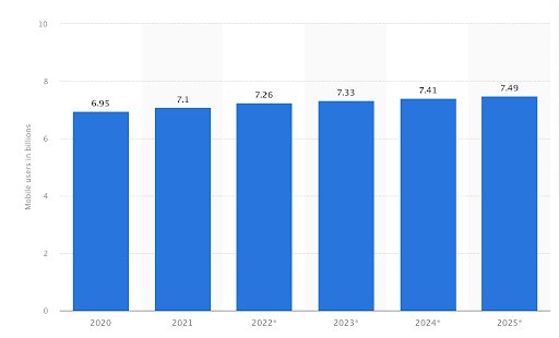
Image source: Statista
With the rise of mobile eCommerce, it has become necessary for eCommerce websites to follow a mobile-first approach in web development.
A mobile-first approach means designing a website for smaller screens first and then working up towards larger screens. Part of the approach is to have a responsive design, which enables on-site elements to automatically adjust and rearrange themselves to fit the screens of different devices.
With this approach, the content of the website is displayed in a way that’s comfortable for the users. It removes the need to perform operations like zooming, panning, resizing, or scrolling when users browse through the website. It contributes to the website user experience positively.
According to Alex Williams of Hosting Data, “A responsive site is of prime importance as people nowadays are mostly doing their shopping on their mobile devices. It won’t be surprising if one day we realize that we do most or all of our shopping using our phones in the future. So future-proof your eCommerce store as early as now and check if everything operates right on mobile.”
2. Optimize your homepage loading speed
Page loading speed refers to how quickly your content loads when a user visits a specific page of your website. It’s one of the factors that determine how long a site visitor stays on your website. A slow loading time will turn most people off and go somewhere else.
But how fast should the homepage loading speed be? It turns out, site users will not wait for more than 3 seconds for an eCommerce page to load. A slow loading time is a contributing factor to page abandonment and kills conversions.
According to research done by Google, as page load time goes from 1 to 6 seconds, the probability of the user abandoning the site (bounce) increases 106%. It’s safe to say, a slow homepage loading speed is a dealbreaker for many site visitors.
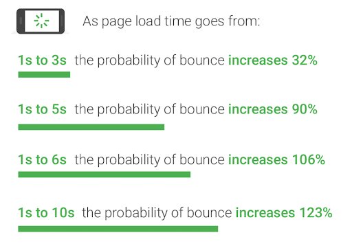
Image source: Think with Google
If the user experience takes a hit, it can have a negative effect on sales for an eCommerce site. The opportunity to engage site visitors and make sales vanishes when they abandon the site.
To speed up your homepage, here are some best practices you may want to keep in mind and implement right away:
- Compress your images. Large image files will significantly slow down your page, so use compression tools like Smush or Website Planet to squash out excess data that could be bloating up images.
- Minify your HTML. Another element of your homepage and eCommerce store in general that can tend to slow down your loading speed is your HTML. Minification is the process of optimizing your site’s code, like deleting unnecessary or redundant code or shortening code when possible.
- Enable browser caching. When you enable caching, any resources and elements that load on your site are “remembered.” What this then does is allows your homepage to load faster since elements like logos and photos don’t need to reload every single time.
3. Simplify search and navigation
A complex website design makes it difficult for users to navigate your site. Unnecessary clicks and extra steps to find the relevant content will negatively impact their user experience. If they don’t find what they are looking for right away, they will give up and move on.
When designing an eCommerce homepage, you should take into account users’ expectations and what they find most useful. Easy navigation enables them to find things more quickly and efficiently.

Image source: WISETR
The design elements must be logical and intuitive, from the placement of the search box to the location of the menu and toolbars. The structure should give users the ability to navigate between pages effortlessly. This contributes to a great user experience and ensures that they stay engaged while navigating through your site.
Because of this, consider adding a search bar at the top of your homepage menu so that users can easily navigate to different products, categories, promos, and even news and blog posts on your site.
For best results, conduct an A/B test for your search bar. Experiment with different search bar positions and designs to see which one brings higher conversions.
For instance, in this A/B test conducted by Best Choice Products for the search and navigation bar on their eCommerce store, their results found that a bigger search bar on mobile, versus a simple magnifying glass icon, gave them a boost in conversions.
We can infer that this is because users may not see the search bar right away when it’s only an icon on their phones. So by stretching out and revealing the actual bar where they can tap and type their query, it can help facilitate searches through their eCommerce store.
Of course, for your own store, it’s best to base this on your customers’ preferences, so this is where the A/B test comes in handy: you’ll know what’s the best way to simplify search and navigation with actual user data. Start A/B testing your design ideas to boost UX with VWO Testing 30-day free trial.
Download Free: Improve Conversions In 60 Days Guide
4. Maximize the space above-the-fold
Above-the-fold in website design refers to the section on a web page that is visible to the user without scrolling. This concept dates back centuries ago, to the beginnings of the printing press.
Since newspapers are printed on large sheets of paper, they have to be folded, with only the top half of the paper visible when they are displayed on the newsstands. The newspaper industry found a way to use it to advantage by putting attention-grabbing headlines, sensational stories, and eye-catching imagery above the fold.
In the case of websites, the fold pertains to the scrollbar. So, any content that is not immediately visible and requires users to scroll down is considered below the fold.
A good example is this page of FreshBooks. All the relevant information, links, and call-to-action are displayed above the fold. This makes it easier for leads and customers to know what to do next when they land on a page using their mobile phones.

Image source: FreshBooks
Applying the above-the-fold concept to websites is not as simple as the newspaper version because not all screens are the same. Different devices have different screen sizes and resolutions, so it’s quite tricky to determine where the fold line is.
There are no hard and fast rules but a good starting point is to know how the website’s dimensions appear to the user, taking into account the different screen sizes of devices. To maximize the space above the fold, put the most relevant, the most engaging, and the most important content that users expect to find once they land on your homepage.
Don’t be afraid to get creative and think out of the box. By implementing a split URL test, you can even see how an entire redesign of your homepage might help you boost your conversions and make more sales from your store.
This way, you can really make big changes in your above-the-fold elements to see which one performs best. Experiment with different copy, images, or call to action to see which homepage converts the most over a period of time.
5. Highlight your most popular products
It might seem counter-intuitive to promote products that are already popular because logic dictates that you should be making efforts to draw customers’ attention to products that are not selling well. But there’s a method to this madness.
Popular products already have a lot of buyers. In that sense, these products fulfill a need or solve a problem. People tend to be attracted to products that are popular because their popularity is perceived as a testimonial of sorts to the quality and benefits of the products.
By highlighting popular products on your eCommerce homepage, you are not only attracting potential buyers to purchase the popular products, but you are also creating an opportunity for them to buy other items from your product catalogue.
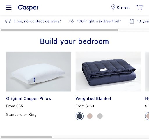
Image source: Casper
By doing this, you also can provide a better user experience for return customers. Your loyal buyers might be looking to repurchase their favorites. By making it ridiculously easy to spot then purchase their popular picks right from your homepage, you can encourage faster checkout every time.
6. Streamline your checkout process
Getting customers to visit your site is just the first step in their purchase journey. Even if they add items to the online shopping cart, it does not guarantee that they will push through and complete the transaction.
According to the Baymard Institute, 69.8% of customers who add items to their cart will leave and not proceed to the checkout process. While there are several reasons for cart abandonment, one that deters people from completing a purchase is a long and complicated checkout process.
Creating a streamlined and customer-friendly checkout process has a positive impact on user experience and helps increase conversion rate. You must establish a clear route to the final purchase so that they can go through the process smoothly without distractions such as excessive upselling.
If you bombard customers with too much information and options, they are likely to get confused and abandon the cart out of frustration. You must remove unnecessary steps required to complete a purchase. Fewer clicks mean faster checkouts. Some platforms make it possible to have a two-step checkout process for eCommerce stores. Amazon has a 1-click checkout option which makes purchasing extremely fast.
It’s also important to present a clear order summary with a breakdown of quantity and cost so they know what they are buying. You must also provide an option to remove items and make it easy to go back and continue shopping.
The streamlined checkout process must be complemented by an easy payment process. This requires carrying out research on the payment preferences of your target audience so that you can integrate the payment gateways into your site.

7. Make it easy for your customers to come back
Every business wants to acquire new customers and get repeat sales from returning customers. High-quality products and excellent customer service usually do the trick. But a few strategies can make it easy for your customers to stick around.
Repeat customers help generate a steady stream of income for your eCommerce business, so it’s important to give them a reason to shop again. Incentives like loyalty programs, discounts, free shipping, and special offers can all be integrated into your eCommerce site so that they will be encouraged to visit more often.
But more than the incentives, it’s the constant improvements on your site that will make customers come back. If you make shopping more convenient for them, they are likely to return, even with just the occasional email reminder.
Customers want to have an easy way to contact you if they have questions or concerns. You can make your customer service team available through a live chat integrated into the site itself. This also improves your interaction with them and you can get valuable feedback which you can use to further improve your service.
Online purchases require customers to have some level of trust in your eCommerce site. They want assurance that their data is safe when they transact business through your online platform. You must give that assurance for their peace of mind.
The ability to track their orders and shipments is a great way to get customers to come back to your site. If they are on the site, there’s always a chance that a product or an offer will get their attention, which is another opportunity to make a sale. More so, if they get personalized recommendations and tailored content that will encourage them to engage with your brand.
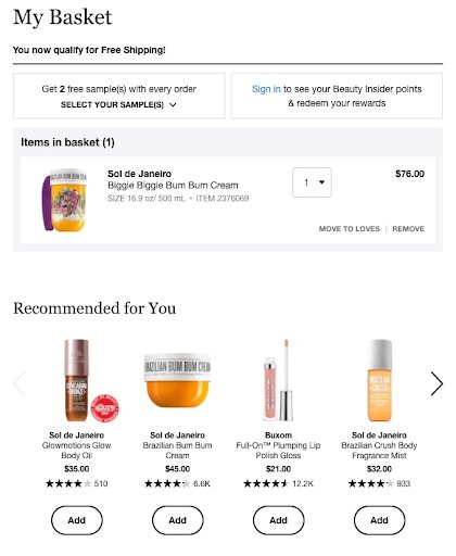
Image source: Nosto
Another way to help customers keep coming back to your site is through the use of push notifications. eCommerce stores and websites have increasingly been making use of this relatively new feature to get their customers’ attention and have them return to their site even if the browser is not currently opened.
Set up a push notification opt-in on your homepage, so when a visitor subscribes, they’ll get notified for any new promotions, offers, or flash deals your store might want to share. And because push notifications get much higher click-through rates than email, you can increase conversions without worrying that customers aren’t receiving your notifications.
Key takeaways
When customers reach your eCommerce homepage, they expect to find relevant information about the product they wish to buy and want a quick and hassle-free online transaction. Your job is to meet and exceed customer expectations by providing them with a positive user experience at every step of their purchase journey.
Following these seven eCommerce homepage best practices makes it easy for visitors to interact and engage with your brand and it increases the likelihood of completing a purchase. When your customers have an enjoyable shopping experience, they are likely to return and repeat the process all over again. Start a 30-day free trial or request a demo to get started with optimizing your homepage to boost UX and conversions on your eCommerce website.
Today, the no-code revolution has empowered people with limited or no coding skills to create websites and apps without writing a single line of code. There are ample no-code tools in the market that enable you to make edits on your website without requiring any coding skill and create webpages and apps altogether. This makes no-code very nifty for new-age business ventures.
Download Free: Website Optimization Guide
What is no-code?
You do not have to be a programmer, coder, or developer to build and edit a website nowadays. But for the longest time, marketing and product teams have depended on development teams and got blocked by their bandwidth and constraints.
To mitigate the tech resource constraint and for quick deployment of business-transforming ideas, nearly all industries have embraced the no-code movement for the better. As anyone could predict, the revolution brought a boom in the no-code tools industry and also helped businesses establish themselves online and accomplish their conversion goals faster despite possessing limited skill sets.
VWO’s Visual Editor is one such tool that enables you to edit website elements on the fly, with zero intervention from the development and IT team. Before you ship any edits to your visitors, you can also know the impact of the changes through A/B Testing.
Difference between no-code and low-code platforms
While no-code platforms are intended for business users where they can perform simple actions without instructing the machine, low-code platforms are primarily for developers to build complex applications fast and easy. Unlike no-code platforms, users of low-code tools can customize the code and can perform third-party integrations as well.
For example, VWO features a Code Editor that helps developers make complex changes directly in HTML/CSS/JS enabling website owners to make complex and sophisticated changes through low-code. A non-developer can simultaneously make changes to their website in the no-code Visual Editor.
VWO’s Visual Editor allows website owners to make changes primarily without any coding (no-code). However, a few complex changes can demand a bit of fine-tuning through a mix of point-and-click changes and minimal coding (low-code).
What is a visual website editor?
Visual website editors enable you to create, design and customize your website without having to code your webpages. These editors offer an intuitive and user-friendly UI for people having no coding knowledge. Anyone can make changes on the website without seeking help from developers, almost instantaneously in a point-and-click or drag-and-drop manner.
For instance, Dorado Fashion increased its overall business conversions by 80% by removing a background image from its homepage and modifying its search icon. This change enhanced visitors’ focus on the search bar, enabling them to land on desired landing pages and make a purchase. With the VWO Visual Editor, making such a change requires just two clicks—the first one to select the image and the second one to click on the delete icon.
Edit with ease in VWO Visual Editor
Text and images
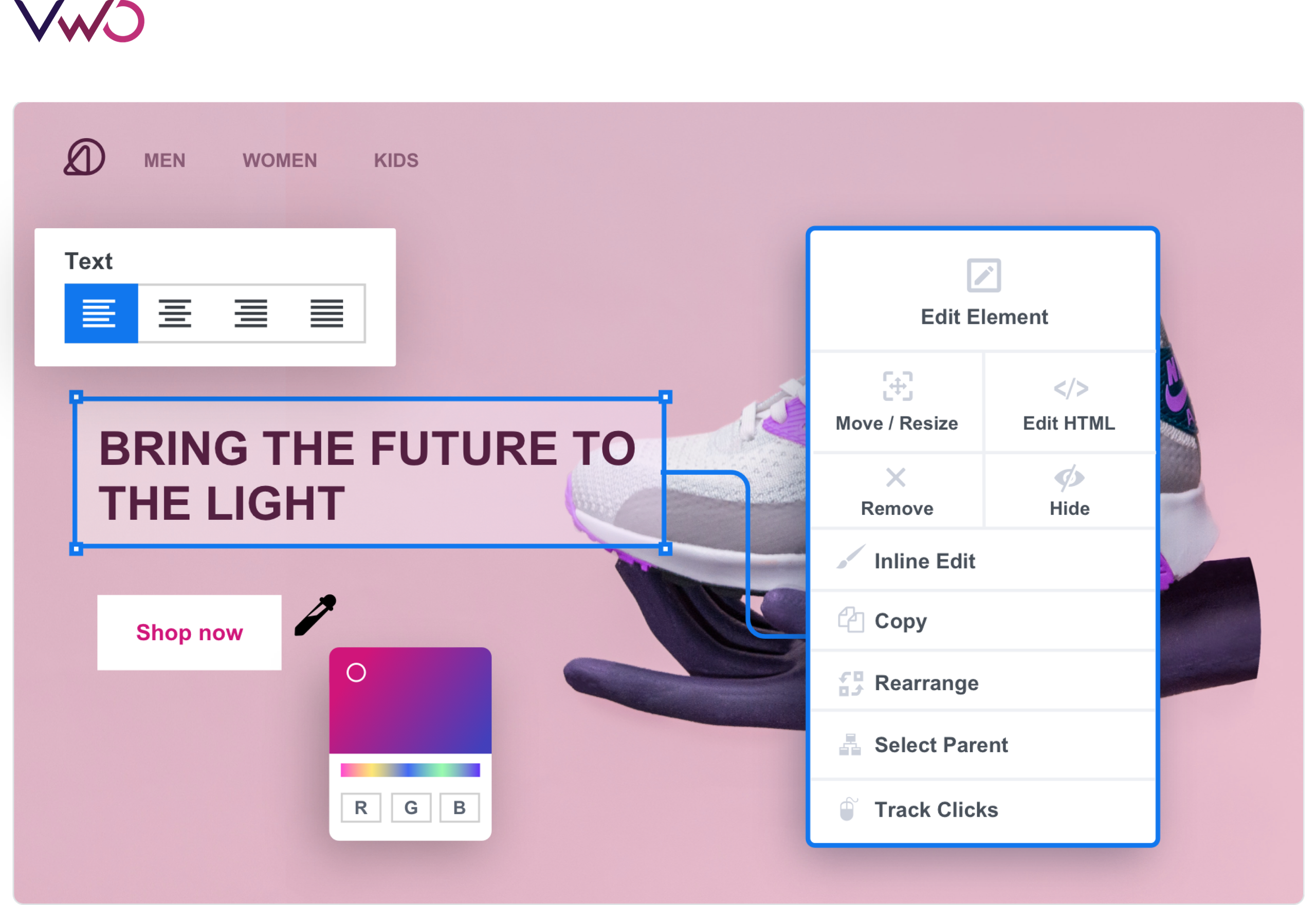
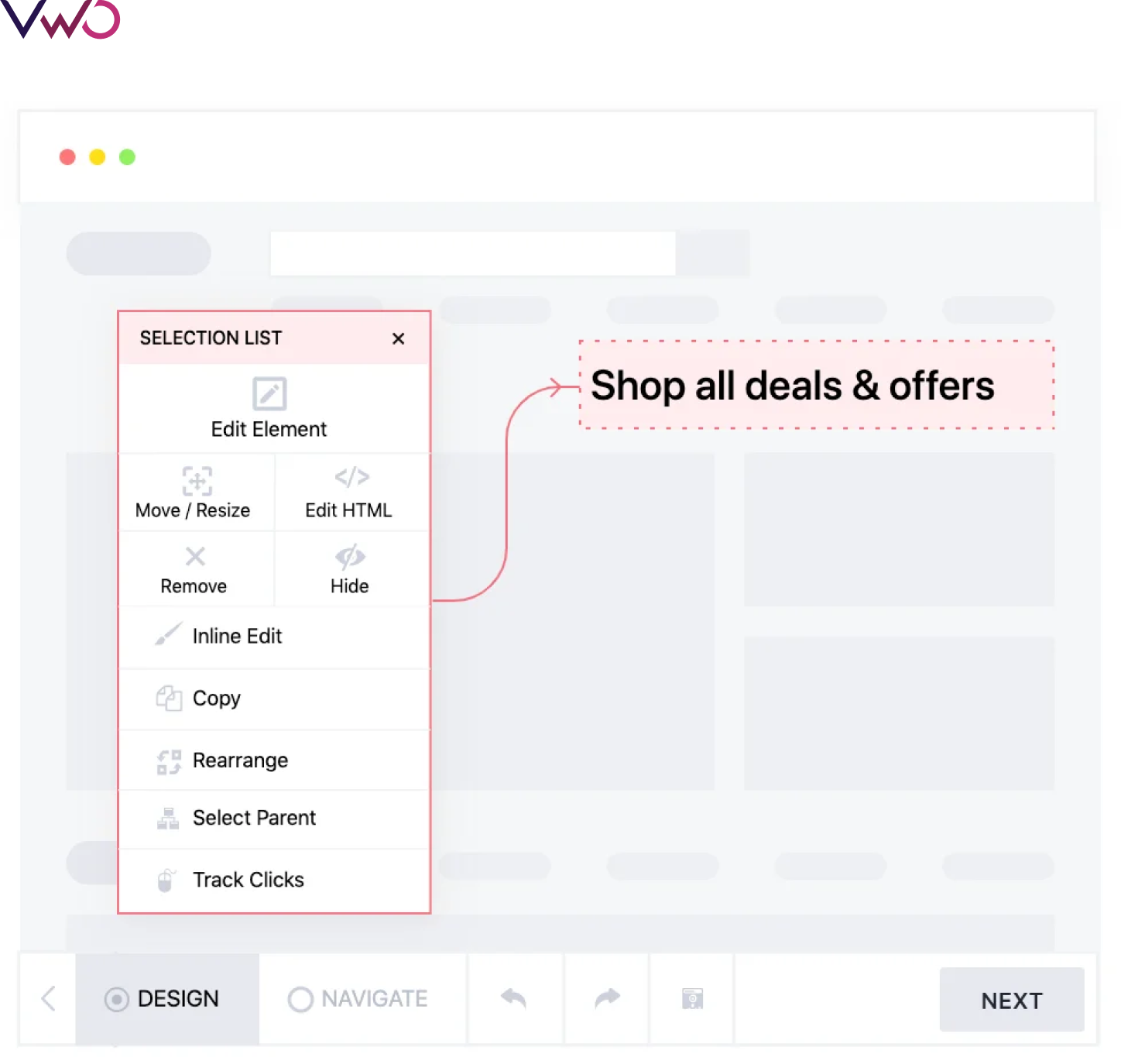
With VWO Visual Editor, you can easily edit text and image elements on your web pages and optimize the page for increasing conversions, which could be anything ranging from adding a product to a cart to a number of purchases of a particular product. For example, if you want to change the copy of your CTA button to increase conversions, you can do so with a few clicks in the visual editor.
Widgets and new elements
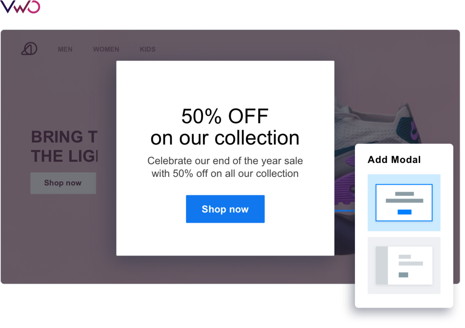
Adding new elements to a hard-coded website used to be a time and resource-intensive process in the past. However, with Visual Editor, you can add banners, modals, text, and lists with just one click! In addition, you can build your own library of widgets to reuse later on your website.
For example, forms are a great way to collect user information that you can utilize in your marketing campaigns. You can control the form fields, the associated text like headlines, descriptions, and field labels, and create pop-ups where forms are embedded in Visual Editor.
AI-based text suggestions
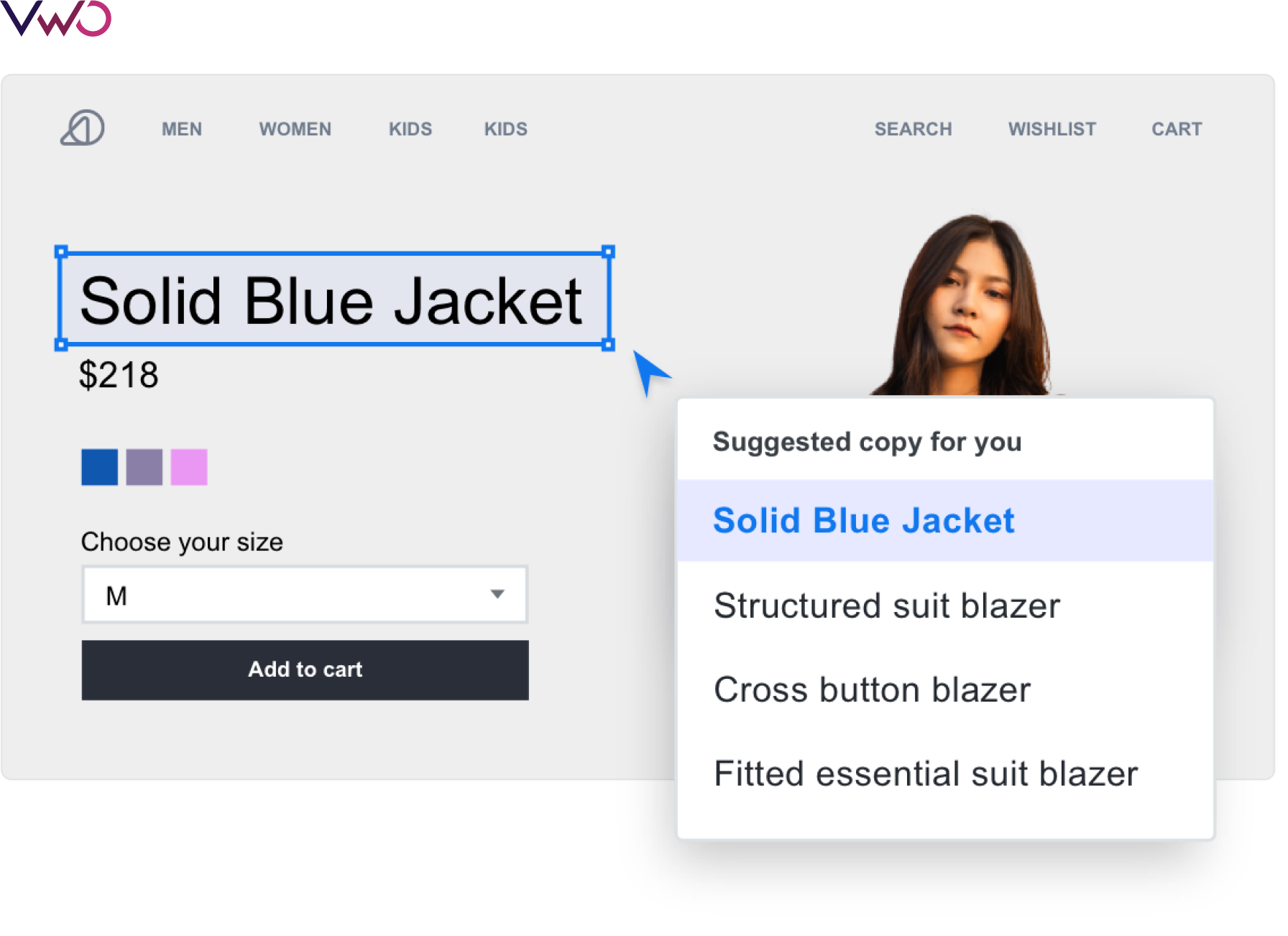
GPT-3.5 Turbo is a third-generation powerful language generator that uses machine learning to predict and produce text. You can select a sentence or any copy on your webpage and request the Visual Editor to suggest a copy. You can also choose a text from a large set of suggestions with the GPT-3.5 Turbo-powered AI text generator. The suggestions are based on the existing content on your website, such as headlines, product descriptions, CTA buttons, etc.
Dynamic elements
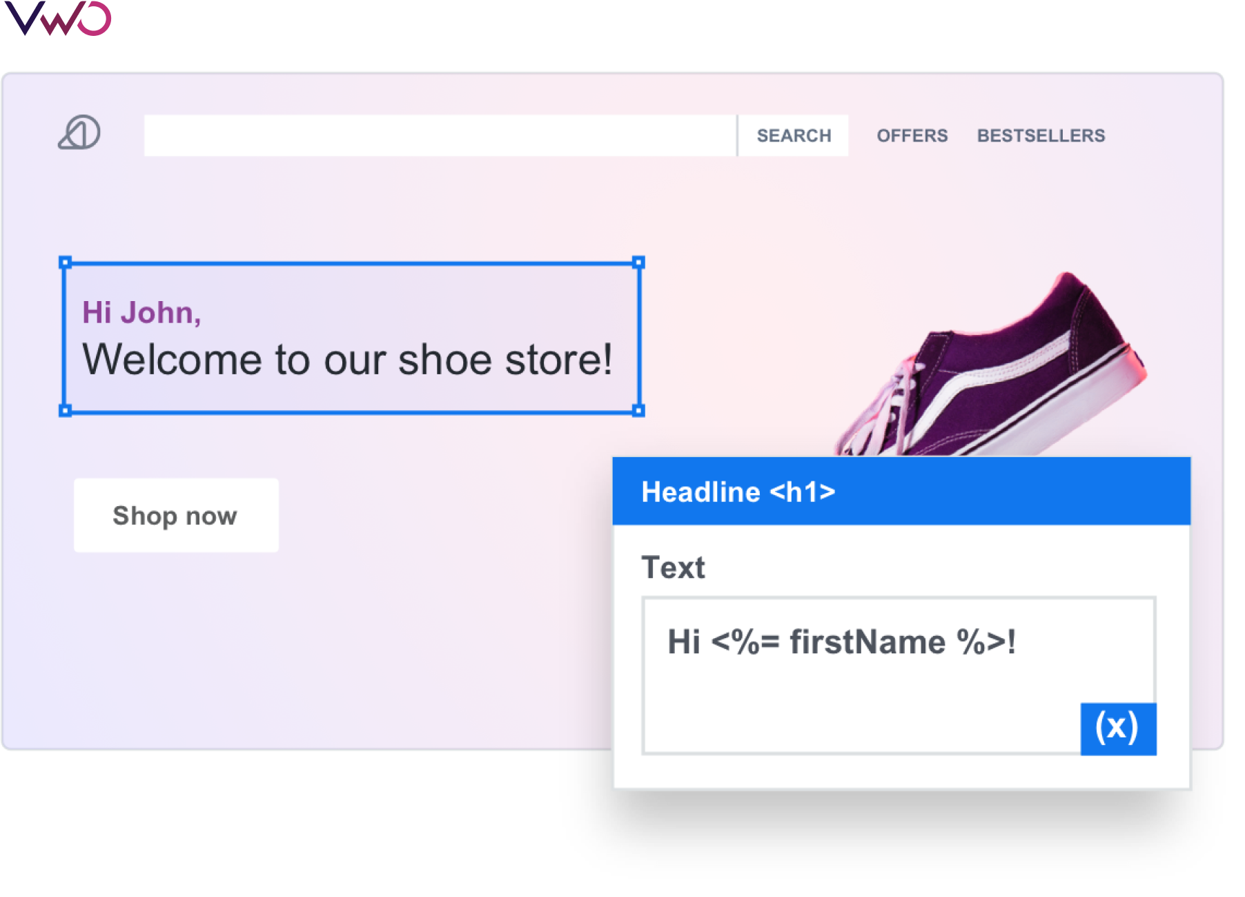
Visual Editor offers micro-personalization of website content. It uses on-page elements as variables to modify website content based on available data points such as the overall context, visitor profile, past activity, etc. You only have to select a section of your webpage by clicking and then convert it into a dynamic variable. This dynamic variable can be configured with your integrated tools to show content specific to a visitor or user.
[Please note that this content must be available in your database. You can also show a default value as a fallback wherever unavailable.]
Apart from that, you can get deep insights into visitor behaviour as well that help you form a strong hypothesis for the changes leading to your A/B test to identify the best-performing image, text, modal, list, and copy on your website.

Download Free: Website Optimization Guide
Testing Visual Editor webpage changes
With no code, making changes on your web pages has become convenient and hassle-free like never before.
The changes you make on your web pages can have three possible outcomes on the metrics that affect your business:
- Positive impact
- No impact
- Negative impact
While your intentions would always be toward positive impact, ensure that your intention and outcome are aligned. When you A/B test your changes, you can ensure the intention—impact alignment before you make the deployments.

Deploying changes with Visual Editor
There are many situations for a marketer when a flat change is required. Situations like a planned downtime for maintenance or deployment, rebrand, redesign etc., are very common in a marketer’s day-to-day work (For example, let’s say, a Covid-19 banner alert). In such cases, making changes on the website is urgent and need not be blocked by developer bandwidth.
With VWO Deploy, you can easily make changes on your website, validate them across multiple browsers and screen sizes to ensure a seamless visitor experience, and release the changes with just one click! You can also choose to schedule your releases, roll back any changes and maintain a change log for audits.
Watch how easy it is to set up a VWO deploy campaign:
Segmentation opportunities
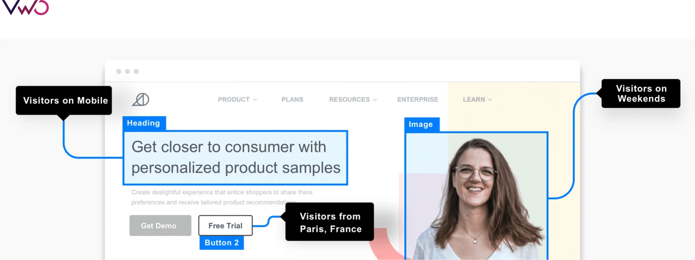
Pushing changes to a specific visitor group is also possible with VWO Visual Editor using segmentation. For example, if you want your mobile visitors to see a particular copy, image, and CTA button over a weekend, you can do that with a few clicks.
Conclusion
The visual editor is promoting experimentation and deployment ease in big organizations and enabling the smallest of start-ups to be a part of this new-age digital economy.
With tools offering no-code website functionality such as VWO’s Visual Editor, you can utilize it primarily for faster product experimentation and continue to freely optimize your website’s conversions, bypassing your development team’s bandwidth constraints.
So should developers call it a day? Not any time soon! Since no-code tools are going to only facilitate the expansion of the web space to accommodate more businesses, coding is a skill that will continue to grow. No code opens gates for all to be a part of a thriving digital economy, but developers will continue to have their share of path-breaking innovations and giant leaps.

Even though the outcome of SEO and Pay-per-click ads can be quantified more easily, and the true impact of CRO only shows over time, CRO should be prioritized. This is because not optimizing your website could eventually push back your SEO and PPC efforts too. If you cannot convert your visitors into customers, you are not doing justice to your brand and traffic spend. Without CRO, you also run the risk of focusing on vanity metrics and lose money due to lost opportunities and conversions. Besides, your decision-making around website updates, if not conversion-focused, can end up costing the company too.
Download Free: Advanced CRO Program Guide
Rutger Kühr, Head of CRO at Pricewise, says,“CRO is not just about getting the golden nugget of a 20% uplift, but also about preventing bad ideas from going live”.
Rutger believes that while it could work differently for different companies, without CRO, any change in eCommerce is a gamble.Despite this, many companies still do not set aside money specifically for CRO. Also, those starting to understand its importance might not know how to budget for it. If they spend on CRO at all, the funds are likely to be drawn from a shared marketing pot. Having worked with thousands of brands, at VWO, we’ve realized that many companies struggle to transition from this shared budget, where CRO is not a priority. Hence, we want to demystify the CRO budgeting process for you.
In this guide, we share our findings providing an actionable framework with real-world insights.

What are the benefits of creating a dedicated CRO budget?
Budgeting for CRO generally means you are looking at either hiring an agency or investing in bringing CRO in-house.
Here are some common benefits of creating a separate CRO budget:
- You can hire dedicated staff or an agency to run tests. Dedicated staff can coordinate with other departments allowing for a CRO strategy that aligns better with overall goals.
- If you have the budget to hire a dedicated CRO Manager, you can create a robust CRO testing roadmap.
- You are not fighting for funding against other marketing functions.
“To us, it’s just as important to spend on CRO as it is to spend on our advertising or our creatives”, says Harry Cederbaum of Twillory eCommerce company.
Rutger from Pricewise puts forth the perspective of flexibility to this. Though a staunch advocate of CRO, he does not agree with attaching a specific number to it.
“If you put aside a fixed amount for CRO, you’re probably missing out on potential opportunities outside of that amount”, he says.
What constitutes the budget for CRO?
Here are four of the main categories that you must consider within your CRO budget:
Human capital
Human capital is likely to be the highest cost as a proportion of your budget. Human capital costs include the cost of your existing staff spending time on, or any new team members hired, to meet your CRO objectives. It also includes fees for external consultants or agency teams, if you’re using them.
Building an in-house team (it is unrealistic to combine all required skills into a single role) usually costs a lot more than outsourcing your CRO program to an agency. If you do opt for building a team of experts, you would ideally need at least one specialist each in the area of project management, strategy, UX design, data science, and front-end development. Even a conservative estimate of the team’s total compensation would fall at nearly half a million dollars annually.
Hiring a digital marketing agency to run your CRO program can cost you in the range of $3k/month up to $9k/month. If you choose to get a freelance CRO practitioner on-board, you tend to pay them $10/hour to $400/hour, depending on the level of expertise. The other alternative is hiring a specialized CRO firm – the top ones can cost you around $16k/month, but you can also find some of the smaller ones charging approx. $3k/month to $5k/month.
Tool cost
Alongside staff costs, you’ll also need to consider the cost of any tools or equipment you need. Tool costs will depend on the providers you use and the features you require.
On average, companies spend nearly $2,000 a month on CRO tools. The tools available in the market can be evaluated based on your requirements at each stage of the CRO journey – research, hypothesis, prioritization, testing, and learning. If you’re a beginner in CRO, there are free tools with basic features that can give you a headstart. Depending on your level of CRO maturity, you can also choose a single, integrated tool like VWO for all your optimization needs. VWO comes with an all-inclusive and guided 30-day free trial that you can opt for to try the tool for yourself. Alternately, you can request for a demo of the tool that explains all features in detail.
Harry from Twillory explains how decisions around acquiring a new tool are based on reviews in their company.
“If we are considering a new tool like VWO, for instance, we have a review for whether we want to invest in it. We are a bootstrapped company and don’t have VC money to spend, so our decisions are usually based on reviews”, he says.

Opportunity cost
Opportunity cost refers to revenue lost as a result of the choices not made.
CRO helps you identify the best call-to-action (CTA). In the period when your website runs with the lower performing CTA, you are incurring an opportunity cost.
For example, if you decide to use CTA Option 1, you lose the potential sales you would have gained using CTA Option 2. If Option 1 is less successful, you have incurred an opportunity cost during the period CTA 1 was run.
Once a winning variation is identified, it takes time to deploy it on the website. There is a cost associated with the time lapse between testing and implementing a winning idea. What you need to bear in mind though, is that A/B testing is an important part of the CRO process. What it essentially does is prevents you from making changes to your website that don’t improve conversions and implementing ideas that could potentially damage conversions.
Take a free trial with VWO and start A/B testing your website for improved conversions.
Experimentation regret
During any test, one version will perform better than the other, however small or sizable this difference may be. If the variation performs better than the control, the overall performance of your website will be better than the status quo. Experimentation regret, on the other hand, is if the variation happens to perform worse than the status quo, therefore resulting in an overall decreased website performance.
When you create your CRO budget, aim to strike a balance between highlighting potential issues and focusing on the potential benefits.
Does a CRO budget fit into your current needs?

Before you go any further, consider whether a budget is right for your needs at this time.
According to Rohit Dey, Optimization Consultant & Sales Head North America at VWO, clients start thinking about budgeting for a CRO service when typically one of these two things happen:
- They’ve started acquiring traffic through paid mediums and they understand the composition of this traffic along with the conversion rate for each of these traffic mediums. Now they want to see an ROI on it.
- They are reiterating their design philosophy i.e. taking major design decisions that they need to validate and make sure that they impact conversion rates positively.
Rohit also believes that a lot of organizations are realizing that analytics, by itself, is not enough.
“Analytics gives the answer to ‘what is the problem on your website’, but does not explain the ‘why’ of it. Getting to the solution for the problem requires a hypothesis, which in turn needs research and data. Organizations look for CRO services for this”, he says.
How to prepare your CRO budget

If you’re preparing a budget for CRO activities, it means you’re convinced that these activities will impact your bottom line positively. But you need to convince your management on this too (more on how to do this in the coming sections). If everyone is on board with the idea that the resources required are worth the end goal, budgeting should be a smooth process for you.
Start with calculating your lead value. If your average lead value is $5, and you’re generating 5,000 leads every month, you know you can set aside less than or equal to approx. $25,000 for setting up CRO tools, and a team. As your lead value increases, you can consider increasing your CRO budget too. Likewise, if an A/B testing tool costs less than the lead amount it generates, you can go ahead and purchase it.
Rutger from Pricewise says, “It depends on the tool you’re using and where you’re storing results. For instance, client-side testing can be done in-house with developers but would be more expensive for us than using a tool”.
There could be some tools and talent already within your organization that you could maximize for CRO. It’s a good idea to scope the projected use of these in your budget.
Set conversion goals in your budget that circle back to quantifiable, profitable returns for your company. Calculate your present conversion rate to determine a baseline and set benchmarks for the tests you’re committing to in your budget.
According to Alan at ClickThrough Marketing, it typically takes 10-14 months to see a good ROI and actionable learnings from CRO experiments. So you’d want to start with an annual budget that allows you sufficient time to test your ideas and analyze the outcomes.
Based on your specific reason for investing in CRO, you can create a budget and build a CRO test case that aligns with your goals.
What you need to be mindful of is that demonstrating value early on in your CRO journey is very important. Without that, getting a budget sanctioned in the future may not be possible. To get early results, make sure you scope for and focus on experiments that don’t require a lot of development work or occur on low-traffic pages, hence slowing down your testing velocity. VWO’s Bayesian-powered stats engine, SmartStats, enables you to conclude tests faster and more accurately.
Take a free trial with VWO to improve your testing velocity.
Download Free: Advanced CRO Program Guide
How to decide if you should use an agency or an in-house team

One of the most significant decisions you will make as you draw up your budget is whether to hire a CRO agency or manage your campaign in-house, and the right choice will depend on your company and your needs. There are numerous considerations to make.
First, consider the skills and capacity within your existing marketing team. How much do they know about CRO? Companies with a strong marketing team that already understand CRO might consider directing existing staff time towards the process rather than hiring a new person or bringing in an agency. However, this may not be a good idea in the long term. The skills needed for nailing CRO are wide and deep, and many marketing teams might not have the required knowledge of say, statistics, psychology, or user research. The question then would be if you’re willing to spend considerable time to upskill your existing pool of resources, or use an agency.
You can start with a smaller budget focusing on those low-cost, high-reward options we mentioned earlier. Just keep in mind that CRO can fail if you don’t have the right person for it in-house. Something as simple as not knowing when to conclude a test can damage your position to get further buy-in for CRO from the management.
Also, hiring is expensive. As mentioned before, putting together even a small team of specialists would cost more than what many companies, particularly smaller businesses can afford.
For this reason, it may make more sense for small businesses and newer companies to start out by working with an agency.
Here are some of the benefits of working with an agency:
- Shorter project-initiation times. Hiring a new team member and getting started can take weeks or months, whereas a project with an agency can be initiated in a matter of days.
- Greater flexibility.
- Smaller upfront budget commitment.
- Shorter-term financial burden.
- Strategic experience in experimentation and building a testing culture so you get the ROI needed to convince stakeholders.
- A wide range of expertise in different areas that would prove very expensive to achieve in-house.
- An unbiased approach to conducting research.
Working with a CRO agency can cost anything from $5,000 to $16,000 per month as mentioned earlier, depending on your project’s size, complexity, and the velocity of testing you opt for.
Another option for companies is to start their CRO journey with an agency and transition in-house when the timing is right. Agencies are equipped to help companies build and run an in-house program. Also, your CRO program does not end when your contract with the agency ends, it makes sense to use the agency when extra resources are needed or for help to resolve specific challenges. Therefore, the options need not necessarily be mutually exclusive.
Here are some benefits of bringing CRO in-house:
- An in-house team will be focused solely on your business, as opposed to having multiple clients.
- An in-house team can work out more cost-effectively if you are dedicated to CRO as a permanent business function.
- In-house staff can get to know your business best.
- Stronger opportunities for collaboration between teams.
The team associated with each business unit works closely together to share best practices, monitor progress, and fix anything that isn’t working. With CRO specialists entrenched in the company, they can operate in an agile fashion, planning on a month-to-month basis with an eye on the long-term goals and overall KPIs.
An in-house CRO team can be structured around 3 models depending on your company size, CRO budget, and metrics: centralized, decentralized, and center of excellence (COE). Centralized teams focus on developing long-term optimization strategies and have localized expertise within the team. Decentralized teams have responsibilities distributed among team members across departments. The COE model utilizes a combination of centralized and decentralized approaches. Each model has its own set of advantages and disadvantages, so figuring out which one works best for you is important. One final aspect that you might consider as you make your decision around hiring is your average order value.
Alan at Clickthrough says, “if the average order value for a website is high, then [an agency’s] capability to get that return on investment is much greater”.
Creating a proposal and making a compelling case for CRO
Before you begin constructing your proposal, there is some critical information you will need to gather.
- What is the current conversion rate on your website and how is it being measured?
- How does your company currently define conversion? Which important actions is it aiming for visitors to perform?
- What is your maturity level compared to others in your segment?
- Which tools do you currently use to manage your website and analyze its performance?
- Who are the important stakeholders, and who are the people you need to liaise with on an ongoing basis for the CRO program to work effectively?
Once you have this information in place, create a proposal that incorporates the following:
- Your explanation of what CRO means and how it will improve the business.
- Your conversion goals and how you will measure them.
- The process you will follow to achieve the goal in terms of audit, action, and reporting.
- The existing resources that you will need access to; both tools and talent.
- The cost of planned CRO activities bundled in an easy-to-consume package.
- The expected outcome and ROI.
If you’re bent towards hiring an agency, you will most likely receive such a proposal from their side. If you’re considering CRO in-house, you will need to create one.
In either case, each of the proposal elements should focus on the company’s benefit. The proposal should clearly articulate how the CRO goal of getting more visitors into the sales funnel will be achieved. Rohit from VWO explains that an agency’s focus during the proposal stage is to help the client understand that CRO is a process, it would take 6-12 months for a successful CRO program to
yield results, and what a projected uplift in conversion rate would mean for the client in terms of say, gross sales or number of leads.
“We focus on the ROI, and then justify the investment in the CRO program. We also focus on learnings – we don’t say every experiment will be a winner but there will be a learning in each experiment”, Rohit says.
As a follow-up to the proposal, many companies also present a business case to the senior management highlighting specific financial details of the budget. For instance, considering your current traffic and conversion rate, how much an X% increase in a particular metric could drive in terms of revenue, how it could make paid campaigns more profitable, or allow you to spend an additional X amount of money into ads to scale your business.
Navigating the proposal process
The proposal process is likely to include the following steps:
- Generating buy-in from relevant team members.
- Getting support from the Head of Marketing (or equivalent).
- Running test cases and gathering data.
- Creating your proposed budget.
- Presenting your proposal to the Board or C-suite.
- Answering questions about your proposed project. You’ll need to show you have thought through the possible risks and taken steps to manage them.
- Possibly refining your proposal or providing more information, if required.
If you use a financial justification for CRO, present specific numbers and robust data at every stage of the process to support your case.
“Associate CRO to one lever in the organization – whether it’s UX, financial, or operational. Explain what an un-optimized form means for say, an insurance provider. What does the loss of conversion look like in terms of revenue loss?”, Rohit from VWO explains.
Often, focusing on the negative can get you the buy-in you need. You could stress on something like – CRO will get you a 10% uplift (which is very tough to predict in the first place) – or you could show how bad UX will create a negative brand image. The latter could prove to be more effective.
How to design an initial test case that builds buy-in
A test case is a set of actions designed to prove a hypothesis – in this case, that CRO matters and is worth the investment. Your test case should be low risk and high reward. In other words, the investment cost in time or money should be minimal, while the outcome will help either decrease cost or increase earnings.
You will need to design a simple experiment and establish a framework of trackable KPIs to demonstrate the outcome. Focusing on compound annual earnings when measuring success can help. In other words, how much additional revenue are you likely to generate for the next year based on the results of a successful test?
For example, let’s imagine that you design a test case based on changing the layout of your sales page to improve the customer experience. Now let’s further imagine that this change brings in a 5% increase in conversion rate. That number might sound small, but project it out over the next year. What does that small increase in conversion rate mean in terms of annual revenue?
A great test case should have the following characteristics:
- Low cost – both in terms of the financial cost and time.
- Easy to implement.
- Easy to replicate or re-run if necessary.
- Controlled for other variables. For example, don’t run your CRO test on Black Friday when your revenue increase can be easily attributed to the sale instead of your CRO efforts.
- In addition, you should consider the long-term potential (or lack thereof) for a test and result. Alan at Clickthrough told us about a test he ran using the “dark mode” on Apple’s iOS system. Though the initial results were promising, he noted that they likely wouldn’t last. “Those results are likely to be short-lived because dark mode was a trend”, Alan says.
There are numerous test cases you could run, but the important thing is to start with research or user insights and identify the low-hanging fruits. Based on your observations, you could formulate a hypothesis around some of the examples mentioned below :
- Changing the wording, color, or placement of your call to action. For example, in one test VWO ran for a client, a simple change to the CTA button yielded a 62% increase in conversions.
- Improving product image quality.
- Adding customer reviews or testimonials to your sales page.
If you ensure your test case meets all the criteria we outlined above (low cost, easy to implement, easy to re-run if necessary, and controlled for external variables) and is based on user insights gained from research tools like heatmaps, you’ll ensure that you present a results-oriented and detailed case for CRO budgeting. If this sounds tricky, you can always get in touch with our experts at VWO for a detailed audit of your website.
Common problems that might sink your budget (and how to avoid them)
With any project, things can go wrong. If you’re the person in charge of the project, the blame will land on your feet. The best way to avoid this is to be aware of the areas that could cause your CRO project to go over budget or identify tests that might fail and mitigate those risks.
Some of the most common budget-sinking problems you should be aware of are:
- Delays. Preventable delays are the biggest cause of project overspend.
- Testing ideas that are based on gut rather than user data; which is likely to lead to failed experiments.
- Incorrect prioritization of hypotheses i.e. the high impact ideas are not tested first.
- Lack of patience to see the first (and regular) “successful” tests.
- Inability to interpret test results correctly, so you don’t know what to do with them – implement or take learnings.
- Incomplete buy-in/support from management/relevant teams you want resources from.
The best way to manage these strategies is to have a clear plan and be aware of what you want to achieve. For instance, you can avoid delays by creating a clear and realistic timeline for the project, with numerous smaller deadlines and check-in points along the way.
In addition, when an experiment fails, or you don’t see the results you wanted, ensure you take the time to learn from them. Every failure teaches you something that will enable you to increase revenue, improve customer experience, or streamline your processes next time.

How to strategically scale your CRO program and increase your budget
CRO is still undervalued in many companies, with senior executives preferring to use their budget for traffic acquisition rather than increasing conversions. To overcome this, you need to demonstrate the value CRO can add. Low-risk, high-reward tests and a strong project proposal and budget are the tools that will allow you to do this.
The trick to a scalable strategy is to build a company culture that values experimentation and sees the value in CRO.
You need to be forewarned with the knowledge that CRO investments tend to go down the path of diminishing returns if not treated wisely. A boost from 1% conversion rate to 2% will generally cost less than a boost from 2% to 4%. You then need to adapt your strategy as your website gets optimized – test bolder ideas and test more broadly throughout the business.
As Alan from Clickthrough Marketing says, “CRO is not cheap, but if you do it well, it pays more dividends than you can hope for. You need to be open-minded and think long-term”.
This means that what matters more is not what you use, but how you use it. Your ability to use the tool properly is important to get the job done.
I never really vouched for it. How do you expect a doctor to treat you properly if there are no advanced and efficient pieces of equipment for making the right diagnosis in the first place?
Quite honestly, it’s the same when you’re in the experimentation arena and looking for an A/B testing tool, also called split URL testing tools, to improve conversions through this exercise.
Download Free: A/B Testing Guide
In fact, you can only expect your team to show results when you provide them with the right testing tools to work with. The right tool brings out their best skills and helps move business metrics forward by allowing the testing of ideas before launching them. Having said that, we don’t mean you should become complacent with your team’s current skill set. It’s not until you have both – the right tool and the necessary expertise – that you can reverse a low conversion rate by implementing effective ideas.
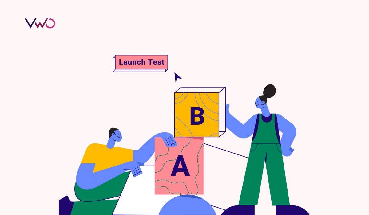
But how do you recognize which A/B test tool fits your business needs in the first place? Especially in a saturated market that is overflowing with over a hundred testing options.
To save you time and hassles, we list the top 13 A/B testing tools you can pick from in this blog.
Table of Contents
- Top qualities that make a great A/B testing tool
- Best among the rest – Our recommendation
- Now it’s your turn to decide!
- Frequently Asked Questions
Before we dive in, let’s discuss the characteristics you can’t compromise on when choosing the best A/B testing software for your business. It’s a practical question to ask yourself. And we will give you the answer below.
Top qualities that make a great A/B testing tool
Supports Different Types of Testing: When you’re looking for an A/B testing tool, don’t be fooled by the name. You’d want a tool that gives you the flexibility to run any type of test – starting from A/B tests and Mobile app testing to Split URL testing, Full stack, and Multivariate tests – depending on your requirements.
Effect on Load Time: Synchronous code runs in a linear order and may block the web, landing pages, or product pages from rendering until the code is fully executed. This can cause delays in page load times, impacting user experience negatively. On the other hand, asynchronous code allows web or landing pages to load faster by executing code in the background.
Some of the best split testing tools offer both types of code implementations which allow you to choose an approach that works best for you.
Intuitive Interface: If an A/B testing tool has an intuitive user interface, you or your team can have a quick one-time training to get started, and an ongoing extensive dependency on IT teams is not required.
So, when choosing from the top testing tools, look for how easy it is to use. Can you set up A/B tests quickly? Are the labels and cues easy to understand? You can sign-up for a free trial to experience the look and feel of it before making your final call.
Advanced Targeting: Look for an A/B testing tool that can target tests to specific groups of people based on landing page URL, location, times, device, traffic source, and other conditions.
Advanced targeting allows you to target specific groups with specific tests to learn more about their behavior on your website and create a better customer experience.
Maximum Integrations: The A/B testing tool you use should be integrable with as many meaningful third-party platforms as possible for a seamless export and import of data to enrich and launch marketing campaigns across platforms. The best A/B testing software is that lets you build your own custom integrations or build an integration you request!
Accurate Test Results and Analysis: Below are some questions you can ask the vendor of an A/B testing tool:
- What is your methodology for calculating statistically significant A/B testing results?
- What level of confidence do you typically use for determining statistical significance in A/B tests?
- How does your tool account for factors like sample size and confidence level in determining significance?
Only when your test results are accurate, you can make changes. And when your experiment results are statistically significant, you can be sure that they’re not just due to chance or random variation.
At the same time, you must look if the tool lets you interpret A/B test results by offering easy data visualization techniques. The quicker you can infer from your test results, the faster you can make data-driven business decisions.
Customer Support: Features and capabilities are of course important when you’re choosing a tool. But some of the best A/B testing tools stand out for offering high-quality customer support. Is there a support system you can fall back on in case you face any problems using a feature? Is assistance offered through various channels like email, phone, live chat, or help center? Having reliable customer support gives you peace of mind and also ensures that you’re leveraging the tool correctly and effectively.
VWO has the best support team of any SaaS platform I’ve worked with, without a doubt. The level of personalized, direct support that we receive on a regular basis is just incredible. We have vendors with support teams in the same time zone as us who aren’t nearly as responsive as VWO
Scott Antrobus, Product Manager, Weekends Only Furniture & Mattress
Alright, now that we’ve got an idea of what qualities to look for in an A/B testing tool, it’s time for you to discover our top picks for A/B testing tools.
1. VWO (Featured Tool)
VWO is an experimentation platform that offers a suite of tightly integrated capabilities to unify customer data, discover customer behavioral insights, run A/B tests on server, web, and mobile, rollout features, personalize experiences, and improve customer experience across the entire buying journey. As one of the pioneering testing tools, VWO started with the industry-standard drag-and-drop editor in 2010 but has since evolved into an enterprise-grade platform. From code editor to multi-armed bandit testing features and everything in between – this A/B testing software can take your website optimization strategy to the next level.
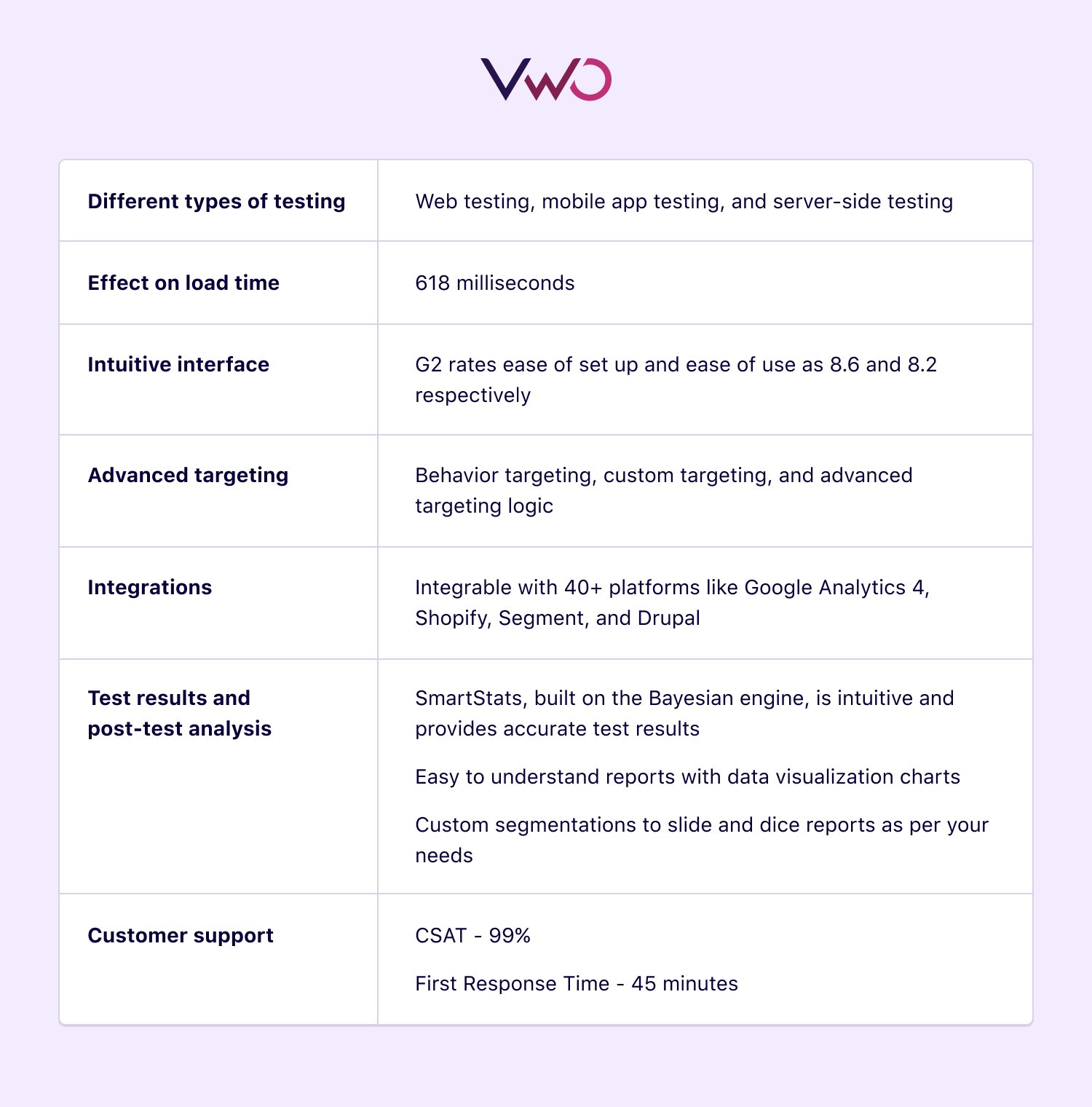
Pros:
- Tightly connected to behavioral insights analytics tools that allow you to make data-driven decisions
- No flickering is ensured for client-side testing with a single-line asynchronous smart code
- SDK-based server-side tests mean no latency and allow users to conduct omnichannel experiments across devices
- Bayesian-powered SmartStats shows accurate test performance even without requiring a large sample size and in real-time
- User data, segments, and customer profiles from VWO Data360, the CDP, enrich the personalization of experiences across digital properties
Cons:
- Less advanced feature management as it is not the core offering of the platform.
- A product recommendation engine is missing which can take personalization of customer experiences to the next level.
Pricing:
- VWO Testing Web
- Starter – Free
- Growth – $321 per month, billed annually
- Pro – $739 per month, billed annually
- Enterprise – $1294 per month, billed annually
- VWO Mobile App
- Enterprise – $1595, per month, billed annually
- VWO Testing – Server Side
- Enterprise – $2279 per month, billed annually
Check out more about pricing and plans.
Our take on this tool: This all-comprehensive website optimizer offers nearly all the necessary A/B features to enrich your conversion optimization program. But if you find the pricing plans to be expensive at present, you could consider testing out the starter plan. Later on, when your business expands and optimization needs increase, you can upgrade to any paid plan to try more features on this A/B testing software.
2. Google Optimize
Google offers a free A/B testing tool called Google Optimize, while its premium version is known as Optimize 360. With Google Optimize, SMBs can run A/B tests with a limited number of experiment objectives and simultaneous experimentation and personalization. The paid version, Optimize 360, offers extra bandwidth for A/B testing features and capabilities to support enterprise-level businesses
Pros:
- High loading speed ranges between 210-220 ms due to an advanced anti-flicker snippet across the platform (applicable to both versions)
- Delivering personalized digital experiences is possible using targeting options like audience targeting, geotargeting, behavioral targeting, and first-party cookie targeting on both Google Optimize and Optimize 360
- Modification of dynamic websites and single-page applications is possible through activation events on both versions
- Multivariate testing with up to 36 combinations, can run over 100 experiments simultaneously, and perform more than 100 personalizations on Optimize 360
Cons:
- Advanced features like Mutually Exclusive Campaigns and customizable widgets are absent.
- Reporting relies heavily on Google Analytics and is not in real-time
- Even in the premium version, there are limitations to the number of experiment objectives and combinations of multivariate testing
Pricing: Free
Google Optimize is one of the best A/B testing tools for beginners in testing who want to learn and explore the features. When you opt for Google Optimize 360, you get a customized quote and invoices on a monthly basis.
Our take on this tool: Despite the additional bandwidth for certain testing features in the paid version, key functionalities like feature rollout and unlimited bandwidth for running concurrent experiments are missing. Further, the visual editor is not as intuitive as editors found in other testing tools.
Google Optimize will be discontinued on September 30th, 2023. If you’re a current Google Optimize user, there’s good news. You can quickly migrate to VWO in just 30 seconds for uninterrupted and conduct free A/B testing for up to 50k monthly visitors. Email us now – Google Optimize Migration.
Wonder why we say Multi-armed Bandit testing is an advanced testing feature? To learn how it can contribute to your bottom line, watch this webinar.
3. Optimizely
Optimizely is a Digital Experience Platform with capabilities ranging from web and feature experimentations to web content management systems and personalization engines. With this platform, you can run low to no-code experiments as well as SDK-based server-side testing. Optimizely also facilitates omnichannel experimentation across mobile and OTT. Additionally, Optimizely has a Customer Data Platform (CDP) under its umbrella that harmonizes customer data and enables the launch of highly personalized multichannel campaigns.
Pros:
- The Stats Engine follows the Sequential Hypothesis testing that improves the accuracy of test performance and offers strong segmentation capabilities
- Advanced targeting native integrations are available in the server-side experimentation
- Supports MAB and Mutually Exclusive Campaigns
- Project management capabilities are available on both client and server-side testing
Cons:
- Switching between snippets and mini-snippets causes performance issues and delays the website loading time
- The Visual Editor lacks advanced features like widgets and adding new elements to web pages
- Visitor behavioral insights are not available
- Too expensive for small and medium companies
Pricing: You’ve to request pricing.
Our take on this tool: Optimizely offers a range of features that can help start or advance any experimentation program. However, due to its relatively high cost, the platform is typically only affordable for enterprise-level companies.
4. AB Tasty
AB Tasty is an experience optimization platform that empowers brands to deliver positive customer experience through AI-powered experimentation and optimization. Apart from client-side testing, the tool also offers personalization and audience activation. Flagship by AB Tasty allows you to run server-side tests and minimizes the risk of future feature releases with flagging and progressive rollouts across multiple devices, apps, and software.
Pros:
- An extensive library of widgets to explore, to add to your test variations
- Easy-to-use drag-and-drop editor to make changes to your webpage without involving your development team
- Personalization and targeting engine lets you craft frictionless and granular tailored customer journeys on your website
Cons:
- User behavior insights are not available
- Reporting infrastructure may seem complicated for beginners
- Implementation documentation doesn’t help a lot in solving user queries
Pricing: You’ve to request pricing.
Our take on this tool: While AB Tasty is one of the easiest split testing tools with excellent feature management capabilities, it may not fully meet the expectations of users seeking dedicated customer support and comprehensive implementation documentation.
5. Adobe Target
Adobe Target is enterprise-grade software that meets the requirements of mature experimentation teams. The split testing software lets you conduct A/B as well as Multivariate tests to create the most effective combinations of content, UX, and layout on your digital properties every time. By leveraging Target’s customer profiles, you can create a personalized user experience across channels. With its AI-powered automation features, you can test and personalize at scale, which is beyond the scope of manual approaches.
Pros:
- Supports client-side, server-side, and mobile app testing capabilities to help you make changes to your digital properties
- AI-based recommendation engine lets you deliver personalized experiences throughout a customer journey
- Easy integration with Adobe Analytics helps with advanced audience segments and reporting
Cons:
- Reporting is underpinned by the Frequentist model which requires large sample sizes and does not let you quantify the extent of win of the winning variation
- Users have to rely on Adobe Analytics for reporting and does not have its own reporting dashboard
- Server-side SDKs do not support third-party integrations
- Pricey option as the tool positions itself as an ‘enterprise-grade’ software
Pricing: You’ve to request pricing.
Our take on this tool: Adobe Target is worth giving a try given its AI-powered personalization features and testing capabilities. However, its user interface is not as intuitive and simple as other A/B testing tools available out there. Further, Target’s high price point makes it an elusive choice for SMBs and an appropriate option for enterprise brands.
6. Dynamic Yield
Dynamic Yield is an experience optimization platform that combines client-side testing and server-side testing and utilizes a Predictive Targeting engine to extend personalization to more specific audience segments. With this platform, you can create effective recommendation strategies to nudge audiences through the conversion funnel and even offer tailored offers and content to individual visitors.
Pros:
- AdaptML, a self-training deep learning system, enhances digital experiences by predicting customers’ next-best products
- Run server-side tests with zero latency across your tech stack
- Test and roll out features on any device targeted to specific segments
- A combination of Bayesian statistics and multi-armed bandit (MAB) algorithms drives optimal outcomes based on specific business objectives
Cons:
- The absence of behavioral analytics tools limits the ability to analyze user behavior on websites
- Lacks helpful capabilities such as project management and an idea factory that ensure seamless team collaboration
- Certain features may require technical expertise to be implemented effectively
Pricing: You’ve to request pricing.
Our take on this tool: By and large, Dynamic Yield is an advanced omnichannel personalization platform and offers testing features as a part of their ‘Optimize’ solution. If you are seeking A/B testing tools that allow easy implementation without requiring extensive technical knowledge, there are other simpler split testing software you may look into.
7. Kameleoon
Kameleoon is a unified optimization platform that offers web, full stack, and feature experimentation capabilities. From experimentation leaders to product managers and developers, the platform caters to the unique requirements of multiple buyer personas. Supporting 30+ integrations, Kameleoon can fit into your tech stack without hassles. Moreover, its AI-backed personalization solutions let you deliver individualized user experiences in real-time.
Pros:
- Create and target audience segments using Kameleoon AI for hyper-personalized experiences
- Option to switch between Frequentist and Bayesian statistical models. Easy-to-understand reports and real-time results
- Strong custom-based targeting capabilities are available on Kameleoon Full Stack
Cons:
- Behavioral insights and project management capabilities are missing
- Advanced features like Mutually Exclusive Campaigns and Post-test segmentation of reports are absent
- Sometimes writing multiple lines of code can slow down your website
Pricing: You’ve to request pricing.
Our take on this tool: While Kameleoon is a viable choice for performing A/B tests and providing tailored experiences, it does not provide much visibility into user behavior on your website.
Download Free: A/B Testing Guide
8. Oracle Maxymizer
Oracle Maxymiser Testing and Optimization offer sophisticated website testing, in-session personalized experiences, real-time behavioral targeting, and product recommendations across websites and apps. Furthermore, Oracle Infinity Behavioral Intelligence-powered heatmaps allow users to gain deeper insights into customers’ digital journeys and discover new testing opportunities from them.
Pros:
- Easy switching between visual and code editing that lets both technical and non-technical users set up a test
- Advanced targeting and visitor segmentation take the personalization of user experiences to the next level
- Create, modify, and launch mobile app campaigns on both Android and iOS operating systems
Cons:
- A steep learning curve may require you to hire Oracle consultants for training and implementation
- Considerable time is taken to execute a campaign and create test reports
- No free trial is available and the pricing falls on the more expensive side of the range
Pricing: You’ve to request pricing.
Our take on this tool: Oracle Maxymiser has significant testing and personalization capabilities but mastering it might involve a learning curve. Moreover, the absence of a free trial option makes it challenging to assess whether this A/B testing platform is a suitable fit for your needs.
9. SiteSpect
SiteSpect is an all-encompassing tool that lets you drive revenue with A/B tests, deliver personalized experiences to the right audiences at the right time, and feature release testing. In addition, the platform lets you add product recommendations anywhere on your webpage without requiring any help from your development team. SiteSpect calls itself the only A/B testing solution that offers advanced optimization capabilities regardless of whether a website is a traditional site or a SPA.
Pros:
- Easy setting up of several metrics and filtering of testing results lets you dive deep into the statistical analysis
- Supports A/B, multivariate testing, and server-side testing, with results available through a comprehensive dashboard
- No flickering effect and ensures high performance across all devices
Cons:
- Behavioral analysis is possible only when integrated with third-party platforms like Fullstory or Hotjar
- The absence of a CDP prevents the fullest utilization of customer data to improve optimization programs
- Not as intuitive as other A/B testing tools and many users have to undergo a learning curve to fully utilize its capabilities
Pricing: You’ve to request pricing.
Our take on this tool: While Sitespect is a suitable choice to kick-start your experimentation journey, it doesn’t support MAB, advanced features in the visual editor, in-built connectivity to behavioral insights, and pre-built widgets. You may look for other testing options if you can’t overlook these features for creating and running your tests.
10. Convert
Convert Experiences is an A/B testing platform with enterprise-grade testing features at self-service prices. You can set up a range of tests starting from A/B testing and split URL testing to multi-page and multivariate testing. Using this A/B testing software, you can explore the visual editor to pull off simple A/B tests as well as switch to the code editor to make changes that are more complex in nature for improved conversions. The audience targeting engine with over 40 filtering options lets you target your tests to relevant and intended sets of users.
Pros:
- Post segmentation based on types of visitors, devices used, and campaign clicked allows slicing and dicing of reports
- Integrable with several third-party tools to turn your data into useful insights to be used on different other platforms
- SmartInsert ensures flicker-free client-side testing, with variation switching in 200-300 ms on the first load and 10-50ms on repeat loads
- Code editor allows you to conduct complex experiments
Cons:
- Mobile app testing and feature testing and management are unavailable. Server-side testing is available in beta
- Dependence on IT to add new elements to your website as no library of pre-built widgets is available
- Necessary to implement multiple code snippets to achieve SPA compatibility, which makes testing dynamic websites a cumbersome process
Pricing:
- Community Web – $99 per month
- Community Full – $199 per month
- Growth
- Monthly – $699
- Annually – $8392
- Expert
- Monthly – $ 1,119
- Annually – $13, 432
- Enterprise – Price on request
Our take on this tool: Convert allows for various types of testing, but the absence of mobile app testing, a widget library, and necessary code-driven SPA support may hinder the comprehensive optimization of user experiences.
11. Omniconvert
Omniconvert comprises Explore to test insights and run experiments, Reveal to monitor and nurture eCommerce customers, and Survey to help businesses gather valuable user feedback. This A/B testing software enables you to design A/B tests for your website visitors across multiple platforms. With over 40 segmentation parameters, you can gain insights into your visitors’ demographics, product views, and browsing history, allowing you to provide a personalized customer experience and improve your conversion rate.
Pros:
- The intuitive and easy-to-use WYSIWYG editor allows you to launch A/B tests quickly
- Switch between Frequentist or Bayesian statistics engines based on your conversion goals and needs
- A powerful statistical engine allows the creation of relevant and tailored user experiences at an individual level
Cons:
- The UI seems complex with too many functions and can be made more user-friendly for designers and marketers
- MAB, Multivariate testing, Mutually Exclusive Campaigns, and Server-side testing are missing
Pricing:
- Start – Free
- Scale
- Monthly – $299
- Annual – $2999
- Enterprise – Custom Quote
Our take on this tool: Omniconvert’s visual and code editor will allow you to run A/B tests on your digital properties. But this A/B testing platform lacks capabilities like server-side testing, behavioral analytics, and project management for teams with mature experimentation requirements.
12. LaunchDarkly
LaunchDarkly is a feature management platform that aims to make software feature releases safe. The platform lets you have precise control over the customer experience, allowing you to conduct safe testing in production, obtain valuable feedback from users, and accelerate product release cycles. It lets you test new features wrapped in feature flags and define metrics to measure success.
Pros:
- Faster iterations are based on continuous user feedback to constantly improve the product
- Super easy to turn any feature off with just a click of a switch
- Effortlessly transition to cloud infrastructure and migrate data to a new warehouse
Cons:
- The UI can be confusing for new users who might need a bit of hand-holding to understand the functionalities
- No facility to conduct web testing using a drag-and-drop editor, which could reduce the involvement of IT and product teams
Pricing:
- Starter
- Monthly – $10 per seat per month
- Annual – $8.33 per seat per month
- Pro
- Monthly – $20 per seat per month
- Annual – $16.67 per seat per month
- Enterprise
- Monthly & Annual – Have to get a quote
Our take on this tool: LaunchDarkly is a good choice if your team comprises product managers who are thorough with the operations of feature flags and know how to leverage them for testing. Also, given the price of each seat, it can get expensive for SMBs.
Curious to discover more about feature flags? How about watching a webinar to clear all your doubts?
13. Statsig
Statsig is a growth platform designed to enable faster and safer shipping of products, automate A/B testing, and analyze the impact of every feature change on your key performance metrics. The tool integrates seamlessly with any data warehouse hosting your data, allowing for greater flexibility in data processing. Its stats engine processes raw events, exposure events, and pre-computed metrics to enrich your experimentation strategy.
Pros:
- Native support is available for the most popular language libraries for feature management
- Easy team collaboration and direct workflow review are possible in the Statsign console
- 360-degree product visibility by combining experimentation with real-time analytics to ensure organizational alignment
Cons:
- Calls for technical expertise to perform complex experiments
- Analytics tools for visitor behavior insights are missing
Pricing: Free plan, event-based pricing, and custom-annual pricing
Our take on this tool: Statsig emerges as a feasible choice for product development and testing multiple variants to ensure risk-free launch features. Given the technical expertise needed to master this platform, this may not be ideal for launching straightforward A/B tests and is not very user-friendly for non-technical professionals like designers and marketers.
Best among the rest – Our recommendation
With so many amazing testing tools available, it can be tough to choose the best A/B testing platform that fits your needs. But we suggest that you go for VWO for the right reasons. No matter your level of expertise in working with various CRO tools, this A/B testing tool meets your needs seamlessly. Here’s how:
If you’re an organization that’s just entering the arena of testing and optimization and wants to take baby steps at the moment…
You’ll appreciate that VWO offers a free plan for up to 50k monthly visitors, giving you the chance to test the waters without investing. And as your testing needs grow, you can easily upgrade to a paid plan and access even more advanced features. Plus, with our 30-day trial, you can test out all of VWO’s capabilities before committing. And with our industry-best CSAT score of 99%, you can trust that you’re in good hands.
If you’re an enterprise-level business that’s majorly focused on driving results and growth via experimentation…
VWO is the go-to choice for advanced testing requirements. With features like multi-page campaigns, server-side testing, and post-test visitor segmentation, you’ll have everything you need to drive testing results and growth through experimentation. VWO’s selling point is its top-of-the-line customer support. With 24/5 support, you always count on quick resolution of any issues.
If your business wants more than A/B testing to take a holistic approach to digital user experience optimization…
- Our customer data platform lets you collect and unify customer data from across channels, so you can create highly-targeted audience segments and launch personalized campaigns on the VWO platform.
- You can also export user data, segments, and customer profiles to optimize marketing campaigns from any platform of your choice.
- VWO Data360’s metrics module allows you to create rule-based metrics to analyze detailed KPIs in your campaigns retrospectively.
- You can track complex and custom business metrics, including North Star, revenue, guardrail, and optimization metrics.
Our Customers’ Triumphs – How we helped them succeed
 Human Interest, a US-based SaaS company leveraged VWO FullStack to integrate with Contentful and enhance lead generation on their landing pages by running server-side experiments. It was hypothesized that showing the contact form above-the-fold would improve the conversion rate. Indeed, they achieved a 3.77% rise in form submissions and a 74.84% increase in the number of scheduled calls with potential customers.
 Hush Blankets, a Canada-based company, partnered with VWO to find friction on – the cart page (mobile) and product page for Hush Classic (desktop). The pages were revamped using the VWO Visual Editor, and the test ran for 15 days. The team saw an uplift of 5.67% in their conversion rate (visits to the checkout page), further a 33.15% uplift in the checkout rate, and an overall revenue gain of 51.32%.
 Penn Foster, a for-profit online college based in Scranton, was concerned with low returns from paid campaigns. The team directed the paid traffic to a new landing page with only relevant information and specific CTA buttons. They believed that this would also help them improve the lifetime value of enrolled leads. The test was a big success with the click-to-lead conversion rate increasing by 202% and the click-to-enrolment rate rising as well.
Check out more success stories now.
“Affordable alternative to Target and Optimizely for frontend testing“
Easy to use WYSIWIG, intuitive interface and responsive support. Anyone who has done A/B testing using other tools will be able to pick this up quickly. We are also able to customise it to our highly dynamic website by tapping into our JavaScript layer (developer support may be required but minimal, and much less involved than doing a release).
Our account manager is very responsive, stays in touch and actively resolves our issues / concerns. One thing I asked for was to keep the filter selections when going back to the same page, as it was very annoying having to re-select filter items, and a few months later it was done. They also offered training for my new starter which is very helpful.
Jen L. (Small-Business)
“User-friendly and powerful testing platform”
VWO is an incredibly user-friendly and powerful testing platform that has helped us optimize our website and increase conversions. The visual editor makes it easy to create and modify experiments without coding knowledge, which has allowed us to test quickly. The platform’s advanced targeting and segmentation capabilities allow us to test specific user segments and gain insights into their behavior, unlocking more tests and filling our backlog. We particularly love VWO’s heatmaps and session recordings, which provide valuable information on how users interact with our website. The customer support team is also excellent, always willing to assist with any questions or issues we encounter. Overall, VWO is a fantastic tool that has become an integral part of our optimization process.
Alex A.(Mid-Market)
“VWO is a smart and efficient tool for running A/B tests.”
VWO Editor makes it very easy to set up variations and also a custom code feature which makes it possible to do changes for more complex experiments. It is very good compared to competitors.
Sahil N. (Enterprise)
Now it’s your turn to decide!
Did you enjoy checking out our top picks for the best A/B testing tools? We totally get it, selecting the best A/B testing platform for your needs can be tricky because every tool has its own strengths and weaknesses. Take your time and do a thorough comparison to make the best decision for your business. And if you ever need help, just remember that we at VWO have always got your back. To explore how we can help, you can start a free trial today. Here’s to testing and embracing growth!
Frequently Asked Questions
To create a successful A/B testing framework or strategy, it is crucial to:
1. Define your goal – identify which metric you want to improve by implementing the test.
Make observations – understand your website friction and identify any issues by conducting qualitative and quantitative research.
2. Formulate a hypothesis – use insights from user behavior analysis to create a hypothesis.
Run tests – conduct A/B tests for a sufficient period to obtain statistically significant results.
3. Calculate the A/B test duration here.
4. Interpret results – analyze the test results carefully to make data-driven decisions and implement the winning variation.
5. Conduct post-test analysis – analyze the results and identify areas for improvement in your test report.
With these steps, you can create a structured and effective A/B testing framework or strategy that leads to actionable insights and meaningful improvement in your website or app.
If your in-house team lacks the necessary expertise to spearhead an end-to-end app or website optimization program, you can hire professionals offering A/B testing services. At VWO, our success team can identify optimization opportunities, create tests, and analyze learnings to help build an experimentation culture in your organization. So, if you’re looking for an integrated experimentation platform as well as top-notch professional assistance, VWO should be your top choice.
Once you’ve read this blog, you will not need to search anywhere for A/B testing tools comparison. This blog lists the best A/B testing software that are at the top of their game and truly elevate digital experiences. We’ve discussed their pros and cons to help you make a sound choice based on your testing needs.
Not all website testing tools offer mobile app testing capability. If you’re looking for mobile app testing tools, you can consider opting for VWO which makes mobile app testing a breeze. VWO offers lightweight SDKs for iOS, Android, and other widely used backend languages. Once you integrate the mobile app SDK, VWO will generate API keys that you can use for initializing your iOS and Android apps. For a detailed explanation of the steps involved, please refer to our guide.
There are a number of tools available for A/B testing and you can choose one depending on your business goals and the complexity of the multiple tests you want to run. We discussed the best-split testing tools like VWO, Optimizely, Kameleoon, and AB Tasty in this blog. After you’ve gone through each of their pros and cons, you can decide which tool to invest in.
A/B testing tools allow you to test two different versions of a website element to see which one improves your business metric. You can set conversion goals, create variations, split audiences, and even analyze your test results through data visualization charts on these testing tools. With some of the best-split testing tools, you can even slice and dice test reports to evaluate how a test performed for a specific segment. To get more insights into each of these steps, you can read our comprehensive guide.
Before you choose an experimentation platform, it’s important to make careful considerations and be aware of limitations. For example, if your website doesn’t get enough traffic, it can be a tad difficult to get statistically significant results. In that case, you would want to explore ways to increase the flow of relevant website traffic first and then get a tool to run a test. Here’s a blog you may want to read to learn more about testing on low-traffic websites.
Also, avoid A/B testing if your hypothesis is not data-driven and is solely based on guesswork. To determine if a test can enhance the user experience, it’s crucial to base your idea on user behavior across your website. WO’s experimentation platform stands out from others by offering both behavior analysis and testing capabilities, ensuring that your tests are based on solid hypotheses derived from user insights.
When running an A/B test on any testing tools, choose a metric that aligns with the goals of your business model. For instance,
if you run an eCommerce business, you’d focus on metrics like average order value, revenue per visitor, or conversion metrics like page visits or email subscriptions.
On the other hand, if yours is a SaaS website and you want to run a test on it, you’d want to set metrics like free trial conversions, form submissions, subscriptions, customer lifetime value, and so on.
You’d also want to look at bounce rates irrespective of your business model to understand if users are engaged or prematurely leaving your website without converting.
Download Free: A/B Testing Guide
If you expand on GPT-3.5 Turbo, here’s what it denotes:
Generative: Indicating that the goal of the model is to generate text by predicting one word at a time in a given sentence.
Pre-trained: Indicating that a huge amount of data has been fed into the system to train it.
Transformer: Indicating the algorithm used by the AI model, which specializes in natural language processing, i.e., how words are used in a language and what they mean.
Once GPT-3.5 Turbo is fed a prompt, it generates streams of text by predicting the possibility of a sentence existing in this world. Currently, the functionality is in beta and only offered to a select group (including VWO) through an API accessible via the cloud.
Let’s face it – copywriting is no easy task. GPT-3.5 Turbo’s robust and flexible language model can produce a short copy at scale. If you add to that the ability to test copy versions, you can get the best of both worlds. Also, some of the most commonly run tests revolve around webpage copy. So, integrating Open AI’s GPT-3.5 Turbo API with VWO Testing was the most natural and logical thing for us to do.
Our new feature enables you to use AI-generated copy to create variations for your website copy and deploy them without any help from IT. You can also test the AI-generated copy against the original human-written copy on your website. The next section covers how popular brands uncovered the practical implications of our new feature via a friendly contest between human-written and AI-generated copy.
VWO’s Human vs. AI competition
In August this year, VWO hosted a friendly competition between copy written by human copywriters and that by our new feature powered by OpenAI’s GPT-3.5 Turbo API. We invited participants from all over the world and tested AI-generated text against human-written one for their webpages with sufficient traffic via VWO or any other testing platform they were using.
Over 450 brands were given access to the AI copy generating feature during the course of this competition. Among the 18 shortlisted participants were Booking.com, Clark Germany GmbH, and Schneiders, to name a few. The AI feature was able to generate copies in various languages such as Spanish, German, Portuguese, etc. The participants were highly satisfied with the accuracy of the output in these languages.
All participants had to set up their tests keeping the original website copy as the control and the AI-generated one(s) as the variation.
Results of the competition
Among the 18 tests run by the confirmed participants, 1 had an existing (or new) human written copy as the winner, 3 had AI copy as the winner, 3 were declared as a tie, 2 are still awaiting results, and 9 were inconclusive.
Let’s take a look at some of the tests where the AI-generated copy won:
Schneiders [An eCommerce store for horse wear & equipment]
The team tested their topmost banner copy by creating a variation of the original page using the AI-backed language generator. Here’s a look at the control and variation from the test:


Once statistically significant results were achieved, the A/B test declared the variation to be the winner as it led to a 7.06% uplift in their banner clicks.
Clark Germany GmbH [An insurance agency based out of Frankfurt]
3 variations of the page headline were created using the AI copy and pit against the control. The test was run for 48 days. Following are the control and variations of the test:
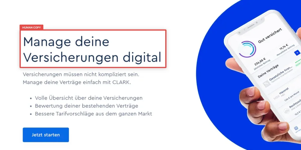
English translation: Manage Your Insurance Digitally
English Translation: Manage Your Insurance Digitally
English Translation: Keep Track Of Your Insurances
English Translation: Clark Is Your Digital Insurance Manager
Once the test reached conclusion (statistical significance > 90%), all 3 variations outperformed the control. Variation 2 resulted in the maximum uplift in their CTA clicks (15.77%), while Variation 1 and 3 resulted in an uplift of 9.13% & 7.13%, respectively.
Here’s the test that declared the human copy as the winner:
Booking.com [A global travel company]
The team at Booking.com tested the CTA on their hotel booking pages. 2 human-written copies were pitted against an AI-generated one. Following are the variations they created:
The human copy #1 won the test as it resulted in a 1.7% uplift in the CTA conversion rate.
Here’s a test that resulted in a human-AI tie:
Springworks [A SaaS company based out of India]
The team at Springworks tested their landing page headline by creating a variation using the AI-generated copy and pitting it against the original (control). Their goal was to improve clicks on the ‘Add Trivia’ CTA. The test was run for 8 days. Here’s a look at the control and variation:
Since the difference in the uplift in CTA clicks between the control and variation was less than 5%, and the test results were statistically insignificant, the test was declared to be a tie.
Download Free: A/B Testing Guide
Let’s deep dive into the nitty-gritty of how VWO Testing and GPT-3.5 Turbo work together.
VWO Testing & GPT-3.5 Turbo
We integrated Open AI’s GPT-3.5 Turbo API with our Visual Editor so that every time you decide to run a test or deploy a change, you can generate copy recommendations that you can choose to create variations out of. This means you get to cut down on time spent brainstorming on variations and alternatives by having a library of AI-generated ideas readily available at your disposal.
Whether you are looking to optimize headlines, CTA text, product descriptions, or any other text on your site, you can quickly generate alternatives and either directly deploy them or test them against your original copy, both without any developer help. Either way, by automating this aspect of experimentation, you get to make your CRO program more efficient and agile.
Once you open VWO’s Visual Editor and click on any piece of text, you will find a ‘Suggest Variations’ option in the drop-down menu. Clicking on it will display a bunch of AI-powered copy suggestions (based on the existing copy) that you can choose from.
Sounds too good to be true? Sign up for a free trial by VWO and assess the GPT-3.5 Turbo feature for yourself.
What the future holds for GPT-3.5 Turbo, automated copywriting, and testing
Experts have conflicting views about the scope of GPT-3.5 Turbo and the extent to which humans can leverage it to automate copywriting. While some feel that the model can be trained to mimic and replace human written copy, others argue that it lacks the ability to construct cohesive sentences, use reasoning or logic constructively, or build a narrative – something you can only expect from a human copywriter.
It is hard to anticipate everything that might happen. We don’t think we can get everything right, certainly not up front. Still, it’s better to play around with this type of technology now while it can still be controlled and learn lessons to be applied as AI gets ever more powerful
Greg Brockman, Co-Founder & CTO, OpenAI
Whether automated copywriting will be a norm in the future is something we are yet to figure out as we explore GPT-3.5 Turbo’s full potential. However, what we know for sure is that this innovation is going to be revolutionary when it comes to copy experimentation.
With your new AI partner, you get to reduce the time spent on manual work as well as iterations with a copywriter. As you generate AI copy on demand within seconds and make real-time quick fixes on your website, you can create short-form content at scale and thus take a giant leap towards increasing your experimentation velocity and evolving your CRO program.
The power of GPT-3.5 Turbo in copy-driven optimization is immense, and we’ve only touched the tip of the iceberg so far. However, some restraint is advised because we cannot equate it with the intelligence of human copywriters – not yet, at least. The real value, at least for now, lies in being able to effectively test out copy variations while reducing the back and forth with copywriters and developers. The good thing is we can keep leveraging the power of GPT-3.5 Turbo to run better and faster experiments using platforms like VWO.
Download Free: A/B Testing Guide
Experience optimizers across the globe suggest that the best way eCommerce businesses can survive today’s market heat, maintain their customer base, and ensure revenue growth is by investing much into modern marketing activities and focusing their energies on testing and optimization. These have the prowess to provide seamless and frictionless customer experiences and help businesses succeed.
Assuming you’re already familiar with modern marketing activities and their importance in today’s time, we’d like to jump directly to the benefits of eCommerce testing and optimization, key challenges, and website areas and elements that you must test.
What is eCommerce testing? Why is it important?
eCommerce testing can be defined as the process of testing various eCommerce website elements such as design, specifications, functionalities, pages, and features to check their sanity and ensure they’re not harming the performance of the site in any manner possible.
When done correctly and continuously, testing can not only improve your site visitors’ overall experience but significantly increase conversions as well. Mentioned below are some reasons explaining the importance of testing and optimization.
1. Improve user engagement
As stated above, testing helps check the hygiene of a page element. It tells us which page element or process affects a user’s onsite journey and helps us rectify the issues faster. The better the user experience, the more shall be the onsite engagement.
2. Generate marketing strategies
Testing and optimization allow you to make effective plans for your website. By reiterating your site’s problematic areas, you can engage more people and also increase their stay.
3. Reduce risks
Many times, making major and considerable changes to your site can cause notable strategic changes or even trigger significant losses. However, testing these changes in a planned manner can help eliminate the chances of these uncertain losses.
4. Increase conversion rates
Since you’re testing almost every aspect of your website and ensuring a smooth visitor experience through site optimization, your conversion rate is bound to increase.
5. Better understanding of visitor behavior
It’s often difficult to map your website visitors’ needs and preferences and optimize your site accordingly. But with testing, everything is possible. It’s one of the best and quickest ways to confirm what your visitors like.
What should you know before you run an eCommerce test?
From the source code to product pages, you can test the viability of every element of your website using an extensive range of testing methods. Some of the most common methods are as follows:
- Functional testing
- Usability testing
- Security testing
- Performance testing
- Database testing
- Mobile application testing
While each of these methods has its own rules and regulations, running multiple tests using multiple testing methods at the same time can cause chaos as well as disrupt test results. Hence, it’s always advised to run one test at a time or use a good testing tool like VWO that enables you to run multiple tests simultaneously without one overlapping the other.
Given this fact, you must prioritize the order in which you want to run tests based on the test’s impact on your brand’s overall conversion rate. Theories like agile testing, which is used by teams conducting software testing, can help you find the balance.
Logically, focus on significant bugs and software flaws that impact everyone through mobile app testing and website testing first. Once you’ve addressed these issues, then look at the minor bugs.
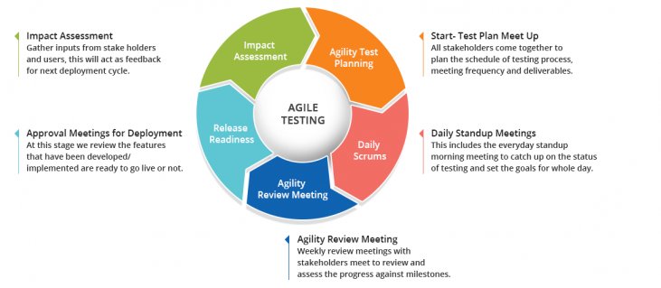
Furthermore, it’s always a good idea to evaluate your test ideas and testing techniques on a regular basis because a poor website testing strategy can lead to loss of customers, revenue, and even jeopardize your brand’s reputation in the market. You must always carefully outline the testing scope, set the objectives, check it’s viability or chances of success, and estimate efforts in a time frame.
What are some key issues related to eCommerce testing?
The underlying principle behind a good user experience (UX) is to make life easy for your visitors. Every task on your website should be intuitive. You want people to be able to navigate around your website or application with minimum fuss.
While these principles are straightforward, it’s their implementation where things get tricky. A lot of factors play into the user experience. Think of all the stages of a user’s journey and test them from the first click on a product to the shopping cart.
For example, through form analysis, you can track how people are interacting with various input fields. This information provides you with insights on where users are experiencing problems. You can use this data to develop a hypothesis and run a test to check whether your assumptions or assertions are correct.
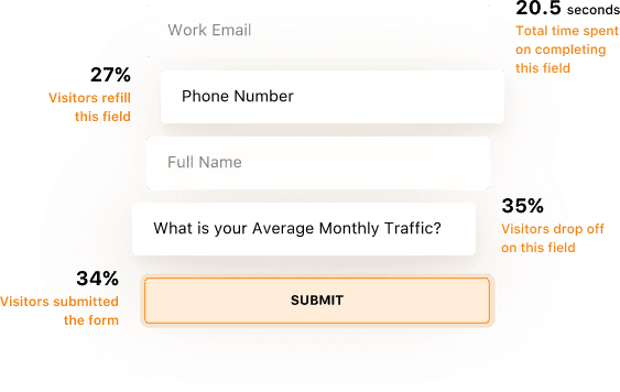
1. Testing for bugs
Regardless of how well you develop your website, there shall always remain some bugs in your wireframe that may disrupt your site’s functionality or hinder the visitor’s journey. While developers once couldn’t do anything about these bugs, today, they can use testing to fix these issues and create seamless UI/UX designs.
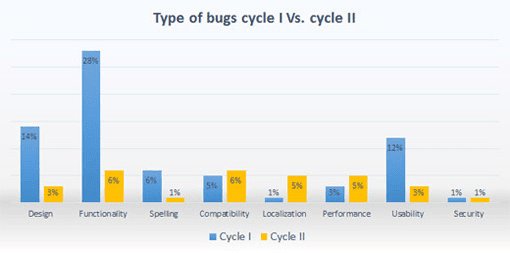
Some of the most common bugs that you may find on your eCommerce website are as follows:
- Browser compatibility problems
- Broken links
- Inconsistencies in the catalog
- Shopping cart issues
- Checkout bugs
According to a study by QualiTest, most of the bugs that sites encounter are of medium severity. These do not impair the usability of the site. However, they do have the potential to impact the eCommerce conversion rate and overall business sales.
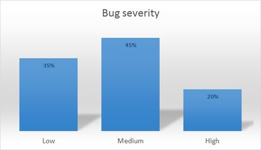
When managing an eCommerce store, it’s essential to put a system to identify bugs and eliminate them as soon as possible. It is especially important to have a quality assurance strategy in place when undertaking any sustained eCommerce testing.
2. Testing conversion rates
Your eCommerce conversion rate ultimately defines the success of your business. The higher the conversion rate, the higher shall be your business’ revenue. Understandably, given the importance of sales to any business, conversion rates focus on extensive eCommerce testing.
There are various stages to any conversion rate optimization test. The first stage is to set objectives and determine the most suitable type of test. Your choice must always be based on data, rather than pure intuitions. For example, if you decide to review your brand’s purchase cycle, ensure to data back all your decisions.
The next step is to test and gather available data and form a hypothesis. Tools like heatmaps, form analytics, scrollmaps, session recordings etc. can help analyze user behavior and provide useful information. Always gather enough information before running a test to ensure you’re moving in the right direction.
Standard statistical testing methods include A/B testing, split testing, and multivariate testing. You can use this A/B duration calculator to determine how long a test on your site will take.
Which site areas and elements should you test?
The ultimate goal of every test is to increase the conversions and revenue of your eCommerce business. You want to focus on running conversion optimization tests that provide the maximum return on investment. There are certain areas of your eCommerce website that you will naturally target to ensure a seamless visitor experience. Some of these are as follows:
1. Search and navigation
Site search and navigation are two of your website’s primary elements extensively used by your visitors to explore your website or mobile app. Ensuring they’re free of bugs and promise a frictionless experience must always be your top priority.
Best Choice Products, an eCommerce website selling garden, music, children, and fitness products, illustrates the importance of testing your navigation. As part of a round of eCommerce A/B testing, they ran a test on their mobile navigation and search bar. They hypothesised that by improving the visibility of the search bar on the header will improve user penetration into the website. The control and variation version of the test are as follows
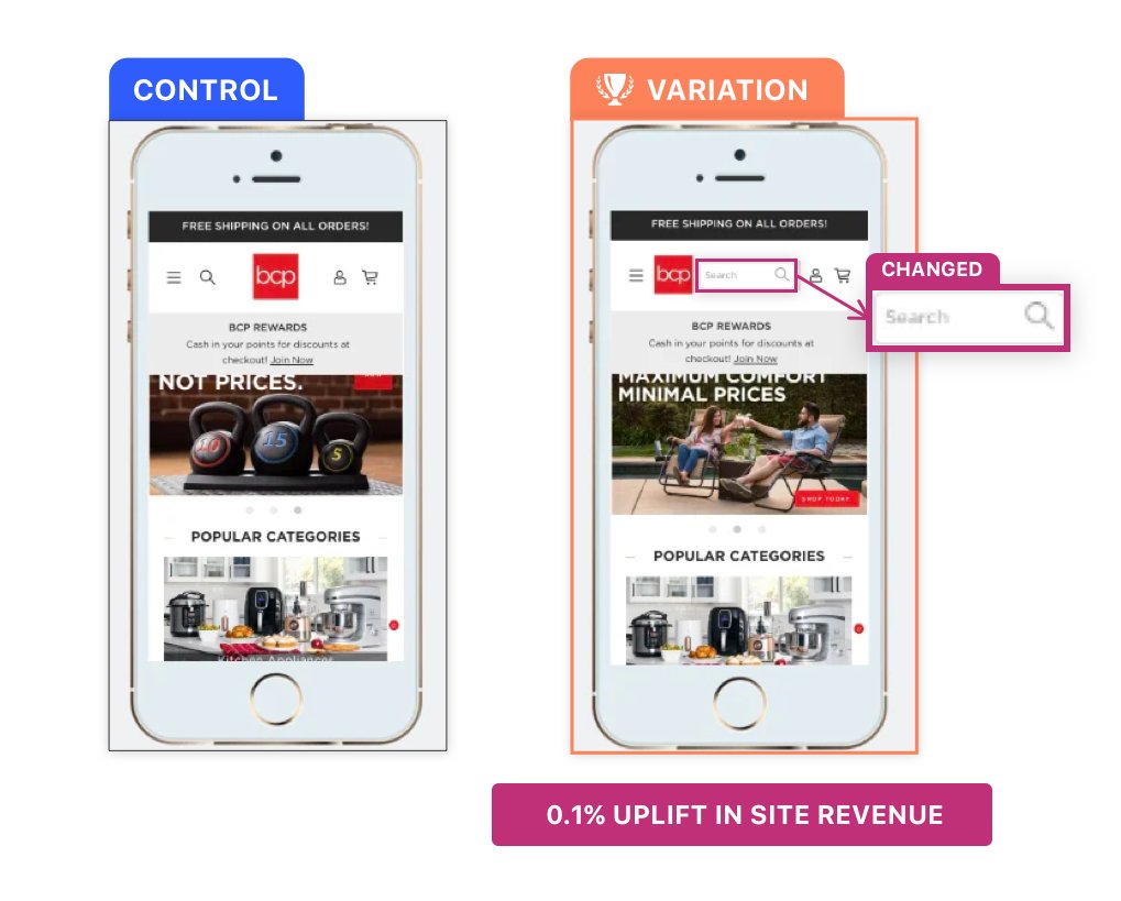
Running the test for about 7 days, the execs at Best Choice Products witnessed that visitors were engaging more with the search functionality. A minor change on the header resulted in a 0.1% increase in site revenue. It may not have been a game changer, but it did help the company get more revenue than before.
2. Homepage design and features
The homepage is one of the most important pages of any website, for it represents the face of your brand. Even if it’s not your primary landing page, it still deserves to be one of the most intricately designed pages. You need to offer great user experience and ensure that everything works as it should.
There are numerous forms of eCommerce testing you can run on your homepage. One thing which is becoming increasingly accessible to sites across content management systems is website personalization. The Very Group’s website is a perfect example to quote here.
Based on a visitor’s geographic and demographic information, the site shows personalized homepages to each of its visitors. For instance, and as visible in the image below, if a customer lands on Very’s homepage during the winters, it displays a collection accordingly. Meanwhile, if the customer belongs to a country experiencing summers, the website personalizes user experience accordingly.
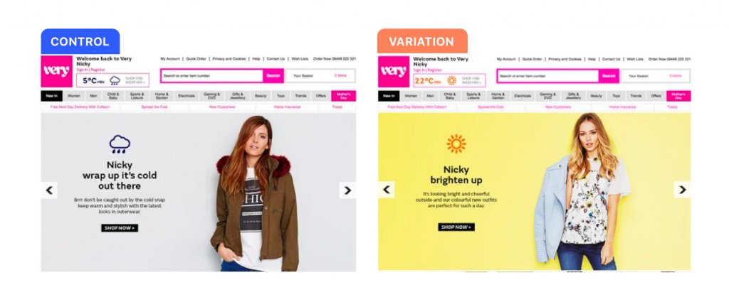
Personalized homepage and landing pages open new and exciting avenues for eCommerce testing.
3. Product pages
A visitor to your eCommerce store will either land directly on a product page or eventually navigate to one. Once there, you want them to purchase the product. Ask yourself, what does your potential client need to know about this product or service to get them to my payment gateway? What can I do to increase the likelihood of a person adding a product to the shopping basket?
Unfortunately, there is no one answer to these questions.
You will need to run tests to see what changes you make to the product details page that get your business the best results. For example, you can test if adding elements that emphasize on scarcity or urgency would boost sales.

(Image source: Neilpatel)
Other elements on a product page you can test include your CTA, social proof, images, videos, recommended products, featured products, etc. Changes to any of these elements have the potential to increase conversion rates to the shopping cart and onto your payment gateway.
Download Free: A/B Testing Guide
4. Shopping cart and checkout process
It is a well-known fact that cart abandonment rates are high. According to BigCommerce, the average cart abandonment rate is 69.23%. This is the number of people who put a product into their cart and leave without making a purchase.
There is a large body of information on why people abandon a shopping cart during an online purchase. The graph below illustrates some common findings.
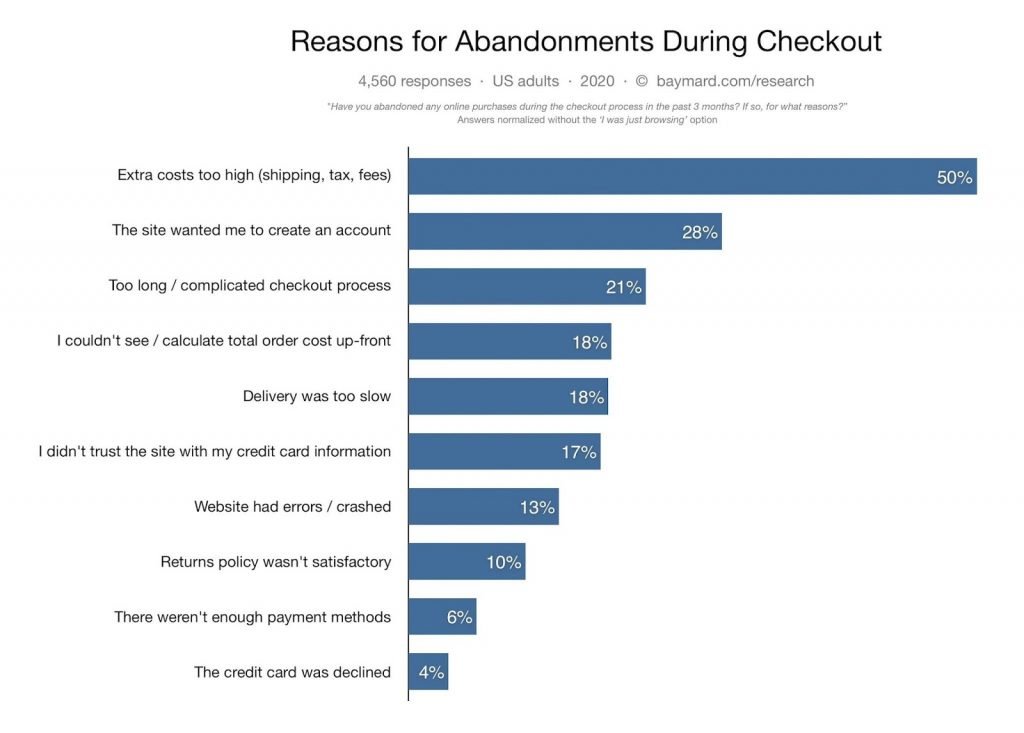
Improving your checkout and payment system revolves around addressing some or all of these issues. The eCommerce website Zalora offers an insight into how eCommerce testing on checkout pages can improve conversion rates.
They ran an A/B test on their checkout page, testing how they could emphasize the free returns policy for some products. The control is on the left, and the variant is on the right.
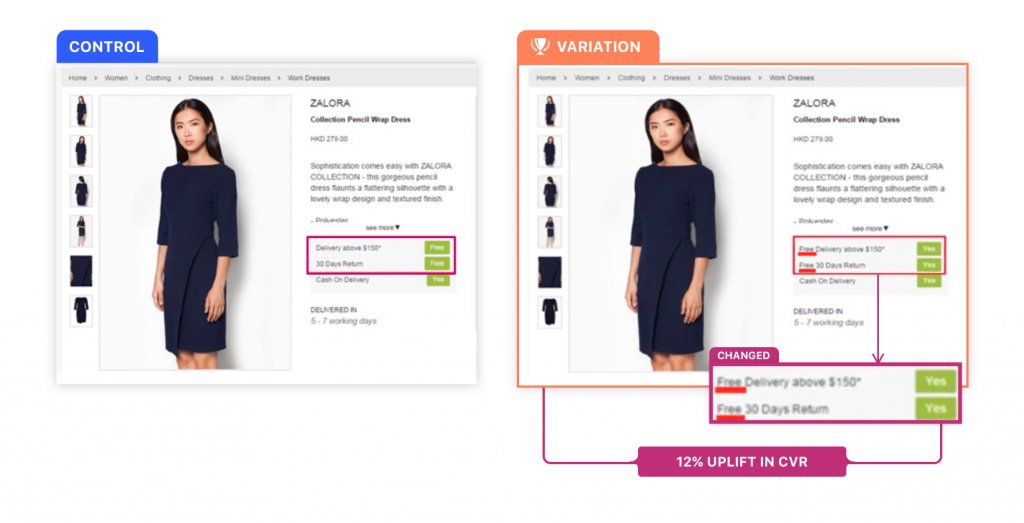
The variant outperformed the control by 12%. This small change to the design of the checkout page caused an uplift in the checkout rate.
There are, of course, other elements to test. Adding more credit card payment options, security logos, social proof, and more can all lift your conversion rate. The important thing is to instill a culture of testing into your company, and experiment to discover what works.
Optimizing your shopping cart experience for conversions is one of the quickest ways to increase sales. Running these tests is a lot easier than you might imagine. Try VWO now to see for yourself.
5. Site performance across devices
As mentioned earlier, people are accessing your website through an increasing range of devices. A study by Statcounter shows that 52.03% of the world population accesses the internet through mobile.[5] At a basic level, it’s essential to have responsive websites. This allows you to adapt your site to different devices and screen sizes.
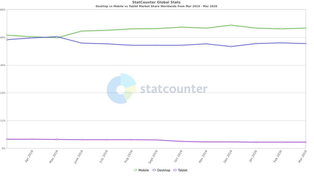
However, even if your site is responsive, you can still encounter problems. Cross-browser compatibility issues are common. To further complicate matters, the OS a website is accessed on, the screen’s size, and the internet speed all impact user experience.
As you are no doubt aware, there is a clear correlation between the amount of time a page on your site takes to load and the likelihood of someone making a purchase. The graph below illustrates this point.
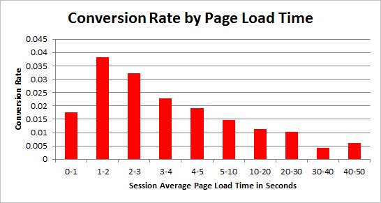
There is a high probability that your website’s page load time is optimized for desktop because for most sites it is. However, mobile load time can vary tremendously. You must implement technical solutions that address problems like this alongside optimizing your eCommerce website copy and design elements. Every step a user takes through your website is part of their user experience.
Summing up – eCommerce testing
A culture of testing will play an important role in the success of your company. Ensuring a smooth user experience is essential to customer retention. Meanwhile, updates to a site design through conversion rate optimization can have a significant impact on profits.
In this guide, we looked at the importance of eCommerce testing. We covered the types of tests you can run on your site and discussed some of the practicalities of running these tests. Finally, we discussed some of your eCommerce store’s most important elements to test, backing up each point with data and case studies that illustrate why it matters to your business.
Note: The author owns screenshots used in the blog.
]]>
