This blog explores customer engagement examples from leading brands and the strategies they employ for success. We are sure that learning from their stories will inspire you to create winning customer engagement strategies for your brand as well.
So, let’s start.

Spotify
Spotify, with customized playlists created for every listener based on their listening preferences, aces customer engagement like no other! From mood-based collections to regional and occasion-based playlists, Spotify’s recommendations are a musical marvel. As it replaces your need to curate playlists manually, you can simply sit back and enjoy your favorite songs wherever and whenever.
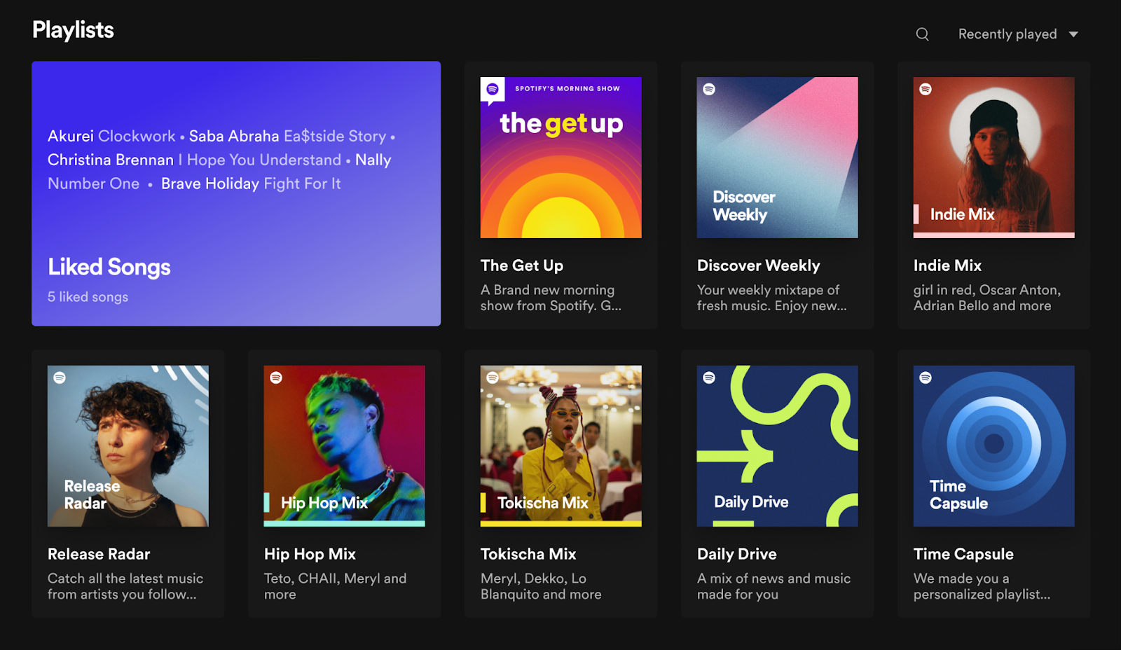
Have you heard about Spotify Wrapped? It is a popular online customer engagement campaign where you can see a roundup of all your most-played and cherished songs from a particular year. It was first launched in 2016 and is still going strong. In fact, it is such a hit with users and this campaign has become a part of Spotify’s brand identity.
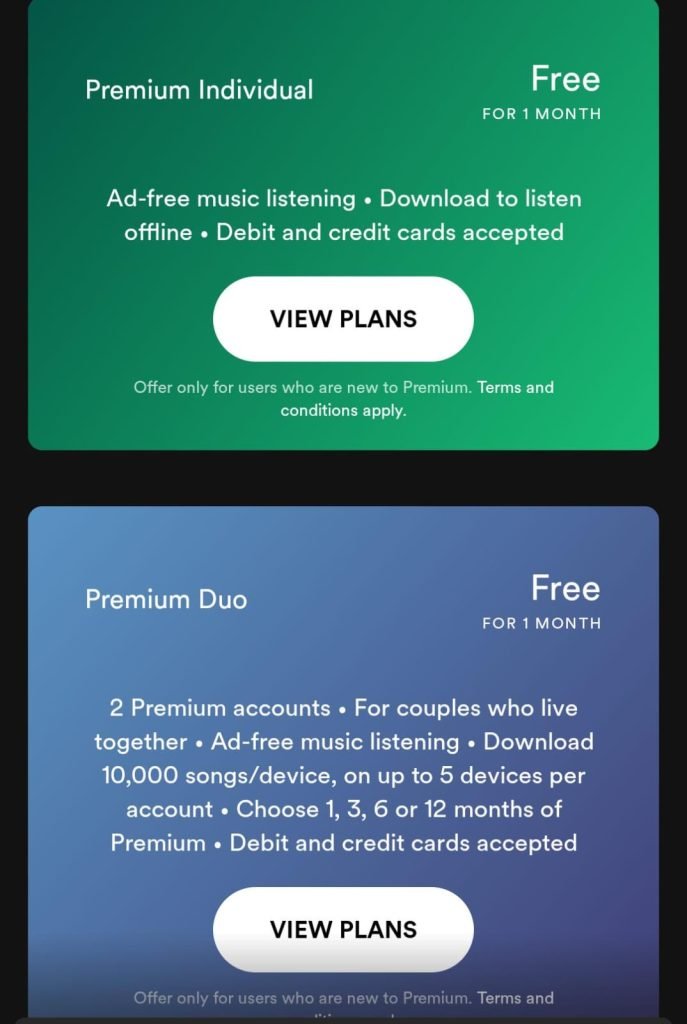
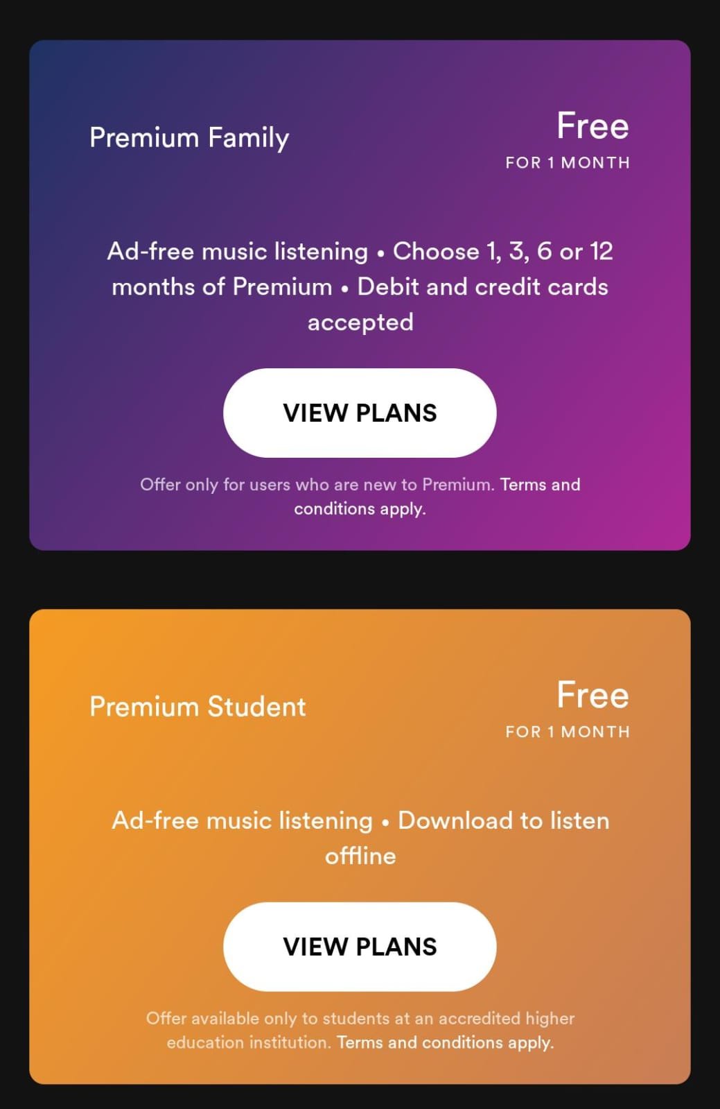
But it doesn’t stop at playlists. Spotify’s commitment to user satisfaction extends to its pricing plans as well. They offer a wide range of pricing plans catering to individuals, duos, families, and even students. This inclusive approach ensures Spotify meets the diverse needs of its audience, making it a top choice for those craving personalized listening experiences at flexible pricing.
Mailchimp
Mailchimp is one of those B2B companies whose customer engagement marketing strategies are always on point. Since creating an account with Mailchimp, I’ve received some compelling newsletters from the company. Recently, I received an email revolving around promoting their upcoming virtual conference.
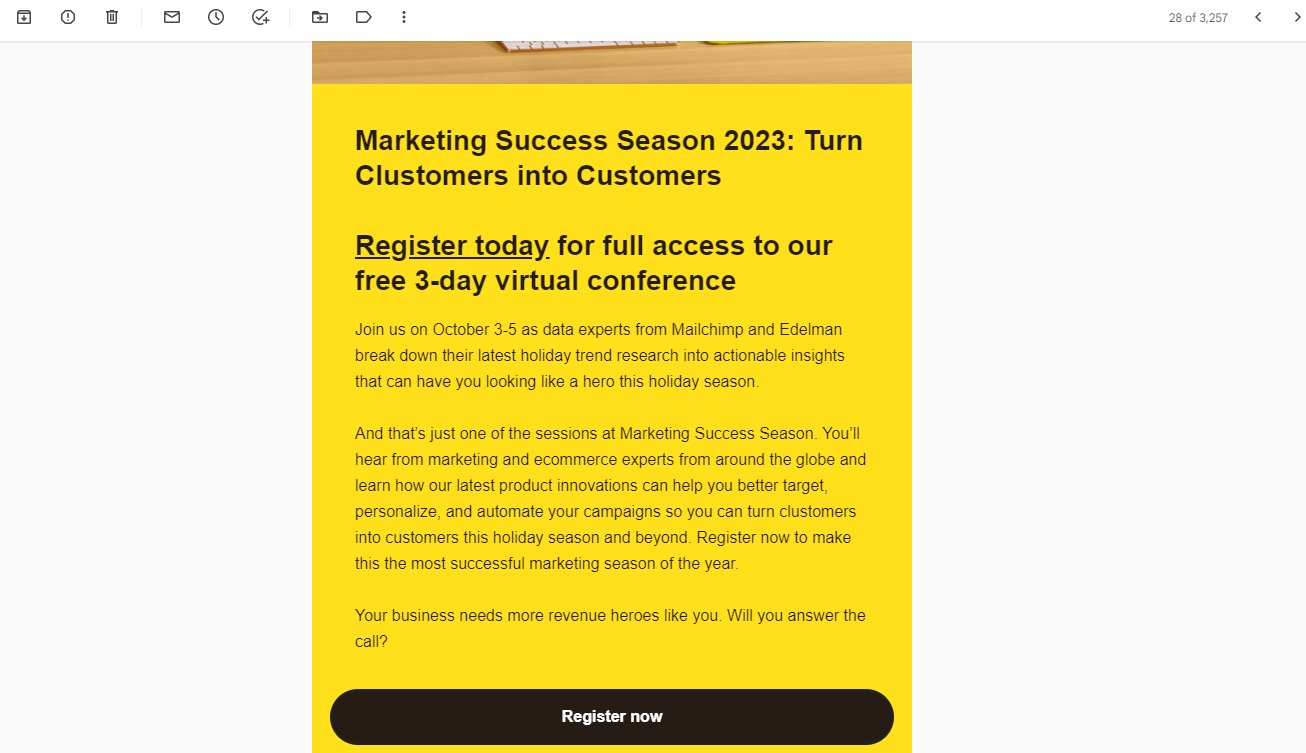
What stood out to me was the detailed information about the conference’s savings, giving a clear picture of what attendees can expect. This provides value to their audiences more than promoting their own product.
This strategy may not lead to immediate revenue boosts, but it reinforces Mailchimp’s reputation as a valuable resource. It is a good move, as it can contribute to long-term revenue goals by re-engaging users who may have been dormant for a while and enticing them to explore Mailchimp’s tools once more.
Sephora
There is no beauty enthusiast who has not heard of Sephora. This French multinational retailer is at the top of its game because it has put customer engagement at the heart of what it’s been doing. Its personalization strategy is top-class without a doubt. But what is specifically more commendable is its loyalty program – Beauty Insider.
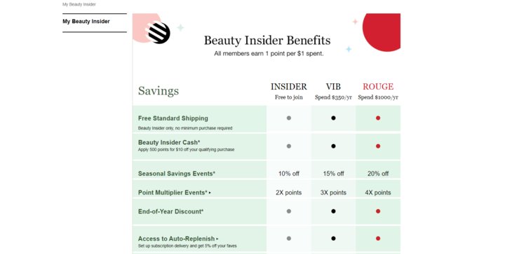
This program operates on a points-based system, where customers earn points with each purchase, which they can later redeem for beauty products, samples, or exclusive experiences. This incentivizes frequent shopping, instilling a sense of accomplishment and satisfaction among customers.
Beauty Insider members enjoy exclusive access to sales, discounts, and promotional events. With this excellent customer engagement example, Sephora shows how to make your existing customers feel valued.
Sephora also extends thoughtful birthday gifts to its members, fostering a sense of appreciation and potentially encouraging purchases around their special day.
Further, Sephora’s online platform fosters customer engagement among Beauty Insider members, enabling them to share reviews, ask questions, and participate in beauty forums, solidifying a sense of belonging and loyalty among customers.
Uber
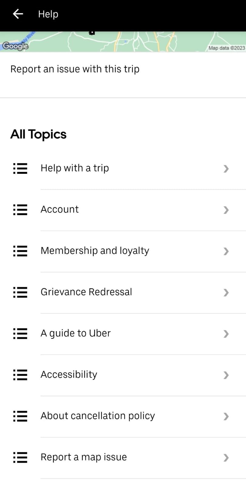
Uber’s consistent drive to innovate, adapting and enhancing experiences to align with evolving customer behaviors, positions the company as a leader in the industry. However, recently the issue of trip cancellations and offline driving left many Uber passengers in India dissatisfied.
In response, Uber India promptly launched a customer engagement campaign named ‘If you’re off the app, then you’re off the map’. This was aimed at re-engaging its customers and winning back their trust.
This initiative not only discourages offline trips but also places a strong emphasis on transparency and passengers’ safety. By doing so, it reassures the passengers that their well-being is Uber’s top priority. This also simplifies the process for passengers to report any instances of offline trips.
Reducing offline trips and trip cancellations directly impacted Uber’s revenue. When rides are completed off the app, Uber loses out on commission and fees. By curbing these practices, the company protects its revenue stream and works toward profitability.
Regaining the trust of passengers will likely encourage them to choose Uber for their rides. This customer engagement example is expected to boost revenue and foster enhanced loyalty among its customer base.
IKEA
In today’s world of marketing where companies often go to great lengths to prove why they’re the best, IKEA has taken a different approach with its latest customer engagement campaign – Proudly Second Best.
Instead of focusing on their products, they’re highlighting the special bond between parents and children. A lot of their customers are parents who shop for cribs, stools, and high chairs.
IKEA highlights the subtle truth that no piece of furniture, even if it’s their product, can be as important as a parent. Their products can help improve family lives but can’t be a substitute for parent-child bonds.
This furniture brand taps into a universally emotional theme in this campaign, which is poised to significantly increase customer engagement. The campaign positions the brand as one that cares about family dynamics and relationships, leading to a more positive brand perception and increased customer loyalty.
The messaging clearly showcases IKEA’s commitment to understanding, valuing its customers, and fostering trust and authenticity. Now, this is an excellent customer engagement example all brands must learn from.
Liked the examples so far? We’ve got some more for you. Below, you’ll find some more case studies showcasing how brands made the best use of visitor behavioral analysis and A/B testing to improve customer engagement on their digital properties.
Bizztravel
Goal
The Bizz Travel Group is a popular name in the Dutch online travel business. They are experts at making their leisure products and selling them on their websites. The company wanted to conduct an A/B test to identify the best way to arrange navigation on their website to improve visitor engagement with the information available and nudge them ahead in their booking process.
Quantitative analysis showed that many visitors used site searches to look for ski villages like Gerlos and Val Thorens.
Some 23% of visitors landed on the homepage, while the majority entered the site at deeper levels. On average, visitors click about 5 times before finding a link to a ski village. This led the team to conclude that almost 75% of visitors never see the homepage of the website.
Test
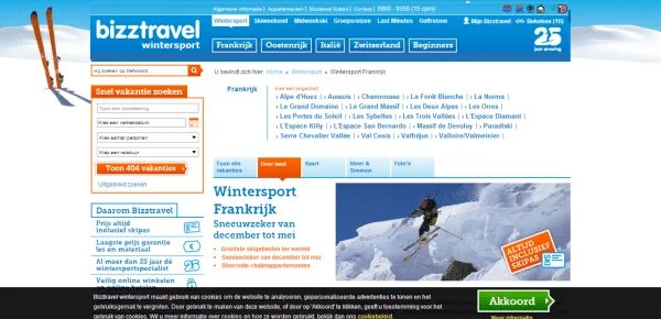
Based on these observations, the Bizztravel team decided to streamline the website navigation to ensure visitors could easily locate the desired content and engage with it to make selections.
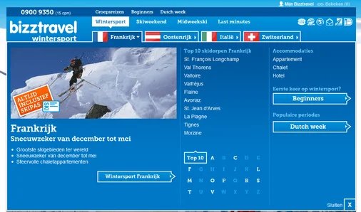
They introduced a revamped page header, designed to make navigating to specific pages effortless from any part of the website. This was expected to reduce the likelihood of them leaving the site due to frustration and cognitive load.
Qualitative tools like heatmaps were used to analyze user behavior, revealing which areas of the website attracted the most attention and guiding the selection of key offerings for the header. Therefore, this is a great example of customer engagement that has made effective use of both quantitative and qualitative analytics.
Changes like including direct links to ski villages, special marketing theme pages, and the top 10 ski village getaways by Bizztravel were made in the variation. It featured a menu that made it easier for visitors to find what they needed without searching through a messy page. Consequently, this was expected to improve customer engagement.
Result
The primary goal of this A/B test was to track visits to the thank you page. As expected, the redesigned navigation showed a 21.34% improvement in the conversion metric.
Hyundai
Goal
Technology companies provide us with good examples of customer engagement. Hyundai (Netherlands) aimed to improve conversions from the lead-generation page on its website with the help of Traffic4U, an international online marketing agency.
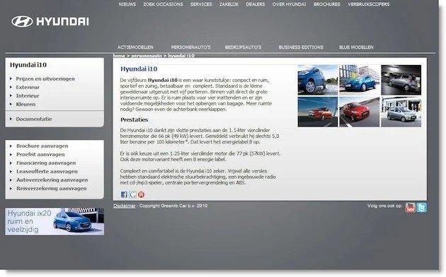
Hyundai had individual landing pages dedicated to each of its car models, offering visitors the opportunity to request a test drive or download a brochure. While these landing pages primarily receive traffic from paid ads, they also attract some direct and SEO-driven traffic.
To tap into the potential of this incoming traffic, they set some objectives.
Firstly, they aimed to boost the volume of brochure requests and test drive inquiries, optimizing their conversion rates. Secondly, the company sought to increase the click-through rates from the landing pages of each specific car model as the initial step of the customer conversion process.
Lastly, Hyundai intended to gauge user engagement levels, effectively measuring the opposite of the bounce rate. This was to ensure that visitors were actively interacting with the landing pages.
Test
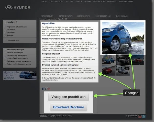
Traffic4U opted to conduct a multivariate test for each individual car page on Hyundai.nl. This was because Hyundai’s car-specific landing pages featured several components, including car headlines, visuals, descriptions, testimonials, and more.
A multivariate test could help gain insights into which of these elements influenced a visitor’s choice to request a test drive or download a brochure. For example, the hypothesis was that large car images, rather than thumbnail images, would be more effective in capturing users’ attention and engaging them on the page.
Similarly, an extra CTA button was expected to better highlight the desired action and nudge visitors toward it. Further, SEO-friendly text was implemented in place of non-SEO text for long-term SEO benefits.
Result
The test results were phenomenal with the click-through rates increasing by 208%! This test is regarded as one of the best customer engagement examples because it won silver in the annual WhichTestWon awards.
Hubstaff
Goal
Established in 2012, Hubstaff provides software solutions for time tracking and project management and is a big believer in experimentation for customer engagement. So much so that it has up to 5 experiments running on its website at any time.
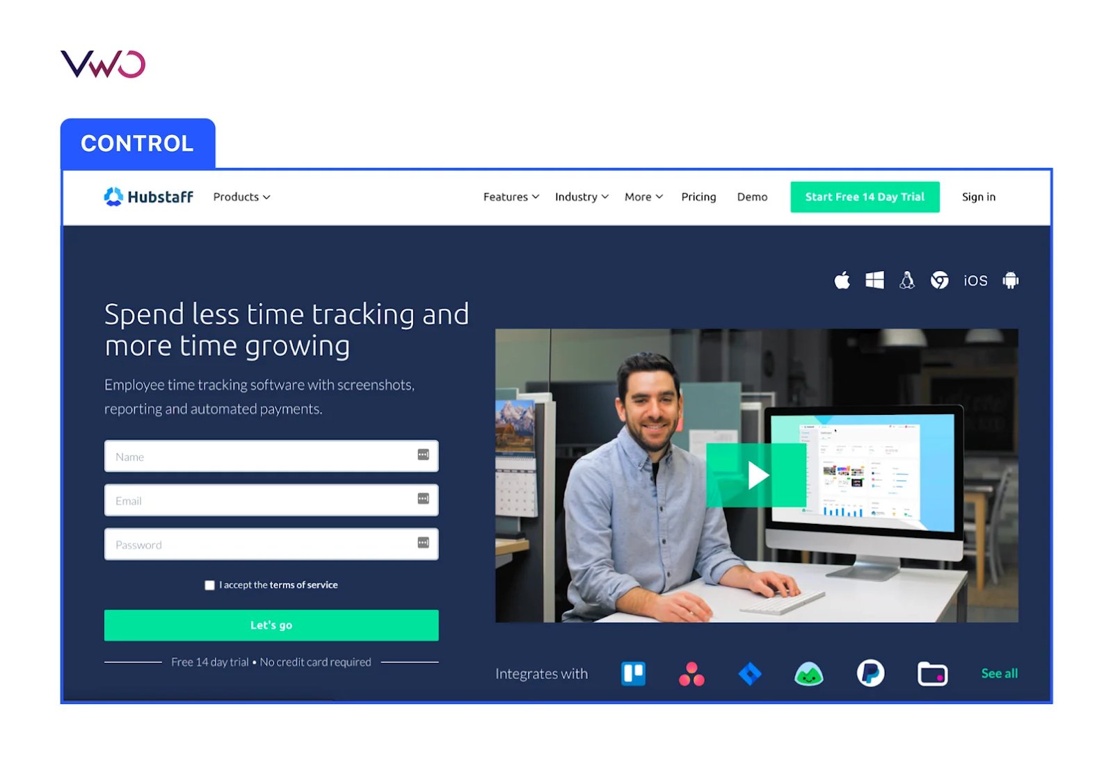
Previously, Hubstaff’s homepage had only small modifications. However, the team wanted to overhaul it completely for better results. Visitors to Hubstaff’s homepage were immediately directed toward trial and paid plans. It was crucial for the team to prioritize SEO best practices to attract the right organic traffic.
Test
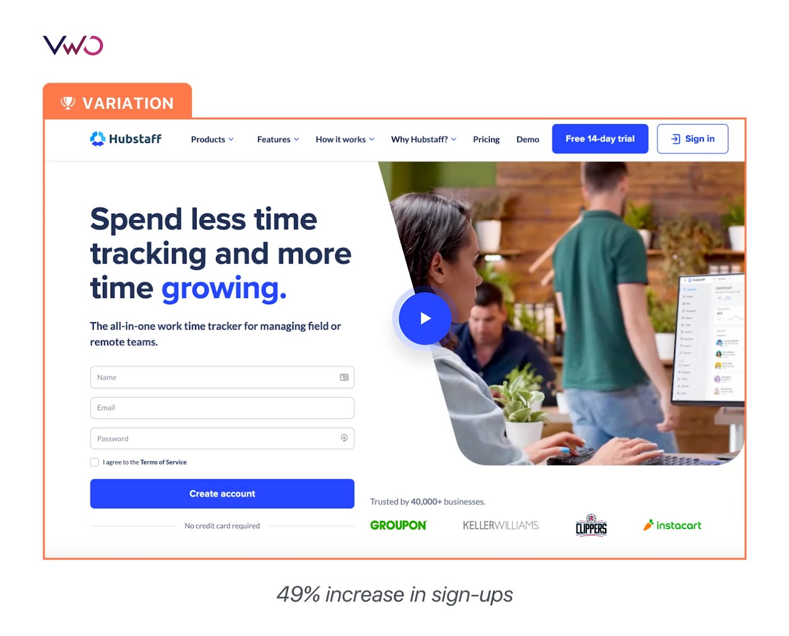
The homepage revamp aimed to achieve an optimal conversion rate by strategically arranging content and visuals to effectively showcase the key product features.
If this test turned out to be a success, the team would proceed to implement the new design across the rest of the website as a part of their customer engagement strategies.
The team planned to conduct a split URL test and established some key metrics to test its effectiveness – visitor-to-trial conversion, on-page customer engagement, hero form submission (create account), pricing page views, and full-funnel user journey.
Result
After running the test for three months, the variation emerged as a winner with a 49% increase in visitor-to-trial conversion. Although the number of clicks decreased, the sign-up data showed that the new page actually generated more sign-ups, leading to a decrease in the number of clicks.
Medienreich
Goal
A German-based company called Medienreich Training specialized in software training and offered its services to participants from the same organization or across different companies. Its objective was to boost conversions, with a primary focus on improving customer engagement with the offerings on its website.
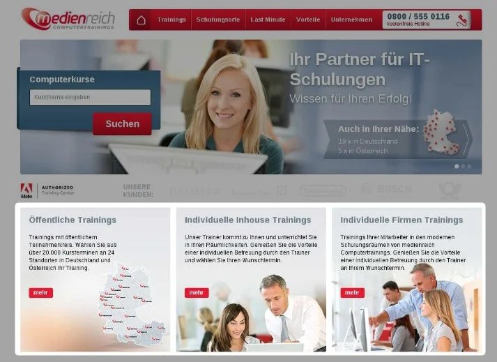
Medienreich presented its training services categorized into three sections – Open training, Individual in-house training, and Individual company training. To improve user engagement with the training they offered, the company decided to run an A/B test as a part of their customer engagement program.
Test
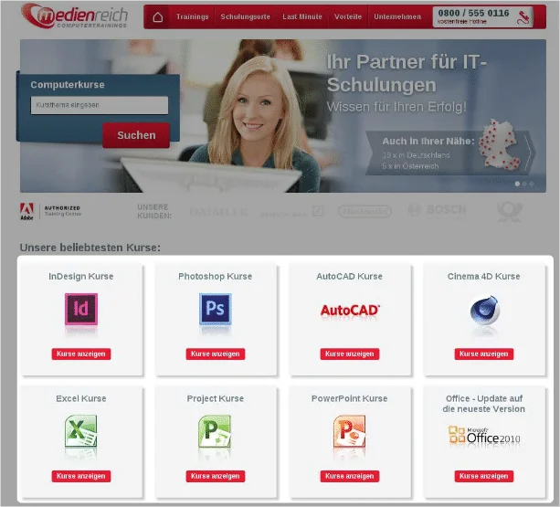
Medienreich’s online marketing team decided to swap the three categories with its top-selling courses like Photoshop, AutoCAD, InDesign Excel, PowerPoint, and more.
The team realized that structuring the information in the right sequence is essential for creating the right kind of impact on users. For example, visitors would first like to know the types of courses offered by Medienreich and not the details from the outset.
The homepage should feature content that is valuable and relevant to visitors and should be easy for them to access. Hence, they wanted to avoid cluttering the homepage with information that may seem important to them but not necessarily to potential visitors.
Result
They tracked ‘engagement’ as the primary metric and ran this test for 20 days. And the variation indeed improved user engagement by an impressive 40.87%. Due to this change, the year-on-year value of the homepage improved by a massive 106.42%.
Details only become important once you have correctly presented the names of available courses first. This is what helped grab the attention of users and engage them, pushing them further down the conversion funnel.
Overall, what we learned from this customer engagement example is that your homepage serves as the gateway to your website, so it must contain details to entice prospects and not turn them away.


Get inspired to build your customer engagement strategy
Enjoyed reading the customer engagement examples we shared? Enhancing customer engagement should be seamlessly integrated into your digital strategy because if you overlook engaging with your audience, your competitors will seize the opportunity and win them over.
To harness the power of behavioral analytics and experimentation for an enhanced customer engagement strategy, consider taking a free trial of VWO today.
Frequently asked questions
Some of the top customer engagement examples have been discussed in the blog. From Spotify’s personalized content to IKEA’s emotional messaging, you will glean valuable insights on acing customer engagement from these top brands.
We have also discussed some case studies where brands leveraged user experience analytics and testing to improve customer engagement. Please refer above to read them in detail.
Companies build customer engagement strategies to retain existing customers and enhance their bottom line in several ways.
Firstly, engaged customers show brand loyalty and tend to make more frequent purchases, leading to increased revenue. This customer loyalty gives you a competitive edge.
Secondly, engaged customers often serve as brand advocates, promoting products through word-of-mouth and other social media channels, reducing marketing costs.
Thirdly, gathering customer feedback through engagement helps companies refine their products and services. Continuous innovations improve customer satisfaction, encourage engagement, and reduce churn.
Lastly, personalizing customer experience based on engagement data boosts cross-selling and upselling opportunities. As you will see in every customer engagement strategy example, when done right, customer engagement leads to increased customer loyalty, higher retention rates, and continuous growth.
Customer-focused content, gamification, personalization, customer feedback, humanization of brand communication, and customer feedback lead to effective customer engagement strategies. To know about some great customer engagement ideas in detail, read our blog.
How can I measure the effectiveness of my customer engagement strategies?
Measuring the effectiveness of customer engagement strategies involves key metrics like customer retention rate, churn rate, net promoter score, and customer satisfaction score. As you have seen in some of the case studies above, the click-through rate is also a reliable customer engagement metric.
Whatever metric you choose to measure customer engagement, make sure it is contributing to your overarching business objectives. That’s how customer engagement initiatives will improve your bottom line. Read more on customer engagement metrics and analytics.
What you learn from customer engagement examples are not just best practices, but also the mistakes to avoid.
Some of the common customer engagement mistakes to avoid include neglecting user behavior on your website, getting complacent with delivering a generic customer experience, overloading customers with irrelevant messages, lacking consistency in messaging, and more.
In addition, being unresponsive to user inquiries and failing to come across genuinely concerned toward customers. Being present for them helps you build positive relationships and improve customer satisfaction.
Time for a reality check!
According to research on worldwide retention rates, the churn rate for mobile apps starts at 74.7% on Day 1 and gradually increases to 94.3% by Day 30. In other words, the retention rate across 31 mobile app categories is 25.3% on Day 1 but drops to 5.7% by Day 30.
If you are running a gaming app or a publishing app, losing users means they’re disengaged. For eCommerce or delivering apps, it can seriously impact your revenue goals.
So, what is the solution to reverse this churn trend? In this blog, we will tell you how to tackle the problem at its core using the power of experience analytics.
To understand where to start, you first need to calculate the churn rate for your app.
How to calculate churn for your app
The lower your churn rate, the better. A higher churn rate means more effort is required to improve user engagement and retention.
Imagine you run a subscription-based streaming service. You want to calculate churn for your app to understand user engagement and make strategic decisions to improve retention if needed.
Let’s say your app has 40,000 active users at the beginning of a month, and by the end of the month, 28,500 have stopped using your app. You can calculate the churn rate of the month, using the formula below.

In this hypothetical scenario, your churn rate stands at 71. 25% and needs immediate fixing. To do so, understanding the reasons behind the churn becomes essential.
Why do app users churn?
According to a survey of 2,000 users, the primary reasons for app uninstallation are as follows: not using the app (39.9%, limited storage (18.7%), and excessive advertisements (16.2%).
It is evident that non-usage commands the lion’s share as the primary driver of app churn. To uncover what drives users away, there are some key questions you must find answers to.
Why did users drop off from the app and never come back?
Take an objective look at your app. Is its navigation cumbersome? Imagine using a different app with such difficulties – would you stick around? Challenging navigation increases the cognitive load on users, which can drive them to abandon your app.
Further, intrusive ads alone can drive away 16.2% of users, making them one of the top reasons why users drop off from an app.
Users constantly crave novelty. If your app stagnates, lacking updates or new features that align with users’ preferences, their interest will wane.
Additionally, if your app lacks security features, privacy concerns can lead users to drop off and seek more secure alternatives that better cater to their needs.
Why do users sign up but are not active?
Generic content or offers blow out users’ interests faster than you think. 63% of smartphone users are more likely to purchase from companies whose mobile apps offer them relevant product recommendations. So, it’s worth checking if your app is missing that personalization angle.
Now, think about users who signed up but aren’t doing much. Could it be because your app is like a maze, making it tough for them to derive the right value from your app? Users do not have the time or patience to embark on a treasure hunt in your app.
Your app should be seamless enough to enable users to achieve their goals efficiently, providing the expedition they need.
Why do some users come back to your app? And how is their experience different from the ones dropping off?
At times, users simply choose to disengage. This change of heart has become increasingly common in today’s digital world, with several options available online. However, if you still see users returning to your app, it shows that your app offers something valuable that resonates with your audience. Some of these returning users may be your loyal customers who trust your brand and your app.
On the other hand, certain segments of users who drop off to the point of never returning may be seeking more personalized experiences. This trend is especially noticeable among Gen Z, where over 60% of them explore alternative options even if they have a preferred brand.
For them, a poor user experience, intrusive ads, or generic offers are the least accepted elements to be found on mobile apps today. To re-engage users who may be losing interest, optimize your app to leave a positive impression and foster trust.
We have touched upon the reasons why users may not be engaging with apps. But remember, user behavior can vary significantly from one app to another. To have users keep coming back to your app, you need to figure out the exact reasons behind their disengagement and fix them. How to do so? We discuss that in the following section.
What is user experience analytics all about?
When digging into the problems behind app churns, you will encounter two types of analytics offering a solution – quantitative and qualitative.
As the name implies, quantitative analytics deals with the numbers, and the measurable aspects of the issue at hand. Some of the key performance indicators (KPIs) we can measure using quantitative analytics include:
- Monthly active users: This tells us how many unique users engage with our app in a given month.
- In-app purchases: It measures the percentage of users who make in-app purchases.
- Average revenue per user: By calculating the average revenue generated per user, we can assess the financial impact of churn.
- Notification engagement: This metric informs us about the number of users responding to in-app or push notifications.
- Feature usage rate: It helps us gauge the adoption and usage of specific features within our app.
While these numbers provide valuable insights into user behavior and app performance, they don’t tell us the ‘why’ behind the numbers.
For instance, if we observe a consistent drop in monthly active users, it signals that users are disengaging with the app, but it does not explain why they are engaging in the first place.
This is where qualitative analytics becomes invaluable.
It goes beyond just the numbers, uncovering the reasons behind user behavior. Qualitative analytics reveals the friction points users encounter on our app, how they interact with various elements, and what drives them to churn.
Without these insights, numbers remain mere data points without direction.
However, when we combine quantitative and qualitative analytics, they provide a comprehensive understanding of why users are churning and how we can address these issues effectively.
Therefore, user experience analytics involves delving into behavioral analysis and comprises the following:
Watch the user journey with recordings
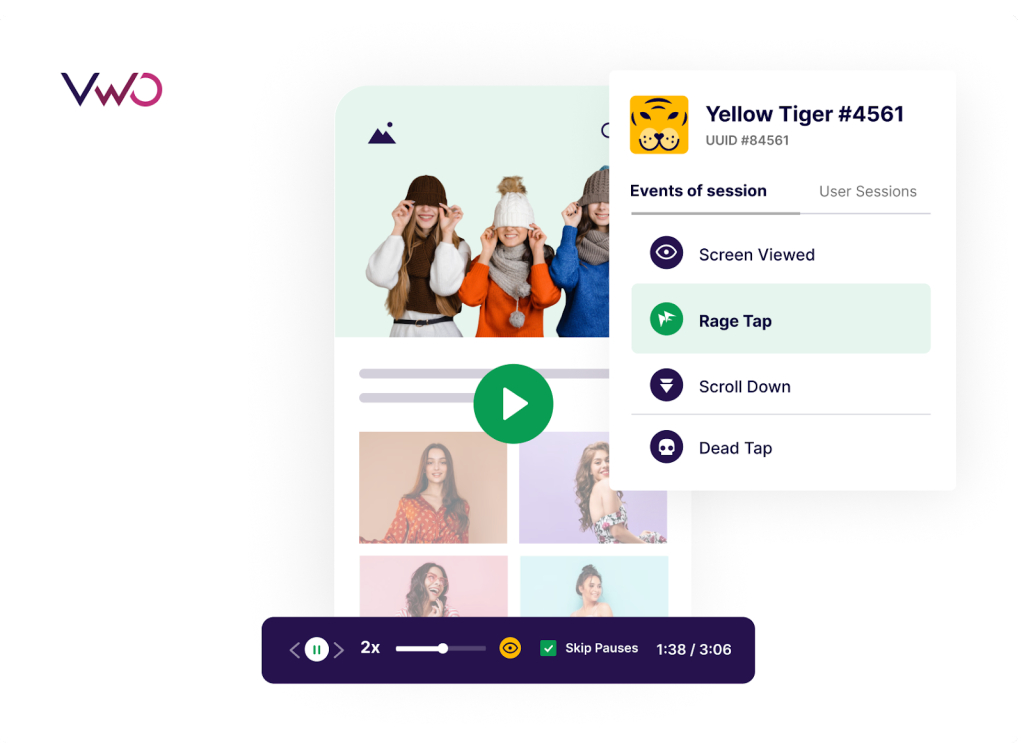
Session recordings are qualitative tools that capture real-time browsing sessions of app users, allowing you to review the recordings later to extract valuable insights into visitor behavior.
Visualize user engagement with heatmaps
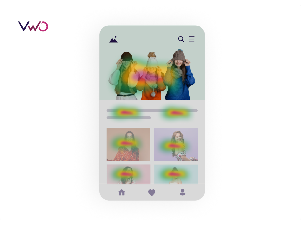
Heatmaps provide colorful visual representations of user interactions with different elements on your app. By using a color spectrum ranging from red to blue, heatmaps illustrate which elements on your app page are the most popular (hot) and least popular (cold).
Study-specific user cohorts
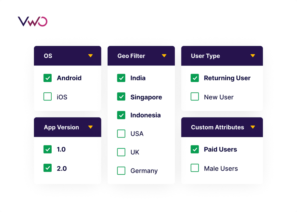
In experience analysis, you can study how users from different cohorts behave on your app. For example, you can observe the behavior of users from specific locations. New users and returning users are also two distinct cohorts that you can delve into to gain a deeper understanding of their specific behaviors. App version, device type, Android version, and iOS version are other user cohorts that can further be analyzed to examine user behavior deeply on the shared characteristics.
Our platform, VWO Insights for Mobile Apps, supports all these segmentation options and also allows you to create custom events specific to your app as filters.
Understand funnel drop-offs
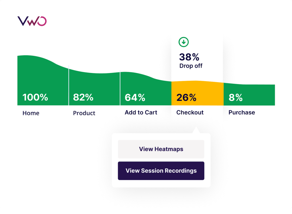
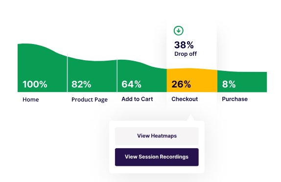
Funnels help you figure out where your users are losing interest and dropping off from your app. Funnel reports can also be filtered using different segments to deep-dive into user behavior across their journey on your app.
How to use user experience analytics to reduce your app’s churn
Regardless of the mobile app, resorting to user experience analytics allows you to zero in on user behavior and use the collected insights to improve the app even further. These enhancements directly contribute to higher user engagement and reduced churn rates, ensuring people stick around and enjoy the app longer.
Here are some use cases of leveraging user experience analytics from different industries.
Shopping apps
When it comes to a shopping app, session recordings can provide insights into user struggles or obstacles that lead to cart abandonment. For instance, you can determine if users drop off after trying and failing to access coupon code links on your app.
Heatmaps offer valuable information by highlighting which elements within your app receive the most user interaction.
For instance, if users are not scrolling down to view reviews, as indicated by the cooler blue areas on the heatmap, you may consider relocating them to a more prominent position at the top.
This approach enables you to design your app layout and arrange elements based on your users’ mental model.
How do they help reduce churn?
Let’s say quantitative analysis has shown that users are churning from your shopping app. You believe that adding items to their wishlist will encourage users to return to the app and reduce churn. Therefore, your goal is to improve wishlist additions to tackle the problem of churn.
But before you work on improving the feature, you want to understand users’ current level of interaction with it. So, you analyze recordings to see differences in behavior between users who add products to their wishlist and users who don’t. Interestingly, you see many users refrain from using the feature.
These observations will lead you to make UI changes and optimize the wishlist icon, making it easily accessible and shareable for users. This, in turn, will increase wishlist additions, providing an effective solution to reduce churn.
Food & drink apps
Food and drink ordering apps heavily rely on user experience analytics. Session recordings provide insights into how users browse menus and make selections, revealing any difficulties they may encounter in finding what they want.
This information enables you to make improvements in the menu design for enhanced user navigation.
Analyzing user behavior with specific dietary preferences or interacting with such filters can help you refine personalized recommendations. Filtering and watching user sessions by different times of the day can offer valuable insights into user behavior during peak ordering periods.
Similarly, heatmaps can highlight areas of increased user interaction, such as ratings or images, helping you plan their design and placement effectively.
How do they help reduce churn?
Consider you have added a new feature named “Nutritional intake” in your food app for every user. You have noticed that users who used this feature often returned to the app to see their accumulated nutrition/calorie data, which often led them to place orders from the app.
As the next step, you turn to session recordings to observe the behavior of users who are not using the feature and identify ways to encourage its adoption. For instance, placing the nutritional count on screens could attract users’ attention and drive more engagement.
Therefore, this UI change (or any other) guided by qualitative analysis can improve the feature adoption rate, drive more orders, and reduce churn from the app. But before you implement any change, be sure to run a test and confirm its effectiveness.
Finance apps
Session recordings help identify any difficulties users may have encountered while filling out loan forms, such as missing fields or incomplete information at certain steps. They provide a detailed view of user interactions leading to contact with customer support, allowing you to pinpoint areas where in-app guidance can reduce support inquiries.
If you are interested in assessing how users respond to newly added investment charts or graphs in your app, heatmaps can reveal their interactions, enabling you to optimize the layout and information presentation for better clarity.
You can also gain insights into user behavior when they make changes to their investment portfolios, identifying opportunities to offer guidance and support.
Finally, filter recordings by the hour of the day will help you understand how users react to market fluctuations of any kind.
How do they help reduce churn?
Let us say, you have observed a high churn rate on the ‘Add/Manage your payees’ screen of your banking mobile app.
To understand why users are dropping off, you have analyzed their behavior through session recordings and noticed that they tend to scan only halfway through the form and drop off without completing the necessary details.
Further, heatmaps show that users are attempting to click on the ‘Help’ button at the top, but it is inaccessible. Based on these insights, you can streamline the UI of the screen by retaining only essential form fields and making the ‘Help’ button accessible.
Finally, these changes will encourage users to fill out the form, complete the details, and seek help (if needed) with just one click of a button. Simplifying these actions will reduce churn and enhance user engagement with the app.
Travel & local apps
Travel & local apps can also benefit from the capabilities of user experience analytics. Session recordings reveal booking abandonment patterns and provide insights into user behavior and preferences when making last-minute travel bookings, allowing customized offers and support.
Further, filtering recordings by date will help you gain a better understanding of user behavior and preferences during peak travel seasons while filtering by screen resolution ensures a seamless mobile experience across different devices.
Heatmaps offer insights into user interactions with map views, guiding improvements in functionality and design. Further, you can track events of saving favorite destinations, thereby identifying ways to improve this feature.
How do they help reduce churn?
Imagine you have a brand-new travel and hotel booking app, and you have recently noticed a significant churn from the home screen of the app.
After investigating session recordings of the home screen, you discovered that a segment of users opening the app on older Android versions experienced app crashes when trying to make bookings.
Subsequently, you shared the recording with the development team, who promptly resolved the issue. As a result, the booking process became as easy as a breeze for users. And what’s more? The reduction in user frustration led to less churn, increased bookings, and improved user satisfaction.
Gaming apps
Gaming apps can also be improved with the use of these analytics. Session recordings highlight areas where users encounter challenges with controls or levels, providing insights for enhancing game design.
Session recordings also uncover user interactions with tutorials and guides, offering guidance for improving instructional content and overall design. Further, filtering the recordings by game version will tell you how updates or feature introduction impacts user engagement.
Heatmaps too can help you gauge which areas of your app users interact with the most and ensure optimal placement of offers, purchase prompts, and other elements.
How do they help reduce churn?
Suppose you have recently introduced a daily login reward system in your gaming app, offering users access to new content and in-game currency, all in an effort to reduce churn rates.
To gain insights into user reactions, you have analyzed both recordings and heatmaps. What you have discovered is a mixed response – while some users are actively engaging with the reward system, others are barely interacting with it.
You can conduct an experiment to enhance the placement and messaging of the feature, making it more prominent for users to engage with. This test can determine whether these changes will reduce churn rates and improve user experience.
Reduce app churn with user experience analytics starting today
Before you jump right into reducing churn, understand what is causing users to leave. Doing this will give your churn-controlling strategies the right direction.
VWO Insights for Mobile Apps is a robust user experience analytics tool that helps you pinpoint the root causes of your app’s churn. By leveraging insights from Session Recordings and Heatmaps, you can generate test ideas and optimize your app to boost retention and revenue growth.
Sign up for a product tour now and gain a 90-day free access to uncover the reasons behind churn in your mobile app.
]]>Table of Contents
- 1. Analyze the performance of your current forms
- 2. Beware of what you’re asking for
- 3. Mandatory fields and form validation
- 4. Clear and attention-grabbing CTAs
- 5. Testimonials and social proof
- 6. Form placement
- 7. Concise and convincing copy
- 8. Personalize your messaging
- Keep leads coming in with simple form fills!
In the world of B2B SaaS, free trials and demo request forms are more than shooting just a list of questions to prospects. In your pursuit to humanize B2B marketing, you should focus on building connections with your audiences, generating trust among them, and convincing them to try what we offer. And the starting point for all of this is having them sign up for a trial or request for demos.
It may seem like a lot of work, but it’s worth the effort.
Of course, your forms need the right ingredients to achieve their objectives. But to tap into their true potential, turn your focus on A/B testing. This strategy not only allows you to test one experience against another but also to understand what works and what doesn’t at that point for your website.
So, let’s begin discussing how to approach revamping forms and utilizing A/B testing to increase lead generation in this blog post.
1. Analyze the performance of your current forms
Before you give your web forms a makeover, make sure to diagnose the pain points.
By examining user behavior and identifying where they’re getting stuck or abandoning your form, you can make targeted improvements that will increase your conversion rates and drive more leads.
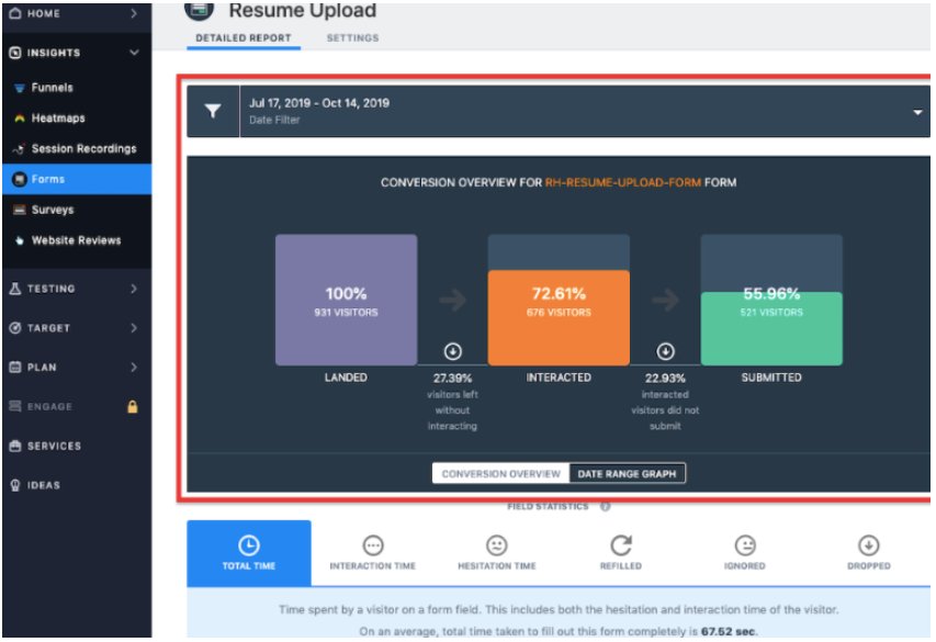
And that’s where VWO Form Analytics tool comes in. It can track and analyze user behavior to give you all the juicy deets on what’s working and what’s not. From drop-off points to time spent filling out each field, our form analytics tool helps you delve into macro-level as well as field-level statistics. Once you’ve gotten your hands on these data, you can work towards building high-converting forms by testing and incorporating the right elements.
2. Beware of what you’re asking for
Less is often more, and in the world of forms, this couldn’t be truer! Ever found yourself abandoning a form because it was long and you did not have the time to fill it out? But your audiences don’t have to go through the same. Make this process easy for visitors by reducing the number of questions you ask them to answer. This way, they can focus on the most important ones and save a lot of time. They’ll appreciate that you’re not too curious to collect too much personal information and therefore trust you enough to try your offering.
Suppose you’ve asked users to enter both personal and official email addresses in a free trial form. But for this purpose, entering just one email address could work. Some forms ask a ton of questions like, “How many employees do you have?”, “What industry is your company in?” and “How long have you been in business?” which are often not important to be answered at the outset. Let’s stop overwhelming users with so many questions from the get-go. If your product is solid, they’ll stick around.
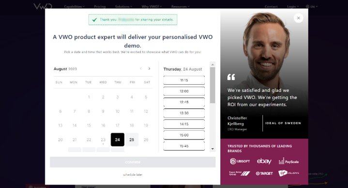
Having said that, we also believe that asking questions can sometimes help a brand evaluate the potential fit between the product and the customer. At VWO, filling out our free trial and request demo forms is a breeze. However, to ensure we connect with prospects who are truly invested, we’re ramping things up by scheduling one-on-one meetings with our team immediately after they submit their basic information on the request demo form. The winning experience saw an increase in clicks on the request demo CTA button by 35.32% and demo page visits by 3.01%.
3. Mandatory fields and form validation
Imagine you spend time filling out a form but all your efforts go in vain as you see an error message telling you that you entered the wrong information after you’ve filled out most of the fields. This is where form validation comes in. Form validation helps users ensure that they are filling out all the fields correctly on the go, which reduces the chances of making errors and speeds up the submission process.
Highlighting mandatory fields is also crucial in helping users save time. Imagine your prospects are to fill out your request demo form which is quite lengthy because you need to ensure the product-customer fit. But the form doesn’t clearly indicate which fields are required. When mandatory fields are highlighted, users can identify which fields should be filled in and focus on them, resulting in a faster form submission rate.
4. Clear and attention-grabbing CTAs
CTA buttons can make a big impact on your leads and bookings. They are the ones that seal the deal and get those leads coming in. But if they are not attention-grabbing, they are highly likely to be overlooked by users.
Suppose your free trial form features a “Try now” CTA button, but it’s barely getting any clicks. A CTA like this one might fail to motivate visitors to take action. What you can do now is run a test by creating a variation featuring a far more interesting CTA copy – “Start your 30-day free trial now” This specific CTA gives visitors a clear picture of what they’ll get by clicking it. With years of experience helping brands, we’re confident that this variation will be a winner. But we still suggest you study visitor behavior on your website and then decide if you’d like to run this test or not.
5. Testimonials and social proof
Testimonials and social proof are like stamps of approval from your existing customers. They show that these customers have already taken the plunge and had a great experience using your product. As a result, prospective clients can also take the leap following their footsteps.
If your form ticks most of the boxes of best practices yet doesn’t bring in any leads, try adding testimonials and see how that performs. Below is how Chargebee encourages users to sign up for a free trial by displaying a testimonial on the left side of the form.
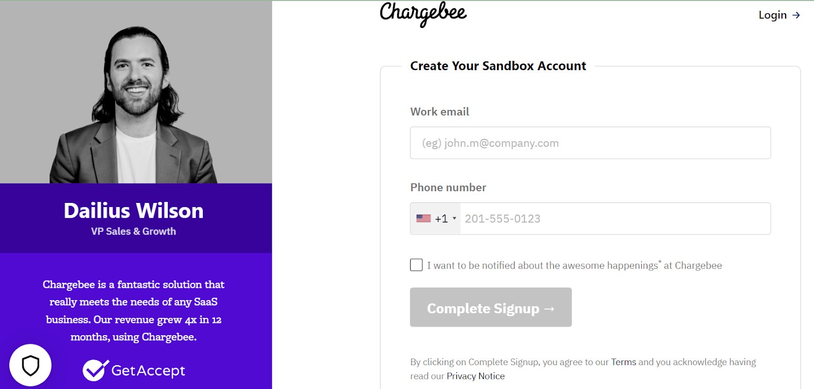
Using VWO Visual Editor, you can add any type of form modal or widget to pop up on your website. You can also edit and customize them to suit your brand guidelines and improve request demo/free trial conversion rates. It’s also possible to preview the changes on both desktop and mobile before the test starts. Sounds fascinating? Try it out to fully understand its capability.
6. Form placement
If your forms are not easily noticeable, visitors are less likely to take the pain to find them all by themselves. So, keep them in a prominent position, making it easier for visitors to engage with it and use it to submit their information.
To determine the right placement of your form, you can A/B test different form placements. At VWO, we ourselves champion the use of pop-up forms on our website. Our pop-ups are not at all intrusive in nature as they show up only when users click the CTA button.
Why not give your website visitors a hassle-free experience by embedding your form above the fold? This smart placement eliminates the need for scrolling and allows them to fill out the form with ease.
Human Interest, a US-based SaaS company, opted for VWO FullStack to integrate with Contentful and improve lead generation on its landing page. By showing the contact form above the fold, the number of form submissions increased by 3.77% and the number of calls scheduled with prospective customers increased by 75.84%. To know the details of this case study, read here.
Alternatively, you can also place the CTA of the form in a sticky header that remains at the top of the page as visitors scroll down. Clicking the CTA button can open either a separate landing page or display a web pop-up.
The age-old question, pop-ups or landing pages, which is the better form submission tool? We say, test them and see which one of them brings the maximum conversions for you.
Pop-ups ask for minimal information, such as an email address, to sign up for a free trial. Landing pages, on the other hand, show detailed information about your product or service and may ask for more information to be submitted, such as name, company, or phone number.
If you go for landing pages, make a statement with head-turning information and take advantage of all that extra space. Give your landing page the attention it deserves by including SEO keywords, showcasing your success with testimonials, and adding reviews or security badges. Plus, you can add a compelling video that showcases what your product can do for your prospects.
Does VWO help you test landing pages? Oh sure, it does! You can use VWO to test either individual elements of your landing page or conduct split-URL tests to validate complete overhauls. Request a demo and have our experts explain this in detail.
7. Concise and convincing copy
One of my favorite sayings on LinkedIn these days is ‘Sell benefits, not features”. And that’s what I’m suggesting you do in your free trial or request demo forms. Users want to know how your product helps them solve their problems. If you’re not getting that part right, they can switch to brands that do that better.
Tell your users what they can expect by signing up. Apart from a catchy headline, you must also list the benefits awaiting them after they are up for request demos. Think your current copy is not performing well? Our Visual Editor can come to your rescue. Its AI-powered copy generator can suggest great copies that resonate with your prospective customers. A/B test and see if the improved copy helps drive more conversions or not. The results will impress you, we’re sure.
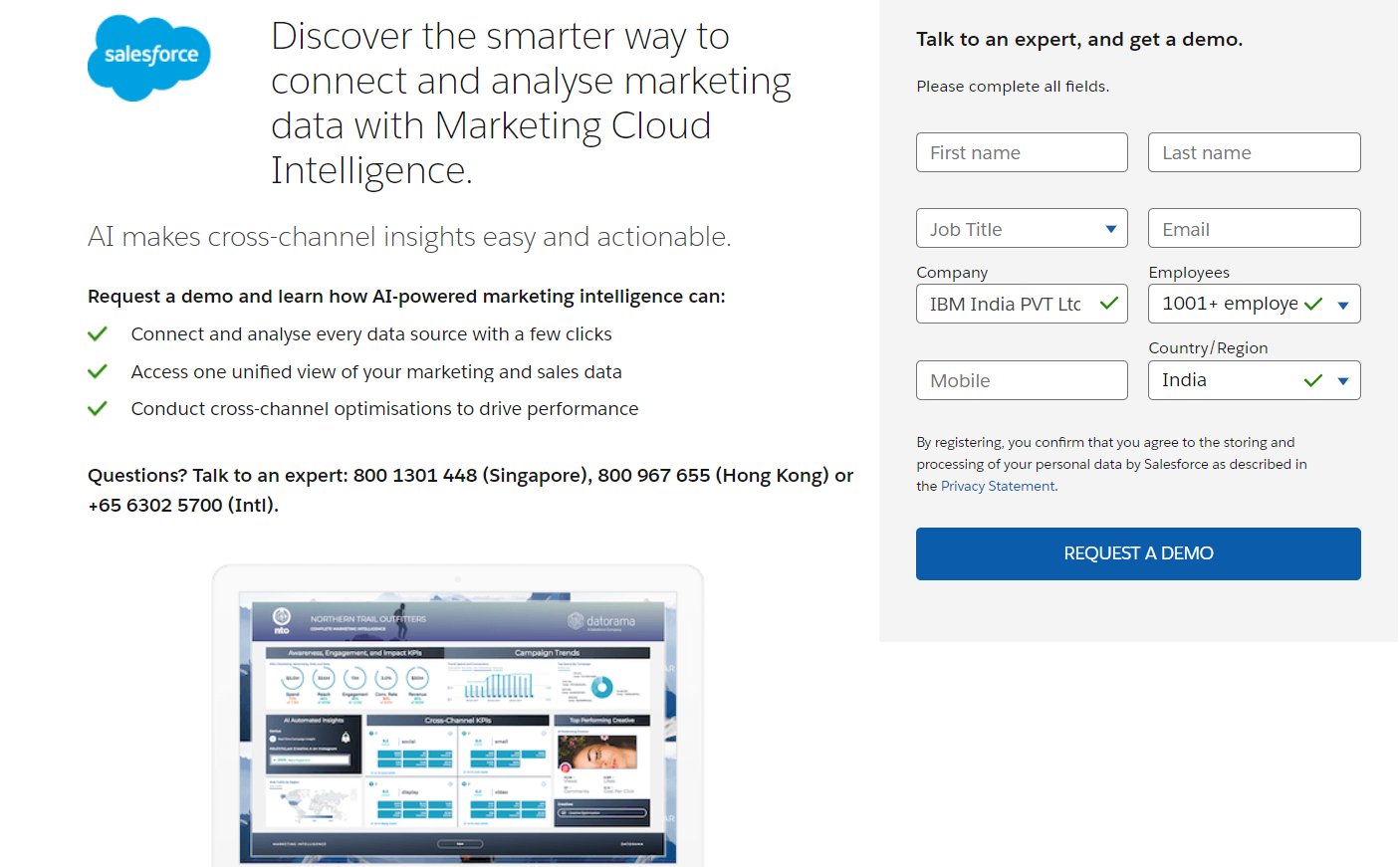
8. Personalize your messaging
Personalizing your forms can increase the likelihood of conversions. Here’s an example to help you understand how.
Let’s say yours is a customer relationship management platform. You’ve observed that most new visitors are starting to fill up the free trial form but not completing the signing process, based on the insights uncovered from segmented visitor groups on VWO Form Analytics. To push them down the lead conversion funnel, you can personalize your form and test it against the non-personalized generic form for this audience group.
Suppose the control has something like “Unlock a 15-day free trial to start building better business relationships.” To appeal to this segment of the audience specifically, you can now tweak your offer to “Unlock a 30-day free trial to start building better business relationships”. The duration of the free trial can make a big difference in driving responses from visitors.
Similarly, for a request demo form, you can offer 3 days of free inbound marketing consultation with one of your in-house experts who can customize a plan in the areas of marketing and sales for a prospect’s business. Run this test against the regular request demo form without a consultation offer. Roll out the experience that drives maximum demo bookings to all new customers.
Keep leads coming in with simple form fills!
Free trial forms and request demo forms are the gateways to your SaaS products that spark user interest and guide them towards exploring what you have to offer. Whatever we discussed in this blog are the basic components of a good free trial form. But remember, with user experience being unique to each website, A/B testing is key to finding your perfect fit.
Whether you’re analyzing current form performance or testing out new optimization ideas, VWO has got your back. From form analysis to a range of testing options, it’s the ultimate tool for boosting your leads and taking your business to the next level. So, don’t settle for mediocre results. Let your free trial and demo forms soar with VWO!
]]>There’s no harm in seeking more information. But actionable tips are more helpful for starting to learn something new.
The same principle applies to customer engagement in marketing. Consuming theories and data around the concept can enrich your knowledge and enhance your awareness. But it is practical tips that will actually fuel your customer engagement engine.

If you are reading this blog, it means you’re here for actionable customer engagement tips. You’re in the right place!
We are about to discuss proven tips that can help you win customer trust, encourage brand loyalty, and ultimately boost revenue growth for your business.
Keep reading…
Idea 1: Craft a customer-focused content marketing strategy
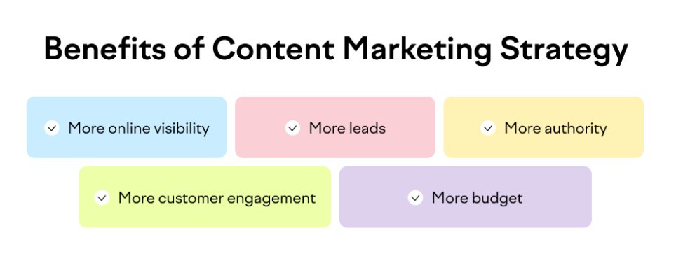
With online customers being more aware today, content forms the bedrock of your creative customer engagement ideas. However, mere content creation will not garner attention, let alone foster the desired engagement. To attain your engagement objectives, you must center your content around the customers.
Begin by sketching a typical buyer persona and leveraging data to understand customer requirements, interests, motivations, and aspirations, constructing a good customer engagement strategy. Moreover, try different content formats for various channels and touchpoints:
Interactive content
Quizzes, polls, surveys, and interactive videos encourage active participation, keeping customers engaged while collecting valuable insights.
Visual content
Infographics, images, and videos are more appealing and shareable, grabbing attention and conveying information quickly.
User-generated content
Sharing content created by customers, such as reviews, testimonials, and social media posts is a part of successful brand engagement activities.
Educational content
How-to guides, tutorials, and informative articles position your brand as an industry expert and provide value to your audience.
Storytelling
Current digital engagement ideas center on content that connects emotionally with customers, making them more invested in your brand.
Live streaming
Live videos on platforms like social media offer real-time interaction with customers, thereby forming an integral part of your good customer engagement strategies.
In addition to determining the type of content you create, make decisions about posting frequency, distribution strategy, and performance measurement. Also, don’t confuse personalized content with your content marketing strategy. While personalized content is crucial for delivering tailored experiences to your audience, your overarching content marketing strategy should exude empathy through compelling storytelling and reflect the personality of your brand.
Idea 2: Gamify customer experiences
Gamification is one of the innovative customer engagement ideas gaining momentum among many businesses. If you have not tried it yet, here are a few ways you can use gamification to engage customers:
- Run social media contests where you challenge followers to share product unboxing videos to win free tickets to your company’s meet-and-greet or virtual events.
- Add treasure hunts during special events like sales or anniversaries and offer personalized rewards to the winners.
- Organize quizzes to test visitors’ knowledge about your brand and offer special discounts based on their scores.
If you want to make gamification an integral part of customer experience on your digital property like your app, consider launching it as a feature. Suppose you run an online newspaper website where you want to introduce badges for readers using the app. These badges might include titles like ‘Engaged Reader,’ ‘Category Expert,’ and ‘Social Sharer,’ rewarding users who actively participate in discussions, specialize in specific categories, and share articles on social media.
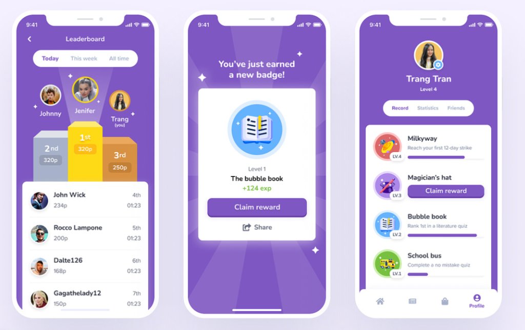
Readers can see their badge collection on their profiles and compare them with others in a friendly competition. Additionally, you could create a leaderboard to showcase the top badge earners.
However, these ideas to engage customers can’t be shipped hastily. They must be tested and iterated upon to achieve the desired outcome. Using server-side testing on VWO, you can not only create features like this but also improve its development through incremental releases, feedback collection, and continuous iteration. To know how it works, request a demo now.
Idea 3: Constantly gather customer feedback
A robust customer feedback loop is indispensable for your consumer engagement strategies to show the desired result. Encouraging customers (especially existing customers) to share their opinions and actively listening to their feedback demonstrates that their voices matter, thereby improving customer satisfaction.
Implementing changes or enhancements based on their suggestions not only addresses their needs but also showcases your brand’s commitment to continuous improvement. This collaborative approach will help you win loyal customers and increase customer engagement.
Deploying tools like exit pop-ups for departing visitors, incentivizing customer surveys, utilizing live chat for real-time insights, or sending regular feedback forms via email are effective feedback collection methods. These brand engagement ideas help uncover valuable customer perspectives that can be used to refine your customer engagement strategies effectively.
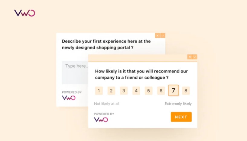
If you want to get started, you can consider creating an on-page survey where you ask visitors what they liked about your website, if they faced any problems trying to look for something, and what they think can be improved. This feedback is your treasure trove of insights to guide your website optimization efforts. Fresh out of the experience of navigating your website, visitors will remember the details and share their honest opinions. Check out more about on-page surveys now.
Idea 4: Humanize your brand communication
Whether you are in B2B or B2C, maintaining detached and emotionless communication won’t cultivate valuable customer relationships. Instead, humanizing your communication builds a brand personality that resonates on a personal level, transcending mere product or service associations to cultivate customer engagement.
Begin by strategically infusing a human voice into your content. For your blog, establish a distinctive storytelling style that connects uniquely with your target audience. Infusing empathy into your blog posts strikes an emotional chord, moving beyond mere facts.
On social media, establish exclusive online communities, such as dedicated forums or groups on social media platforms. These spaces not only provide customers with a platform to connect with each other but also foster a deeper connection with your brand. Hosting interactive webinars or Q&A sessions within these communities can further enhance customer engagement and foster a sense of brand belonging. Transparency is key; being authentic resonates with customers who seek genuine interactions when shaping effective customer engagement strategies.
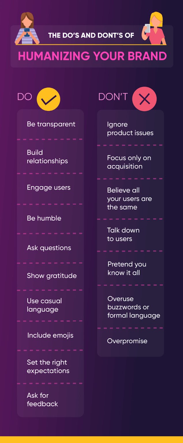
Creating videos and podcasts ranks among the proven user engagement ideas today. Just scroll through your feeds on various social media platforms to see. They lend a human face and voice to your message, fostering a sense of familiarity similar to interactions with friends and family. These are some good examples of customer engagement that can make your communication more relatable and impactful.
Even if you are in B2B, an empathetic and human-like brand voice is crucial. People don’t suddenly change upon entering the office. Major corporations are shifting away from traditional client communication due to the evolving B2B marketing landscape. So, why not join in? Experiment with creative client management activities that resonate with your audience, building loyalty in the process.
Idea 5: Personalize customer experiences
Now we come to the sensational part of online marketing today – personalization of customer experiences. Starting from the relevant content users read on social media to the offers they receive in emails and products they are recommended when checking out from a website- these are all due to personalization of their experiences at every touch point of their online journey with a brand.
Thanks to robust database software like Customer Data Platforms that make customer engagement possible by gathering user data from various sources, segmenting them, and creating Single Customer Views (SCVs). For example, you can transfer these customer profiles to your Data Management Platform (DMP) and launch targeted ads for specific user segments. Similarly, these SCVs can be exported to email automation platforms to launch personalized email newsletters for different segments of customers.
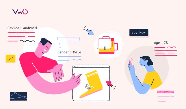
On our VWO platform, you can leverage the two capabilities, VWO Personalize, and VWO Testing. Taking customer profiles from the CDP, you can launch personalization campaigns and even run A/B testing campaigns.
Here is an example of customer engagement. Let’s say you own a holiday booking site. Using data from the CDP, you want to display curated travel packages – hiking and safaris, romantic honeymoon getaways, and family travel vacations – to specific audience segments. In this scenario, VWO Personalize can help you launch these targeted segment-specific marketing campaigns.
On the other hand, suppose you want to test whether offering discounts to a segment of your customers can boost sales of your adventure vacation packages. In that case, you can use VWO Testing to run a test and determine if showing a discount in the variation improves your metrics. Take a free trial today.
Idea 6: Create loyal advocates
If you have customers who really like your brand, make sure to nurture those relationships and make them stronger. Keep in touch with them, get their feedback on your latest product launches, and give them special attention, so they know you appreciate them. This will help you convert your existing customers into brand advocates who will support you every step of the way. Here are some great consumer engagement activities to make them feel super special:
Exclusive previews
Offer them exclusive access to new products, services, or features before they’re available to the general public. This makes them feel valued and appreciated.
Surprise gifts
Occasionally send them small surprises like personalized thank-you notes, phone calls, gifts, or samples. These unexpected gestures can go a long way in winning loyal customers.
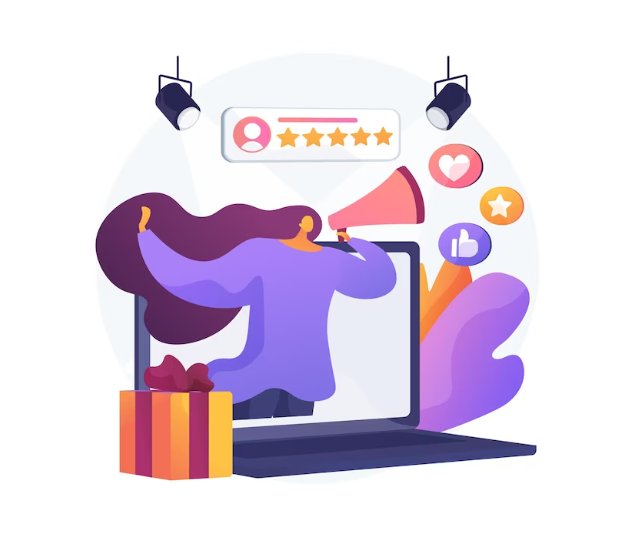
Customer appreciation events
Organize special events or webinars exclusively for your dedicated existing customers, where they can interact with your sales team and learn more about your products or services.
Seek their input
Involve your long-term existing customers in decisions like product names, features, or future offerings. This gives them a sense of ownership and importance.
Referral program
In addition to these loyalty programs, you can launch referral programs that encourage existing customers to refer new customers to try your brand’s products or services by offering rewards and incentives.
Conclusion
A popular saying goes, “The best time to start is now”. Taking a cue from this, you should not delay launching or improving your customer engagement plans any further. Start moving before your customers consider switching to your competitors due to not getting what they need from your brand. And if you think VWO can help you in executing your customer engagement activity, consider taking a free trial. Explore all its features and decide if it’s a great fit for your business.
Frequently asked questions
Boosting customer engagement is crucial to build relationships, engage prospects, and, ultimately, drive business growth. Here are some consumer engagement marketing examples:
Craft a customer-focused content marketing strategy: Tailor content to address customer needs, delivering valuable insights and solutions. Keep content fresh and relatable, nurturing an ongoing connection.
Gamify customer experiences: Experiment with fun customer engagement ideas like introducing rewards, challenges, and games.
Constantly gather customer feedback: Regularly seek opinions to show you value their input. Use feedback to refine products or services, making customers feel heard and involved.
Humanize your brand communication: Speak authentically, share behind-the-scenes stories, and engage in conversations that resonate emotionally, encouraging deeper connections.
Personalize customer experiences: Tailor interactions based on preferences, behaviors, and history. Personalized offerings show genuine care for users and give them a sense of individual importance.
Create loyal advocates: Encourage engaged customers to share their positive experiences. Leverage testimonials, referrals, and user-generated content to amplify your brand’s credibility.
Personalizing the customer experience is paramount for fostering strong connections with them. Firstly, you can collect and analyze customer data to understand preferences, buying habits, and interactions. Then, segment your customers into smaller groups to target them more effectively. For example, you can implement recommendation engines on websites to suggest products tailored to individual interests.
Further, you can leverage personalized email campaigns to show relevant offers and increase customers’ purchase frequency with your brand. With these customer engagement strategies, you enhance customer engagement, and loyalty, and lead to a more lasting customer relationship.
There are several great customer engagement ideas to experiment with on social media, and we are sharing the most effective ones here. Start by creating compelling content that resonates with your target audience’s interests and pain points. Respond promptly to comments positive reviews, questions, and feedback, showing genuine interest in their opinion.
Some other customer engagement examples are: using interactive features like polls, quizzes, and contests to encourage participation and gather insights. Collaborate with influencers or partner brands to extend your reach and credibility. Share behind-the-scenes glimpses to humanize your brand and connect on a personal level. Regularly update your profiles with relevant information, ensuring a consistent online presence.
Live chat remains the top choice for conducting various customer service engagement activities. Firstly, integrate chatbots on your website to handle routine inquiries, ensuring 24×7 availability. Offer instant assistance by addressing queries quickly, and showing you value their time. Use proactive chat invitations to initiate conversations, engaging customers through their journey on your website.
Secondly, consider collecting feedback through chats as part of your customer engagement plan to understand pain points and areas for improvement. Share helpful resources, product recommendations, or exclusive offers within the chat to add value. With these customer engagement strategies, a live chat becomes a dynamic tool for building stronger customer relationships.
In a city dominated by competitive shops that are all about selling, this bookstore thrives by offering more than just books. They host book clubs where readers can engage in lively discussions, invite local authors for talks, and organize contests and quizzes.
In short, they create a literary heaven for customers. They believe exceeding customer expectations matters, and the rest will follow.
Table of Contents
- Top 5 strategies to increase customer engagement
- Three steps to build a customer engagement strategy
- Customer engagement strategy examples
- Way forward
- Frequently asked questions
As brands compete neck-to-neck increasingly every day, how do the winners set themselves apart? By placing customers at the center of their business. Building a solid customer engagement strategy is the key to fostering a sense of belonging among your audiences and transcending competition.
In this blog, we explain overarching strategies on how to increase customer engagement and help your brand become a favorite among customers.

Top 5 strategies to increase customer engagement
1. Leverage user behavior analytics
The foundation of any successful customer engagement strategy lies in understanding your audience. Research your target demographic’s preferences, behaviors, and pain points. This knowledge will help you tailor your customer engagement plan and establish meaningful customer relationships.
Utilize visitor behavioral analytics to comprehend how visitors behave on your digital properties, what prompts increased interaction, and where they encounter friction. By delving deep into visitors’ behavior, you will gain insights into the improvement needed to enrich their online journey with your brand.
Bear Mattress, a New Jersey-based online mattress-selling company, uncovered interesting visitor behavior on its website with the help of VWO Insights. They observed reduced user interaction with the cross-sell section, ineffective product-centric copy, and reduced engagement due to missing product images in key sections on the product page. These observations led to a solid hypothesis that resulted in an A/B test generating a 16% increase in revenue.

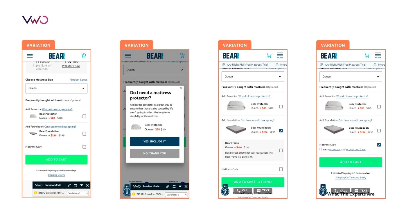
While heatmaps illustrate various levels of visitor interaction through colors, session recordings allow you to observe users engaging with your website elements. This is just the beginning; VWO Insights offers an array of other features for user research on both website and mobile. To explore them all, start a free trial today!
2. Set clear and practical objectives
Set specific, measurable, attainable, realistic, and timely (SMART) goals for every customer engagement campaign. For instance, while offering frequent discounts and cheap deals might appear conducive to quick revenue growth, it could negatively impact your brand reputation and profitability. Instead of solely concentrating on metrics tied to your paid advertising, set objectives that provide a more comprehensive view of whether your customers are truly committed to your brand or not.
Further, defining the corresponding metrics becomes important to get better results from your consumer engagement strategy. Regularly evaluating and adjusting these metrics may be necessary to ensure they are in line with the most recent advancements in your business and industry innovations. Read this blog to learn which customer engagement metrics are worth monitoring.
3. Map customer journeys
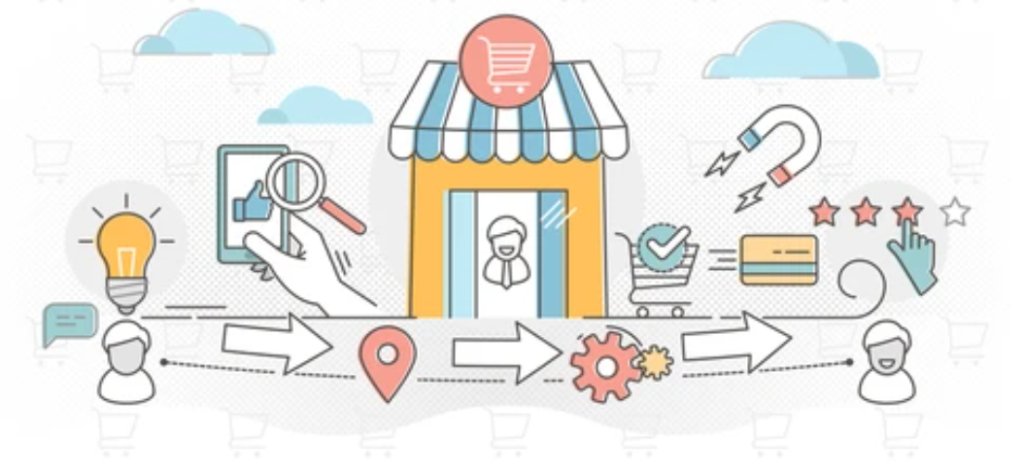
Plot out your customers’ journeys from discovery to post-purchase. Identify touchpoints where customer engagement can make a difference and create strategies tailored to each stage. Let’s understand with an example.
Samantha is a 30-year-old marketing professional looking for stylish workwear to buy online. This is how her journey from decision-making to purchase and post-purchase might look like and how brands can improve her experience across touchpoints.
Awareness:
- Touchpoint: Instagram sponsored post
- Action: Sarah sees a post showcasing trendy workwear styles from the retailer.
- Improve customer experience: Craft visually appealing and informative posts that showcase various workwear styles, highlighting the unique features and quality of the products.
- Offer: Include a special offer or promotion code for first-time visitors who come from the Instagram post.
Interest and evaluation:
- Touchpoint: Visits the retailer’s website
- Action: Browses through the “Workwear Collection” section, looks at product images, reads descriptions, and checks prices.
- Improve customer experience: Enhance the website’s user interface for easy navigation. Implement high-quality product images, detailed descriptions, and a clear sizing guide.
- Offer: Provide a virtual try-on feature that allows customers to see how the workwear items would look on them.
Purchase:
- Touchpoint: Adds a tailored blazer and trousers to the cart
- Action: Proceeds to checkout, enters payment details, and confirms the purchase.
- Improve customer experience: Streamline the checkout process by minimizing steps and offering multiple payment options. Include a progress indicator to show customers where they are in the process.
- Offer: Offer an option for expedited shipping for those who need their workwear items quickly
Post-purchase:
- Touchpoint: Order confirmation email
- Action: Receives an email with order details, expected delivery date, and a discount code for her next purchase.
- Improve customer experience: Personalize the order confirmation email with the customer’s name and ordered items. Include a link to track the order’s delivery status.
- Offer: Suggest related products that complement the purchased items, encouraging cross-selling.
Engagement and loyalty:
- Touchpoint: Follows the retailer on Instagram and subscribes to their newsletter.
- Action: Receives personalized product recommendations based on her purchase history.
- Improve customer experience: Send personalized newsletters with relevant content, such as styling tips, outfit inspiration, and exclusive offers for loyal customers.
- Offer: Provide early access to new collections and special events for newsletter subscribers.
Advocacy:
- Touchpoint: Receives her order, which includes a thank-you note and a referral discount.
- Action: Shares a photo of her new outfit on social media, praising the retailer’s quality and service.
- Improve customer experience: Include a handwritten thank-you note in the package, expressing gratitude for the customer’s purchase. Personalize the note by referring to the specific items bought.
- Offer: Provide a referral discount not only for the advocate but also for the referred friend, encouraging them to share their experience with others.
Now let’s say you own a SaaS company and you want to lay out a highly effective client engagement strategy. You can map any customer journey like this to tailor experiences at each stage of their journey with your brand. The crux is that no matter which industry you operate in, with the right customer engagement strategy, you can boost brand trust and encourage loyal customers to advocate for you.
4. Create segments for tailored experiences
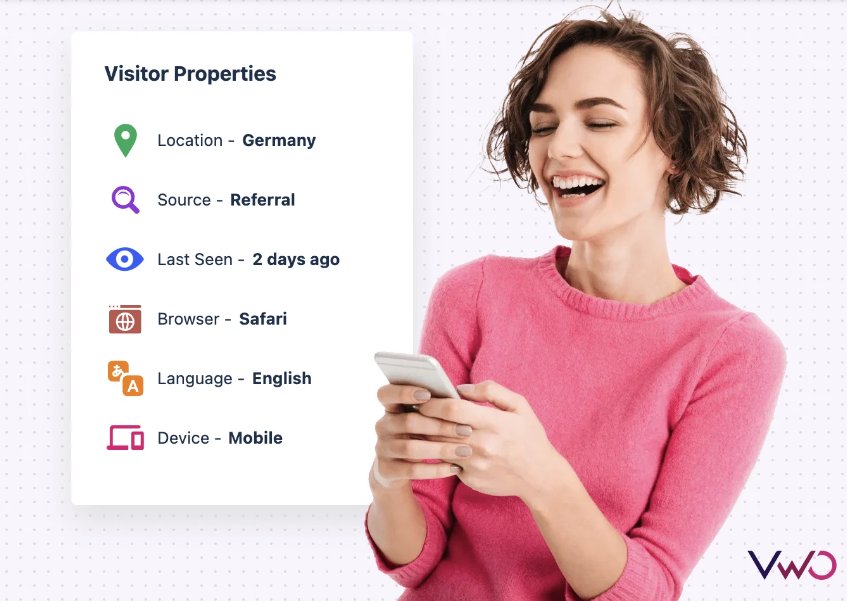
You have performed user research and mapped the customer journey. Now you must be wondering how to drive customer engagement. The answer is segmentation. It’s only once you segment your visitors into different cohorts (based on similar preferences, attributes, and more) that you can deliver tailored experiences to them. This is one of the most effective customer engagement strategies that align your campaigns and communications with customers’ requirements, behavior, and purchase history.
Imagine owning an OTT platform. You would want to personalize every piece of content, starting from the homepage to cater to each viewer’s preferences. If you identify a segment of viewers as a fan of romantic comedies (from their watch history), consider showing more of such recommendations. Utilizing their location data, you can also suggest trending movies or web series from their country, such as France.
Now, suppose you’re interested in running a personalization campaign that offers a 10% discount on subscription plans for viewers from a new market in the Nordic countries like Norway. This can be accomplished through personalization. Even better, if you’re utilizing a customer data platform, you can leverage single customer views (SCVs) to create more intricate segments based on the extensive data you have about your new and existing customers.
Building upon the same example, you could decide to target this discount offer specifically to individuals aged 25-45 in Oslo, Norway, who access content via mobile devices.
This data-driven approach to increase customer engagement can set you apart from the competitors. From collecting and segmenting data to launching personalization campaigns, VWO Data360 and VWO Personalize can work together to elevate your customer engagement marketing strategy. Explore how it works by taking a free trial now.
5. Craft a definitive omnichannel strategy
Once you have implemented all of the above steps, it’s time to create an omnichannel customer engagement strategy. This strategy should clearly outline:
- The main and secondary (if applicable) buyer personas, along with their behaviors and interests.
- How you’ll engage these personas at different touch points throughout their purchasing journey and beyond across devices.
- Methods to seamlessly connect interactions across multiple channels, ensuring a flawless and delightful experience.
- The different opportunities you’ll harness, like product launches, relevant events, retargeting, etc., to enhance consumer engagement.
- An actionable plan for customer engagement that you can put into action right away.
And while you are trying your best to increase engagement with customers, bear in mind the power of A/B testing across your digital properties.
A/B testing deciphers the preferences and behaviors that truly resonate with the audience. This empirical approach sidesteps guesswork, infusing data-driven precision into customer engagement marketing strategies. In the long term, the insights gained from A/B testing cultivate a culture of continuous improvement, aligning optimization ideas with evolving customer preferences. As a result, businesses fine-tune user experiences and improve conversion rates, all while ensuring high customer engagement.
Mediereich, a German eLearning company, conducted a split URL test on its homepage which increased visitor engagement by 40%. That’s not all. Due to this change, the home page’s year-on-year value skyrocketed by an incredible 106.42%, going up from $2,149.72 to $4,436.41. This underscores how enhancing engagement will directly influence your revenue metrics. And it is experimentation that makes it possible.
Three steps to build a customer engagement strategy
We have shared overarching strategies on how to create online customer engagement. Now we quickly tell you three key steps you must take to build a robust customer engagement strategy.
1. Conduct in-depth behavioral research
Gather critical visitor data tailored to your business. In addition to customary metrics from customer loyalty programs, social media interactions, and customer support, focus on the aspects shaping customer-brand engagement. Survey responses, heatmap analysis of website behavior, and funnel analysis help uncover user preferences and identify any friction they encounter.
2. Link insights with metrics
Convert insights from observed visitor behavior into defined objectives with corresponding metrics. For instance, if funnel analysis reveals that existing customers are dropping off from the product page prematurely, your objective should be to retain customers on the page and reverse the drop-off. As a result, you can run a test with an optimized product page and set ‘increase in Average Order Value (AOV)’ as a metric to measure the change in visitor behavior.
3. Analyze and refine continuously
Once you have run an experiment, uncover loopholes and areas for improvement. Through iterative cycles, refine your ideas and devise improved strategies to optimize conversions. This ongoing process ensures that your engagement strategies remain dynamic, effective, and aligned with ever-evolving customer behavior.
Customer engagement strategy examples
Optimizing your website/app
Whether focusing on messaging, UI, or UX, every aspect of your website or app contributes to shaping customer perceptions. To optimize engagement, the aim is to enhance these components, streamlining the customer journey for ease and providing immersive experiences that retain their interest.
For improved engagement and delightful experiences, consider targeting the following opportunities:
- Provide relevant, valuable content across blogs and resources to captivate customers and provide value.
- Personalize customer touchpoints based on individual needs, devices, locations, and industries to deliver context-rich communication.
- Employ incentives throughout touchpoints, such as freebies, exclusive coupon codes, expert consultations, and referral rewards, to entice prolonged interaction with your digital platforms.
Incorporating these tactics into your engagement strategy ensures extended customer stay time on your site/app, resulting in improved engagement metrics.
Emails
Despite being a conventional method of customer communication, emails remain a remarkably relevant example of customer engagement strategies. Marketers and customer-facing representatives heavily rely on emails for communication. These customer emails can generally be categorized into:
- Newsletters
- Welcome/Signup Emails
- Thank You Emails
- Abandonment/Recovery Emails
- New Product/Service Launch Emails
- Feedback/Survey Emails
- Transactional Emails
To maximize engagement through the email channel, remember these guidelines:
- Craft compelling subject lines for higher open rates.
- Optimize emails for mobile viewing, as over 50% are accessed on mobile devices.
- Stand out in crowded inboxes by providing value and utility—keep content informative, interactive, and non-promotional.
- Utilize customer stories and social proof to build trust.
- Personalize emails based on interests and behavior for enhanced relevance and engagement.
Chatbots
Given the trust and preference it has earned from customers, incorporating live chat for improved engagement is a clear decision for businesses.
Apart from immediate issue resolution, companies can elevate user engagement through strategic retargeting of returning visitors, providing personalized recommendations, sharing valuable resource links, and guiding traffic to essential site pages.
Social media
In today’s social media-driven world, a big part of how companies engage with users happens on these platforms. This affects how customers interact with brands overall. In this noisy environment, it’s really important for businesses to regularly and meaningfully connect with their followers.
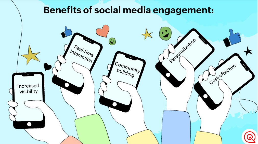
Though there’s no surefire method for getting lots of engagement on social media, these tips are a good starting point for building strong interactions, engaging customers, and keeping people interested:
- Stay responsive to mentions so you know what your audience is saying and can interact with them.
- Use trending topics to talk about things that matter to your audience and industry.
- Be consistent in posting, so your audience remembers you.
- Address customer complaints in the comments, showing you’re listening and caring.
- Share stories about your customers and employees to make your brand more relatable.
- Make your posts interactive with polls, quizzes, and contests to show you value your audience’s opinions.
Videos
Videos, the most preferred content by consumers, now make a conspicuous part of the customer engagement strategy framework. Brands increasingly invest in video marketing for higher engagement. Whether on your website, app, or social media, videos excel due to their captivating, shareable, and on-the-go nature.
To harness this growing engagement avenue, constant innovation is key. Alongside product and educational videos, consider interactive formats like Q&A sessions or ‘Ask Me Anything’ with experts. Experiment with user-generated content (UGC) videos, inviting followers for short video contests.
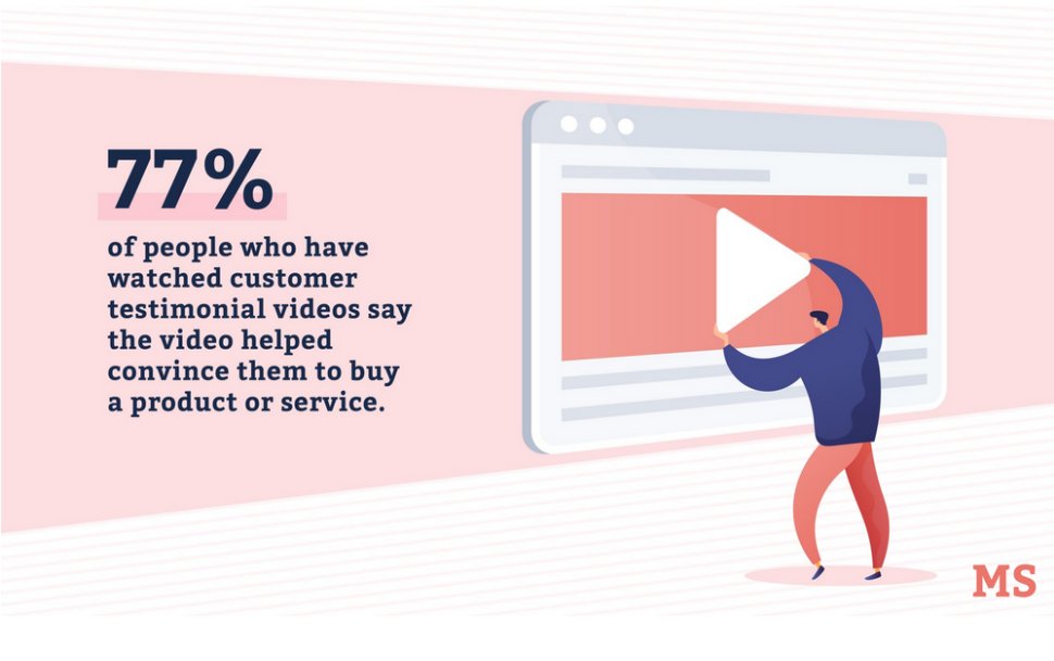
Video testimonials shared on social media are highly effective, showcasing happy and loyal customers for greater engagement compared to text-based testimonials. Depending on your business, explore vlogs and webinars, offering in-depth content that retains audience attention better than lengthy blog posts.
Way forward
Customer engagement programs are the key elements that can help a business improve its bottom line. When companies focus on their customers rather than getting caught up in competitor comparisons, they thrive on unparalleled customer satisfaction. This approach leads to relevant interactions and long-lasting customer relationships. Having seen how VWO can increase your customer engagement, you will only benefit from making it a part of your business strategy. Start a free trial today to take the next step.
Frequently asked questions
The best customer engagement strategies excel by customizing customer experiences at each of these stages. Customer engagement typically unfolds in several stages:
Awareness: Introducing customers to the brand
Interest and Evaluation: Customer curiosity and evaluation of different options
Purchase: Transactional stage where customers make a purchase
Post-Purchase: Feedback on the product or service
Engagement and Loyalty: Satisfied customers share good reviews and repeat purchases
Advocacy: Positive word-of-mouth leads to brand advocacy
An example of a customer engagement strategy is a retail brand that employs a personalized approach across multiple channels. They start by showing tailored product recommendations based on customers’ past purchases and browsing history. Once a purchase is made, they follow up with a thank-you email and offer discounts on future purchases. The brand also promptly responds to customer feedback and queries on social media. Regular personalized newsletters provide updates on new arrivals and promotional offers. Adopting this multi-pronged approach will help you implement a better customer engagement strategy that leads to higher customer satisfaction.
In the past, customer engagement could be measured through transactions. Luckily, today we have multiple ways to understand what a good customer engagement strategy is all about. Here are the types of customer engagement examples:
Emotional: Builds deep brand connections through shared values, storytelling, and resonating emotions.
Social: Online discussions shape purchasing decisions; positive experiences spread, while negatives harm reputation.
Convenience: Enhances loyalty with personalized suggestions based on preferences and behaviors.
Contextual: Tailors messages using customer data for real-time, relevant engagement.
Client engagement strategies go beyond transactional interactions, encompassing tailored approaches, valuable insights, personalized messages, and interactive experiences. Understand how to increase customer engagement in B2B from the following tips:
Personalization: Tailor interactions, content, and solutions to address specific client needs.
Thought Leadership: Share industry insights, whitepapers, and expert opinions to establish credibility.
Interactive Content: Utilize webinars, workshops, and interactive tools for engaging knowledge-sharing.
Feedback Loop: Regularly seek input to refine offerings and show commitment to client success.
Relationship Building: Foster genuine connections through networking events and personalized communication.
Find below some effective customer engagement ideas and strategies:
Content-driven: Storytelling, interactive content, informative materials.
Social media: Active online interactions, and engagement on platforms.
Personalization: Tailoring experiences to individual preferences.
Advocacy: Fostering customer referrals, customer loyalty programs, and brand advocacy.
Omni-channel: Consistent engagement across various channels for meaningful customer relationships.
Delivering customer engagement involves personalized interactions, valuable content, prompt responses, and seamless experiences across various channels. It is achieved through strategies like targeted communication, interactive content, customer loyalty programs, and fostering emotional connections, all of which lead to higher customer satisfaction and engagement.
The key is to strategically spend on marketing to maximize your return on investment during these challenging times.
Table of Contents
- Get the right team by your side
- Accelerate the testing speed
- Set your focus on lifetime value
- Inform experiments with user research
- Make the most of user segmentation
- Recession-proof your business with experimentation
If your next plan is to audit your marketing strategy to adjust spending, ensure experimentation sits at the top of your list of priorities. Anyone who says you can forsake experimentation is probably taking you for a ride.
In fact, experimentation is hands down the best way to convert all that traffic into customers by allowing you to ship the best-performing experiences to audiences. Instead of spending on acquiring new customers right now, it makes a lot more sense to focus on converting what is already on your website.

But yes, experimentation during a recession might require you to pivot your strategy. So, if you’ve been wondering how to harness the power of experimentation during testing times like this, we’ve got some tips to share with you.
Get the right team by your side
If you decide to start with experimentation now, building an exclusive team for this exercise will consume a lot of your resources in an already cash-strapped market. At the same time, without skilled people by your side, you’ll be remote from getting the best result out of the testing platform.

This is where the VWO customer success team can lend you a hand! Our dedicated success managers plan and support your journey with VWO, training your team to get the best out of our product. Throughout your optimization process, they are your true friend, guiding you to early successes and monitoring your progress. Further, they keep you informed about the latest developments in VWO and the industry, all while helping you achieve the highest possible ROI from using VWO.
Accelerate the testing speed
During an economic downturn, businesses shift into high gear and take all the necessary steps to keep their business surviving and even thriving. The approach should remain the same when it comes to your experimentation. The faster you test, the quicker you will know what can work and what cannot to protect your business from the effects of the recession. If you have an experimentation program laid down already, audit it and see if it’s possible to increase the velocity of testing with high-impact tests first.
For example, Dorado Fashion, a US-based fashion website, added a bundle offer in the mini-cart on all devices to improve the Average Order Value (AOV). An A/B test was run only for 26 days where the variation emerged as the winner with a 14.14% increase in clicks to the Thank You page. Explore other small tests that led to impressive results in our Small Tests. Big Wins. eBook.
Further, VWO’s A/B Test Duration Calculator can be of great help in this regard. Enter details like existing conversion rate, minimum improvement expected, number of variations, average visitors every day, and percentage of visitors included in the test – and you will get the duration for which you must run the test to achieve a statistically significant result. Prioritize tests that can be run quickly and contribute to conversion uplift.
The more you reduce your dependencies on the developing and engineering team, the faster you can set experiments and get results. Not only can you make all types of changes to your web pages through VWO’s Visual Editor, but you can also make these changes go live without involving the IT team with VWO Deploy. Plus, you can release a change only to a particular set of visitors, whom you can segment in more than 1000 ways.
So, let’s understand with an example. Consider you want to show a 10% discount to new visitors on your hotel booking website against the control without a discount offer. Using the VWO editor, you can add a standard widget template to let’s say the homepage of your website. Next, you decide that you want to direct this offer to new visitors using mobile and in the age group of 25-40 from Connecticut, where you’ve just started your operations. You then combine multiple parameters together to target a very specific segment for this test. This is just one example; you can target visitors in various ways using custom segments on VWO. Run the test for a set time and see if the variation wins. If successful, launch it with VWO Deploy.
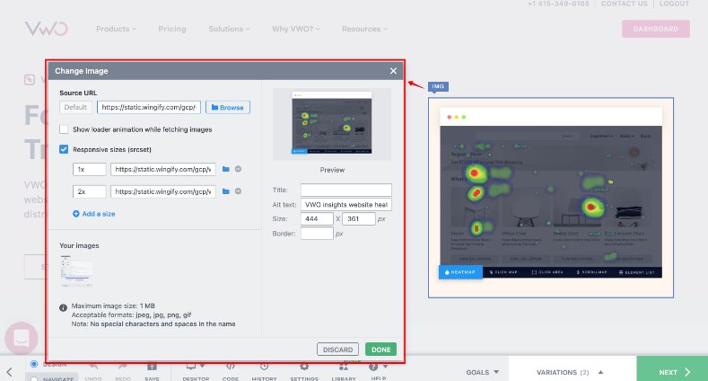
Set your focus on lifetime value
Acquiring new customers is 5 to 25 times more expensive than retaining existing ones. This makes maximizing the Lifetime Value (LTV) of existing customers all the more crucial, especially in a tight financial market.
Of course, you should test every piece of content on your website before shipping them, but prioritize the ones that may have a greater impact on your LTV. For example, changing the color of a CTA button may increase the click-through rate but there is no guarantee that it would contribute to the business metric.
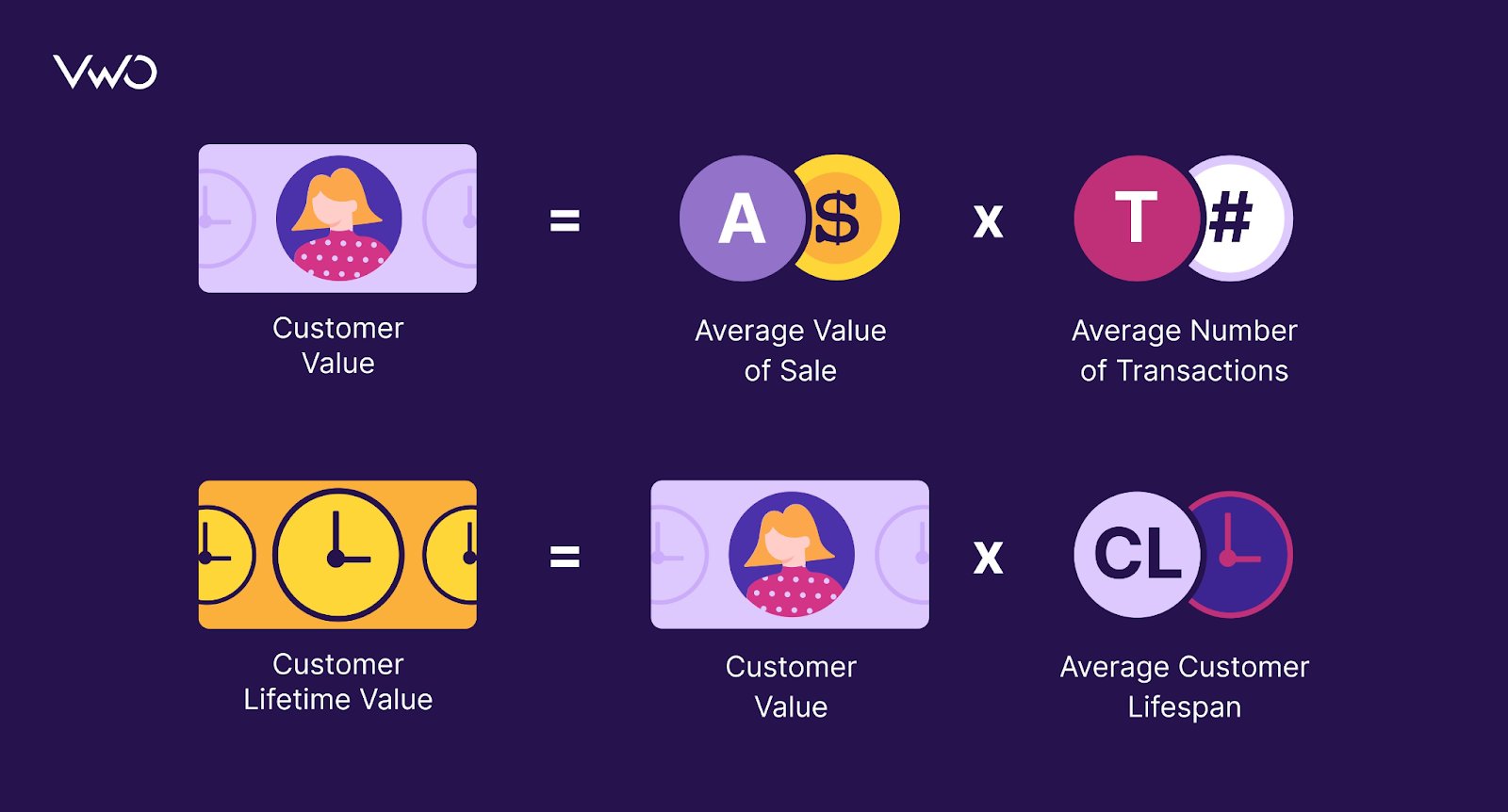
Test loyalty programs, up-selling/cross-selling, free shipping, or any idea that delights your customers and encourages them to continue purchasing from you. Remember, there is no one test against another. It all comes down to prioritizing when times are tough.
Let’s see how Bear Mattress, a bed mattress-selling brand, increased the number of purchases by improving cross-sell flow on its mattress product page. They partnered with the VWO team who observed that user interaction with cross-sell items was minimal, images for cross-sell products were not present, and the copy was not customer-friendly on the product page.
For the variation, they implemented a number of changes, including making the copy more customer-centric and adding thumbnail images if cross-selling items.
This test was run for 19 days and led to a 16% increase in revenue. Drawing inspiration from this case study, you can run cross-sell tests on your website, provided your research shows the scope of implementation of such a test.
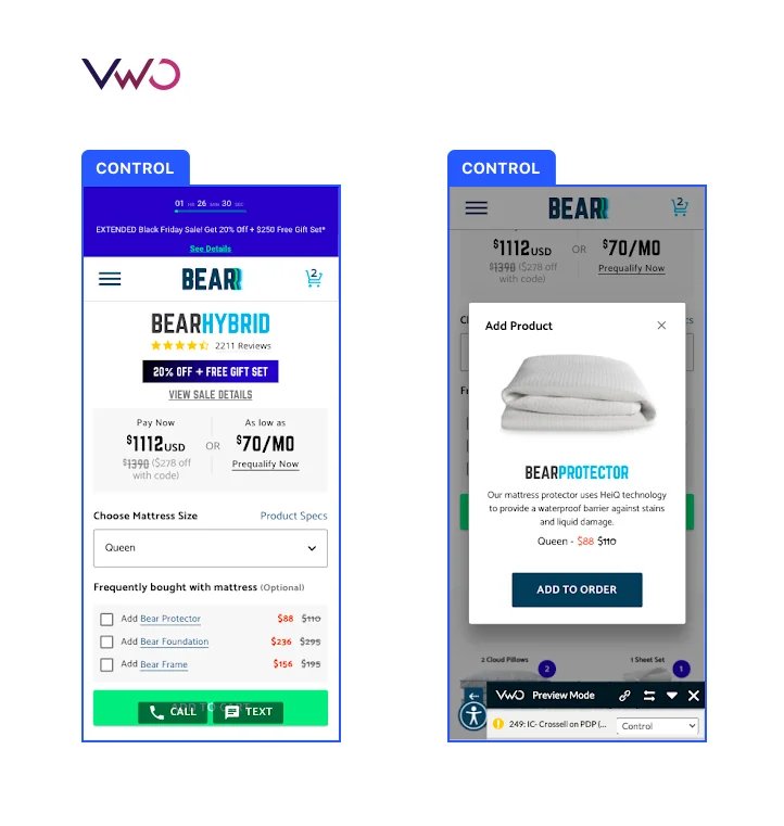

What we must mention here is that VWO Data360, our customer data platform, lets you create and track complex business metrics like LTV by considering customers’ page-level engagement. Using this capability, you can roll out an experience that can help you retain customers, repeat purchases, and drive revenue. Want to discover what this experimentation platform can do to sharpen customer experience other than this? Sign up for a free trial today!
Inform experiments with user research
Don’t sacrifice research at the altar of faster implementation. When we suggest that you should increase the velocity of the test, we don’t mean you can pick any random tests that you ‘think’ can improve conversions. Rely less on your convictions and more on how visitors behave on your website.
For example, if you see users dropping off from the checkout, you can implement a guest checkout hoping to increase revenue through this test. This is where VWO Insights helps you big time with its user behavior analytical prowess. While heatmaps show you the visual representation of users’ activities on your website, session recordings give you a walk-through of their journey on your website from landing on the website to exiting or converting.
When you plan experiments that are in line with what users expect to experience on your website, they are more likely to emerge as winners and impact conversions positively. Hence, combining the power of VWO Insights and VWO Testing empowers you to turn user insights into data-focused testing strategies.
The Australia-based IMB bank has been using our experimentation platform since 2017 to optimize its website. Funnel analysis using VWO Insights showed that users dropped off from the first page of the loan application form. For the first campaign, the team introduced a number of elements like awards, USPs, and total time to complete the steps in the hope of arresting drop-offs from the page.
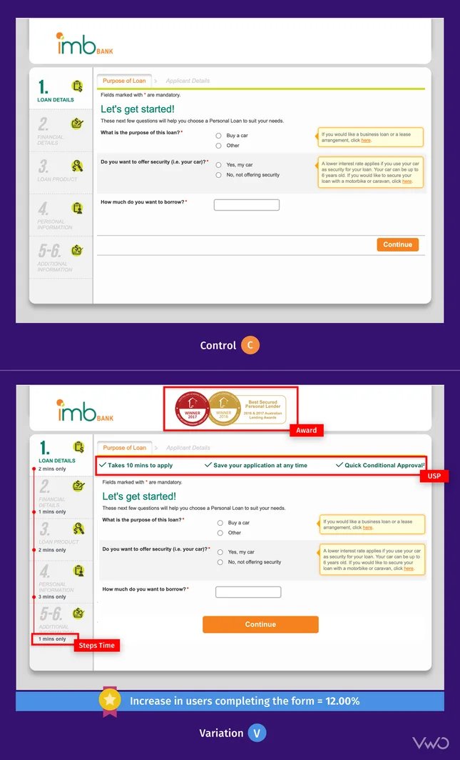
For the second one, an exit pop-up was added that asked visitors to save the application form and continue according to their convenience. The two campaigns saw an increase of 52% in form completion and 85% in completed saved form respectively. To know more, read the case study.
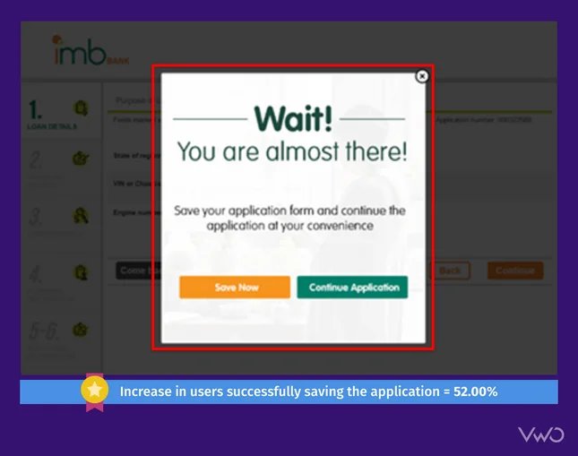
Make the most of user segmentation
Running tests that are targeted to specific user segments gives you more impactful results. Loyalty programs work great during economic tough times. They helped several businesses entice returning customers during the recessions of the 1990s, 2008, and COVID-19 times. Taking inspiration from this, you can segment returning customers and run a personalized campaign where you show a loyalty program sign-up option in a website pop-up.

Since you’re targeting this campaign to returning customers, the chances are high that your variation will outperform the control. On the other hand, had you run this test without segmentation, everyone, including new visitors, would have become a part of this campaign. Because new visitors are less likely to sign up for a loyalty program as they haven’t tried your products/services yet, including them would have skewed the result of this campaign.
Now let’s say you sell luxury cosmetics online. To attract new customers, you can offer 15% off on the first purchase and build a test based on it. Along the same lines, you can create tests by segmenting users based on shared geographies, age, gender, and so on. But that said, remember, over-segmentation can reduce the sample size you need to divert to your variations and prevent you from arriving at a statistically significant result. So, create segments based on the traffic your website gets and the number of variants you’re testing in an experiment.
Here’s a case study proving how businesses can pull off a test using custom segmentation – OneClick is a US-based eyewear retailer that has been using VWO Testing and Insights for conversion optimization on their website.
One of their experiments using VWO aimed to increase conversions by personalizing the checkout page for One Click’s customers based on their country. The hypothesis was that, as a global brand, tailoring the experience to each user’s location would make it more engaging and relevant.
The personalization was achieved using VWO’s custom segmentation, which dynamically altered the content on the checkout page to include localized information such as shipping rates, delivery time, and currency. This was done in order to enhance the customer’s shopping experience. For example, customers visiting the website from Canada would see relevant information such as Canadian shipping rates, estimated delivery time, and Canadian currency on the checkout page.
The variation outperformed the control and increased the conversion rate by 30%. You can read here how VWO helped One Click conduct other winning tests.
Recession-proof your business with experimentation
Experimentation allows businesses to make data-driven decisions, rather than relying on intuition and assumptions. This is especially important during a recession when resources are limited and every dollar counts.
And to come through all of these challenges with flying colors, arm yourself with VWO. From user behavioral analytics and testing to personalization and customer data platform – VWO will help you navigate the woes of recession with its multifarious capabilities.
To use all of its capabilities to your advantage, sign up for a free trial now. Don’t let the recession hold you back, start experimenting with VWO and see the difference it can make for your business.
]]>A good search function can make or break a customer’s shopping experience. If it’s fast, accurate, and intuitive, it can turn a browsing session into a purchase. On the other hand, a slow and clunky search experience can drive customers away in frustration.
For this reason, A/B testing your website search is super important. The more you test, the faster you understand what your customers want and the more conversions you can drive.

But where do you start and what do you test? Making the search bar more noticeable is just the beginning of improving your website’s search function. You’ll still have to do a lot of other things but don’t worry, we can help. So, in the second blog of the series ‘A/B testing ideas for eCommerce,’ we share the top testing ideas to enhance your site’s search experience. Let’s begin!
1. Image search results
Just imagine you have to enter the whole search query every time and you’re not even sure if it is right because there’s no correction prompt. That would be frustrating for sure! Autocorrect makes sure that typos and misspellings don’t impede the process of finding the products you want. Autocomplete helps you find what you’re looking for even faster by suggesting search terms and phrases as you type. These two search features have proven to be so effective that they’re now accepted as the standard in UX design.
Safety Gear Pro has been collaborating with VWO for quite some time now and has run a number of tests, one of which was improving the search box design on the former’s website. The variation where the size of the search bar was increased emerged as a winner, but the team didn’t stop there and ran an iteration.
Unlike the control that only displayed suggestions once the visitor began typing, the variation showed top searches and categories as soon as the visitor tapped on the search bar. The suggestions were based on keywords frequently used by users on the website through the site search, as well as the categories with the highest traffic and page value. The variation increased the number of transactions, resulting in a 20.40% increase in Thank You page visits.
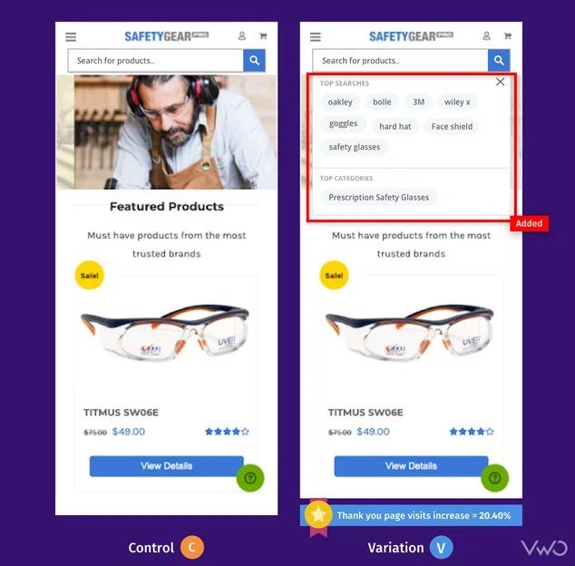
Test idea 1 – Replace text-based suggestions with image search results
Users who search on websites are 2-3 times more likely to convert. It’s really smart to capitalize on this user behavior. How? Here’s a simple solution to try: replace text-based search suggestions with image-based results. Let’s say a visitor has searched for an ‘iPhone cover’ in the search box. Instead of showing text suggestions, show different product images (iPhone covers) so users can get a quick idea of the product they want to purchase and click through to the page from the search result itself.
While you can test the UI elements of your search bar using VWO Testing, experimenting with search engine algorithms falls under the purview of our power-packed VWO FullStack. With some help from your developers, you can have these interesting ideas implemented and tested on your website. Roll out the version that improves user engagement on your website. This will give you an edge over competitors and tempt your visitors to come back for a seamless experience.
2. Filter options
Visitors who search on your website are in a purchasing mindset and eventually end up converting. But just because they know what they want to buy doesn’t mean they don’t need a bit of hand-holding. They are meticulous about what they want and want to reduce the clutter of items they are not looking for.
For example, I was looking for wedges on a shoe-selling website some days back. The search results were overwhelming, with so many options! I was trying to find something casual, not fancy party shoes. Did I go back to the search box to try again? Nah, the search results page had a filter on the side that let me narrow down my choices based on what I was looking for, like casual wear, color, and foot shape.
Test idea 2 – Side or horizontal filtering bar
Usually, the product filtering bar is seen on the left side of the website. But if you see many visitors dropping off after interacting with filtering options, you can create a variation with a horizontal filter bar featuring major product categories and see if it helps arrest the problem. This will bring every category within the sight of visitors without them having to scroll down and look for filtering options.
Test idea 3 – Add more filter options
A mere 16% of eCommerce sites have effective product filtering. You too can belong to that 16% by boosting your filter options and gauging its impact on user engagement. If visitors are grumbling about too many “out of stock” items in search results, consider adding an availability filter where they can easily exclude those items and only see what’s available now.
To implement any sort of client-side tests including this one, VWO Visual Editor is the best thing that there can be to help you through this. Whether you want to rearrange, move, replace, or copy-paste any element, all of that can be easily done using this editor. Plus, you can use the code editor if you have to make any changes to the HTML code of your website.
Here’s how Eastpak, one of the leading backpacking companies in the world utilized VWO to improve product filtering. First, by using VWO Heatmaps, they noticed that only a few mobile customers interacted with the filter bar on their product category page. So, they ran a test where they redesigned the mobile filter bar with clear and consistent labeling and made it stay at the top of the screen which would lead to enhanced filter usage and conversions.
And as expected, the interaction with filters improved by 106% compared to the Control. There was a 7% increase in the click-through rate because customers were now able to find relevant products more easily. Want to replicate these wins on your website? Sign up for a free trial with VWO and get a reliable tool by your side on your experimentation adventure.
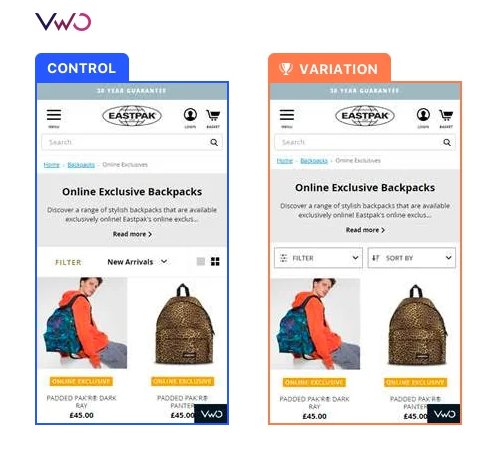
3. Sorting
Don’t assume that optimizing product filtering means you’re all set – optimizing sort options is crucial too. Both serve different purposes and optimizing one doesn’t excuse neglecting the other.
By arranging products based on important factors like price, popularity, or customer ratings, shoppers can compare and simplify their choices by saving time and enhancing their shopping experience.
Additionally, well-designed sorting features can also help eCommerce websites improve their search engine optimization, as they can use sorting options to create a more organized and user-friendly website structure.
Test idea 4 – Display more sorting options
Going with the same old sorting options of price low to high, price high to low, and A to Z is a common sight in most eCommerce stores. If you find that visitors are using the sorting options but not getting the best out of them, try experimenting with adding more relevant options, like sorting by highest ratings, review count, and in-stock items.
When you’re using VWO Visual Editor, you can not only make changes to the element but also add a goal which can be “click on element’ in this case. Consider making it available to all visitors if heatmaps and other qualitative analysis tools show that users are using the sorting options more. Catch a glimpse of these features in action by signing up for VWO free trial.
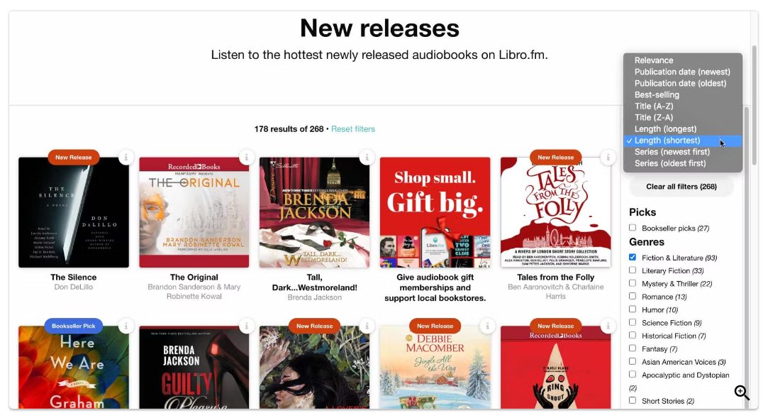
4. Product information
How product information is displayed on the search results page will decide if users click through and visit product pages as the next step. First thing first, product images should be high-quality because this is what visitors rely on entirely since they can’t touch and feel the product they want to buy. Next comes important product information that can sway audiences to make a purchase.
Test idea 5 – Enable quick view of product images
Run a test where you create a variation that allows visitors to click ‘Quick view’ and see the product picture in full-screen length. Clicking outside the picture can bring it back to the default size. Have this variation compete against the control and see which one helps improve user engagement.
Here’s another inspiration for you. So, Optimics, a conversion rate optimization agency, used VWO to run tests for one of its retail clients called Mall.cz. In one of the tests, the agency wanted to see if showing larger product images would have a favorable impact on revenue. Two variations were created: the first showed larger product images with a text description, while the second had larger images with a description viewable upon mouse-over. The second variation was a winner with an increase in revenue by 9.46%.
Test idea 6 – Show ratings and review
One piece of information that can totally make visitors flock to your product is a rating or review. Instead of just keeping them on the product page, display them on the search result page as well. This will catch visitors’ eyeballs when looking for a product they wish to buy. Plus, you can show not only the ratings of the product but also the number of reviews those ratings are based on. A rating of 5 stars and just 3 reviews is not as reliable as a rating of 4.5 with over 60 reviews. Run an experiment to determine if this change leads to increased user interaction and directs more visits to product pages.
5. More product recommendations
Having organic search results appear in response to visitors’ search queries is considered sufficient to meet their needs. But why not provide them with even more options? So, here’s what you can do –
Test idea 7 – Display a section highlighting top choices or expert recommendations
Create a variation that showcases a carousel, banner, or recommendation tile featuring top choices or expert-recommended products related to a visitor’s search. Compare this to the control and observe its performance. If it helps increase transactions for your brand, implement the change right away. Look at how Target showed me a tile of recommended products along with hundreds of products in organic search results as I searched for kitchen rugs.
6. Pagination/scrolling/load more button
Pagination works great for users who want to have control over the number of items they see on each page and then jump to specific pages. This is especially beneficial for websites having a large product inventory, as it helps reduce loading time and simplifies navigation.
On the other hand, infinite scrolling offers a seamless browsing experience by automatically loading more items when visitors scroll down the page. This is a good option for websites with a smaller number of products and for those that want visitors to browse more items. An amazing cross between the two results is restricted scrolling with a “load more” button. It allows users to see a limited number of items at first and then choose to see more items if they want by clicking on “load more”. It provides visitors with control over the amount of content they see while still allowing for an easy browsing experience.
Test idea 8 – Pagination/infinite scrolling vs restricted scrolling with load more option
Based on the visitor behavior on your website, you can create a new variation of restricted scrolling with a load more button and run it against your control, be it pagination or infinite scrolling. Next, you can see which one is keeping visitors for a longer period on your website.
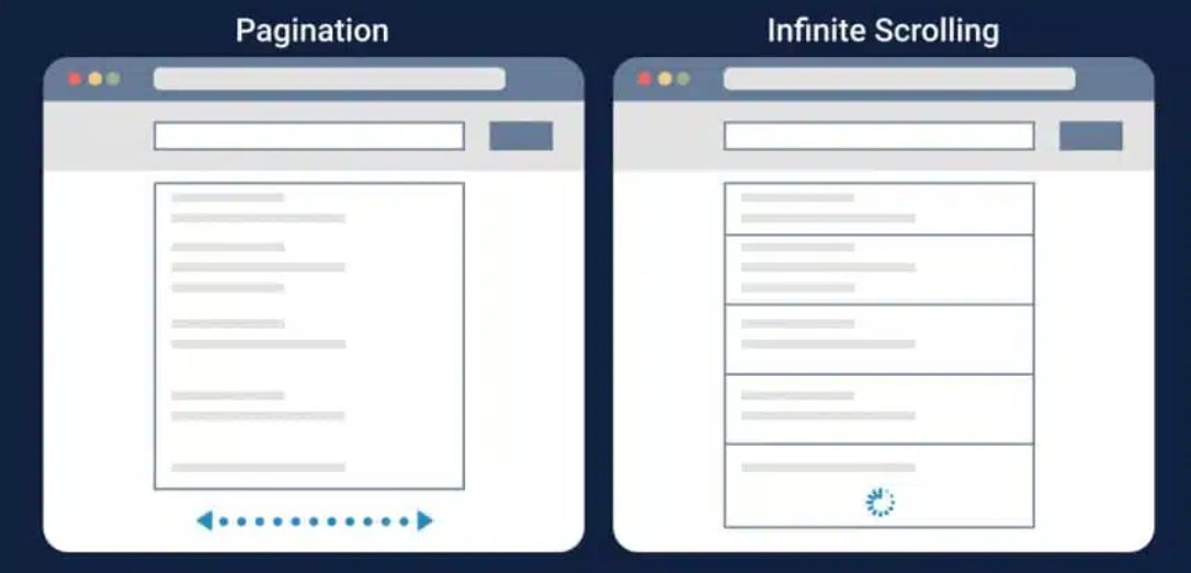
7. Breadcrumb navigation
Breadcrumb navigation gives a proper understanding of where users are on your website and how they got there. It also makes it easy for users to return to a previous page without using the back button or go to the homepage.
Further, breadcrumb navigation can improve a website’s SEO by ensuring a proper organization of the website architecture. This helps search engines crawl and index pages and rank them more effectively – all of which leads to increased online visibility.
Test idea 9 – Incorporate breadcrumb navigation
As a business grows and expands its product offerings, it’s important to keep the website user experience up to pace. One way to do this is by incorporating breadcrumb navigation. This navigation is crucial for larger websites with many pages, but may not be necessary for smaller sites with fewer pages. Based on all these factors, you can run a test with a variation showing breadcrumb navigation. If it’s helping improve user engagement, click-throughs, or cart value, you can roll this out to all visitors.
Let’s clarify something for you. Some may question the best placement for breadcrumb navigation. Unlike most eCommerce sites, Apple’s website has placed this navigation towards the bottom of the page. Therefore, decide its placement based on how visitors behave on your website and what they expect from it.
Breadcrumb navigation is at the top for Lenovo, while it is at the bottom on Apple’s website.
8. Call-to-action buttons
CTA buttons nudge customers in the right direction to make a purchase. Don’t underestimate the importance of CTA buttons by assuming that customers already know to click a product image to access the product page. Panduro, a Swedish jewelry store, found this to be true after conducting a CTA test.
In collaboration with VWO experts, they found that in the control the call to action (CTA) button was labeled “KÖP” (Buy), which confused users as to whether it would take them to the product page or add the product to their cart. It was, therefore, hypothesized that renaming the CTA copy to “Snabbköp” (Quick Buy) in variation 1 and “Lägg i varukorgen” (Add to Cart) in variation 2 would provide a clearer indication of the intended action when clicked. Adding a secondary “View Product” button below the main CTA would also serve as a visual cue for users who wish to navigate to the product description page.
And yes indeed, variation 2 saw a 6% improvement in the conversion rate for clicks on the main call to action (CTA) button. This was accompanied by a 10% increase in visits to the revenue page.
Test idea 10 – Show CTA buttons on the category page
Some eCommerce websites don’t show CTA buttons on search results/product category pages at all, thinking they take up a lot of space and users already know where they have to go from here. If your website belongs to this category, we say that you take the middle road – create a variation where you show CTA buttons only when users hover over the product image on the desktop. If it shows an improvement in click-through for products, go ahead and roll it out for all visitors. But remember, CTA buttons should be all-time visible for mobile visitors on your website because hover doesn’t work on small devices.
Wondering if you can create variations for both mobile and desktop using VWO Testing? Stay assured that there’s nothing to worry about. The Visual Editor doesn’t just let you create or edit but preview variations on different screens in different resolutions before shipping them. Sounds great? It’s time that you tried the feature out.
The way forward
To summarize, A/B testing is crucial for providing your customers with the best search experience and making their shopping journey super easy. The ideas we discussed here will give you a solid foundation to start from. Taking a cue from this, you can further tailor your experimentation program based on your visitor behavior and business needs to achieve search success on your eCommerce store.
VWO can be a valuable ally in your optimization journey. Its extensive capabilities, from testing and analytical tools to a customer data platform and personalization, make it an exceptional optimization platform. Sign up, try it out, and see for yourself why it’s a game-changer. You won’t regret it. Good luck!
]]>
We are beyond delighted with your unwavering love for our content. Your support has enabled us to reach so many audiences, and we couldn’t have done it without you. We’ve been working hard to keep up with your demand to see more of our content, and we’re thrilled to announce something new and exciting – our very own VWO Podcast. 


Podcasting is a fun and interesting space where you can enjoy any content of your choice anytime and anywhere. So, let’s say you’re in a rush to pick up your kid from school, but you also want to utilize the time to learn about data-driven personalization. You don’t really have to choose between the two. Tune into the relevant podcast episode and gain some valuable insights on the go. Also, we know that everyone learns differently, and some of us just absorb information better when we’re listening. All in all, our objective is to make the process of acquiring information or knowledge easy and fun for our audiences.
We spent a lot of time curating VWO Podcast for you, featuring exclusive episodes with industry leaders who will share their knowledge and insights about everything related to conversion optimization, UX, experimentation, data analytics, and so on.
So, who are the top industry leaders on our podcast?
Darrell Williams – Darrell Williams On Using Hick’s Law To Drive CRO Success
Currently serving as the Head of Insights and Optimizations, Darrell has several years of experience as a growth marketing expert with special focus on CRO, SEO, and analytics. In one of our episodes, you’ll hear the expert shedding light on the perils of offering too many choices to your customers and overcoming this problem by leveraging feedback & prioritizing products/services.
Chris Marsh – How Chris Marsh Added +$3M to Client Revenue With CRO & UX
Chris Marsh is an independent CRO consultant who shines bright in the CRO community on LinkedIn, offering his thoughtful suggestions and tips for audiences. You’ll hear the expert talk about how he added +3M to client revenue using the right approach toward CRO. Want to replicate his success? Well, Chris says it’s not simple or easy, but it’s not impossible either. Just have the right approach and give this episode a listen.
Brian Massey – Brian Massey On How Data Has CHANGED The Way We Design
With 15 years of experience under his belt, Brian Massey is the conversion scientist you must listen to if you want to take a scientific approach to conversion rate optimization for maximum results. He says the design process is getting smarter. Marketers no longer exhaust budgets and then analyze if it was money well-spent. So, what do they do instead? This is why he discusses how data can improve design and boost ROI.
Julia Ritter – Julia Ritter on How To CONVERT Users From Email Campaigns
Having worked as the Email Marketing Manager at Mailjet by Sinch, Julia Ritter loves sending out emails and measuring their performance. Julia drops a bomb that people usually receive up to 50 emails per day! How do you make sure they open and read yours? Join Julia as she shares the do’s and don’ts of email campaigns along with actionable strategies to improve email open rate and click rate.
Our lineup of industry experts doesn’t end here! But for now, we’ll leave you with a taste of what’s to come. Want to discover more? Subscribe to our podcast and join us on this exciting journey! 
Here’s where you can listen to our podcast
Our podcast will be available on Spotify in video format and on other streaming platforms like Apple Podcasts, and Google Podcasts in audio form. We’ll be releasing a new episode every Wednesday. Make sure you hit the follow button on Spotify so you’ll be notified when a new episode is out.
Spread the word!
We’re excited to share our VWO Podcast with you and hope you’ll enjoy listening to it as much as we enjoy creating it. If you find it helpful and informative, do share it within your network. We want to help as many people as we can.
Your feedback is important to us, and we’d love to hear from you. So, go ahead and tune into our first podcast episode. Enjoy listening! We’ll catch up with you soon. Until then, keep listening and stay tuned!
]]>I was evaluating two skincare brands to make a decision on which one would be the best fit for me. I remember receiving generic emails from one luxury skincare brand that simply spoke about their achievements and who they were. It felt impersonal and lacked the emotional connection I was looking for. On the other hand, I received emails from another luxury skincare brand that were personalized to my preferences and skin concerns. This level of customization not only showed that they cared about my individual needs, but it also made me feel valued as a customer.
And this got me thinking – as much as brands love the idea of using personalization in their marketing efforts, not every brand gets it right.
Personalization isn’t just about sending out random discounts or automated birthday greetings. It’s about understanding the customer, their preferences, and behavior across different touchpoints and delivering a tailored experience.
This is where visitor or customer data lays the foundation of kickass personalized campaigns. If brands don’t collect and bring together customer data, they’ll be light years away from acing their personalization game.
In this blog, I discuss why and how you can use data to get personalization right so you connect with your audiences and improve their experiences with your brand. Let’s begin then.
What Data Should You Track?
Long gone are those days when businesses could rely on just identification data to create basic-level personalized content.
Today, you need to track everything a customer does across their buying journey starting from awareness to purchase and even post-purchase. So, here are the types of user data you need to collect to deliver personalized experiences.
1. Identification Data
This type of data provides basic demographic information about a person.
- Name
- Location
- Contact
- Age
- Job title
2. Descriptional Data
This data centers around where users work, their habits, and their lifestyles.
- In which company do they work?
- What is the size of the company?
- What’s the salary they get?
- Lifestyle, habits, and hobbies of visitors.
3. Contextual Data
Contextual data shows a visitor’s unique properties and gives context to their session on your website.
- Are they using a desktop, mobile, or tablet?
- What is the location of the device?
- Which browser do they use?
- What day of the week did they last purchase?
- What time of the day do they purchase?
4. Behavioral Data
Behavioral data tells a great deal about a user’s interactions with your brand. Such data will answer questions like:
- How many times has a user purchased from your website?
- Has any user brought the same product twice?
- What products do a user search for the most on your website?
- Has the user clicked on any upsell offers?
- How many times does a user interact with a live chat?
- How many times a user has opened the monthly newsletter email?
When you combine the power of all types of data, you unlock the real magic of personalization.

How Can You Track & Use Data For Personalization?
Collecting data from multiple customer touchpoints is challenging already. Using this data in the proper context is even more difficult. Wondering who can make the job easy for you? The answer is simple – a Customer Data Platform.
If you want to strike a chord with your customers through your personalization efforts, then a CDP is going to be your true friend and guide. Here are some reasons why CDPs are a must-have for modern businesses.
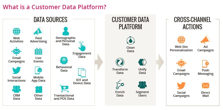
1. Collect & Unify Data
Collecting and bringing together all the data is step one in the personalization game. From what your users are searching for on your website to how they’re interacting with your email campaigns, to even if they clicked on your targeted ads or checked out a product demo in-store, your CDP can scoop up data from everywhere. Whether you want to keep tabs on what your visitors are up to, track their behavior, or see how they react to different things, your CDP brings it all together from a ton of sources (like DMPs, CRMs, ABMs, browsers, and so on). Then it unites them all together in its database so you can use them to send out personalized campaigns across channels through any third-party platforms you want.
2. Single Customer View
With the data all consolidated and brought together, the CDP can now create a Single Customer View (SCV) where you can find everything related to a visitor in a single profile page – properties, attributes, segments, and experiments they are part of. This view hosts real-time and accurate data on each visitor that allows you to tailor your marketing efforts to deliver the right message at the right time to each individual.
Okay, let’s think back to my experience with the luxury skincare brand that sent generic emails. If they had a super smart single customer view with all that extra data, they could’ve easily sent me tailored offers or content based on my preferences or concerns. Not taking advantage of all that data to connect with customers at the right time is a big loss, right?
Further, having a centralized view ensures that all individuals within your organization know where to access customer data. This streamlines the process and eliminates the need to spend time searching for and verifying data, thereby increasing its usefulness and value for your company as a whole.
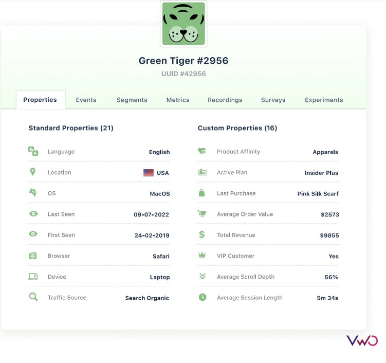
3. Segmentation
Okay, now that SCVs are ready, it’s time to figure out who your key website visitors are so you can better cater to their needs. Segmentation is a surefire way to do that. Let me give you an example to help you understand.
So you’re the owner of an online shoe store and you’re curious to see how well your new orthopedic shoes are doing in Canada. Based on the data drawn from SCVs, you group customers aged between 40-55 sharing a common interest in this type of shoes in a single cohort. Within this, you further see that most of them are women. All you want to know now is where they’re finding out about your product, and it turns out they’re coming from organic search results. Now that you’ve narrowed it down to a very specific segment, you can start an ad campaign aimed at these customers who looked for these shoes but didn’t buy anything yet.
This is how a CDP allows you to unlock the power of data, fine-tune your customer segmentation, and launch targeted campaigns for maximum conversion. Also, this is just one way to use customer data for personalization. You can also use it to make all sorts of personalized campaigns, like email, website content, and push notifications.
Why VWO For Data And Personalization?
VWO Data360 is the robust customer data platform you need to add to your martech stack. Of course, there is a multitude of choices available in the market. But when you opt for VWO Data360, you enjoy the benefits of some fantastic features that set this platform apart from the rest. Here are some of them:
1. Houses Advanced User Behavioral Insights
VWO has a host of behavioral analytics tools like heatmaps, form analytics, session recordings, and survey analytics. You can use behavioral data from here to feed into data collection in Data360 and therefore create accurate and up-to-date customer profiles.
2. Allows Creation Of Custom Business Metrics
From average order value to lifetime value per user, you can build and track complicated metrics like these by applying rules on the user’s page-level engagement. In fact, any numerical data that is seen to impact your business goals can be turned into a metric only on this platform!
3. Integrates With Other VWO Capabilities
VWO Data360 and VWO Personalize work hand in hand to deliver the ultimate personalized experience. Data360 collects and consolidates data from all sources, creating a single customer view. This data is then seamlessly integrated with Personalize, which allows you to segment your audience and launch tailored campaigns based on their interests, behaviors, and attributes.
An example of how personalization with VWO works
Imagine yours is a hotel booking website, and you’re using Data360 which collects data from various sources and consolidates them to create SCVs for every visitor.
Based on data collected by the CDP, let’s say you create a segment of visitors aged between 30-45 looking for hotels that offer cab rentals in Manhattan, one of the premier business districts in the US. Next, you head over to VWO Personalize to launch a personalized website banner where you offer 20% off on booking business hotels with cab rentals targeting this user segment.
Here’s another scenario. Say you want to promote the Las Vegas romantic package your company has curated very recently. You can use CDP data to create a segment of audiences from the US who interacted with your social media post announcing the launch of this new package. Through Personalize, you can set up a campaign where you show a pop-up that reads – Discover why Las Vegas is called the Romantic Capital of the world. Individuals who engage further with this pop-up may be given a discount if they make a booking for this package. Driven by data from start to end, this is a step-by-step process to nurture leads and ultimately push them down the hotel conversion funnel.
No matter in which industry you operate, the collaboration between Data360 and Personalize makes it easy for you to deliver a data-backed seamless personalization strategy that drives results.
What About Data Privacy?
Data and privacy go hand in hand and there are no two ways about it. This is why VWO is built on a privacy-first approach that adheres to global data protection standards and regulations.
Its Data360 feature uses secure architecture and tight privacy controls to protect visitor data. Enterprise-grade encryption is used to hash unique user IDs and PII is automatically removed from profiles. Additional filters and rules can be added for further data security. All data is hosted on the Google Cloud Platform and distributed across multiple global locations.
Along with other stand certifications, VWO is compliant with regulations such as GDPR, CCPA, and HIPAA.

Your Journey To Data-Driven Personalization Starts Today
If you don’t mind me being a little dramatic, I’d say data and personalization are a match made in heaven. While you need data to personalize, you need to personalize to make sense of all data, otherwise, it’s like a bunch of Legos serving no purpose when scattered but giving rise to something meaningful when organized properly.
With VWO Data360 and VWO Personalize, you can harness the power of data like never before. And the best part is you can make the most of other VWO capabilities like behavioral insight analytics, experimentation, deploy, program management, and so on. Take a full-featured trial to chart your path to data-backed personalization.
]]>