How to Boost Your eCommerce Conversions and Make More Sales
With offline stores across the globe stalled due to the Covid-19 pandemic, shoppers and businesses are adopting eCommerce like never before.
As shown in the graph below, the value of global eCommerce sales reached USD3.5 billion in 2019. This figure can get almost double by 2023.
Download Free: Improve Conversions In 60 Days Guide
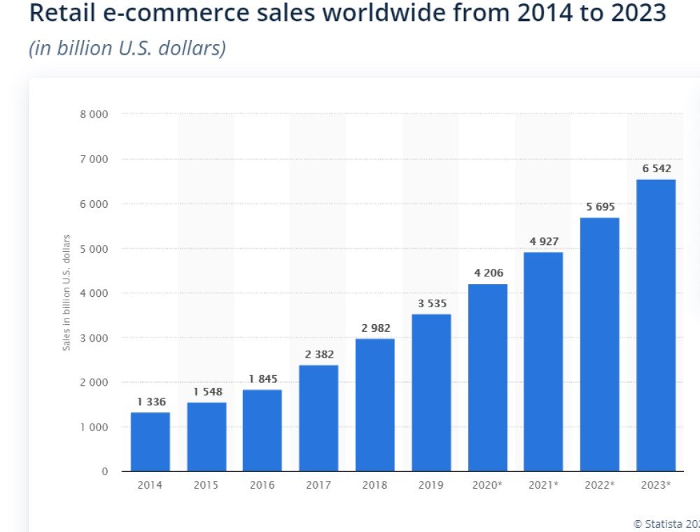
Image Source: Statista
A recent estimate puts the number of global eCommerce firms between 2 and 3 million. This excludes businesses based in China. In order to get a foothold in the sector, learning how to improve your eCommerce conversion rate is paramount.
This eCommerce conversion rate guide brings you tips on generating more sales from the visitors on your site.
How is eCommerce conversion measured?
An eCommerce conversion is a site visitor turned into a customer. Attempts to increase your eCommerce conversions are generally focused on the product page or pages and the checkout process.
Take, for instance, a dropshipping site that gets 1,000 visitors and makes 20 sales. Your calculation would be (20 / 1,000) x 100. That produces a resulting eCommerce conversion rate of 2%. While knowing your site’s conversion rate is important, understanding it is critical.
The idea of measuring average conversion rates for your site is an excellent place to start with.
Conversion benchmarks by sector
Millions of online stores that operate globally are spread across a plethora of sectors, offering a variety of products and services. However, conversion rates vary by industry. A study by Littledata found the global average to be 1.4% across various industries and devices. However, you must dig a little deeper to genuinely understand your site performance.
It’s imperative to keep track of your industry’s performance and update yourself. You can do so by understanding how eCommerce conversion rate benchmarks stack up within your industry. This information is available online.
IRP Commerce provides a kind of one-stop-shop for eCommerce market data. You can find the average eCommerce conversion rates by industry here. For instance, you could use the site to find that the average rate for sports and recreation stores, as of March 2020, is 1.42%. You can find similar information for a wide range of sectors.
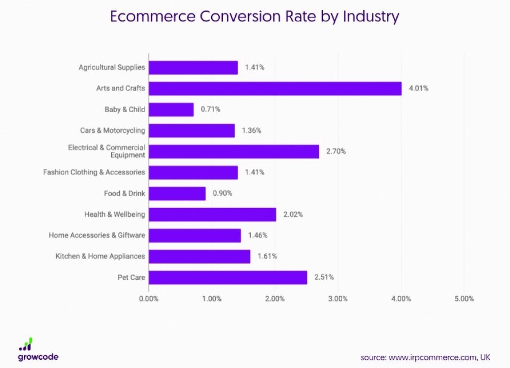
Image Source: Growcode
Finding a benchmark for your sector is critical, as it helps you optimize your sales funnel to drive more conversions.
How to improve your eCommerce conversion rate
They say that acknowledging a problem is the first step towards solving it. If you’ve discovered your conversion rate, you’ve already taken that first stride. You’ve identified that eCommerce A/B testing could be a part of the solution. In the following section, you will find six components in your existing optimization strategy that you can tweak to optimize your conversion rates.
User flow and UI
User flow defines the visitor’s journey on your website as they accomplish a task. Don’t make your prospects struggle on your web page to do so.
You can start optimizing the user flow as the first step in your eCommerce conversions optimization efforts. In the case of eCommerce websites, a user journey can have multiple steps before they make an actual purchase. These steps can be termed as micro conversions, which can include signing up for your website, adding a product to cart, clicking on a discount link, etc.
Micro conversions should direct the user towards the main conversion, that is, a purchase. This journey has to be as seamless as possible and avoid any friction that might result in visitor’s expulsion from the sales funnel.
Audit your current user flow to identify the bottlenecks that are adding friction for the visitor to enter the funnel and preventing them from accomplishing the micro conversions. You may use Google Analytics to track it or can choose to generate a flow chart for your convenience to depict it.
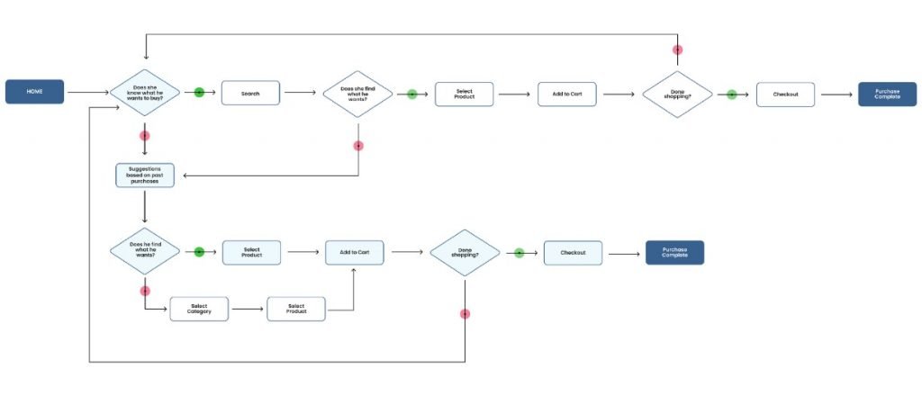
Image source: UXdesign
User flow optimization encompasses a diverse range of factors, such as design of the web page, position of CTA buttons, etc. The insights driven from studying the user flow can help you upgrade the UI of your website. An eye-tracking example below illustrates this point:

Image Source: Multichannelmerchant
Let’s suppose that your user flow discovered an issue with the search functionality of your website. An average of 30% of site visitors use an on-site search feature, and this feature on your site is spooky.
A/B testing your search bar to refine your eCommerce site search can be your resort. You can test and fix the UI with a better performing variation.
You can draw numerous insights from your user flow audit and tweak the web page’s UI accordingly. The principal takeaways are to empathize with your site’s visitors and understand the importance of UX.
User experience (UX)
eCommerce UX is all about how customers or visitors perceive your site after interacting with it. Ensure that your website looks like an eCommerce site at a glance and has an intuitive UI that can lead the visitor to the products they desire to explore. Having intuitive navigation, high-resolution product images on the landing page, correct branding and CTA buttons in place, a clear search box, and any loyalty program can hook your visitors and persuade them to browse your website further.
Also remember that satisfied customers generate new customers, which means more conversions. Users are likely to come back as you build a bond of trust with them.
Usability testing
The next important step is usability testing, which is an essential exercise for eCommerce conversion rate optimization. If you’re going to persuade more people to buy from you, you must understand what makes them tick. Why aren’t they buying from you? What can you do to have them converting at present as well as in the future. User testing your eCommerce site is critical to get answers to those questions. For your complicated website elements, you can do a card sorting exercise followed by the user testing. It can help you redesign your UI with your usability testing results.
Download Free: Improve Conversions In 60 Days Guide
Responsiveness across devices
Do not undermine the importance of the responsiveness of your eCommerce website across devices, such as laptops, tablets, and smartphones. Ensure that the UX is consistent and functional for each website visitor.
Behavior analysis tools such as mobile app heatmaps can be utilized for deriving behavioral insights on mobile. For example, the Brothers Leather Supply Company used a heatmap to analyze visitor behavior on their product page. The heatmap revealed that product photos were the most clicked elements on the page. As a result, the company introduced more thumbnails and high-resolution images. These changes eventually increased their conversion rates.

Image Source: Instapage
Average order value (AOV)
Apart from boosting conversions, some optimizations can also help you maximize Average Order Value (AOV). Raising AOV is an excellent way to support your CRO efforts, and will work with those to aid your bottom line. You can enhance AOV via personalization with a few impactful tweaks to your business.
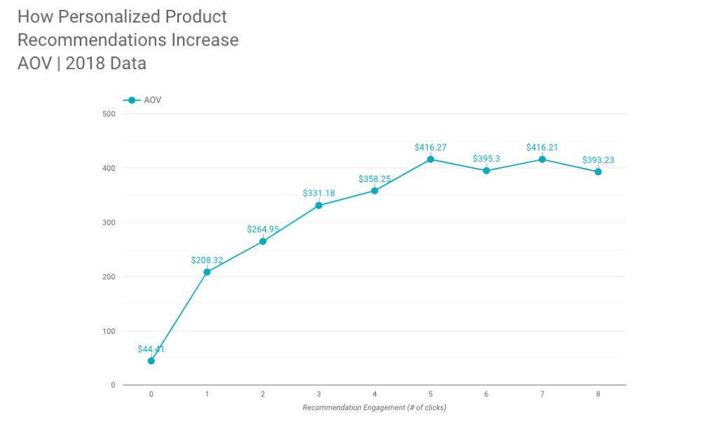
Image Source: Barilliance
You should utilize personalization throughout your website and marketing efforts. There are numerous methods for increasing average order value. Amazon provides its customers options while browsing a product as ‘frequently bought together,’ ‘related items,’ and ‘newer product recommendations’ for personalization.

You must test and discover which method is right for your business and increases your eCommerce conversion rate.
eCommerce checkout conversion rate
The final stage of any eCommerce conversion is turning a visitor into a customer. This happens on the checkout page—a page that witnesses both conversions as well as abandonment. The latter occurs pretty often and hence is a subject of concern for the majority of eCommerce businesses. In fact, the average cart abandonment rate across the eCommerce sector is close to 80%.
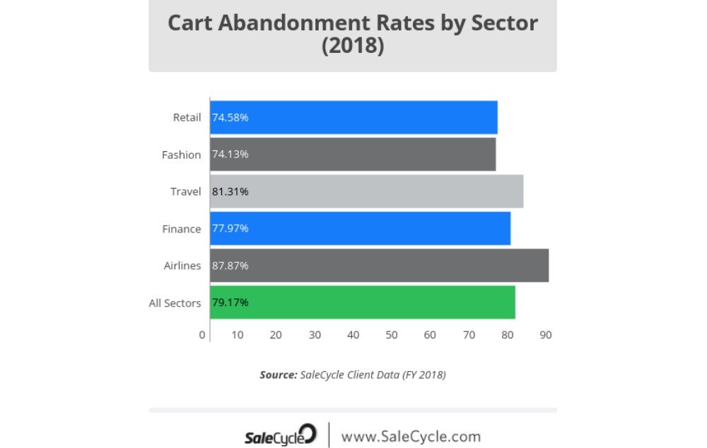
Image Source: Salecycle
Optimizing your checkout becomes essential to improve your conversion rates. There are many different routes one can take to create a perfect checkout page. You can consider the following:
- Guest checkout
- Persistent shopping cart
- Offer free shipping or other customizable delivery options
This is not an exhaustive list, though. However, you should consider the most common problems that shoppers encounter on your landing page while creating a checkout page.
The image below from the Baymard Institute illustrates common customer pain points that negatively impact a store’s eCommerce conversion rate.
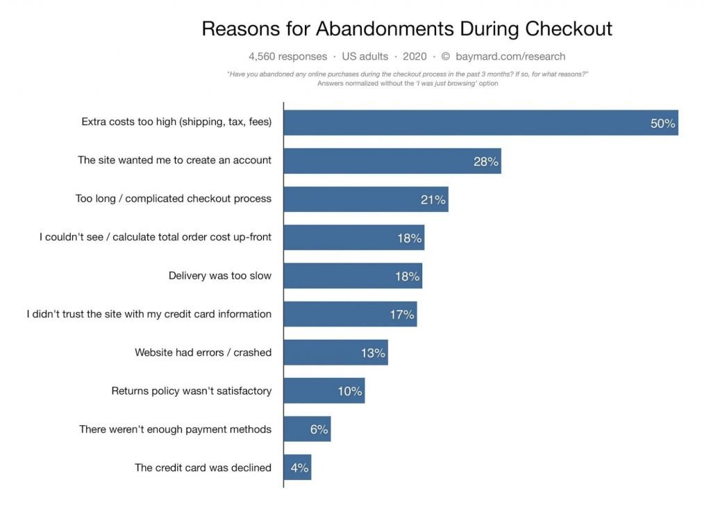
Image Source: Baymard
The range of problems shoppers highlighted is reflected by the diverse solutions for improving the checkout process. For example, small changes to the design of the product page can result in a significant rise in the conversion rate.
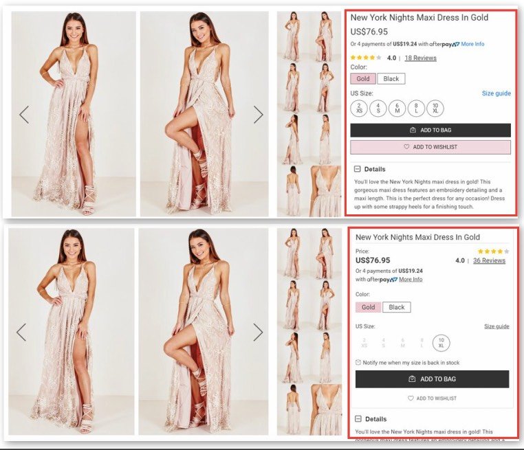
Through these tweaks, VWO helped the clothing retailer Showpo increase conversion rates by 1.33% by making small but necessary tweaks to the design.
The top image is the control, and the one below is the better performing variation. One of the notable changes is a tweak to make user reviews more noticeable by decluttering the product information section. This kind of social proof is very persuasive when you’re looking to nudge wavering potential customers to that sale.
You can learn how to run such tests on your website using VWO on a personalized VWO demo or give it a try yourself with a free trial.
Wrapping up
You may have noticed a pattern in all the above tips for boosting eCommerce conversion rates. If you’re going to persuade more people to buy from you, you must understand what makes them tick. Why aren’t they buying at present? What will make it easy for them to convert in the future?
By taking a step back and assessing your website and its visitors, you’ll know what improvements you can make. The changes may boost UX, improve your checkout, or do something else entirely novel! If they’re powered by a well-thought testing strategy, they’re more likely to improve your eCommerce conversion rate.


