Swiss Finance Company Uses A/B Testing To Increase Conversions
About Meddelandelån Sverige AB
Meddelandelån Sverige AB is a Swedish company that offers online loans to consumers. The company uses the VWO platform for its website optimization tests.
Goals
The goal of this test campaign was to boost conversions from Meddelandelån’s home page.
Tests run
The company’s business depended on online users who applied for a loan through the website. To apply for a loan, visitors had to follow a simple 3-step process by using the widget on the home page:
Step 1: Select the loan amount and time frame.
Step 2: Identity verification by using a PIN code, bank account, or online identification.
Step 3: Submission of personal information such as contact details, monthly income, and other fields.
If the applicant fulfilled certain credit check criteria, the loan would be granted and the money transferred to the applicant’s bank account.
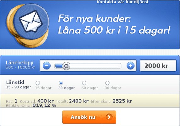
Despite the simple process and the Meddelandelån Sverige home page slider inviting prospects to Borrow 500 Kr for free as a new customer, the carousel was not getting any click-throughs.
The image slider on the original home page looked like this:

Sampsa Vainio from Meddelandelån’s online marketing team was the person responsible for driving conversions. To figure out why conversion rates were low, he first set up a conversion tracking test on the home page to analyze how visitors behaved on the website.
Having read about the potential perils of using an image slider on a website, Sampsa suspected that the image slider might be the reason why visitors get distracted and bounce. He hypothesized that replacing the slider with an impactful headline would cause more visitors to use the widget to apply for a loan. In turn, this would increase their website conversion rate.
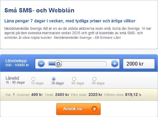
To test this hypothesis, he used VWO to set up and run an A/B test on the home page image slider. A variation was developed with a headline that emphasized their value proposition:
Small Internet Loans
Borrow money 7 days a week with clear pricing and honest terms
To add credibility, a brief text was also added mentioning the company’s presence in the industry since 2005 and with thousands of happy customers. The headline and text replaced the slider.
This is what the variation looked like:

The variant was pitted against the original page. The goals tracked by using VWO were loan value per visitor and overall conversion rate.
Conclusion
The variation delivered a 5% increase in both overall website conversion rates as well as the loan value per visitor. This translated to an annual increase of US$90,000 without any additional advertising.
The image slider (or carousel) hurt conversions for several reasons:
- They are a usability catastrophe because they take away control from visitors, who are left with an annoying browsing experience.
- They increase the page load time. And every single second of delay in the load time can reduce conversions by 7%.
- Many studies have shown that as little as 1% of total visitors interact with the slider.
- People often ignore them. An NN group study mentioned that “The user’s target was at the top of the page in 98-point font. But she failed to find it because the panel auto-rotated instead of staying still.”
- They push down the content of the page, which might harm your SEO (and hence search traffic). Note that sliders usually occupy the most important real estate on a website and this can be utilized to better effect.
- By offering umpteen choices, they cause action paralysis in visitors, thus hurting conversions.
If there’s an image slider on your home page and you are looking at what to change, here are some possible options:
- Create impactful headlines.
- Use the static image of a trending/profitable category.
- Use each slide as a static image to target different visitor segments.
- Customize static offers for repeat visitors based on their behavior on the site. For example, if a visitor spends the most time on a certain product, the next time s/he visits, show an enticing image of the same product on the home page (instead of showing a carousel). You can easily implement this with VWO’s behavioral targeting feature.

Location
Sweden
Industry
Finance
Experiment goals
Increase in website conversions
Impact
5% increase in Conversion


