3 Easy eCommerce Conversion Tactics You Need to Adopt Right Now
Innovation in eCommerce is happening at record pace, and as a result, consumers’ expectations are also growing. Users now expect highly optimized experiences across the whole website, including product pages, images, videos, checkout process, copy, pricing strategies, and so much more. But these expectations are also an opportunity to outdo your competitors and win the purchase. In fact, conversion rate optimization has the power to supercharge your revenues and profitability. But with so much information on the internet, it’s easy to feel overwhelmed about where to get started, or even zero-in on the next change needed to keep your conversion cycle rolling.
Download Free: Improve Conversions In 60 Days Guide
If you’re stuck in such a “what next?” dilemma, here’s a quick list of the top three eCommerce tactics you can adopt to boost your conversion rates.
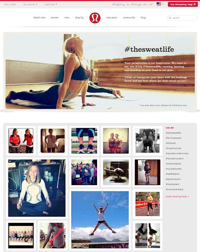
1. Add Instagram photos to your website
User-generated content shared by real people is known to have a positive impact on conversion rates. Retailers encourage their fan base to share their pictures flaunting clothes, accessories, shoes, and to use a particular hashtag for easy tracking. This lends immediate credibility and social proof, giving people visual cues and a good idea about how products will look in real life.
There are many platforms that can help collect and publish content from various social networking sites on your website. Some even provide analytics to track which images work best, what the trending products are and other actionable data points.
TechCrunch had this to say:
During its beta, clients saw an increase between 5 and 7 percent in their conversion rates when they displayed user-generated photos on their site, and click-throughs on the most engaging photos were between 15 and 20 percent. The majority (82 percent) of the latter came from Instagram.
As to where to embed your Instagram feed or photos, it can work on product pages, index pages or even the home page. Testing across different parts of the website will enable you to find where it has the most impact for your business.
2. Track users’ location and tell them if you ship to their country
Shipping globally is now not just possible, it’s expected. So your users could be browsing your site from anywhere in the world. Tracking where the user is located and personalizing the experience is an easy way to boost conversion rate. ThreadLess utilizes this amazingly well on their homepage. See how they place the message in a salient (but not intrusive) location on the home page in an interactive tone of voice.
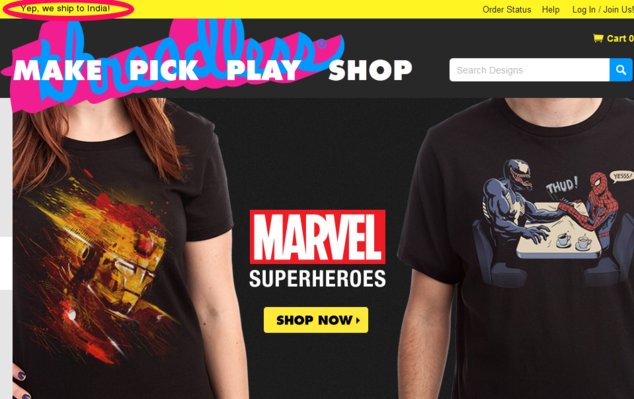
This is an awesome add-on to your website if you cater to customers in many countries. If you’re a VWO user, you would know that setting up a location-specific test takes just a few minutes with VWO’s behavioral and geotargeting feature.
3. Show them a coupon codes link or a coupon codes box
Coupon codes are an easy way to boost conversions, as they tap into the universal desire for a bargain. Coupon codes can be used any number of ways. For example, show new website visitors a discount code exclusive to their first purchase. Or give returning visitors an extra bonus for buying more items. Coupon code boxes is a trend that have been adopted by many retailers.
But there is a catch to boxes—they might actually increase cart abandonment rate because visitors who don’t have the promo codes might leave the site to Google for them, get distracted in the process and never come back again.
So some retailer have gone one step ahead and added the “View current promo codes” link right below the coupon codes box. Sephora provides a “view promo codes” box right below the coupon box.
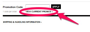
This is a great idea—don’t make them go away from your site, give them what they want right there. Problem solved! This increases buyer satisfaction and probably return visits too.
But there are a few loopholes with this method, according to Craig Sullivan, an independent conversion optimization expert:
- Right now the “View Promo Codes” link below the box means that retailers have to cut off on their margins, instead of using the discount as a subset to improve conversions. It’s important that this method should be tested for profitability metrics.
- When you make things too easy and everyone is getting an off, it doesn’t seem like a “win” to the customers anymore. They don’t feel special. And the promo codes of that website lose their charm.
So what can be done? We discussed this with Craig quite a bit and came up with a solution.
Remove the “Enter Promo Code” box and show only “Got a Promo Code?” as a link instead. A blank box seems to scream to buyers that they are missing out on a saving opportunity. But when you show it as a link, those who have it will click the link, those who don’t will simply move onto the next step.
Download Free: Improve Conversions In 60 Days Guide
As a result, the link is more likely to have reduced exit rates, working well for your profitability as well as buyer satisfaction.
In a nutshell, here’s the whole idea: Add a “Got a Promo Code?” link on your checkout page. Clicking on this link will give two options to visitors: a) Enter the Promo Code Box (for those who have it already) b) Create a Coupon Code (for those who don’t have it)
So whether you use coupon codes or links, maximizing conversions through promotions is an effective way to boost purchases across the board. Simply test to find the method that works best for your business.
In summary
Whether you’re just getting started in CRO or are looking for ways to quickly boost conversions for your eCommerce business, embrace experimentation to deliver a better shopping experience and achieve incremental gains in your conversions with these three easy tactics.
Want to learn more about conversion rate optimization?
Start a 30-day free trial or request a demo to learn more about conversion rate optimization for your online eCommerce store.


![[Gifographic] Better Website Testing – A Simple Guide to Knowing What to Test](https://static.wingify.com/gcp/uploads/sites/3/2021/01/Feature-image_Gifographic-Better-Website-Testing-–-A-Simple-Guide-to-Knowing-What-to-Test.png?tr=h-600)

