Bakker Hillegom Added A Promotional Banner To Boost CTR Using A/B Testing
About Bakker Hillegom
Bakker-Hillegom is an international mail order company that sells plants, flower bulbs and garden accessories through its website.
A client of VWO, the company’s online marketing team uses the VWO platform for testing optimization opportunities for its website.
Goals
The objective of the test was to increase the number of visitors clicking on the “Top Deals” section of Bakker Hillegom’s website’s information pages.
Observations
The problem was clear: in spite of having a large number of visitors to its information pages, Bakker was not able to encash those visits.
Tests run
Apart from operating as an online web store, the website contained a huge repository of information on how people could take care of their gardens. According to Ben Vooren, the online marketer at Bakker, the website’s information pages attracted many new visitors every day because the content was unique and relevant. But although traffic to the website was high and visitors spent a considerable amount of time going through the content, the vast majority left without buying. As Ben said, “While we were hoping that the visitors would engage with the website and buy from us, they generally left after consuming the relevant information”.
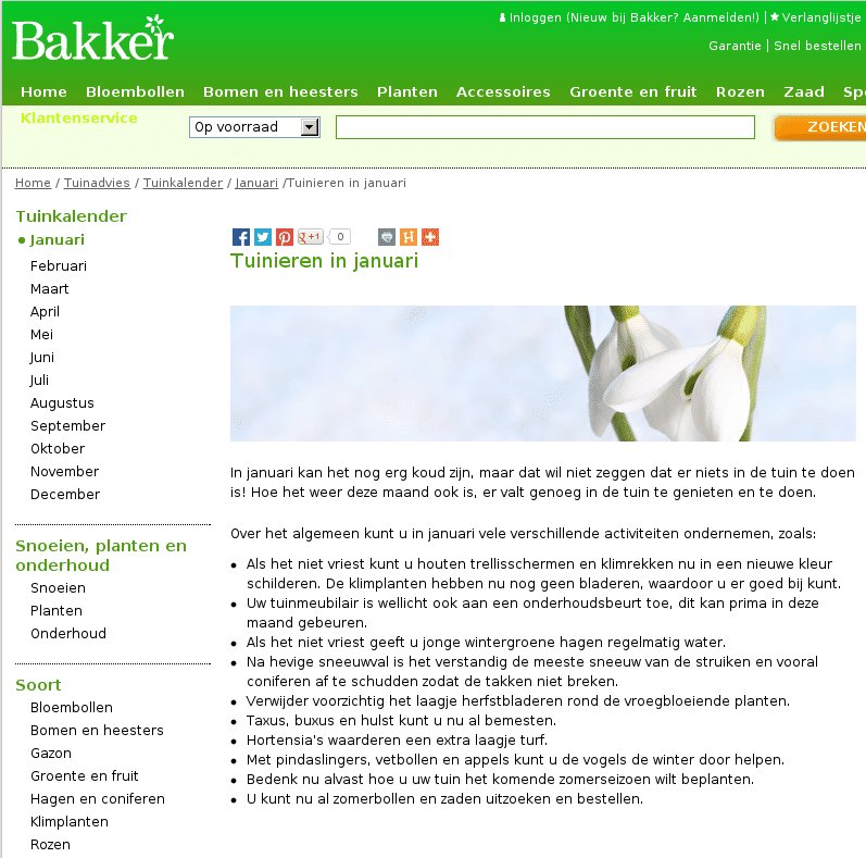
This is what one of the information pages looked like:

Ben hypothesized that placing commercially-focused banners on top of all the information pages of the website would increase user engagement. But before actually implementing the change on the site, he wanted to check if this hypothesis would bring any positive results.
For this, he used VWO to quickly set up and run a pattern test on all the information pages of the website. The primary goal was to increase the number of people clicking on the “Top Deals” section of the website (which consequently increased site engagement). The test was run for 12 days on 8,000 visitors.
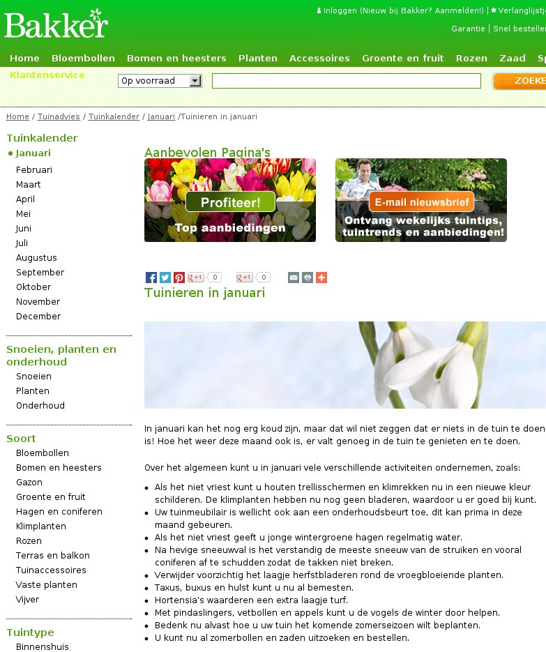
The challenger had just one major change in that two prominent banners were placed on the top. The first banner read “Top Deals” and it sent the visitors to Bakker’s top deals page where they could buy products at discounted rates. The second banner was for newsletter subscription. This is how the variation with the banners looked:

Result: The challenger won hands down, recording a 104.99% increase in visits to the ‘Top Deals’ with a statistical significance of 99.99%.
Conclusion
The results inspired Ben to perform further tests to identify additional opportunities- for example, where the banners are placed on the information pages.
As always, it is useful to go behind the scenes to understand what may have caused the desired change in behaviour. Three possible reasons can be identified:
1) Directing visitors towards a bargain
One reason why the ‘Top Deals’ page got so much attention is because it suggested incentives. Visitors were assured by the CTA text that they would be taken to a place where the “best deals” would be listed. This tempted them to click and explore. This is how incentives work.
2) Prominent positioning of the banners
The banners were placed at the top of page and the ‘Top Deals’ message was on the right side. F-shaped reading pattern indicates that this position was effective in ensuring that visitors do not miss content placed there. This was a significant difference vis-a-vis the placement of the ‘Top Deals’ link on the original page, where it was buried as a category under a drop down menu. This meant that only visitors with resolute intent to buy would click on it.

3) Clearly defined path of engagement
The phenomenon of visitors consuming relevant information and leaving without buying could be explained by the fact that the original page did not have any prominent call to action or navigation path. Adding the banners gave visitors an opportunity to engage further.

Location
The Netherlands
Industry
Retail
Impact
104.99% increase in Click-through rate


