7 Common Pitfalls of Call to Action Design
CTAs are your gateways from one stage of the conversion funnel to the other. Together, they lead to a final revenue conversion in the last stage of your funnel.
It means a Call to Action gone wrong at any stage is a conversion gone wrong. It’s critical for your business that your CTAs be properly designed.
Download Free: Website Redesign Guide
An ideal CTA:
- Should be easy to spot.
- The CTA text should come across as as a simple and actionable phrase.
- The goal of taking that action should be compelling enough.
Are you doing it right? Data driven analysis suggest that there are high chances of you messing it up. 53% of fortune 500 companies don’t go by the CTA 1o1 on their homepage, 70% of the small businesses have websites with no CTAs on the homepage.
Your copy and images are meant for the user to clearly understand the proposition. If the users can’t make sense of it, your CTAs (the desired action expected of a user) will be rendered ineffectual.
Here are the seven common pitfalls impeding Call To Actions on your landing page:
#1 Button Blindness and Missed CTAs
If the user doesn’t see a CTA how likely is he to click it?
Not very.
Blink and miss buttons that are too small or are lost in the noise of graphics and text are what lead to Button Blindness. No one has the time to find one to click.
Where Should You Put the Button?
Earlier, best practices would suggest putting it on the top, above the fold.
There is a little catch here. Placing a button above the fold won’t help if the critical information that helps the user decide is below the fold. As the user scrolls down the CTA button inadvertently goes out of his sight. Out of sight is out of mind.
Fitts law: The time required to rapidly move to a target area is a function of the ratio between the distance to the target and the width of the target.
Depending on this scientific law that tracks user movement and ergonomics you can decide where you should place the button and the width it should be allotted.
An ideal CTA button will click with the user and would be clicked by the user.
What Should It Look Like?
Would green be more inviting? Would blue look better and soothing? Would red not build enough trust?
There are a bazillion colors to choose from. Ask yourself the right questions about the color of the button. One of them is the visibility of the button against the background. While the Big Orange Button theory worked well for many, it is not a ‘one solution fits all’.
The psychological aspects of button color is trivial when pitted against the larger backdrop of visibility and accessibility. With the transparent ghost icons on web pages being an emerging trend the color debate has become less of a consideration. The bottom line is if it’s easy to spot, chances for getting a click is high.
Get the basics right. Whatever the button color or no color at all, it should be distinguishable.
#2 Vague Button Text or No Text at All
Even though we have become instinctively aware of the red power button on a remote control for gadgets, most of them would have a sign or a subtext below that says ’pwr’. Labels save us the trouble of guessing and second guessing.
Most CTA buttons will be powered by text but don’t just add it for the heck of it. Either a clear statement of purpose or an obvious result should precede them or the button text should define the resulting event.
Like how Amazon does it:
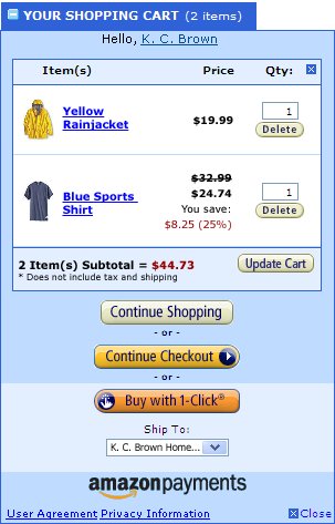
Image Source: Amazon
The button text has to be self-explanatory. For example:
- Create An Account.
- Get A Free Trial.
- Add Me to The Network.
#3 Too Many Call To Actions for One Page
Don’t put the user in a situation where they have to choose between two primary CTAs, just give them a text link to the other choice. A secondary CTA like a text link works but it shouldn’t compete with the primary Call To Action.
See how the secondary ‘Sign in’ doesn’t compete with the primary CTA button here:
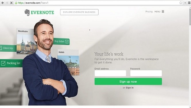
Image Source: Evernote
Let’s say you run a SaaS business and have dedicated a single landing page to both paid and free trials. What do you think will score more with the user? The free plan or the paid one?
While the SMB users are more likely to click on the free plan, the cash-rich enterprises may want to go for the paid features. Cluttering one landing page with too much information to cater to both audiences can lead to indecision.
Scanitto reaped benefits from adopting the one CTA per page theory.
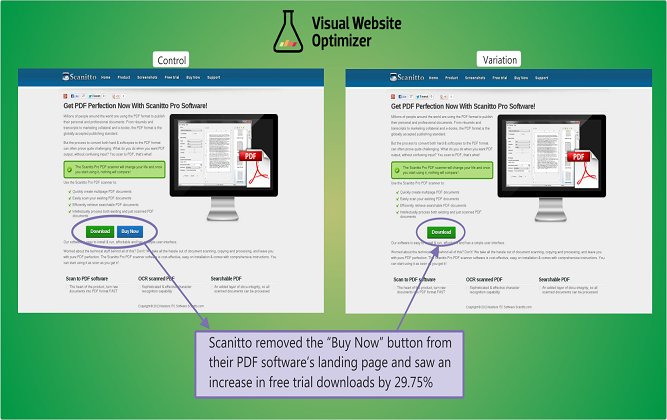
Doing away with ‘Buy Now’ helped them sell more. Dan Ariely’s blog where he writes about how too many options can deter people from making decisions explain the possible reason. Don’t let Call to Action options perplex the customer.
Be clear about what you want to achieve from a page and try not to create too many choices, sometimes the users may end up making none.
You shouldn’t be losing conversions in the war between two clashing CTAs.
#4 Copywriting Woes and Call to Action Misses
Making sales is not only about offering great discounts and offers it’s about showing the customer why they need to buy from you. The emotional and rational appeal that can be achieved using content surrounding CTAs makes all the difference to your pitch.
Copywriting errors could be as simple as using the wrong font, excessive adjectives or even the visibility of the text. If the user can’t read it, the page won’t be useful. They’ll bounce off and you will lose your chances even before the CTA is spotted. Writing vague adjectives and making a flowery copy for rational decisions backfires.
Remind the user of the problem (emotional appeal) and how you will solve it (rational appeal). When you tell the problem they relate and when you give them a solution they respect you. This establishes Likability and Authority of the six principles of influence by professor Cialdini. Only after establishing authority ask them to click on the CTA button and it would give better results.
Similarly, for emails, images and icons can help induce curiosity and effect higher conversions. Add a phrase like ’Would you like to know more?’ Then complete that with a link or a button that takes users to a page that delivers exactly what is promised in the email.
There are specific words that trigger favorable response from the users, identify them. What you are looking for is words that prompt emotional identification. Here’s a list of 380 trigger words as such, use them with restraint lest it sounds too cheesy, remember what we discussed about an excess of emotional appeal.
A CTA copy with excess emotional appeal is like a play overshadowed by melodrama.
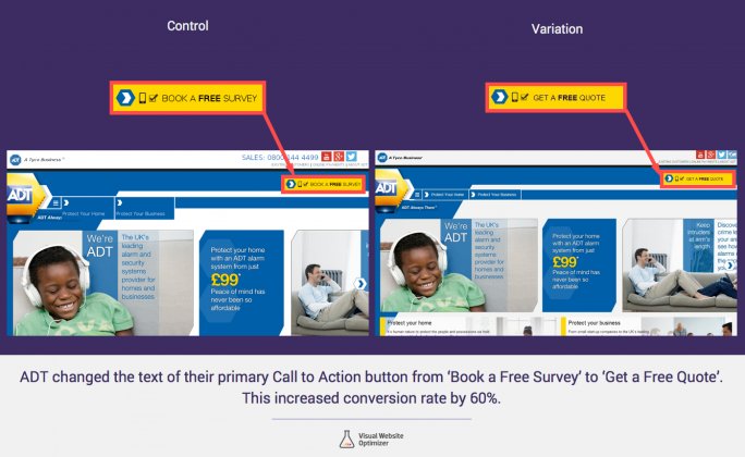
Sometimes changing the CTA copy to better suit your users can turn tables as it did for ADT. Changing the text type and tweaking their CTA copy led to 62% increase in conversions. Little changes, big difference.
#5 Image Clutter
A lot of studies will tell you that adding relevant images upped the conversion by a double digit in percentage. Here’s a VWO success story that points you to the same. Images do increase engagement on a page.
Caution: You should know where to stop. A clutter of images can’t make up for all that it will distract the user from. Users may stay to look at them and when they can’t spot relevant information they will bounce off without acknowledging the CTA. Like in the following example:
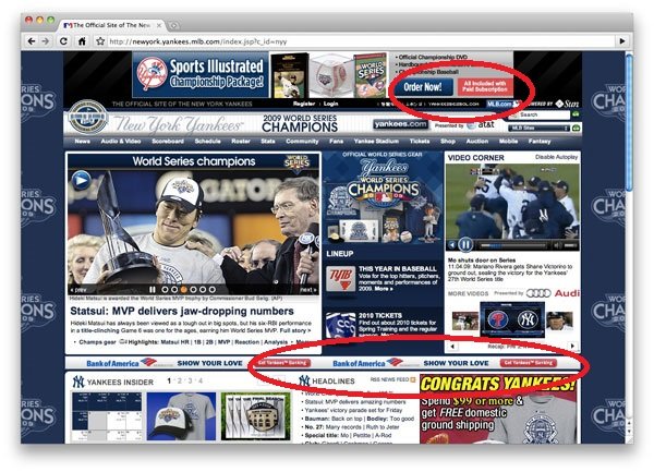
Image Source: Yankees
For a better understanding of the images you should use, understand why you need to use them. Images help you increase curiosity, engage the user and even induce trust. But don’t let them overpower your purpose and hence your CTA.
Like this GIF in an outreach mail, from our own VWO files :
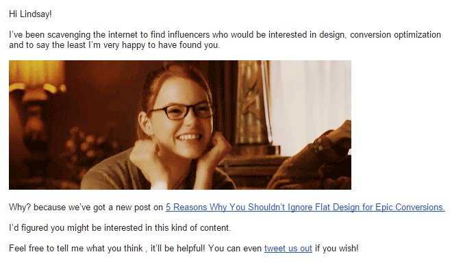
One of the users found the image a little too creepy to read further into the mail. The actual purpose of the email, contained in the the CTA, followed the gif and the affected user never made it past it. Of course, we ended up apologizing profusely! Lesson learnt: images should aid in getting conversions and not deter them.
Download Free: Website Redesign Guide
#6 Background Covers the Front
One reason why your CTAs are not noticed could be an imposing background color.
The solution is contrast.
Contrast is one of the principles of design. Our eyes like contrast. Page elements like backgrounds, text and graphics need contrast for a crisp view on the screen. Using white spaces and differentiable colors together in your web page can improve the visibility and readability.
Why the design industry swears by flat design is the sharp focus on accessibility of content. Blank spaces and bold colors are integral to this approach. As shown in the example below.
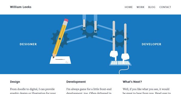
Image Source: William Leeks
Keep the typography clean and try to create a palette that coordinates the text, button and the background to stand out of each other’s interference. If you want to be more scientific with your approach and not go by the naked eye alone, using these tools for contrast calculation would help you make the right decision.
Related Post: 5 Reasons You Shouldn’t Ignore Flat Design for Epic Conversions.
See this page below. Your pupils will hurt from contraction in order to see the green text on a close to neon green background. One wouldn’t probably know if there is a button they should click on, it’s all lost in the color.
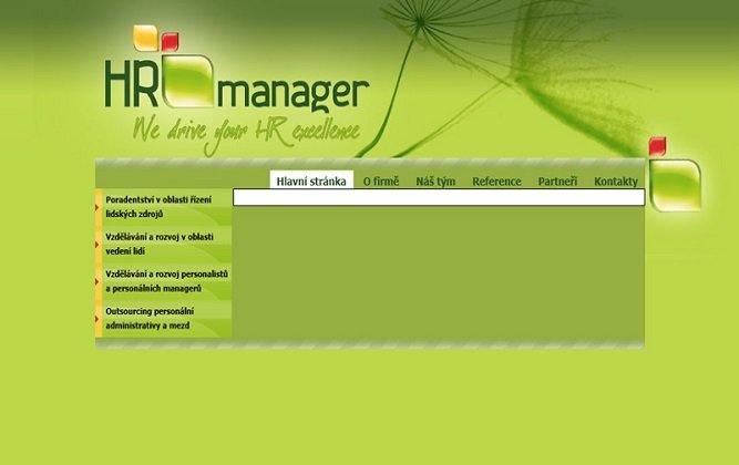
Image Source: HR Manager
Don’t do this. It hurts the user’s eyes and your conversions.
This post may seem handy in case you are looking to overhaul your color scheme.
#7 No CTA Where There Should Be One
Yes, we are reminding you of the elephant in the room because well, chances are you’ve missed it. This is not a Call To Action pitfall, it’s an out and out blunder.
Isn’t every page on your website supposed to have a purpose?
If yes, then add a Call To Action to achieve it.
Every page should be utilized to convert even if it’s a Thank You page at the end of the checkout. Courtesy sake and politeness kept aside, a seasoned salesman knows that when the user is walking out the door a nice finishing touch would make them walk back in.
Use CTAs like magic sauce, sprinkle just enough on pages for better results.
On your thank you page an option to ‘Continue Shopping With Us’ serves a similar cause. You may not need a CTA there, but you would want to have a CTA on that page.
It also brings us to where we started from: Remember when I said 70% of small businesses don’t care to have a CTA on their home page?
Once you take care of copywriting and design issues with the home page, it’s time to look at the CTA.
Placing a CTA on the homepage that is quick to find and takes users further into exploring the details is a good idea. Susty- Party discovered this simple hack and saw a 250% increase in conversions, magical or what!
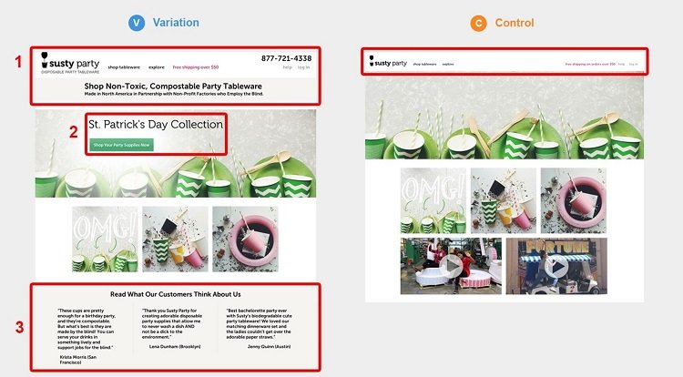
Whatever the desired action, put it on a remarkable button and make it hard to miss. You’ll be glad you did.
How Do You Steer Clear of These Mistakes?
Every CTA offers an opportunity for a micro-conversion. The most common errors that have been pointed here can be easily avoided by paying a little more attention to design and understanding user behavior on your page. We understand the two tasks enlisted are not as simple as they seem. We suggest: when in doubt, A/B test your hypothesis.
Tell us what more you think is wrong with CTAs across websites, there must be some Call to Action mistakes out there that kill your user experience, let us know.


