Have a sales page? Here are 3 extremely simple tips to improve it
You have a different audience than Copyblogger, Mashable and the New York Times. Their websites are designed specifically for their visitors. They are constantly testing them to see what works and what doesn’t.
They know that if they change the color of their “buy now” buttons their conversion rate will go up or down. It’s all about mental triggers.
What most businesses don’t appreciate is, their whole website is one big sales page. If you aren’t optimizing every page that people land on they aren’t getting the most out of their site.
Download Free: Improve Conversions In 60 Days Guide
I don’t mean you should treat every page as a chance to pitch your products and services. This will scare people away faster than my dog from a bath.
The key is to earn people’s trust (part of the sales process) and eventually get them to your sales page when they are ready to buy.
Let me tell you…
I had a client who refused to believe in any kind of sales funnel. She told me that if they wanted to hire her they would contact her.
She was a great business coach and her referral rate was through the roof, but she lost sales because she didn’t want to optimize her website for her visitors.
She was able to do this because she had a great service and people willing to talk about how great she was, but she also made the process very difficult on her potential clients.
Multiple Entry Points
Every business should have multiple entry points to their most important pages. If you focused on finding new clients then you should have links to your services page on your navigation bar, in blog posts, other pages, on your sidebar and at the bottom of your website.
The same goes for your best and most valuable products.
The more options and ways of telling your visitors where they can actually pay you for your products and services, the higher your conversion rate will be. You can overdo this and junk of your site, so that’s why I recommend understanding your website analytics.
It’s why using tools such as VWO and other website analytics that can help you improve your conversion rate. If you have a banner to a product that isn’t converting, which is taking up a lot of visual space then you can remove it and try placing it with a compelling text headline and text link.
The key is not to be afraid to test out your different entry points and keep only the ones that do the best job of driving traffic to your sales pages.
Let’s look at how Copyblogger has done this:
You can see the different main products they offer their audience.
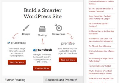
Then very subtlety they offer you to check out synthesis again a little further down the page.
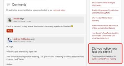
You see the red outline I put around the grey box. They are asking a question which draws your attention and encourages you to check out synthesis again. It’s a simple tactic that works.
I guarantee you they tested the verbiage and placement of this and they are getting a very good click through rate on this offer.
Now once people find your product or service sales pages, this is where you need to apply these next 3 tips.
3 Simple Tips to Improve Your Sales Pages:
These ideas are just the tip of the iceberg, but they’ll give you a good idea of how to optimize your pages.
1. Create a Compelling Offer
Too often people think that if they tell people about all the great stuff that they do on their services page that people will email or call them if they are interested. This is true, but increasing the amount of people who call you can differentiate between a great month and a slow one.
You have to create a compelling offer that speaks to people directly. That means crafting an offer that explains the benefits if they buy.
The formula is simple, but you need to work with it to get just right:
[target market] interested in [goals]? [call to action]
For example:
Small business owners are you interested in doubling your online revenue this year? Download our free white paper to find out how.
Playing with the offer to see what your people resonate is part art and part science. It’s important to try different styles and offers to see what works best.
Download Free: Improve Conversions In 60 Days Guide
2. Remove Distractions
If there is even the tiniest reason for a potential customer to click away, they will. It’s easier to think about spending money to help their business than to actually spend it.
You have to remove:
- Any extraneous links that send them away from your sales page.
- Photos that don’t add to your narrative.
- Videos that aren’t hosted by you because they can get distracted by suggestions to watch other videos.
- Extra verbiage because you feel like you need a long sales page. (Yes, long sales pages usually convert better than short sales pages. These are usually well crafted and used to build trust at every step of the reading process. If you don’t want to invest the time and money to create a long sales page and make sure the copy and layout works well it will help you. If not then go for straight forward copy and design that lets people know exactly how your product can help them.)
- Weak language that shows people you aren’t confident in your offer.
These are 5 big mistakes that people make on their sales page. These distractions can mean the difference between a high converting sales page and a low one.
3. Use Engaging Design
You’ve heard the saying that is the most important aspect of real estate – location, location, location. This is a very old term that still applies today. Your sales page’s most important aspect is design, design, design.
Design is so important because it’s the first signal that your product/service can really help them. They won’t even give you a chance if you don’t have everything laid out in an attractive manner with compelling copy.
Look at Ramit’s Earn 1K program’s landing page:
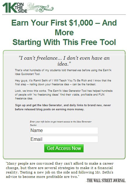
He is still capturing leads with great design and compelling copy that gets you excited about starting up a side business.
Your Sales Pages
When you have someone land on your website and check out your sales page you are in good position to build a deeper relationship with them. Most people won’t buy from you after the first visit. When you find a way to stay on the top of their mind, when they need you the most, is where you will see your conversion rates increase.
Your Turn
What helped you create a more compelling sales page?


