How Inside Buzz Increased Engagement On Its Website Home Page
About Inside Buzz
Inside Buzz UK (now known as Target Jobs) provided graduates and young job-seekers curated information about top employers in different fields in the UK.
The company uses VWO’s Visual Editor for its website optimization requirements.
Goals: Increase Engagement
Given the broad range of information and resources the site offered, the home page itself provided visitors with an overview of the entire site. This allowed them to get a sense of what the site offered, gauge relevance and decide how to engage further.
Engagement for Inside Buzz meant visitors downloading free guides for the industry they were interested in, or reading unbiased company reviews written by other employees, getting the latest buzz around hiring processes and much more.
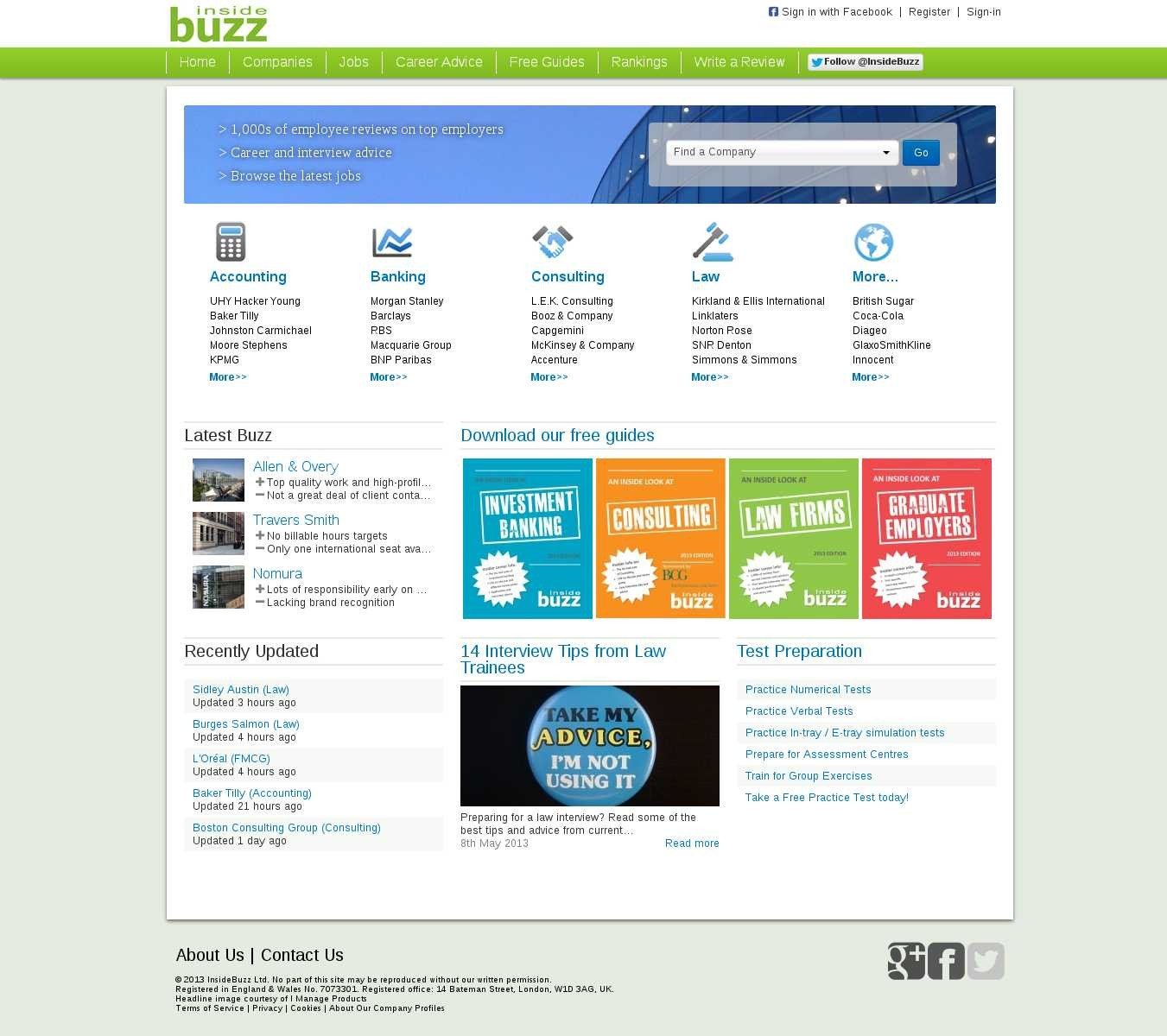
This is what the original page looked like:

Although the website did have a lot of useful information, the home page was cluttered. The existence of so many CTA options confused visitors, leading to a high bounce rate from the home page. Thus, rather than attracting visitors to engage more with the site, the original home page actually encouraged visitors to leave.
The team believed that decluttering the home page would increase engagement.
Tests run: Update Home page to Improve the Engagement Path for Visitors
To validate their hypothesis, they first conducted two tests using the VWO platform. The tests involved removing elements that were hypothesized as “unnecessary”. Buoyed by the positive test results, the team decided to overhaul the entire home page.
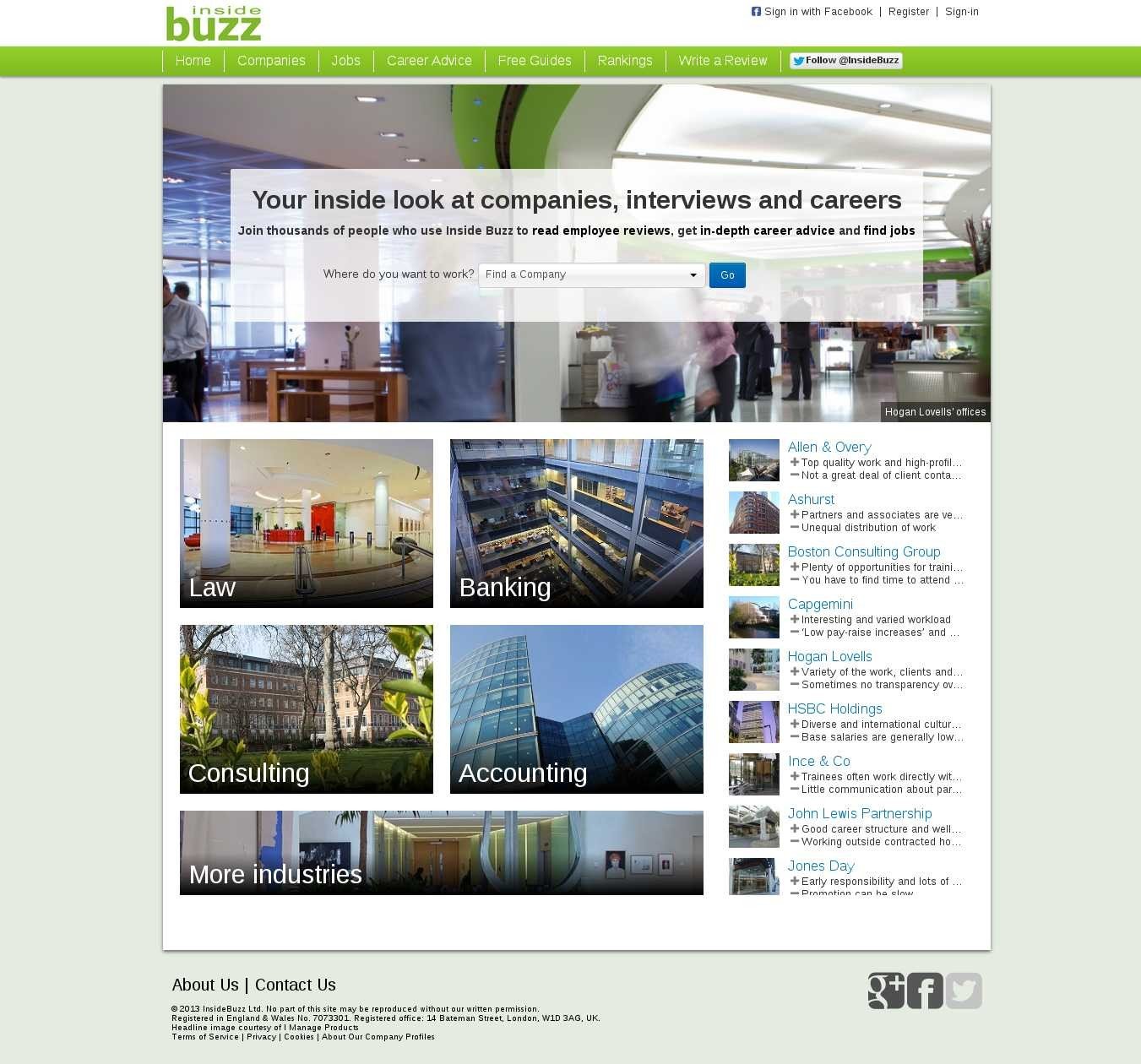
Following the complete overhaul, this is how the Challenger page looked:

Using the VWO platform, the variation page was A/B tested against the original (control). The primary goal tracked was engagement, measured in terms of click-throughs to other pages on the website.
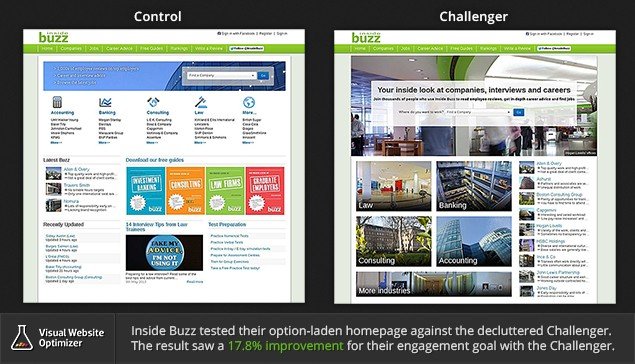
Here’s the comparison image, showing the control and the variation:

Conclusion: 17.8% Increase in Engagement
As expected, the variation beat the control and saw a 17.8% improvement for the overall site engagement.
We believe that the significant improvement in engagement was the net result of several factors:
Simple Design: Unnecessary links and elements were removed, which gave a good facelift to the website. Appearances definitely play their role in first impressions, and when it comes to site design, the Keep It Simple, Stupid! (KISS) approach is advised.
As Psychologist Barry Schwartz explains in The Paradox of Choice: Why More is Less, a smaller number of choices speeds up decision making.
Right Focus: Many first-time visitors to the original page probably felt lost. In contrast, the redesigned variation drew attention straight to the drop-down menu that allowed them to select the industry of interest and from there explore the site further. The focus of the site was to get visitors explore employer reviews and they found the right way to guide visitors to them.
Single Call-to-Action (CTA) Button: A single CTA right in the cener of the page made it harder for visitors to miss it.
Better Value Proposition: Typically, visitors assess the usefulness of a website in the first 8–10 seconds. The original page (the Control) was not successful in communicating the value of the site to visitors because of the clutter. Neither was the variation ideal in its ability to communicate the “What’s in it for me?” message to visitors. However, the headline and the subheading right next to the drop-down in the center provided a decent context to what the site is all about.
The “Where do you want to work?” text right next to the drop-down box reduced ambiguity and provided clarity by guiding visitors to choose the industry they are interested in so that they could explore further what resources the website offered.

Location
UK
Industry
Universities
Experiment goals
Increase in number of click-through to other pages on website
Impact
17.8% increase in Engagement


