A/B Testing Your Way Into A Great Product Launch
Josh Ledgard is the co-founder of KickoffLabs. He knows a thing or two about what it takes to create a successful launch page. In this guest post, he shares his thoughts on how you could be A/B testing your launch page.
You haven’t launched and you don’t know anything about your customer. But you have bought into the idea that you need to have a launch page and start learning how to sell.
Download Free: A/B Testing Guide
Your first sales goal is to get as many of the right set of customers signed up as possible. You can A/B test your way into a successful launch. A launch with a laser focus, the right price, and a line around the block of people shaking fistfuls of money to give you. Here is how…
Test radically different pitches
Founders get stuck on one particular pitch. Maybe it’s because that’s how they sold themselves on the idea in the first place, but it’s probably not going to be the best sales pitch.
Take SiftSocial for example. That’s the next product from KickoffLabs. We love it because it helped us use our limited time to personally market KickoffLabs to the biggest influencers on Twitter. I know the product can save time and generate revenue, but that’s not the pitch that wins over majority of the customers.
We win more people over pitching that it’s a smarter way to engage with higher quality content and people online. People don’t value their time and money as they should, but they do value feeling smarter. 🙂 Same product, different pitch.
Tips for pitching on a landing page:
- Give it a tweetable tagline. You should be able to hook people in less than 140 characters.
- Teasers only work if you are already famous. The rest of us need to actually explain what the visitor is getting into.
- Keep the signup form above the fold. Sorry, people still don’t scroll.
- Drop all the technology buzzwords, drop the jargon, drop things that make you sound smart. Stay clear, concise, & simple. Focus on a problem and the results of using your solution.
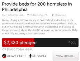
- Tell a great story. For example:
Find the ideal price
Everyone is scared to put a price on their launch page. They are worried it will scare people away from signing up. But if someone was scared away by knowing your product will cost money you’re going to have bigger problems.
[Editor’s note: read our previously published post—Stop guessing! Use A/B testing to determine the ideal price for your product!]

Tips for testing price:
- Start testing lines like “Plans will start at $10/month” and compare it to other price points.
- There is a line you’ll cross where signups will start going down. Find it… because that’s the line no one will pay for.
- You could also use a survey tool like SurveyMonkey to poll users on whether or not the price should be more or less.
- Several startups have had success with actually putting up a Paypal button that charges people a price for “immediate access”. You could test different button prices.
Test design elements
Color, background, typography, and general design choices create the mood for conversion and you need to test to discover what works best for your audience.
The design of your landing page shouldn’t get in the way of the primary call to action.
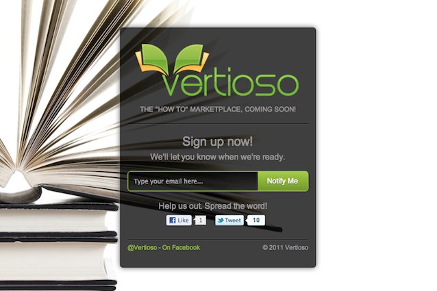
Tips for creating a great launch page design:
- Test a clean page without a background. I think you’ll be surprised that it matters less than you think.
- Use links sparingly. Anything that takes them off the form before they have completed it distracts from the goal. You probably have a great blog, an awesome Facebook Page, and a lot more information somewhere… but if I start clicking around I’m not going to come back to fill out the form.
- Only collect the information you need. The longer the form is, the LESS likely users are to complete it. If you think about it, you probably don’t need to know their full names, DOB, and mothers’ maiden name at this point, do you?
Download Free: A/B Testing Guide
Test signup incentives
The best launch pages offer two types of incentives. One for getting the customer email address and another for getting them to sign their friends up. Does your market react better to a contest, financial motivations, or simply the desire to be part of your beta?
Tips for creating great viral incentives:
- Reward people. Personally thank them on Twitter and send an auto-response that provides them with more value and information.
- Define clear rules. Tell people what they are. Tell people if they change and why, but try and stick to your promises. If you want 3 signups before you give something away…tell them that’s how they get in… and let them in! No one should be begging.
- Tell them how they are helping. Let them know, without effort on their part…if their marketing is helping you achieve your goals. It’s as simple as saying “Hey – you got 5 people to sign up! Thanks! Here is a free ebook about building a landing page.“
- Keep them engaged. Even if you can’t launch yet keep people informed along the way. Demonstrate progress. Send newsletters with information that helps them achieve their goals anyway…even if it’s without you.
Test now or else
Now is the time to test radical differences. Once you launch you’ll be so bought into a design and your direction that testing bigger changes won’t be as easy. Tests like this can absolutely help you identify the best product-market fit possible before you launch. Then you can focus your testing to optimize for the local maximum.
If you’re a fan of this approach, you’ll love how easy it is to combine KickoffLabs and VWO.
