How to Improve Your Landing Page Conversion Rates
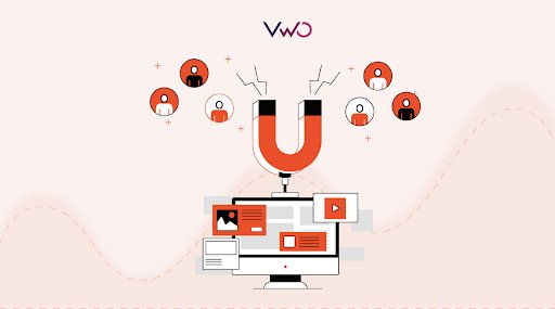
Landing pages aren’t like any regular webpage. Their whole purpose is to encourage the visitors to complete a specific goal. The goals will vary with industry, product, and stage in the customer journey. For an eCommerce landing page, it could be to add a product to the cart or buy now, while for a B2B SaaS company it could be to sign up for a free trial or to view a product demonstration. Whatever the goal, there are tried and true ways to test and improve conversion rates across the sales and marketing funnel.
Download Free: Conversion Rate Optimization Guide
What is a landing page conversion rate?
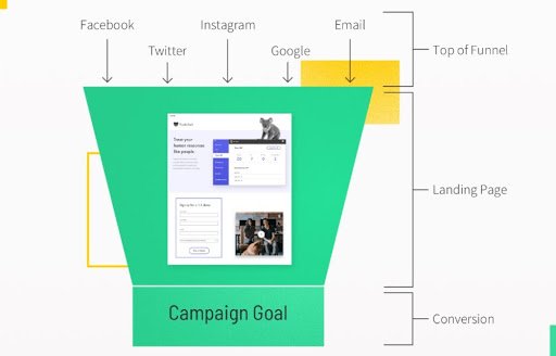
Landing page conversion rates tell you the proportion of visitors who convert into qualified leads by accomplishing your landing page goal. Not every visitor who hits a landing page will take the action you desire. Many people will bounce immediately, while others might read your content and then choose to leave or go to another page.
Take, for instance, a landing page created for traffic from an email marketing campaign The goal is to convert visitors to purchase a product or service as effectively as possible. By tracking the landing page conversion rate, you have a quantitative measurement of how well your page aligns with the needs and interests of visitors. This analysis makes it easier to improve your landing page and see the impact of these changes on the conversion rate.
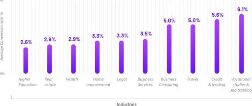
WordStream found the average landing page conversion rate to be 2.35%. The top 25% of landing pages in the same study converted at 5.31%. Some pages converted visitors at an even higher rate.
We know that landing page conversion rates differ by industry and the type of traffic. The following graph displays this in no uncertain terms. But there is always an opportunity to improve landing pages to drive more conversions.
Calculating landing page conversion rate
Landing page conversion rate is a vital, yet simple, metric. Calculating conversion rates is as easy as this:
The number of people who converted (took the desired action), divided by the number of people who visited your page, multiplied by 100.
This simple math will identify conversion rate as a percentage, allowing you to understand which are the high-converting landing pages and which are the duds. Most analytics platforms, such as Google Analytics, record this metric for you. Once you know the results you can start optimizing landing pages to boost the conversion rate.

Five simple ways to improve landing page conversion rates
The way to increase conversion rates for landing pages and building high-converting ones is by consistently optimizing them. The following are five straightforward things you can do to get the ball rolling.
1. Step back to audit which factors are determining your current conversion rate
You won’t know the best way to increase conversions until you understand why web page visitors are or are not converting. Luckily, there are many ways to analyze the various aspects of your landing pages.
The audit of the user behavior on the existing landing page provides you immensely valuable insights. Website heatmaps can provide insights around the elements on your landing page that attract the most and the least attention. With these insights, you can fix and optimize any troublesome element, such as a CTA button or an image on your landing page.
Take the example below of an eCommerce store that sells baby products. The heatmap revealed that the baby’s face was a distraction to visitors. When the image was replaced with an alternative in the variation, site visitors paid more attention to the copy, and conversion rates increased.
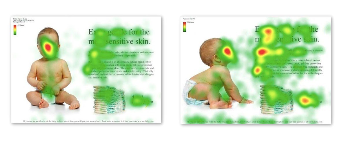
Bandwidth used VWO Heatmaps to better understand user behaviors, then made a number of improvements to product pages which delivered a 12% visit-to-lead conversion uplift.

Download Free: Conversion Rate Optimization Guide
2. One call-to-action (CTA)
All landing pages should have one clear goal, whether that is to get users to fill in a form, download an eBook, or take some other action. Everything about the page — visuals, design, or copy — must align unanimously with one call to action. Declutter your landing page as much as you can. You can answer some crucial questions and know where you stand with this handy landing page analyzer.
Placing a clear CTA ‘right there’ where your visitors find it intuitively as they land on your web page. Your chances to witness an uptick in the conversions will be maximized. ArchiveSocial made their primary CTA more legible and salient by moving it to a prominent position above the fold and differentiating colors, increasing clicks on the form by a mighty 101%.
3. Introduce new landing page elements and test exhaustively
Optimizing your landing pages is an ongoing process with learnings at each step. The best practice is to continually tweak and replace elements on your pages, as well as experiment with new ones. Experiment with new headings, copy, CTAs, images, colors, and more. Move things around and change the design. Seek components that convert visitors better than those you currently use.
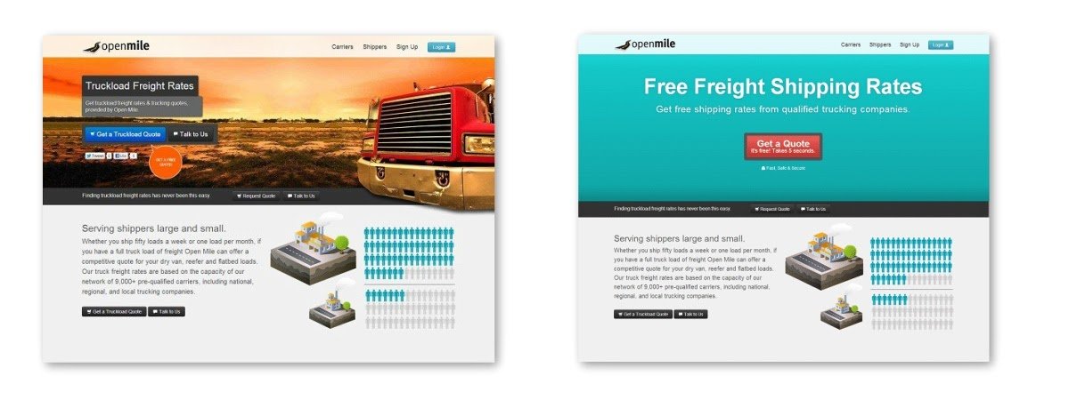
Take the US shipping company, Open Mile, for instance. They tested a new top section of a lead generation landing page. It used a different background color, a more prominent CTA, and altered text. They witnessed a massive hike in conversion rate – from 3.95% to 13.11%. In terms of lead generation, that equated to a 232% improvement.
We recommend keeping tinkering with all elements, testing consistently, and documenting everything during the course of experimentation.
Employ A/B tests to analyze changes to single elements and multivariate tests for brand-new pages.
4. Enhance your landing page visuals
A picture is worth a thousand words. When trying to improve your landing page, the right visuals may be able to generate many more conversions. Compelling images, explainer videos, and even animated GIFs are prime examples. However, while visuals may feel like they are the solution to an improved conversion rate, it’s not always the case.
Hubspot ran an A/B test on an opt-in form. One version contained an image, and the other did not. The version without the image saw a 24% increase in sign-ups.

As per the heat maps example, the position of an image has an impact on where people focus their attention. This is why it’s essential to run tests to improve your landing page conversion rates.
Also, if there are videos or animations on your landing page, ensure they don’t slow down your page load time. Longer loading time leads to more friction and higher bounce rates. Ideally, page load time should not exceed 3 seconds.
5. Leverage the power of social proof
Social proof is a powerful motivator in human psychology. People are much more likely to take action if it is recommended to them by others. Stories, evidence, and opinions have tremendous power to move people and influence their decisions. Therefore, adding social proof to your landing pages is an excellent way to enhance conversion rates. This could be in the form of a testimonial, review, or even a simple display of a brand’s popularity on social media.

Take the example of a landing page for Kaya Skin Clinic. Adding the social proof of the brand’s Facebook presence boosted the conversion rate by 70%. And that was on top of a 22% increase brought about by tweaking the copy above the CTA button.
In summary
Optimizing your landing pages is one of the quickest ways to increase your volume of leads and sales. Similar to other CRO practices, you can improve landing page conversion rates as long as you have a sound understanding of your target audience’s needs.
Through a regime of careful data-driven analysis combined with experimentation, you will certainly be able to improve landing page conversion rates.


