How “Your Tea” Boosted Revenue by 28% Through Structured Conversion Optimization
An increasing number of companies and agencies are following a structured approach to Conversion Rate Optimization (CRO). Presently, we will be looking at how a tea eCommerce website increased revenue using conversion optimization.
About the Company
Your Tea is an online tea eCommerce site serving health and lifestyle-focused consumers. Tiny Tea Teatox is one of their largest sellers in their diversifying everyday tea product ranges.
Your Tea signed on We Are Visionists (WAV), a digital agency that partners with eCommerce agencies and startups, to help solve their clients’ digital problems ranging from paid advertising to conversion rate optimization.
Download Free: Conversion Rate Optimization Guide
We got in touch with Joel Hauer, founder at WAV, to know all about their successful optimization exercise that resulted in a 28% improvement in revenue.
Onboarding Your Tea
WAV pitched CRO as part of a raft of complementary services, including SEO and PPC, to improve Your Tea’s online presence.

Joel says, “It made business sense and so it was a straightforward decision for Your Tea. If you can create an uplift in your revenue by improving your product page, why wouldn’t you? We were able to make projections based on anticipated improvements to the site, and those projections were what got us over the line. We are lucky to have such a pragmatic client!”
Process of Optimization
What WAV wanted to do was to insulate Your Tea’s revenue stream against any potential declines in traffic and maximize revenues in the periods of high traffic.
While doing so, they decided to follow a formalized approach to CRO, that is, researching their website data and visitors’ behavior intently to create hypothesis and running A/B tests that would impact revenues the most.
The Research Phase
To begin with, they analyzed their website data using Google Analytics (GA) to understand the journey of the visitors. They detected a large number of drop-offs on the product pages of the website, that is, a lot of people were landing on the product pages but not adding anything to the cart. They discovered that the Tiny Tea Teatox product page in particular was attracting the largest amount of traffic, and decided to optimize it first.
On further research on that page, they found that more than 50% of visitors were browsing through mobile. This information compelled WAV to closely analyze the mobile version of Tiny Tea Teatox. They found multiple optimization opportunities. For instance, the CTA was not prominent, there was no detailed description of the products, and more.
Here’s how the original page looked:

Hypothesis Creation
Since a majority of traffic was coming from mobile in particular, WAV decided to optimize both the desktop and mobile versions of the Your Tea website. They hypothesized that adding a more prominent CTA, along with a detailed description of the product and user reviews would increase add-to-cart from the product page.
Using Visitor Behavior Analysis, they were able to develop their hypotheses further. For instance, by looking into heatmap analysis, they realized that visitors mostly browsed the product description and its benefits.
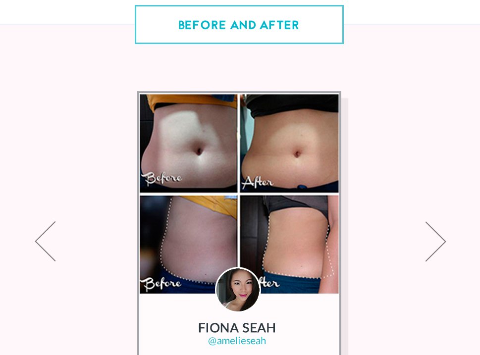
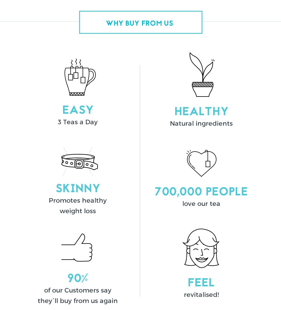
A large number of visitors also visited the reviews section, thereby making it clear that they were looking for trust elements. WAV decided to add more product information and benefits, along with credible “before and after” images and testimonials to the page. WAV also conducted website surveys and user testing sessions, which confirmed their hypothesis of adding more “credibility proofs” to the page.
Download Free: Conversion Rate Optimization Guide
The Test
WAV concluded that a full redesign of the product pages could yield better results than a series of incremental improvements from smaller tests. Such a massive redesign required heavy technical work, and WAV used VWO’s Ideact service to create a variation. Below is the screenshot of the control and variation:
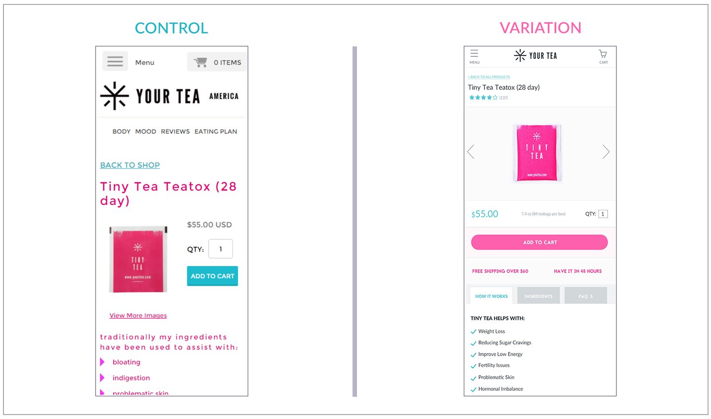 Here’s how the Before And After section in the variation looked like:
Here’s the Why Buy From Us section in the variation that aimed to improve the website’s credibility :
 Results
With the tests, they tracked two goals, that is, the add to cart conversion rate and the revenue.
The improvement in add-to-cart actions led to an impressive 28% increase in the revenue. In terms of add-to-cart conversions, control of the test was yielding a conversion rate of 11.3% in contrast to the variation which emerged to be the winner with a conversion rate of 14.5%.
Road Ahead
To capitalize on these higher conversions, an optimized checkout experience is required.
The agency could identify that the checkout pages were receiving multiple views from the same visitors. Users were getting stuck in loops around the checkout page. After they identified what to look for, the data from analytics supported it. Currently, they are testing to optimize the mobile experience on parameters such as anxiety and trust signals.
When asked about his biggest learning of the test, Joel responded: “One thing that came out of this test was learning more about the checkout experience—particularly on mobile.”
Experience Using VWO
Joel remarks, “The work of VWO’s Ideact team in setting up the tests on the technical front to help us record users through the checkout experience was invaluable.”
“We loved working with Rauhan and Harinder from VWO. The willingness to go the extra mile and help us get the maximum insight from our tests was fantastic. Having spoken about the features in the pipeline, we’re excited to see what’s to come.”
What Do You Think?
Do you have any similar experiments to share?
Write to us at [email protected]!



![[Infographic] Why a Website Redesign Doesn’t Always Work](jpg/feature-image_infographic-why-a-website-redesign-doesnt-always-worka8d0.jpg?tr=h-600)
