Website Surveys
What are website surveys?
Website surveys or ‘Web Intercept Surveys’ are a means of gathering both qualitative and quantitative user feedback on your website or products directly from the users. It may include a set of questions that are either open-ended or close-ended or both. Website surveys are a non-intrusive, minimum effort (on the part of the respondents) way of sharing feedback. They enable marketers to gauge your website and then use that information to rectify what is broken and make good things even better. And because the feedback comes directly from users, the changes that are made, match their expectations, creating a win-win situation.
What are the different types of website surveys?
Website surveys may be conducted to realize different goals like user research, UX optimization, understanding visitor behavior, getting product feedback, and much more. The type of website research you choose depends on the goal you want to achieve. Broadly speaking, in the online world where businesses run on websites rather than brick and mortar shops, there are 3 types of website surveys:
Pop-up surveys
Pop-up website surveys quite literally pops-up on visitors’ browsers as soon as a condition triggering an event is met. This type of survey can be configured to appear anywhere throughout the journey of a visitor.
Widget surveys
Widget surveys appear as a small widget in the corner of a web page that opens up as a form when clicked on. They are unobtrusive and give website visitors the freedom to initiate a survey from their end to provide feedback whenever they deem fit based on the kind of experience that your website delivered to them.
Collapsible pop-up surveys
Collapsible pop-up surveys are a mix of pop-up surveys and widget survey. They pop-up on the visitors’ screen when an event is triggered like pop-up surveys. But unlike pop-up surveys, when the visitors close it, instead of disappearing altogether, they appear as a small widget in the corner of the web page. It gives website visitors the agency to choose and become a part of the campaign simply by clicking on the widget and then filling in their response.

Why should you use website surveys?
The success of any online business depends on how well it understands the end-users, their needs, and intent. And website surveys help you capture exactly those to help optimize your website’s interface and experience, thereby increasing conversions. Let us look at some of the benefits that your online business can reap out of using website surveys:
1. Enjoy a high response rate
Website surveys have the benefit of high brand recall, and because of the minimum effort required by the respondents, they also enjoy a high response rate. This is because, unlike sending surveys through email that involves multiple steps (opening the mail, accepting the survey invite, landing to another web-page, and then filling the survey), website surveys appear on the same browser or page that a visitor is already on.
Additionally, different people treat emails differently. Some people check their emails multiple times a day, some once a day, some once a week, and so on. Plus, with all the filters that can now be put to filter primary inboxes, there is no guarantee that your survey emails will even appear on the visitors’ screen.
2. Get real-time feedback
Website surveys have the added benefit of collecting feedback and responses in real-time. With website surveys, the experience that visitors had on your website remains fresh, and hence the responses tend to be more representative of that experience. Emails, on the other hand, are sent at a later time, capturing the experiences and thoughts that are formed while they are on your website tend to fade out as they have to be recalled by the visitor.
Another advantage of collecting feedback from visitors in real-time is that the responses come in quickly. And, because you don’t have to wait for respondents to respond to the survey and it all happens on your website in real-time, you can address or respond to certain recurring concerns raised by them faster than you would be able to, had the survey be conducted through email or SMS. This also reaffirms the visitors and users of your website that, as a company, you value their feedback, thereby increasing brand loyalty.
3. Reach a relevant demographic
Conducting surveys through emails essentially restricts you to a pool of respondents, which in effect limits the reach of your surveys. Not only this, a lot of visitors tend to give in their work emails (which changes with change in their organization), or wrong email addresses to avoid getting spammed with marketing communications. So, there is no guarantee that the emails will even reach the intended visitors. Additionally, procuring emails from third-party vendors is often expensive and unreliable. Website surveys eliminate this caveat and enable you to reach a relevant audience base without having to tackle all of these roadblocks.
With website surveys, your sample audience can be as big as your website’s traffic. This is because virtually every person that lands on your website can become part of the survey sample pool simply by virtue of being on your website. There is no pre-requirement of email addresses, phone numbers, and other such information. And because visitors are already on your website, they must already be familiar with and interested in your products and services, your survey’s reach widens exponentially, resulting in a range and quality of responses getting recorded
Website surveys save time, are cost-effective, and reach a more relevant demographic than traditional methods of conducting surveys.
4. Get feedback across the funnel
Website surveys can be configured by setting certain event triggers so each time a visitor performs a predefined event (like scrolling 50% of the page, or spending more than 1 minute, visiting a certain page, etc.), the survey pops-up. This is one of the biggest benefits of using website surveys because you can set different triggers on different pages based on the users you want to target, the problem you want to solve, or the feedback you want to collect through the surveys. Let’s take a look at the questions that can be asked in different stages of the funnel of an eCommerce website which, if asked in the wrong place at the wrong time will provide the visitors with no context:
- Homepage: What are you looking to do today?
- Product page: Did you find what you’re looking for?
- Product description page: Is there any other information you feel is missing?
- Cart page (exit intent): What is stopping you from proceeding with this purchase?
- Payment page (exit intent): Are you experiencing any payment issues?
- Post-purchase: Rate your purchase experience.

How do website surveys work?
Now that you know the benefits of using website surveys, you may have a lot of questions to answer and funnel leaks to repair for your website to deliver a great experience to the visitors. This section enumerates how you can set up website surveys on any of your web pages and then find solutions through suggestions and feedback from visitors. Broadly, running an end-to-end website survey campaign involves 4 stages – Survey Design, Tool Selection, Survey Set-up, and Launch & Analysis. Let’s look at each of these stages in a little more detail:

1. Designing the survey
A website survey’s design comprises of the goal set for it, and the questions asked against those goals. So, the first step in starting off with your website survey campaign is to set up goal/s – have a clear picture of the questions you want to get answers to.
Try to get answers to 4 questions:
- What questions to ask?
- Whom to ask those questions?
- Where on the website do you want to ask those questions?
- And what type of survey do you want to run? (pop-up, widget, etc.)
The questions you ask will then flow directly from the goals you choose, and also allow you to target the surveys better. Do you want to include visitors from a specific segment, or do you want to include the entire audience base? Do you want feedback on your website or your products/service? Do you want feedback on a certain page or certain elements on a specific page?
Your goal/s will also determine the types of questions you choose to ask – open-ended, close-ended, a mix of close-ended and open-ended questions, progressive questions, rating scale, single-question survey, multiple question survey, and so on. This is important because the type of question you choose will determine how close the responses will be to the outcome you desire from the whole campaign.
2. Choosing a tool
The next step is choosing a versatile tool that enables you to configure the surveys based on your requirements. With the growing popularity of qualitative research among marketers, the market space is also getting swamped with a plethora of tools. Hence, it is important to look into each tool there is and choose the best one available. Let’s look at some of the must-have capabilities that any good website survey tool should have:
- Question branching and skip logic: In question branching, marketers design a flow of questions that flow from the previous question, i.e., custom question pathways. This capability is extremely necessary if you want to run progressive surveys. For example, an eCommerce store looking for feedback from its customers may start the survey with a question on the respondent’s gender, i.e., male, female. Depending on the option that they choose, the next question will be displayed based on the decided flow. This capability enables you to gather insights from specific audience set.
Skip logic goes a step further than just enabling you to show different questions to visitors based on their previous response. This capability is especially important because it minimizes the risk of showing redundant questions to respondents. Let’s assume that you design a survey, and the first question has three options as possible answers. One of the options makes the next two questions irrelevant for a visitor choosing that option. Skip logic enables you to take that particular visitor to the next relevant question by automatically skipping the two follow up irrelevant ones. - Question type: Another parameter to judge a tool against is examining the types of questions it allows you to ask. Some tools only allow for multiple-choice and open-ended questions, and it strictly limits your scope of using website surveys. Make sure that the tool you choose supports all types of questions (open-ended, close-ended, rating scale, single-question survey, multiple question survey, etc.) and surveys (NPS survey, progressive surveys, etc.).
- Targeting and segmentation: Website surveys generate the most insightful data when they are personalized and customized for specific visitor segments. And the analysis is also much more representative when segmented. Choose a tool that allows you to target and segment respondents based on various parameters like traffic source, device used, browsers, geography, age demography, and so on.
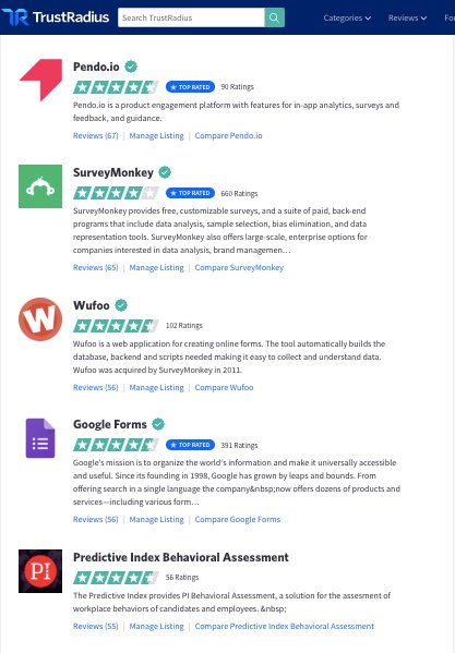
You can, in fact, refer to various review sites like TrustRadius and G2Crowd to see what fellow marketers have to say about the different website survey tools available in the market from their experience.

3. Setting up the survey
Setting up website surveys, which is the next step in the workflow, is fairly simple. There are 4 questions you need answers to before deploying a website survey campaign: Who, What, Where, and When.
- Who: The first you need to answer before conducting a survey is ‘Who your sample audience is?’ i.e,. which visitors you will include in the survey.
Upon diving deep into the data you gather using quantitative research tools on your website’s metrics, you may also be able to further breakdown the behavior of different audience segments on your website. This data is extremely useful because it enables you to send targeted surveys with targeted questions to different visitor segments.
For instance, let’s assume that you are doing a survey to increase your website’s upsell rate. So your target audience would be your current set of users who are regularly using your product or service. Targeting enables you to identify audience segments that are most relevant for the survey you are planning, thereby generating segment-specific insights for personalized solutions. - What: The next question that you need to answer is, ‘What questions should be asked?’. For the changes you make in the pages that need improvement to match visitor expectations and yield positive results, you need to ask relevant questions to your visitors.
When you want to ask the most relevant questions, start by brainstorming the answers that you want. When you point out the answers that you are looking for, the questions will automatically come to you. For instance, you want to know which navigation format is best suited for your homepage, then ask visitors which format they prefer. Or if you want feedback on your new website, ask old visitors how they like the new one as compared to the old one. - Where: The next question that you need to answer is which pages should you include in the survey campaign. The quantitative research tools you use, like Google Analytics (GA), to keep tabs on various metrics will tell you where your website stands: its bounce rate, conversion rate, metrics of specific pages, and more. After looking at these numbers, you narrow down on various sections and pages of your website that need optimizing.
For instance, after preliminary research, you notice that the bounce rate on your resource page is the highest – visitors who land directly on the resource page leave your website without navigating to other pages. Additionally, the blog subscription rate is also on the lower side of the scale. So, you decide to run a survey on the resource page to get insights on the possible reasons for the page performing below average from the visitors themselves and then using those insights to optimize the page.
Page URLs should be finalized for the survey to be run on with data-backed reasoning.
When: The last question to answer when planning to conduct a website survey is, ‘When should the questions be asked?’. Different surveys running on different pages of your website or stages of the sales funnel will have different goals. With the goals being different, the questions each of them asks or the answers each seeks will also be different. Hence it is extremely important that your surveys be timed correctly.
For instance, asking a user at an early stage of the funnel, “what went wrong with your order?” wouldn’t achieve much apart from creating friction. But timing an abandoned cart survey with some benefit for the user in it can do wonders for your website’s cart abandonment rate.
The key here is targeting visitors based on their activity, defining specific triggers for each survey, so only relevant questions are asked to visitors at specific stages of their journey.
Put simply, if you get the Who, What, Where, and When of website surveys right from the beginning, you will have a good survey set-up that unearths useful, actionable insights and helps you deliver excellent website experiences.
4. Launching survey and post-analysis
Now that designing the survey, tool selection, and survey set-up is taken care of and out of the way, next comes the launch stage. Launching a survey is pretty simple: you feed the chosen tool based on the configuration decided upon in designing and setting-up stage and simply deploy the survey. The tool will then do its job by showing the survey to the eligible visitors, and you just have to monitor it for mid-flight glitches (if any) and wait for it to collect the desired number of responses.
After collecting the responses, there is only one thing left to do – analyze. The analysis method of the collected responses will differ based on the way the survey is set-up from the start of the campaign. If, in the setting-up stage, you set triggers and send targeted surveys to different visitors segments, the responses you receive will already be segmented and ready for analysis in the tool’s reporting dashboard. But if you run generic campaigns like website feedback campaigns or website redesign campaigns, after the responses come in, the first thing to do would be segmenting them based on different parameters like UTM source, location, device used, browsers used, and so on. This is important because segmentation enables you to draw similarities or patterns in the behavior of segment-specific visitors. Analyzing the collected data in this manner allows you to slice and dice into each segment and devise personalized fixes for the experience breakages that each segment witnesses or claim to be witnessing through the responses. You can also understand the kind of feedback that each segment provides.
Once you collate all the analysis reports and make a repository of ideas, all will be left to do to deliver brilliant experiences to visitors is implementing those ideas after prioritization, testing them, and finding your website’s most optimized version.

What types of campaigns can you run using website surveys?
The campaigns you run using website surveys can be of virtually any kind you want it to be. You have a leak in your funnel, you discover how different segments interacted with that leak, and you look for solutions by asking targeted questions to specific visitor sets using a website survey. Let us look at some surveys that online businesses run to understand their visitors, gather feedback, and optimize experiences:

1. Website feedback survey
As the name suggests, when online businesses want to understand the kind of experience their website is delivering and identify friction in the funnel that throws visitors off or frustrates them, website feedback survey is conducted. You can get contextual feedback directly from your visitors on your website’s navigation, content, design, and more. A website feedback survey typically consists of questions like:
- Why did you visit our website?
- How did you find our website?
- Did you find what you were looking for?
- How easy/difficult was it for you to find what you were looking for?
- What do you like most about our website?
- What do you dislike most about our website?
2. Website redesign survey
Website surveys not only help you gather visitor insights on your existing website but can also prove to be a very powerful means of testing new website designs. Redesigning a website is no easy task. Months of planning and execution go into it, and you can never be too sure about how the new design will sit with your visitors.
Typically, website redesign surveys are either conducted before the redesign, after it, or both. You can run a survey for a set of your existing visitors to understand what they prefer and what their needs are, and then, use the insights gathered to design a website that delivers stellar experiences.
After redesigning the website and before launching it for the entire audience base, you can design unique surveys for returning and new visitors, and gauge what each audience set thinks of your new website. This not only helps align your website with new visitors’ expectations but also gives you insights that help in delivering great experiences to old and new visitors alike. Website redesign surveys typically consist of questions like:
- Did you like our old website, or does the new one work better? (for returning visitors)
- What do you like the most about our website?
- What would you like to change on our website?
- Was it easy to find what you were looking for?
3. Website exit survey
Website exit surveys are conducted to understand why visitors are exiting the website before completing a conversion goal. They are triggered by a visitor’s exit intent and appear on the screen when a visitor is about to exit the website. For example, you can configure the survey to pop-up as visitors move their cursors towards the close or exit button.
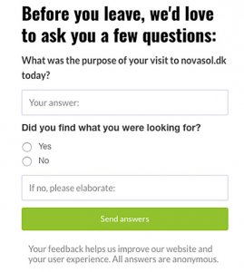
- The two main goals that exit surveys help achieve are first, understanding why visitors are leaving your website without converting for a goal, and second, increasing conversions by using the insights.
The best way to reap the most benefit out of your exit-intent survey is to design different surveys for different pages. For instance, you can have a survey asking visitors who are about to leave your product page without purchasing if they found what they were looking for or not. Or you can have a survey on your pages with a high bounce rate asking questions around why they were leaving without converting. These surveys include questions like:
- What was the purpose of your visit to our website?
- How was your experience on our website?
- Did you find the information you came to our website for?
- Did you find what you were looking for on our website?
4. Abandoned cart survey
If there is one thing that hurts eCommerce businesses the most, it is Cart Abandonment. Cart abandonment happens when visitors or users add one or more products to the cart and leave the website without purchasing those products. The average eCommerce cart abandonment rate currently stands at 69.75%. This means that on an average, approximately 70 out of 100 visitors who add products to their cart abandon it. This is a huge number of opportunities lost for eCommerce businesses.
Abandoned cart surveys help businesses target these lost opportunities or cart abandoners, understand why they abandoned their carts, and nudge them to complete their purchases. This enables businesses to identify in their purchase funnel, problems in the checkout process, pricing issues, and more, and then use these insights to design a high converting funnel.
Many companies offer incentives like special discounts and other offers to abandoners for taking part in the abandoned cart surveys and completing the purchases.
You can define conditions that trigger the abandoned cart survey for any visitor like when there’s fast movement of a visitor’s mouse cursor towards the close or exit button, average order value, and so on.
5. Net promotor score (NPS) survey
NPS Survey is a single question survey conducted to understand customer satisfaction and loyalty. These surveys need to be timed very well and usually ask customers the recommendation potential of your products and service.
NPS survey asks customers, ‘On a scale of 0 to 10, how likely are you to recommend our products/service?’ right after they purchase your product/s. Responses to the question are measured on a scale of 0-10, which then provides an estimated indication of your brand’s reputation and enables you to identify loyal customers who can potentially become brand promoters and also helps identify potential detractors.
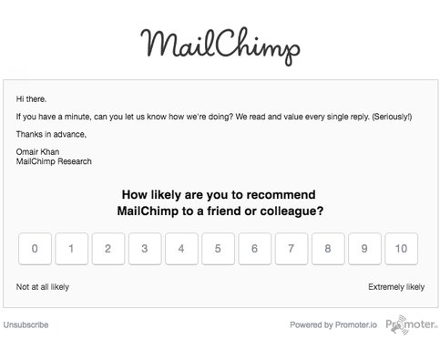
Because NPS survey tells you exactly how customers feel about your products and services and how satisfied they are, it serves as a good means to measure customer service, satisfaction, and loyalty.
What are the elements of a well-designed website survey?
Whether you are looking to decipher your low conversion rates or improve your already acceptable figures, website surveys can play a significant role. Surveys can help you in a lot of ways – understand your visitors and existing customers, and learn about their expectations from your product or service. It’s also a tool that allows you to segment and target your user base. Website owners and marketers with advanced knowledge even use surveys to garner their NPS. But all these benefits can only be realized if the survey you run is in its most optimized version. Here are a few indicative best practices for building a well planned and designed website survey:
1. Know your end goals
It’s imperative that you define an end goal for your website surveys. Your end goal can be anything: reducing bounce rate, increasing subscription rate, minimizing cart abandonment, improving time spent on page, etc. By fixing an end-goal, you’ll be able to frame specific questions and target your survey effectively.

For instance, with the end goal being “reducing bounce rate,” you can probably ask users if they find the page load time to be high. The responses to this particular question will provide direct insights for fulfilling the end goal. The same question, however, cannot be ideally used for an end goal like “improving time spent on page.” Avoid setting up generic end goals, and questions such as “how can we improve our website?” Responses to this question can themselves be generic like “make it more user-friendly,” not giving you much to work on.
Similarly, the more specific your end goals are, better would you be able to decide on who (end-user) to show your survey to (e.g, first-time visitors, users from a particular country or device, etc.) and where to show it (product page, homepage, checkout page, etc.)
2. Make it easy to answer survey questions
Normally, users don’t get anything in return by completing website surveys. They do it out of reciprocity – your website gives them value; they fill out your survey. Since most users don’t have the motivation to complete a survey already, having a rather lengthy survey never helps. The best thing to do here is to either minimize the number of questions to be asked or try to have most questions click-based (which don’t require any typing effort).

Form your questions such that they ask for mutually exclusive answers from users and avoid redundancy. Find if a single question can provide you answers you are looking for, instead of asking multiple questions that simply stretch the survey or prioritize which questions are more important to get answers of first. Net promoter score (NPS), for example, is a single metric to gauge your users’ perception about your brand. NPS involves asking users a single question, “How likely is it that you would recommend us to a friend or colleague?” Users respond on a scale of 1-10; the ones responding with “9” and “10” are your promoters. In place of multiple questions inquiring about user satisfaction and brand loyalty, you can use a short NPS survey.
So you’ve got a lean survey on your website. Great! But how do your users know that it is lean? Well, you have to tell them. When you greet your users at the start of the survey, it’s sensible to tell them how long the survey is. Mention the number of questions the survey has, or the average time users might take to complete it. You can also have a progress bar that reflects how much of the survey is left to be completed.
It is also a good idea to begin with questions requiring small commitment. Use the foot-in-the-door technique to effect a greater number of responses for your survey. Begin with questions that are simple, and users can readily answer. Once users answer a question, they’ve committed to your survey. With this commitment, there’s a good chance that they will complete your survey. This is one of the key persuasion principles given by Robert Cialdini. Questions with a yes/no answer are a great example of questions requiring a small amount of user commitment. Answering a simple yes or no to a question will get your users into the survey funnel. Below is an example:
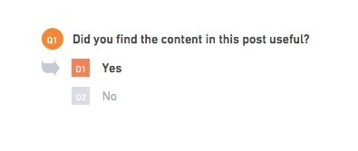
In the worst case, you’ll still have one answer for your survey.
3. Choose appropriate question types
Typical question types gather information in the form of text, check-boxes, rating scales, etc. Whereas close-ended questions (including rating scales and NPS) require minimum effort from users, open-ended questions (with text boxes) call for substantial effort and time.
Various studies have shown that close-ended questions yield a much higher response rate compared to open-ended questions. The studies, however, also confirm that open-ended questions can bring out information otherwise missing with close-ended questions. With close-ended questions, you provide users with predefined responses. The data collected can be analyzed quantitatively, often giving straightforward insights. It’s a good practice to use close-ended questions when you know how your users will respond, and you need quick insights.

Consider this: you run an eCommerce store and think that the size of the product images need to be changed. You can ask users specifically, whether they prefer larger images or smaller ones, or want the size to be unchanged. Open-ended questions, on the other hand, can provide you key details that you yourself might have overlooked. When you can’t think of any concrete ideas for the optimization of your website, it’s a good idea to offer users open-ended questions, asking what they think can improve the website. After responses are collected, a word cloud can be formed to understand what keywords users used most often in their suggestions, giving a good idea of what changes were suggested most frequently.
4. Use separate surveys for different funnel stages
Since funnel stages tie in closely with the type of website pages, you can’t just put one survey across all of your web pages. Your survey questions need to deliver some context to users. Users derive that context from the web page they are on. This makes it important for your survey to be coherent with the pages on which they’re being displayed.

For instance, you own a travel website, and you notice a decline in your conversion rate. You want to know why some users are not going all the way and making a transaction. You run a survey, asking users, “What is stopping you from booking?”. Now, users on the “travel description” page can find the survey question relatable. But, obviously, users browsing your homepage will not be able to answer this question. They might even find the survey box intrusive to their user experience on the page — possibly hurting your conversion rate further.
5. Employ segmentation to uncover niche insights
Similar to creating separate survey questions for different web pages, you also need to identify separate audience groups to whom you’ll display the survey. For instance, if you want to improve ad spends of your PPC landing pages, and want to ask users what they think about your landing page, you need to target users via paid search channel. Similarly, if you want to know how users liked the first impression of your website, you should ideally target first-time visitors (and exclude returning visitors). Want to target only mobile users? Segment your traffic to exclude desktop users.

6. Know the minimum number of responses you need

The larger the number of responses for your survey, the more statistically significant the results are. However, accumulating a large number of survey responses prove to be time-taking and (often) expensive, in terms of not being able to drive other marketing campaigns. So how do you know the number of responses that will be truly representative of your population? Well, that depends on a few data points:
- Population Size: In case of website surveys, the population size equals website traffic. If you want to run a survey on specific pages of a website, the total traffic to only those pages will be your population size.
- Margin of Error: The survey results can only be perfect if you get responses from every person of your population. Otherwise, the results will carry a margin of error. You’ll have to decide the amount of margin of error that you’re comfortable with.
- Confidence Level: This metric, essentially, determines how confident you want to be with your survey results. The commonly accepted confidence levels to base decisions on are 95% to 99% (achieving a 100% is practically impossible in most cases).
With these data points in hand, you can determine your survey’s sample size. Below is an indicative table that can help you decide your sample size:
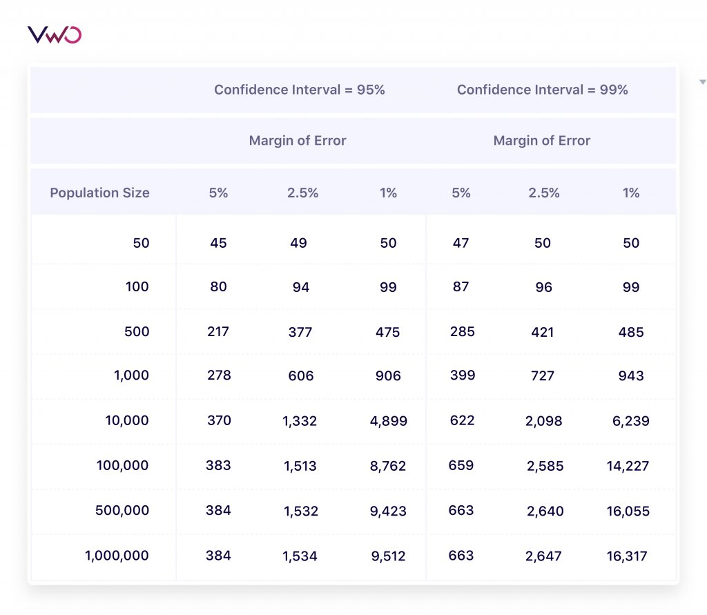
Using the above table, if we have about 10,000 visitors on our target page, and we need to run a survey with at least a 95% confidence level, and a 1% margin of error, we need a minimum of 4,899 survey responses.
7. Make use of survey triggers smartly
User targeting for surveys is not just based on how (and from where) users are landing on your website. You can display your surveys to specific users based on their interactions with your website, too.

There are multiple triggers using which you can define conditions that should trigger your survey. Suppose you want to run a survey on content-heavy pages on your website, and you only want to target users that have gone through your content. To do so, you can set a trigger for your survey, only showing the survey when users have spent a minimum amount of time on the target pages.
Some common trigger conditions are session duration of users, exit intent, scroll depth, or custom conversion goals.
8. Optimize the design and position of your survey
After you’ve put together a great survey (with effective segmentation and triggers), you wouldn’t want to lose out on responses because of your survey’s design. Ensure that your survey doesn’t look out of place on your website. Maintain consistency in color and design between your website and the survey while ensuring that, you must provide some contrast to the survey box to help it separate from the rest of the website and grab enough user attention.

9. Make your surveys mobile-friendly
It’s no news that the number of active mobile users is greater than the number of active desktop users globally. Hence, it’s essential for your surveys to be optimized for mobile (unless your website data tells that your mobile traffic is negligible). Your surveys need to have a responsive design, which allows them to be displayed correctly across all screen sizes. When targeting mobile users specifically, it’s a good practice to provide easy-to-choose answers for your surveys, using minimal input text required on behalf of the responders. You should also try to use closed-ended questions as much as possible with your mobile surveys, which make for a faster, crisper survey.

What are the common mistakes made while using website surveys?
Website surveys may seem like an easy task, but when it comes to execution that leads to fruitful returns, marketers need to be mindful of some common mistakes. These mistakes broadly fall under 3 categories: design pitfalls, launch mistakes, and flawed analysis. Let us look at each of these in more detail:
Design pitfalls
As mentioned earlier, a website survey’s design comprises of the goal set for it, and the questions asked against those goals. Before deciding on the questions of the survey, you need to have clear goals in mind for each survey you run. As mentioned earlier, your end goal can be anything: reducing bounce rate, increasing subscription rate, minimizing cart abandonment, improving time spent on page, and so on. Only when you have a decided end-goal in your mind will you be able to frame questions that generate actionable insights. So, the first pitfall to look-out for is the setting of goals. Without specific end goals, or if you set broad goals like improving conversions or improving the overall website experience, you will not be able to formulate questions that address the friction visitors experience on different stages of their journey.
The next element of survey design are questions. When deciding what to ask, there are 3 decisions you need to take where most marketers falter:
- What questions to ask?
- How many questions to ask?
- What question type should be chosen for the survey?
It is in making these crucial decisions that most marketers fall into the pitfall by asking the wrong question or asking leading questions, asking too many or too little questions that either make the respondents leave the survey midway or gather too little insights, respectively. Survey bias is a phenomenon where the person or the team putting the survey together develops questions in a specific manner that leads to the participant answering as desired by the surveyor. This is one of the most common mistakes that marketers commit, consciously or unconsciously. For example, to confirm a fact about your product, you may frame a question in a manner where your customer answers precisely what you want.
Here is a hypothetical situation, which demonstrates the intent of bias toward a specific answer. If you ask your customers, “Due to the increase in accidents on campus, do you think motor-based vehicles should be banned in the college?” the answer is going to be mostly “Yes.” Why? Because surveyee attention may shift toward the issue of higher accidents on campus and they may answer the question keeping safety in their mind. But when you frame a question like “Do you think motor-based vehicles should be banned from colleges?” students may have a more neutral answer or outlook.
Therefore, it is important to be mindful of this pitfall while designing survey questions. To evaluate if your question is leading readers, run a test with your colleagues or friends, and see if they are biasing toward a similar option. If the percentage is high, then you need to reassess that question.
The choice of the question type is also crucial to be made right because your goal should determine the type of questions you ask. For instance, if you want to know your recommendation potential, you would ask a single question that warrants a rating between 0-10, and not ask multiple open-ended questions about the same. Similarly, if you want to get actionable insights on what exactly is stopping visitors from finishing a purchase, you would ask them multiple-choice questions with an option to write open-ended suggestions as well, rather than asking visitors to rate each element on your checkout page on a scale of 0-10.
The type of question you choose to ask should always be drawn from the kind of insights you want at the end of the survey.
Launch mistakes
The second area where marketers often make mistakes when using website surveys is while launching it. This is especially true in two instances: mismatched triggers and not enough testing.
The first launch mistake that marketers often make is that they either ignore applying triggers to their surveys or put in the wrong trigger. Mismatched triggers can have a huge impact on the kind of insights that the survey generates. For example, if you ask visitors ‘On a scale of 0 to 10, how likely are you to recommend our products/service?’ before they’ve even purchased your product/s, do you think you will gather actionable insights? Or, if you ask a visitor at the initial stages of the funnel why they did not complete a purchase, it will create friction and may even impact your website’s conversion rate. You need to design and configure your surveys in such a way that visitors are asked appropriate questions at different stages in the funnel.
The second launch mistake that marketers often make is launching the survey without testing it. Testing surveys before deploying them to the entire sample audience enables you to find biases in them, identify missing or redundant questions, discover usability breaks in experience across devices, identify if they are mobile-friendly or not, find the most optimized design for it, and more. There are two ways of testing your survey. The first test would be testing its compatibility with the on-page survey. Things like device compatibility, responsive nature, and survey triggers should be tested before going live with the survey. The second test would be doing an internal run of the survey. Try to at least run the survey across 5–10 members of your organization and see if you can get unbiased and honest responses. If something looks wrong, revisit the questions.
Testing surveys before deploying them enables you to catch mistakes and inconsistencies early on in the stage of your research rather than having to do the entire exercise of collecting data again that accompanies late-stage error detection.
Flawed analysis
In case of other qualitative research methods, like website heatmaps and session recording, the analysis stage and everything related to it comes at the end of the process. But with website surveys, the analysis of the data and factors that facilitate it need to be kept in mind from the start of the exercise.
With website heatmaps, for example, you decide on a sample of visitors, and at the end of the data collection, you invariably have data on all of the sampled visitors’ on-site behavior. In case of website survey, you can never be sure about how many of your sampled visitors will submit responses. And without enough responses, no matter how well you nail the design and launch part of the survey, your analysis will not generate enough actionable insights due to lack of data. So, at the beginning of your website survey campaign, you need to decide on how many responses you need for the data to give useful insights. This is where a lot of marketers are left behind because they do not set the sample taking into consideration that many visitors may end up not submitting responses.
The mistake to avoid committing here is to set a sample size that is equal to the number of responses you would want to have during the analysis stage. Always set a sample number that is higher than the number of responses you would need for a statistically significant analysis. This is because each non-submitted response is compensated by the possibility of the extra visitors included in the sample submitting a response.
Another mistake often made by marketers while analyzing the collected data is not segmenting the responses received. For a lot of campaigns that have specific goals of understanding specific audience segments, surveys are already targeted. But while conducting surveys to get overall website feedback or NPS, the same questions are shown to all the visitors. In such cases, it is important to segment the responses based on parameters like geography, device used, browsers, age group, and so on to understand how visitors from these specific segments think about or react to your website as well as products. Without segmenting the collected data during analysis, you stand the risk of coming up with generalized solutions for the entire audience when the pain points of specific audience segments may be very different, requiring personalized solutions.
Website survey in popular industries
Website surveys help businesses understand their audience’s common characteristics, build personas, understand their terminology – the exact words and phrases your customers use. They also uncover insights about what visitors are looking for, conversion blockers, their emotional psyche, how they prefer to buy, their opinion about your competitors, and lots more.
Website surveys also serve as a repository of ideas – if hundreds of visitors come to your website every single day, and you get 50 unique responses from a survey, these responses turn into 50 different test ideas for your website. Out of those 50, even if 10% win, you get 5 solid winners that actively contribute toward scaling your business revenue. Let’s look at some instances when businesses from different industries used and benefited from using website surveys.
Website survey in eCommerce
When it comes to using qualitative data to understand visitors and using the insights to optimize on-site experiences, Amazon leads the way in the eCommerce industry. Amazon does not shy away from using website surveys to meet these goals, either. Given Amazon’s dedication to delivering the best experiences to its customers and visitors, using website surveys does not come as a surprise. Below is a screenshot of a survey Amazon ran to gather customer feedback on their customer support quality:
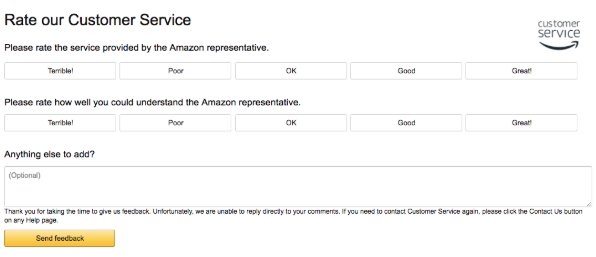
After gathering all the responses, Amazon even made a repository of the information uncovered in the form of a knowledge base/FAQ, which is easily accessible to all its visitors. This knowledge base not only helps visitors get most of their questions answered without getting in touch with customer support in the shortest possible time and also reduced the chances of them placing incorrect orders.
Website survey in Telecommunications
If you have ever taken a call on Skype, you would have noticed that immediately after the call ends, it asks for feedback. This is what their feedback survey looked like:
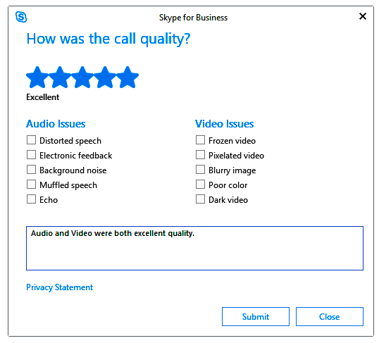
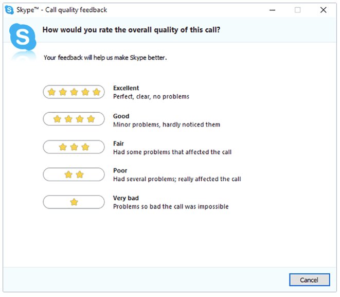
Skype does not just run website surveys to gather insights for later when they take up the exercise of improving the experiences they deliver. They also act on the responses fast, if need be. In fact, there have been many instances when their customers have publicly gratified them for their prompt response.
Skype’s example goes to show how website surveys not only enable you to understand your visitors by gathering insights in real-time but also allow for quick resolution of critical issues raised by users, thereby increasing brand loyalty.
Website survey in Media & Publishing
Just like Amazon leads the eCommerce industry when it comes to conducting survey along with other exercises to understand their audience better and deliver better experiences, in the media industry, Netflix holds the winning baton. This is what one of their feedback surveys looked like:
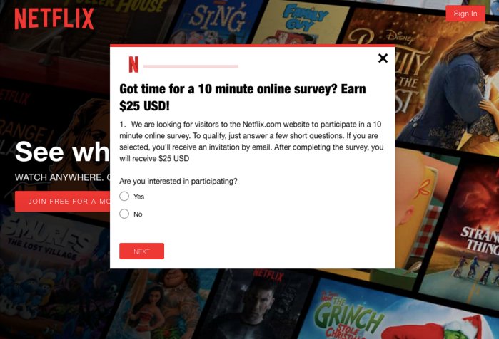
That’s not it. Netflix is well known for not shying away from using surveys to gather real-time feedback and improve conversions by optimizing experiences. And this is why globally, today, it is one of the biggest and most popular streaming websites. Here are some website surveys (some personalized) that Netflix has sent out:
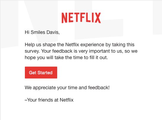
Website survey in Travel & Hospitality
Of all the industries, if there is one industry that cannot survive without personalization, it is the travel and hospitality industry. Each individual visitor is unique with different sets of requirements and different types of bookings. Hence, in order to deliver smooth user experience, business owners, and marketers in this industry conduct multiple surveys in combination with other visitor behavior analysis exercise to understand their audience better and deliver personalized service.
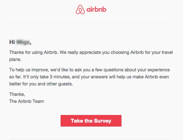
In recent years, Airbnb has emerged to be the fastest-growing company in the hospitality industry. And it comes as no surprise that understanding visitor behavior and needs have a major role to play in their growth plan. Here is one of the website surveys Airbnb conducted with its visitors to get feedback on their experience:
Top survey questions to ask
Website surveys are a great way to understand website visitor experience. Unlike quantitative surveys that answer your questions in numbers making your research extensive, website surveys are a qualitative research method allowing you to unearth detailed insights about visitors’ behavior on your website. Let’s read the top survey questions you can ask to get a good understanding of visitors’ experiences.
1. Were you able to find what you were looking for on our website?
This might seem like a simple question, but it can tell you a lot about if your users can find what they are looking for or accomplish their goals on your website. For example, if yours is an eCommerce website, you’d like to know if your users can find the product of their choice. Positive responses will help confirm that your website navigation or search is on point, while negative answers can help you identify and fix the gaps in user experience. This question can be answered in either yes or no or in some lines.
2. Do you need help finding anything?
Offering customer care and support is one of the best ways to build a long-term relationship with your visitors. Ask your website visitors if they need help finding anything on your website. If they say yes, share the customer support page link or direct them to your website chatbot in the next slide. If they answer no, good for you! Given the objective nature of this question, you can make it a closed question, asking for yes or no answers.
3. What did you like the most about our website?
Give your visitors a chance to shower praise upon you! When you ask them this question, you’ll know what you are doing right about improving your website UI. Some can like the search experience on your website, while others can like how easy it is to checkout. Based on what they like, you can keep optimizing to keep delivering up to their expectations. Of course, make this question open-ended, allowing users to answer in 3 to 4 lines.
4. What are the frictions you faced on our website?
Tough questions must be asked. Honest answers must be heard. Answers to this question will tell you what problems or friction visitors face while trying to complete an action on your website. Suppose you’ve shown a discount offer in a pop-up, but your visitors find it distracting. Knowing about your users’ struggles, you may show it as a sticky offer at the top across the site. Text-based answers can give you an in-depth understanding of user experience problems.
5. What according to you is missing on our website?
Pay attention to what your visitors expect to see on your website. When you try out their test ideas, you can actually be surprised to see how this feedback helps improve your website conversions. Online shoppers may want to see comparison tools to make informed purchase decisions on a gadget-selling website. On the other hand, B2B buyers may want to see product demo videos before signing up for a freemium plan. Hear out what your visitors expect to see and analyze how feasible it is for you to add them to your website.
6. Where did you find us?
Yes, we know you can find answers to this question through Google Analytics. But when presented in an open-ended format, this question can tell you more than which channel brings the most traffic to your website. Learn why users choose the channel they choose to arrive at your website. Suppose you learn that most of your visitors found you on Instagram. You can double your marketing efforts in this channel and cut down on your focus on other platforms to save time and money.
7. Are our products/offerings better than our competitors?
Reads a bit too direct, right? But asking this question is necessary to know how you’re performing against your competitors. Your users might like the quality of your products better than your competitors but think their payment options are much more varied and convenient to choose from than yours. This way, you identify the areas of improvement and start working on them to get an edge over your competitors. Although an open-ended format is the best way to ask this question, you can let your visitors give a point on a scale of 1 to 5 or 1 to 10.
8. What other options did you look for before choosing us?
Sometimes your brand might not be at the top of users’ minds when looking for something. They might have arrived at your website after trying other competitors’ products or services in search of better offerings. This competitor research question will tell you which competitors you must overtake to crystallize your brand as the first choice for your target audiences. You can either let your visitors pick brands in a multiple-choice question format or give them a box to fill in their answers.
9. What was your first impression of our website/products?
Engrossed in improving the usability features, you may forget to analyze something as simple as the overall look and feel of the website. Ask this survey question to see what kind of a first impression your website and products have on your visitors. A bad impression means your visitors are less likely to stick or come back to your website. If most of them say that your website makes a negative impression, speak to your design team and decide what can be improved to enhance user experiences.
10. How accessible is our website do you think?
There are many disabled users who struggle to use websites the right way. Yet too many websites are still without accessibility features today. Ask your visitors if they think your website is accessible, helping them take action. Go for a multiple-choice format or a 5-point rating scale for this question. You can also ask for text-based answers to know what accessibility features your users might like to be added. Some important accessibility features are text-to-speech, layout adhering to color contrast sensibility, images with alt text, and so on.
11. How likely are you to come back again?
Now, this is pretty straightforward. This can be a point-scale question, letting users pick any number on a scale of 1 to 5 or 1 to 10. If users have liked your website, they will select a number closer to 10. If most users select lower numbers unanimously, you should take it as an urgent call for better website usability. You might even want to look at your product, offerings, pricing, and customer support to understand if any lacking on those fronts demotivated users to come back.
12. How likely are you to refer our website or products to others?
Customers who are highly satisfied with using your website or trying your products are very likely to refer your brand to their friends, family, and even on their social media networks. This can be a multiple-choice question with options like very likely, not so likely, and least likely. You can also ask users to rate on a scale of 1 to 5 or 1 to 10. Based on their responses, you can decide how to use the flywheel marketing model to your benefit and turn loyal customers into brand advocates.
Conclusion
This guide outlined in detail every caveat of website surveys (also known as website intercept surveys). After reading it, you should now be fully equipped with knowledge on what website survey is, how it works. Website surveys are an indispensable visitor behavior analytics and feedback tool.
By keeping in mind the variety of insight you can unearth, the mistakes that you can make, and by designing the survey by getting the Who, What, Where, and When right, you can optimize every element and page on your website based on real-time visitor feedback.
If you found this guide informative and useful, and you think that it helped answer some of your questions as a marketer, then spread the word and stop fellow marketers from facing the same roadblocks.
Frequently asked questions on website surveys
User surveys is a mean of gathering both qualitative & quantitative user feedback on your website or app or products, directly from the users.
The kind of questions that you ask in a survey depends upon the campaign that you are planning to run. If you are planning to run a website feedback campaign, an example question could be why did you visit our website or how did you find out about our website.
Using website surveys, you can get feedback from a website visitor, and that too in real-time. The experience that visitors are having on your website is fresh, and hence the responses tend to be more representative of that experience.
You can easily create a survey on a website using a website survey tool. A good website survey tool should have the ability to target and segment the survey based on the audience or visitors coming to your website.
A website survey is an effective way for companies to collect feedback from visitors to know their experiences using their websites. This allows businesses to understand areas of improvement on their websites so that they can be optimized for better user experiences.
There are multiple ways to create a survey on a website but using VWO is the most convenient way. VWO On-Page Surveys allow you to set up pages to run surveys on, define visitor actions to prompt the pop-up survey, analyze users’ feedback to survey questions, and so on. To explore more, you can take a full-featured free trial today.
Setting up website surveys is one of the most useful ways to gather users’ opinions on your website experience. A survey consists of a set of questions that your website visitors answer, giving you a lot of quantitative and qualitative data to refer to for collecting user feedback and delivering great user experiences.
VWO Insights’ On-Page Surveys is one of the best survey tools that allows you to run surveys on website pages and predefine visitor segments with each survey. The platform lets you choose from trigger actions that prompt on-page surveys – click an element, scroll depth, time spent on a page, custom triggers, and so on. Choose an appropriate question format from multiple line textbox and radio buttons to rating and dropdown, and much more. You can also view data in the form of word cloud, net promoter score, bar charts, and ratings to draw better insights from them. As VWO is an integrated platform with end-to-end experimentation capabilities, the insights gathered from your surveys can be easily used to create hypotheses and validate them via A/B testing.


