Conversion Rate Optimization
What is conversion rate optimization?
Conversion rate optimization (CRO) is the process of optimizing your site or landing page experience based on website visitor behavior to help improve the probability of the visitor taking desired actions (conversions) on the said page.
In today’s world, online traffic is highly inconsistent. If you’re unable to get visitors to enter your conversion funnel in the first go, the chances of them coming back and performing the desired action are quite low. This is nothing but an opportunity lost for your business. The best way to improve your chances and get more conversions is by running effective conversion rate optimization campaigns.
A good conversion rate optimization campaign not only means saving high on your time, money, and efforts but also exploring new growth strategies that were unknown in the past. In other words, conversion rate optimization helps you in understanding your website’s usability better while giving customer behavior insights and tips on how to make your UX better to meet your goals.
At a strategic level, conversion rate optimization or CRO is an ongoing process of learning and optimizing. Unfortunately, the “ongoing” aspect often gets ignored while discussing conversion rate optimization and its elements.
What are the 6 primary elements of conversion rate optimization?
CRO is a comprehensive process that sprawls across a multitude of stages. A successful CRO campaign is one that uses in-depth data to analyze results, runs multiple tests, tweaks content to make it more relevant to the visitors, and draws necessary conclusions. Throughout the journey of a CRO process, a marketer will encounter six primary elements that can be optimized.
Landing page design
Landing page design is the first and foremost element that defines the usability and success of a website. The more aesthetically designed a site is, the more traction it will get!
Let’s understand this using an example most of us may be familiar with. Assuming that most customers landing on any of Amazon’s product pages come with the pure intention of buying its product(s), understanding the importance of design in driving conversions (how it can make or break a deal for the eCommerce giant), is important. The giant has strategically designed each of its product pages so as to make even the minutest of details prominently visible to its customers. For instance, when on a product page, customers can instantly add the product to their cart by conveniently clicking on the “Add to Cart” button (in a color that’s prominently visible – Orange) placed right next to the product information column.

How does this help? Orange is an intense color that complements the website’s white background making it easy for the visitors to identify and take the necessary action instantly.
Furthermore, the effective use of white space to highlight the product’s features and smart use of large images on the left side of the page instills trust and quickly captures the attention of the visitors.

Website copy
While a well-designed and aesthetically pleasing website can get more website traffic flowing on your site, words can verbally hook your visitors and convert them into potential leads. Writing relevant and engaging content that emphasizes the product’s persuasiveness can make the difference between visitors staying on your website and taking the necessary actions and visitors leaving your site without taking any action. Website copy can be further divided into two subsections:
1. Headline
Headlines are the first and foremost thing a visitor sees on your landing page. It typically defines their first impression of your business. If they do not like it, they’ll not scroll down and check the rest of your page. To ensure you’re on the right track, focus on the following things:
1. Formatting: Typically focusing on the font type, font size, and color to ensure it captures your visitors’ attention and is easily readable.
2. Writing style: Keep the following things in mind:
- Ask a question – e.g. Do you know email marketing can add 30% more revenue to your business?, How to find the products of your choice? etc.
- Split your content into two parts – e.g. Internet marketing: what lies in store?
- Address directly – e.g. Can you rely on content marketing?
- Focus on the numbers – e.g. 10 ways to ensure email marketing adds to your conversions!
In either case, one should keep the headline short and to the point ensuring it talks exactly about what the product or service is about in a clear, concise manner.
2. Body content
A well-written body of content is essential for a website. It must answer the basic question – “what’s in store for me?” It must also be clear, concise, to the point, and portray your brand’s persona in the most efficient manner.
To draft good body content, consider the following:
A. Formatting:
- Cut content into relevant paragraphs for easy readability
- Use necessary subheadings to break down the content into glance-able chunks
- Bullet points or numbered lists wherever necessary
- Font type, size, and color which matches the overall design guidelines of the brand
B. Writing style:
- Right tonality as per the target audience (fun, professional, casual, etc.)
- Stylistic elements such as metaphor, adjectives, etc. to highlight certain points
- Address directly to the end-user and what they are here for, answering their questions
- Add key phrases to improve the overall usability and easy takeaways
As an example, Slack, a modern collaboration hub space that allows teams to stay connected and work together, has a strong landing page headline followed by subsequent content that focuses on its USPs.

A catchy headline accompanied by content that’s concise and answers all the necessary questions makes any page look attractive, and does the desired work – getting customers onboard.

Call-to-action
A call-to-action (CTA) is exactly what it sounds – a request or call for customers to take the desired action. This action could be anything – from subscribing to a newsletter to booking a slot in a webinar, making a purchase, availing a service, and so on. The stronger and crispier the CTA, the more leads it can generate.
But, is it this simple? Take a look at some of the industry’s best CTA strategies and you’ll see that they all make use of basic psychology to define their CTAs.
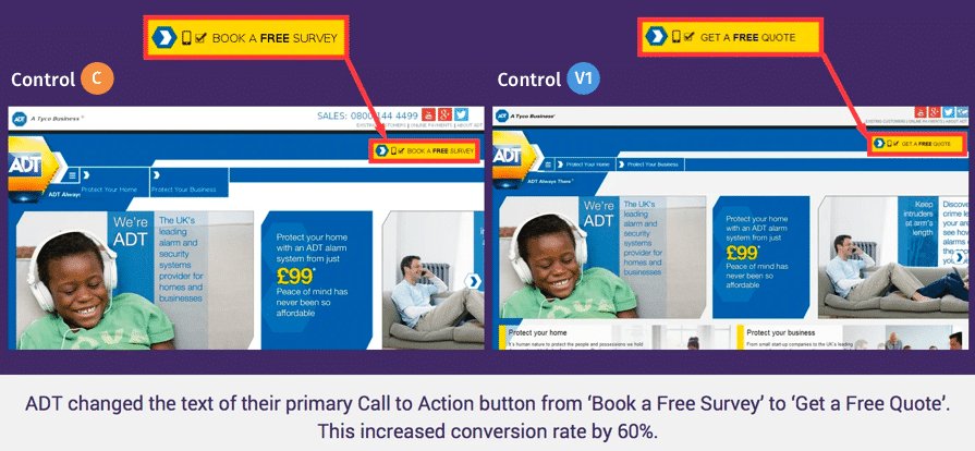
Quoting an example here, ADT, a Tyco International company, was able to increase its conversion rate by 60% by simply changing the primary text of its CTA button – from “Book a Free Survey” to “Get a Free Quote.”
Navigation and site structure
Your site’s structure must focus on building an experience that’s easy to navigate. Site structure, at its core, is typically a graph of how different pages of your site interact with each other.
Although every site is different and has different navigations, this hierarchy style is a standard example.

You typically start navigating from the homepage, then explore its series of categories and subcategories until you’ve found what you were actually looking for. If this entire process is fluid, as explained in the graph above, then your users will not have an issue navigating through your site. But, if it’s unstructured, they’ll be lost in the process; ultimately abandoning your site.
To accomplish this, one must ensure users are easily and quickly able to move between important sections of the website and are able to find whatever they need to accomplish their goals in the fewest clicks possible.
In other words, creating a fluid, easy-to-navigate website is the key to increasing conversions as well as your brand’s reputation.

Forms
Forms are crucial to most companies, especially if they’re a part of their sales funnel. Optimizing these important customer touchpoints can extensively help improve the conversion rate. While many theories follow on how to build a good and effective form for your website, these may or may not work equally for all. In some cases, having a comprehensive form may work wonders, while in many other cases, concise forms may just be enough to get the conversions going up the graph. The secret ingredient here is to always maintain a balance between lead quality and volume of leads that gets the best ROI.
Yet, four basic optimization tips to take your forms from okay to outstanding are as follows:
- The fewer the fields, the better it is. True in most cases but not always, especially when you want your sales team to focus on only the most serious leads or in cases where it is paramount to get additional lead information like the industry or the city if you have lead workflows dependent on this additional fields.
- Good looking forms often equate to a nice user experience. Good forms constitute no flashing text, clear and consistent styling, and tooltips and validation build at the right places. Good forms typically also have the most important fields are the top followed by less important fields. One can also experiment with progressive forms in order to improve their conversion rates without compromising on the depth of user information.
- Easy password creation makes the entire form-filling process an easy breeze. As per internal VWO data, the password is one of the fields which takes up the most time to fill. Needless to say, guiding users on creating strong yet easy to remember passwords are the key to make this process more fulfilling for both the user as well as the business.
- Having one-click form submits using Facebook or Google SSO can also work wonders for your conversion process. Most times users are already logged into one of these sites and this helps them convert much more easily. It also alleviates the pain of creating and remembering new passwords. This, however, may not work in all cases, especially B2B contexts, where businesses work with business email IDs of their prospects.

Page speed
Page speed or page load time has a huge impact on the overall performance of your site. In fact, it directly affects the experience of a user, the conversion rate of the site, and its ranking on the search engine. According to a blog published by Semrush, if a site loads in 1.7 seconds, it’s comparatively faster than 75% of the web. While on the other hand, if it loads in 0.8 seconds, it’s faster than nearly 94% of the web.
A load time delay of even one second can reduce your conversions by 7%. For instance, if your site is generating a revenue of $100,000 a day, then even a second’s delay in its load can cost you about $7,000 per day or even more.
The same one-second delay also means that you’re prone to losing about 11% of your potential customers as they’ll simply close your page or back out without even thinking twice.
Benefits of conversion rate optimization: Why is it important?
CRO enables you to optimize your website’s functionality while helping you understand the whys and hows of visitor behavior. The fact is, your site never reaches its maximum potential until it’s rigorously experimented with. Broadly the benefits of a CRO program can be categorized into two:

Improving marketing ROI
A well-structured and well-thought-out CRO program based on strong analysis can go a long way in improving return on almost all your marketing activities by:
A. Improving the quality/speed of experiments run on your website: CRO allows you to analyze the performance of your site by running tests and look for the best possible variations which promise conversions. By experimenting with different elements on your landing pages, you can not only check the areas which are giving the best results but also use the gathered data as a fundamental benchmark for your next round of tests/experimentations.
B. Better revenue with the same traffic/incremental business returns: One of the prime benefits of running a CRO campaign is that every change you implement on your site, which eventually increases your conversions, is an incremental win for your business.
For instance, an online eCommerce company planning to enhance its customer experience in a way that it makes purchasing products easy and convenient for its customers can immensely benefit from CRO. How?
By running an A/B test, if it’s able to enhance its conversion rate even by 3%, it means that it’s getting 3% extra revenue day in and day out. Meanwhile, if it has a high volume of sales, 3% improvement can effectively translate its sales into hundreds and thousands of extra dollars for its business
Australian-based eCommerce company ShowPo saw a 6.09% increase in its revenue by running a series of A/B tests and introducing new improved variants on its product pages!
Enhancing UX
Benefits of a CRO program spread well across just marketing ROI to give an improved user experience across all lifecycle stages of a visitor whether they’re a first time visitor or they’re a customer through:
A. Personalizing experience for your site visitors: In today’s time, visitors are too impatient. Unless you’re offering them a site that’s easy to navigate with fewer clicks and make the entire process an easy breeze, they won’t stick around and will eventually look for alternative options. By helping personalize sections of your site based on the visitors’ geography, device, local time or past browsing history, you can make the website that much more relevant to them.
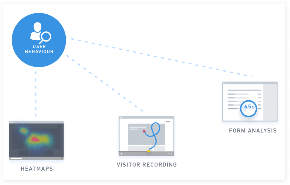
B. Better isights into your visitor behavior: The CRO process begins with understanding customer behavior through tools like heatmaps and clickmaps. Such tools tell you which site sections visitors spend more time on. Other CRO tools, such as user session recordings and session replays, help understand their overall experience. They shed light on the exact journey visitors took to accomplish a set goal on your website and even highlight the friction areas that caused them to drop off and abandon your site. Meanwhile, form analytics and website surveys also help understand a visitor’s overall site-wide experience. Such qualitative data is enough to create a good UX, further pave the way for conversions.
Who is conversion rate optimization useful for?
Conversion rate optimization is beneficial for all types and sizes of businesses irrespective of their industries. Here are some interesting business use cases defining the pervasive nature of conversion rate optimization.
CRO for B2B/SaaS companies
Lead generation is the initiation of grabbing the interest of your customers by engaging them on your site, gathering their information through various means (forms, sign-ups, surveys, etc.), and contacting them to convert them into loyal, recurring customers. As a B2B/SaaS business, it becomes your duty to help your customers find what they’re looking for, capture their interest, and support their buying decision.
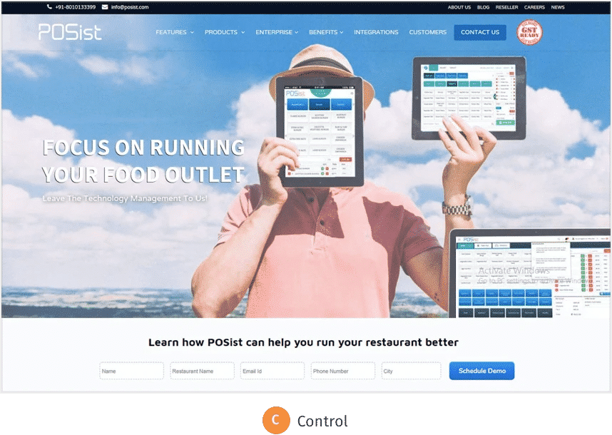
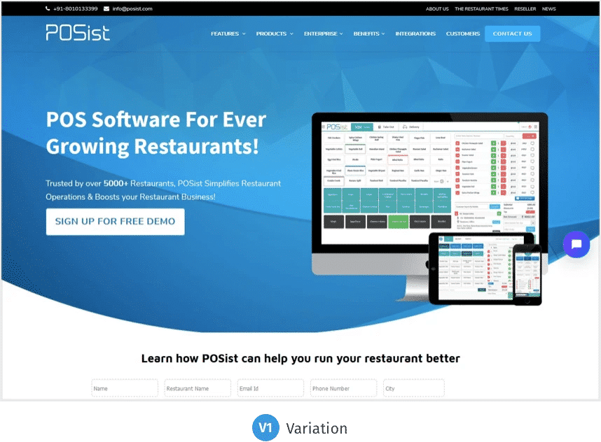
Case study: Continuous testing helped POSist improve their demo requests by 52%!
POSist is one of the leading SaaS-based restaurant management platforms that provide a complete range of online Point-Of-Sale (POS) solutions for all kinds of restaurants. The company wanted to increase its demo requests and reduce drop-offs on its homepage and Contact Us page. Evidently, these were two of the most important pages, which helped the company get maximum conversions.
POSist decided to run a CRO campaign to achieve their goal, which eventually helped them identify the gray areas. The company modified its homepage by adding more relevant and conversion-centric content. This not only improved user experience but also generated conversions. POSist generated about 52% more leads in a single month, which further lifted their website conversion rate to 3.4%, marking an overall 25% increase.
CRO for eCommerce companies
Shopping cart abandonment serves as one of the major challenges to the eCommerce companies, costing billions in sales revenue generation every year. According to an analysis done by the Baymard Institute, nearly 69% of all eCommerce visitors abandon their shopping carts due to innumerable reasons. Hence, building a user-friendly eCommerce site with a great design, exclusive products, and nominal shipping cost that not only solves cart abandonment problem but addresses other drop off issues such as complex payment process, lack of basic information, and so forth, is crucial.
Common reasons why people leave a site are as follows:
- Distractions: Too many pop-ups or forms to fill can distract your customers.
- Difficulty of checkout: The site may not offer a friendly check-out option, which may complicate the purchasing efforts of first-time users.
- Hidden costs: Most visitors get intimidated by hidden costs such as additional shipping charges, other taxes, and more.
Running a CRO campaign helps to identify and address such bottleneck issues and significantly contribute to improving the site’s conversion rate.
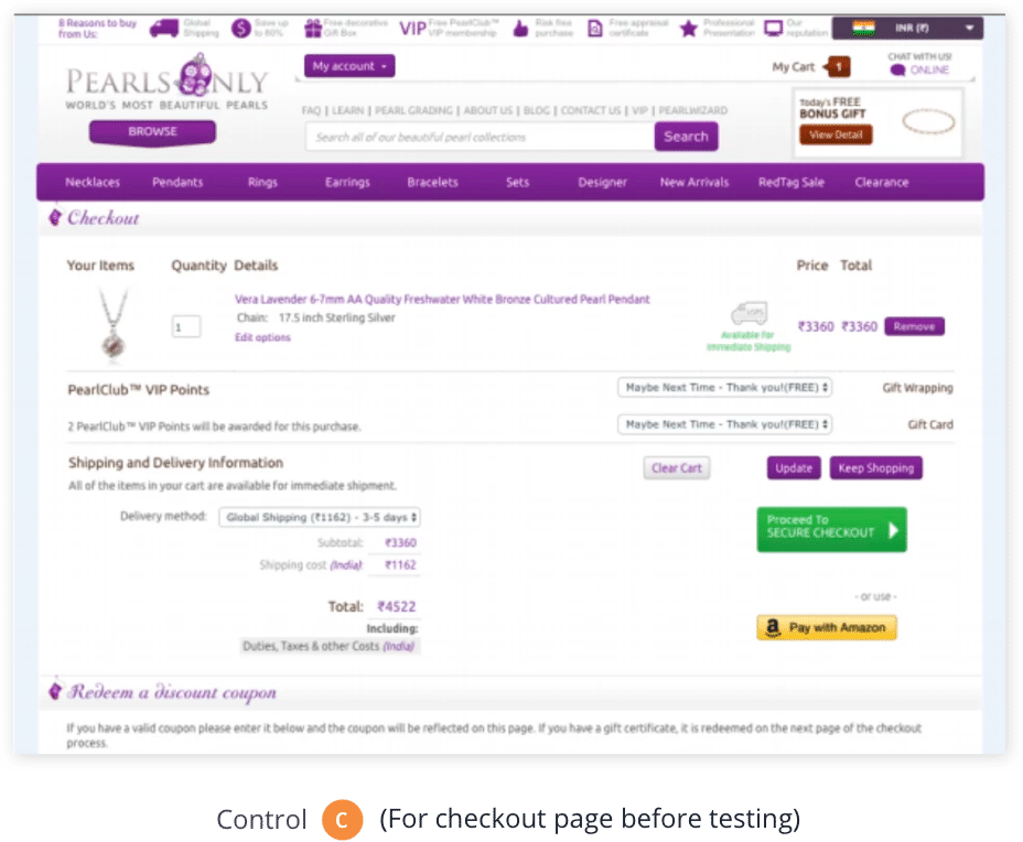
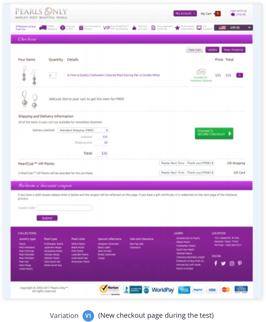
Case study: PearlsOnly increased its revenue by 12% by making its check-out page more CTA-centric!
PearlsOnly is an online jewelry store based out of Houston that specializes in the sale of pearls. Since its inception, the organization has constantly been testing its website and making necessary amendments to stay abreast of the industrial trends and offer the best services to its clients. Yet, it wasn’t able to get as many conversions as it aimed. Running a CRO campaign, they concluded that their checkout page was too cluttered and distracted its site visitors, making them leave the page before they took the desired action.
PearlsOnly, with the help of VWO services, optimized its checkout page while ensuring all its USPs were duly highlighted. They ran the campaign for about a month, and the results were outstanding. The test helped PearlsOnly increase its revenue by 10%.
CRO for Media/Publishing houses
For businesses like media agencies and publishing houses, reaching a larger audience base and keeping them engaged on their platform is crucial for their growth. Here, CRO can help them with this as well as test various site elements such as email sign-ups, social sharing icons, recommended content, and other promotional options to capture more attention.
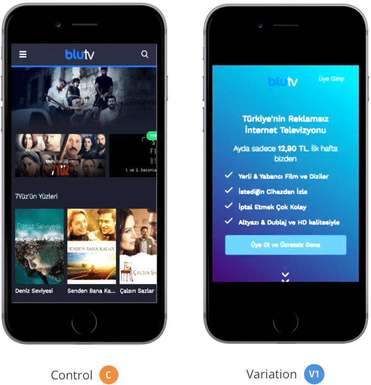
Case Study: BluTV increased its mobile conversion rate by 42% by simply making the homepage more service-friendly!
Being a subscription-based, over-the-top (OTT) video-on-demand service provider, BluTV’s success entirely depends on the number of active subscribers it has. Its primary objective was to get as many visitors to sign up for its paid subscription trials as possible. To start a trial, a visitor had to share their credit card information, and they would be charged only after they’d completed their 7-day free trial period.
Researching visitor behavior on BluTV’s site, Hype, a VWO Certified Partner performance marketing agency, found that the conversion rate for mobile visitors was quite low compared to BluTV’s website average. The service provider’s mobile home page emphasized serving its active customers rather than the new visitors. Basis this, the two companies decided to revamp BluTV’s mobile home page completely. They removed all the distractions in the header section, promoted some of its most popular content, and added an FAQ section at the end. Running a split URL test for a duration of 19 days, they saw the alternate variation increased their conversion rate by over 42%
CRO for OTAs or Travel agencies
Compared to other industries, travel companies usually face greater difficulties in getting conversions. Consumers in the category tend to take longer than usual to decide whether or not to make a purchase. They browse through various sites, compare deals, interact with their peers, and only then take a call. Further, complex booking behavior also adds to the industry’s challenge. Running a CRO campaign can effectively help travel companies analyze their potentials and drawbacks and enhance conversions.
Case study: Bizztravel Wintersport increased its conversions by 21% by simply decluttering its home page!
Bizztravel Wintersport is a Dutch travel company that improved its conversions by 21%, simplifying how users searched for holiday destinations on their website. The company decluttered their site’s homepage by keeping only the most relevant information intact.


CRO for Agencies
Talking about various sectors that have benefited from CRO, agencies like digital marketing, web development, and dedicated CRO agencies are no exception. Running conversion rate optimization campaigns for their own websites or their clients can significantly add to their conversions and uplift revenue, which can lead to better ROI for their work and help in retaining clients and giving an overall good experience for their business.
Digital marketing agencies engaged in offering multiple services to its clients, such as social media promotion, web content development, brand building, and so forth, can pitch CRO services to their clients as a way to get more out of their existing traffic. This can not only help them pitch more clients by offering an additional service besides their usual services but also enhance their overall business impact.
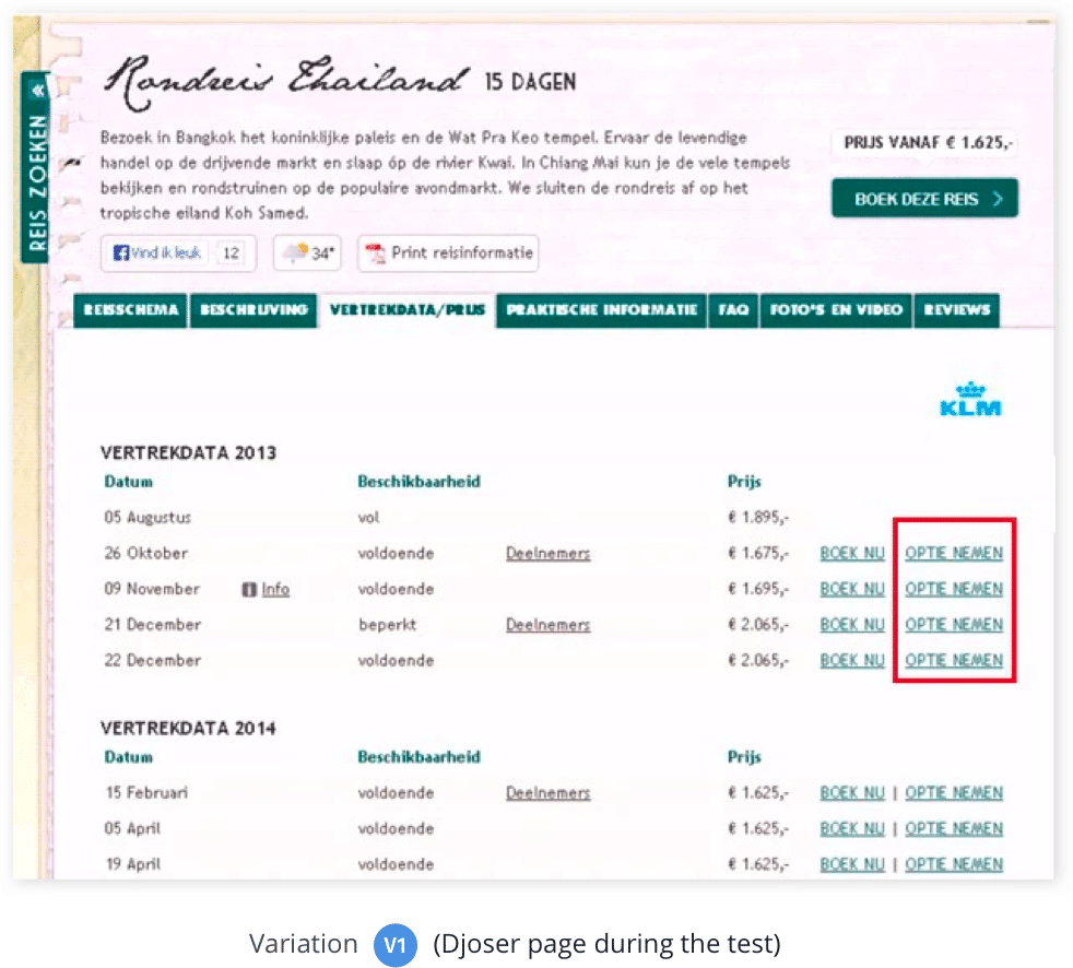
Case Study: Traffic4u helped its client Djoser increase their travel bookings by 33.1%!
Traffic4u is an online marketing agency that uses VWO to optimize its clients’ websites and get them more conversions. In one such attempt, Traffic4u helped Djoser, one of the leading Dutch travel agencies, optimize their site and increase their online bookings.
Deeply studying Djoser site’s data, Traffic4u concluded that making an actual booking was a significant step for the users. Giving them an alternate option with greater flexibility to confirm their booking would encourage more users to book. Here, they decided to create a variation with an extra link attached called “Take an option.” By clicking on the link, users were given an option to reserve their seats opt for cancellation with 72 hours. If no action is taken within the defined time period, the seat would be considered booked. Running the test for about 7 weeks, the variation resulted in a 33.1% increase in Djoser bookings.

Conversion rate optimization steps: Understanding the process
Multiple conversion rate optimization frameworks exist which can effectively help conversion rate optimizers plan and execute optimization campaigns. At the simplest, the CRO process can be divided into 5 steps.

Stage 1: The research phase – Identifying the areas of improvement
Only one in every seven A/B tests gives a winning result. Why? Research!
As a general practice, most marketers tend to copy CRO strategies that yielded results for other firms thinking the same would work for them. But, they fail because every orange button cannot convert and every long form page cannot falter.
Understanding what users do (quantitative data)
The first and foremost thing to do is get familiarized with the basics.
1. Analyze what are your visitors doing?
Analytics allows you to make decisions based on facts and figures rather than pure instincts. In the CRO process, there are multiple ways to derive data to understand your results. For instance, you can fetch relevant information from your web analytics tools such as real-time data tracking, bounce rate, incoming website traffic sources, audience, demography, site behavior, and much. Google Analytics is one of the best tools to obtain in-depth quantitative data on what people are doing on your site.
2. How do page features shape user behavior?
By using visitor behavior analysis tools such as heatmaps, session recordings, interview feedbacks, customer surveys, analytics, net promoter score, and so forth, see how different features on a page are influencing user behavior. For instance, you might find that the search tool placed on your landing page is getting you more conversions than the showcased product categories. Getting such insights can significantly help you eliminate unwanted features and focus more on the ones that convert users better.

Understanding user behavior (qualitative data)
Customer psychology typically lays down the fundamental ground rules for CRO elements to follow.
Two essential elements that aid in understanding customer psychology are:
1. Principles of persuasion: Human beings are highly susceptible to suggestions and cognitive biases. To quote an example here, knowing that an item is popular amid the masses becomes even more popular no matter it’s actual worth. At the same time, the rarer and more exclusive an item is, the more valuable it becomes. Understanding such human psychology is essential to effectively define your goals and draft a CRO plan that adds to your company’s profits.
Furthermore, adding social proofs in the form of reviews and testimonials on your landing page or wherever relevant can add to your efforts. As most case studies published over the internet report, social proofing aids in more conversions!
2. Customer behavior: A research carried out by NN Group states that most people browsing through the internet don’t read; they merely skim through the posts. Another study reveals that younger people are more interested in browsing through flat designs as they are more “trustworthy” than their older counterparts.
Studying the behavior of your target audience gives an insight into “why they do what they do” over the internet, and how you can use this information to build a better-converting website.
There are two primary ways to study the behavior of your target audience:
- Conducting tests and taking in-person interviews: Conducting tests and taking in-person interviews: Closely watching your customers interact with your website in real-time can give you significant data and insights on a plethora of things. These can include, the pages they most visit, the amount of time they spend on your website, the areas where they’re facing maximum problems such as finding difficulty in filling a form, unable to generate passwords, payment drop-off, and much more.
- Reading case studies and following guidelines on user behavior: Many existing pieces of research and case studies can vastly aid in understanding the collective psyche of your customers, which can, in turn, serve as an excellent source for improving your website’s overall look and feel and increase conversions.
Combining the two together, these can collectively give you a much better fundamental understanding of how your customers are behaving on your website.
Understanding the data gathered
Data and customer psychology study can help you accurately pinpoint the actual reasons why users do what they do on your site.
Use the gathered information as a benchmark study and decide the improvements which could benefit your business in the long run. It is also important to arrive at a quantified expected conversion rate as it gives your testing efforts a direction. Else, you might end up improving the conversion rate on a page by 1% and sit cozily without realizing its actual potential.
Qualitative vs. quantitative data
While quantitative data offers a good insight into your business’s performance, it doesn’t paint the entire picture. For this reason, gathering qualitative data is of utmost importance. Qualitative answers offer better insights on how your customers perceive your brand, why they are or aren’t buying your product(s) and/or service(s), and other breakthrough information.
| Quantitative data | Qualitative data |
|---|---|
| Objective approach that provides numerical data to map actionable events. | Subjective approach that offers in-depth narrative information, such as feedbacks, etc. |
| Insights: Pages most and least visited by the visitors.Amount of time spent by a visitor on a particular page. Entrance path taken by the visitors to land on the site. Pages they exit from. Number of incoming visitors who convert. Site’s bounce rate. Links and pages least and most ignored by visitors. | Insights: Purchase journey of a customer. Exact root cause of abandonment(s).Customer thoughts about your product(s) and/or services(s). Their fears, doubts, or hesitations before and during the purchase. Their feedback after they receive/use the product(s) and/or service(s) |
| Precise Information | Draws generalizations |
| Measurable data | Descriptive Data |
| Conclusive Approach | Exploratory Approach |
Data gathering methods
Some of the best methods of gathering data are as follows:
Google Analytics
Google Analytics is an integrated tool that offers numerical data about your website’s overall performance, reports on visitor activities, engagement, traffic inflow sources, content performance, and eCommerce sales.
Customer Surveys
Customer surveys reveal information about the actual psychological thinking of customers – what convinced them to buy a product, what drew them away from the site, and so forth. It’s one of the best ways to learn strategies for effective site optimization.
Usability Tests
Usability testing is a smart way to evaluate the ease of using a website from a customer’s point of view, their engagement rate on a particular page, stumble spots, and similar fall-off. It’s a powerful weapon that only aids in crafting a better user experience but increasing conversions.
User Interviews
Interviews provide deep insights about your site, respective pages, and target audience. They’re more about gathering qualitative data than quantitative data. Interviews can effectively lead to drafting campaign-changing test hypotheses.
Net Promoter Score (NPS)

Net promoter score (NPS) measures satisfaction in terms of customer loyalty. It classifies customers into three categories known as the promoters, passives, and detractors. While promoters are the ones who are most likely to turn into loyal customers, detractors do the opposite. Passives fall in the middle – they’re still in the evaluation phase (in terms of site likability).
Heatmaps
Heatmaps, in simple words, are graphical representations of data that inform about where visitor’s values are mostly contained, in the form of colors, within a matrix. The areas that most attention is marked red while others are shaded in green. This is a classic way to understand what users are doing on a single page.
Click Maps
Similar to heatmaps, click maps provide data about user interaction on a page by way of where they are clicking the most.
Scroll Maps
A type of heatmap, scroll map analyzes how a visitor scroll through the website. It aids in examining their behavior on various website pages and analyzing areas of concern.
The next step is to carefully draft your hypothesis!
Stage 2: The hypothesis phase – construct an educated hypothesis
Using the information gathered in the research phase, you can now draft your hypothesis. At its core, a hypothesis is a proposed explanation of your research that typically comprises 3 parts.
- A particular change: based on insights derived from quantitative and qualitative data
- A particular effect: a goal, a conversion metric or a similar element, which needs improvement.
- A particular reason: the thinking behind why a specific change can bring about the desired effect.
The best way to step forward is to run an actual test!
Form a hypothesis
Here’s an example of a good hypothesis.
“I believe adding social proofs on product pages will result in 5% more add-to carts because it instills confidence about my purchasing decision.”
Based on this hypothesis, you make the necessary changes on your product pages. These new pages are known as variations. The primary objective of the test will check whether or not the new variation would get better conversions.
A well-structured hypothesis also paves the way to more optimization efforts. Even if your path fails, you can use the case to understand what exactly went wrong and take corrective measures. Without a structured process, optimization efforts can go in vain and even lose purpose.
Here’s what an unstructured hypothesis looks like:
“Let’s just combine the sorting and filter tool together because it worked for companies A, B, and C.”
This is precisely the kind of hypothesis you should avoid building.
State your hypothesis
As a rule of thumb, always back your testing with a solid purpose and authentic proof. Make sure you have enough quantitative and qualitative data to support your testing reason(s). State your hypothesis as comprehensively as possible and even make a note of all the necessary information. CRO is an ongoing process. The more useful data you have, the easier it is to form a hypothesis and run optimization campaigns in the future.
Decide how to change your pages
Typically, there are two main ways to run a CRO test – test a completely different page or change one or a few page elements. Choose the one that’s most appropriate and take a leap.
- Test a Completely Different Page: If you’ve identified several areas which could be improved, consider starting from the very beginning. Identify the pages you think (based on statistical data) would best convert and showcase positive results. Remember, you may see similar or drastically different results. Use the information as ground rules and start fine-tuning.
- Change One or a Few Page Elements: This is where A/B testing and Multivariate Split testing serves handy. Identify one or a few problems on your page, which (based on statistical data) may be the main areas of pain. Find their best possible variations, and run a test. Note that a multivariate split test involves testing more than one element at once. This means that it will run for a longer duration and take time to showcase actual results.
Once you’ve uncovered your optimization opportunities, plan and prioritize the elements you want to test. In simple words, schedule your test strategy!
Stage 3: The prioritization phase – choose an order
Here, a number of frameworks can help you through the process. Of these, the P.I.E. framework formulated by Chris Goward at WiderFunnel is what we most recommend:
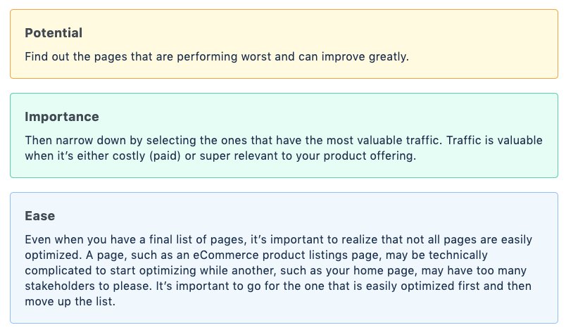
Each of these has its own importance attached which can effectively help in prioritizing your testing elements and take you in the right direction.
Stage 4: The testing phase — A/B, split, or multivariate?
Before running a test, understand the basics:
- What is statistical significance, and why is it critical?
- How long do you need to run a test?
- What should I use—A/B, Split, or Multivariate test?
What is statistical significance and why is it critical?
One of the primary reasons to run a test is to understand if a particular change on our site can help yield better conversions. For instance, you’ve decided to run a test on the first 100 visitors visiting your site. You see that 40 of the 100 visitors converted on the variation you’ve run against 20 on the original page. That’s a 20% conversion rate as compared to a paltry 10% on the original page.
But does this mean you’ll get a guaranteed 20% conversion rate, consistently? Probably not, because these 100 visitors may not be a good representation of the 10,000 visitors that pay a visit to your site every day. Here, statistical significance comes into play!
Considering another example, you’ve run a test whose results showcase that your implemented variation has outperformed the control (original version) with 93% statistical significance. This means that there are 7% chances that your variation outperformed purely by accident.
Concluding the example, the statistical significance of 93% states that it’s the right time to stop the test, provided you’ve run the experiment long enough to derive conclusions.
How long do you need to run an A/B test for dependable results?
Before starting a test, define its run-time!
When you run a test on your site, visitors are constantly included in the test, and the numbers keep changing. This further means that your conversion rate would constantly rise, dip and even stagnate at different times throughout the testing phase. As statistical significance is displayed all-through the test, it can further showcase higher significance even before the test completes its intended duration. So, depending on when you decide to check the results of your test, its statistical significance could be high or low. This further paves the way to the problem of “peeking.”
Peeking error
As the name says, peeking error means looking at the test results even before it has completed it due course of action. The chances are that you’ll discover statistical significance which is higher or lower than expected, and you may decide to stop the test, basis the test has or hasn’t performed well. This can, in turn, result in deploying a version that negatively affects your conversions.
Therefore, it is utmost essential to define test duration and declare a winner/loser only after it has completed its run-time.
Note: A test’s duration majorly depends upon the number of visitors visiting your site along with the expected conversion rate you’re looking for. You can use VWO’s free test duration calculator to find an ideal period for which you must run a test.
Bayesian vs. frequentist A/B testing
Most conventional A/B testing engines make use of the Frequentist method to make statistical computation and declare a winner. The method states that it’s essential to define an A/B test duration based on sample size to draw the right test conclusions.
But the fact is, businesses looking to scale up rapidly do not have the time to get into such nitty-gritty. So, an A/B test engine that bypasses the problem of waiting until a test completes its due course while still enabling rational business decisions became a necessity.
This gave rise to the Bayesian method, which is the cornerstone of the VWO A/B testing platform. Bayesian method not only emphasizes on statistically significant but provides actionable results almost 50% faster as compared to the older Frequentist method.
The bayesian method tells you “at any point, given that you have enough data at hand, what is the probability that variation B has a lower conversion rate than variation A or the control.” Neither does it have a defined time limit attached to it nor does it require you to have an in-depth knowledge of statistics.
What should you use —A/B, split, or multivariate?
There are three primary ways to run a test.
- A/B testing
- Split testing
- Multivariate testing
Businesses often get confused amid the three – which kind of testing method would best suit their needs and demands. To keep such confusion at bay, here are some points to note:
- A/B, split, and multivariate are three different testing methods, each of which comes with its own set of pros and cons.
- The decision to use one of these three methods should purely depend upon the task at hand.
- For reasons of simplicity, A/B testing seems best fit. It is majorly used in cases when design changes aren’t complex.
- Split testing, or otherwise known as split URL testing is used when:
- Design requires heavy modifications against its original version that creating a new, separate page with an altogether different URL is easier.
- Back-end changes are needed, such as testing a pricing page which is linked to multiple tables at the back end.
- To test pages which already exist on different URLs.
- Multivariate testing is used when there are multiple changes suggested on a page, and you want to separately test each combination.
Stage 5: The learning phase – how to analyze A/B test results
While this is the phase where you draw final conclusions about your tests, close the loop for conversion rate optimization, and take note of all the new information gathered for future testing. Unfortunately, most optimizers only look at the test results to see whether a variation was a winning one or if it has failed, they’d go back to creating more hypotheses. However, as an optimizer, it is important to dig deeper.
Considering a testing scenario. There are two possible outcomes of a test you’ve recently run.
When your variation has won the test
Your efforts have paid off well. But, what next? It’s time to seek answers to the following questions.
- What is the cost of deploying the change(s) in terms of engineering hours, design hours and so forth.
- Is the expected increase in the revenue doing justice to the actual cost involved?
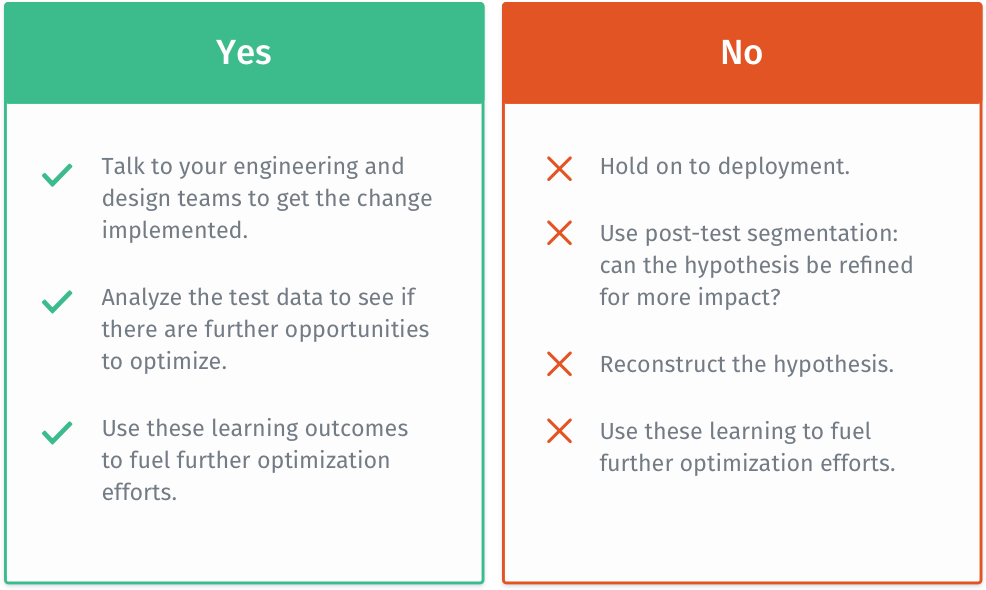
When your variation has lost the test
In such a case, make sure you:
- Analyze your research, check your hypothesis and look for loopholes.
- Study your test data. Segregate it further to examine the insights.
- Validate your research data with all the data gathering tools used.
- Go through all the relevant case studies. They could help you come across new perspectives which you’d missed before.
- Reconstruct your hypothesis by accommodating new insights which you’d missed in your initial research.
- Go back and test again.
Understand, CRO isn’t a once-and-done process. It is rather an ongoing process that demands constant analysis. There’s always some room for improvement no matter how many tests you’ve run. Having a well-planned, well-designed CRO process effectively helps in identifying areas of improvement and implement optimization efforts to get better conversions, further drive more revenue.
Conversion rate optimization best practices
9 mistakes to avoid when running a CRO campaign
Indeed, CRO is one of the best practices to optimize your site and increase conversions. Most individuals/companies jumping into the pool are unaware of CRO’s lengths and breadths and end up wasting a lot of time, money, and effort in the process. Drafting a fool-proof strategy and effectively following it is the key to CRO.
Here are the top four mistakes every CRO beginner must avoid:
Mistake #1: Making changes based on opinion that statistical data
Just because your site’s design looks cleaner, modish, and features better content than its previous version doesn’t mean it will churn out better results. At the same time, getting inspired from other businesses who ran a similar A/B test as yours on their websites and saw an uplift in their conversions, doesn’t really mean that you’ll see the same results on your site as well. This is because there’s no one-size-fits-all conversion optimization strategy. What may work for one business will not necessarily work for the other as well.
Resist the urge. Be patient. If you do intend to make changes or get inspired by A/B tests run other businesses, make sure it’s backed by a reasonable hypothesis that assures that your experiment will perform better.
A successful marketer isn’t the one who predicts which test will win basis opinion or inspiration, instead of the one who doesn’t let biasness win over statistical data.
Mistake #2: Writing copy that doesn’t match your business goals
Carefully drafted and SEO-optimized content can do wonders. But, if it’s distorted and doesn’t match your business’s goals, it becomes useless. Build unique content that adds value to your site.
- Focus on your brand’s USP.
- Use simple language. Let it be crisp, precise, and to-the-point.
- Write for scanners, not for readers.
- Bullet points and ordered lists work better.
- Write catchy headlines.
- Add keywords that rank better.
Mistake #3: Going for small tests before the big ones
When it comes to CRO, most people believe that running small tests is better than big ones. The fact is, small tests will only have a minor impact on the conversion rate. Bigger tests with significant chances, wherein more than two elements are optimized will leave a lasting, noticeable impact off the table. These changes may include:
- Redesigning the page above the fold
- Redesigning the entire home page
- Redesigning the navigation menu
- Moving important elements to improve visibility
- Changing headlines, which is catchier and more impactful than before.
Psychographic segmentation is a crucial element here. It can significantly help to understand the needs and demands of your potential clients and make necessary changes to lure them to enter your conversion funnel.
Mistake #4: Running too many tests and pop-ups at the same time on the same page
Running multiple tests at the same time can significantly affect the analysis accuracy of each test. Every new element experimented with may influence the test results of others. Furthermore, running numerous pop-ups and site designs in the same user session disrupts their overall experience. In fact, it’s quite possible that such pop-ups may annoy and confuse users, making them abandon the site, and never come back.
Running multiple tests with altered variables, known as the multivariate test, usually works for high-traffic sites. Yet, not necessarily promising excellent results. Go step by step. Analyze your results; make the necessary changes; observe; then run another test.
Mistake #5: Not paying much attention to basic design elements
A. Giving more importance to automatic image sliders
For most marketers, adding automatic image sliders on their homepage may be one of the best ways to showcase what’s new and/or upcoming on your website, but almost all conversion experts suggest that these sliders can significantly reduce your conversion rate.
Image carousels do not allow users to explore the site at their own pace. Instead, they hinder with a visitor’s experience and create banner blindness. Popular conversion experts, like Peep Laja, strongly recommend that businesses must give a deep thought to adding automatic image sliders. Here are some reasons to back this theory:
- The human eye strongly reacts to movements. If images scroll faster than the human eye can see or read, it will definitely miss out on the important stuff.
- Too many messages means no message at all. Instead, focusing on adding on the primary message on your banner images and the required action is always more effective.
Therefore, it is always recommended to replace automatic sliders either with touch carousels or static ones to get more engagement and conversions. However, it’s always recommended to run an A/B test here to see what works best for your business. For a reason that what did not work for a company may work wonders for your business.
B. Using cheesy stock photos
Practically, there’s nothing right about using them on your website except their quality. They may give your web page a good, heavy look, but they significantly reduce the credibility of your brand. Remember that the purpose of a website is not to look pretty, but to achieve certain objectives. And, of course, people like to deal with humans, not websites. A case study by Market Experiments also demonstrates the same. A financial investment consultation service providing company improved their signups by 35% simply by replacing a cheesy stock photo on their homepage with a picture of their Founder.
C. Not giving much weightage to videos
Show your product in action. Make instructional videos if you offer something complicated. Believe it or not, but adding videos pays off well. And, there are a plethora of businesses that have actually benefited a lot from this very addition.
Dr.Muscle is one such example to quote here. The website integrated a video on their sales page, which significantly increased the number of visitors who clicked to their price/guarantee page, by 46.15%.
Incorporating videos on your website and other connected platforms can help you convince your users better, and, hence, boost conversions. Furthermore, video marketing also helps you educate your visitors about your product(s) or service(s), without forcing them to go through tons of text.
However, as a marketer, you must ensure that your videos contain a clear call-to-action (CTA). With an absence of CTA, your visitors won’t know what step to take next. In fact, when your visitors are already enjoying your video, they’ll be happy to follow your CTA, and possibly convert into a customer.
Mistake #6: Undermining the importance of call-to-action buttons
As stated above, call-to-action buttons make for one of the most important page elements which persuade your website visitors to take the desired action and start the conversion process. But often marketers do not give weightage to CTAs and lose out on a lot of potential conversions. Below mentioned are some mistakes which you, as a marketer or website designer, must avoid.
A. Using the wrong color combinations
The internet is flooded with case studies that suggest that one particular color, for instance, red, converts better than another, say green and so on. But this doesn’t stand true in all cases. Rather, it’s all about which color pops up better on the background of your banner or web page. RIPT Apparel, a Chicago-based online retail shop, increased its conversion rate by 6.3% simply by changing its CTA color from black to green. In addition to this, many optimizers also suggest that using a CTA color that hasn’t been used anywhere on your web page can also help draw the necessary attention.
B. Not using power words in call-to-action button test
Instead of saying something like, ‘Submit’ or ‘Sign-up,’ use power words to grab the attention of your users. Some popular CTA text copies are as follows:
- Save Your Seat. Book Now!
- Are You In? Let’s Get Started!
- Yes! Let’s Start My Free Trial.
- Grab Your Free Copy!
- Insights Delivered Daily to your Inbox!
- Where Should We Send Your Free Copy?
- Add this Summer Dress to Your Wardrobe!
ADT, a Tyco International company which provides safety solutions for commercial and properties corrected its CTA copy – from ‘Book a Free Survey’ to ‘Get a Free Quote’ – and saw a 60% increase in their conversion rate.
C. Placement of CTA buttons
Besides color and text, the placement of your CTA button also plays an important role in getting more conversions. While some marketers emphasize on placing your CTA buttons in the first fold of your web page to make them prominently visible, many others argue that placing the same below the fold can yield equally good results. The reason being, it all depends upon how motivated your prospect is to click on your CTA button. How desirable do they find your offering that they’re compelled to click on your CTA wherever it’s placed. The more exclusive your offerings are, the more the chances of your prospect clicking on your CTA button irrespective of your placement on the web page.
D. A CTA text link or a CTA button? Which one’s better?
Text links are often lost amid the rest of the text, making them difficult to spot on the web page. Meanwhile, button CTAs are more prominently visible to the eyes and increase the chances of more clicks. Here’s an example to showcase the difference.

Mistake #7: Not creating a sense of urgency
Not many marketers realize that creating a sense of urgency can actually increase conversions manifold. When you offer your visitors a limited-time incentive and give them a good reason to believe why they should bother to take the desired action now rather than later, they will convert. And, a plethora of companies have actually benefited from this – adopting the very ‘Principles of Persuasion.’
Here are some examples to back our claim:
Zappos creates a sense of urgency on its product pages by showing how many items are left in a particular size and color combination for visitors to purchase before they go out of stock.

Amazon uses the phenomenon as well. It showcases the exact number of hours/minutes within which a visitor must complete their purchase process to get the order delivered at their doorstep the very next day.

The eCommerce giant also dramatically uses a running countdown on its homepage to show how long a particular sale will last.
Mistake #8: Not establishing business trustworthiness upfront
No matter how persuasive your call to action is or how simple your website is, if you do not give the impression of trustworthiness to your visitors or give them confidence in your website, you are not very likely to improve your website’s conversion rate. Your visitors need to know that you are not a fly-by-night operation and you are here to remain. There are a plethora of ways to increase visitor confidence in your website and products. These are as follows:
- Assure your visitors that you value their privacy and that you have a secured site. Add HackerSafe (or similar) badges that showcase that your business takes website security seriously.
- Add client testimonials. For these aren’t just pieces of content praising your business offerings, they’re, in fact, an ideal means to establish your brand’s credibility amid website visitors. They can also do much selling for you.
- Display your privacy policy wherever you ask personal information from the visitor.
Mistake #9: Complicating conversion funnels
The conversion funnel is a set of pages (like the checkout process or registration form) that leads to your conversion goal (like a product purchase or subscription). Most web analytics tools (including some free ones) can be configured to allow you to visualize where your visitors are leaking from your conversion funnel. You may be surprised to know that most visitors abandon at Step 2 of your conversion funnel because your entire process is too complicated for them to complete. A complicated conversion funnel must be simplified in order to push the traffic through to the final conversion page. Below mentioned are some tips and tricks to simplify your funnel and increase conversions:
- Remove all extraneous links from pages within the conversion funnel
- Remove all unnecessary steps from the conversion funnel
- Don’t put too much focus on up-selling other offers
- Only ask for information that is completely necessary in completing the conversion process. Visitors are hesitant to reveal their information if it unjustified
- In the case of shopping carts, clearly let the visitor know about postage and packaging costs, taxes and your returns policy as early in the process as possible
- And make sure that you remind your visitors what they’ve added to their cart by placing a link back to the product/service
Even though most marketers believe that using conventional conversion rate optimization strategies still works wonders for their businesses, adopting new and enhanced techniques such as website personalization is the need of the hour. And, as per statistics published by Zoominfo, 98% of marketers agree that personalization has the potential to create advanced customer relationships.
Whether you have an eCommerce store, a SaaS website, or just a blog, offering personalized content to your visitors will improve the user experience and, hence, the conversions. Businesses offering website personalization report a 14% uplift in their sales.
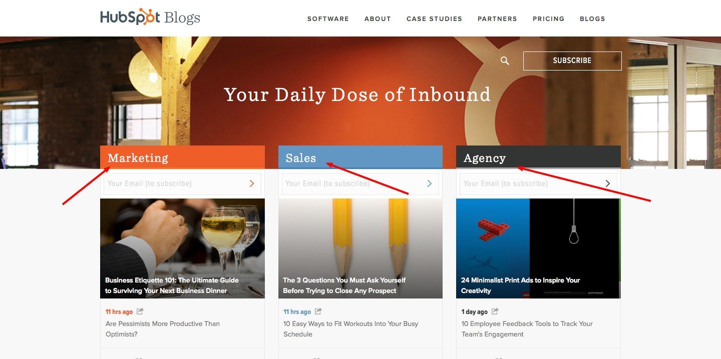
In order to offer website personalization effectively, you must be aware of all the types of users that visit your website. For instance, the Hubspot Blog offers content specifically catered to three major segments of its visitors: marketers, sales professionals, and agencies.
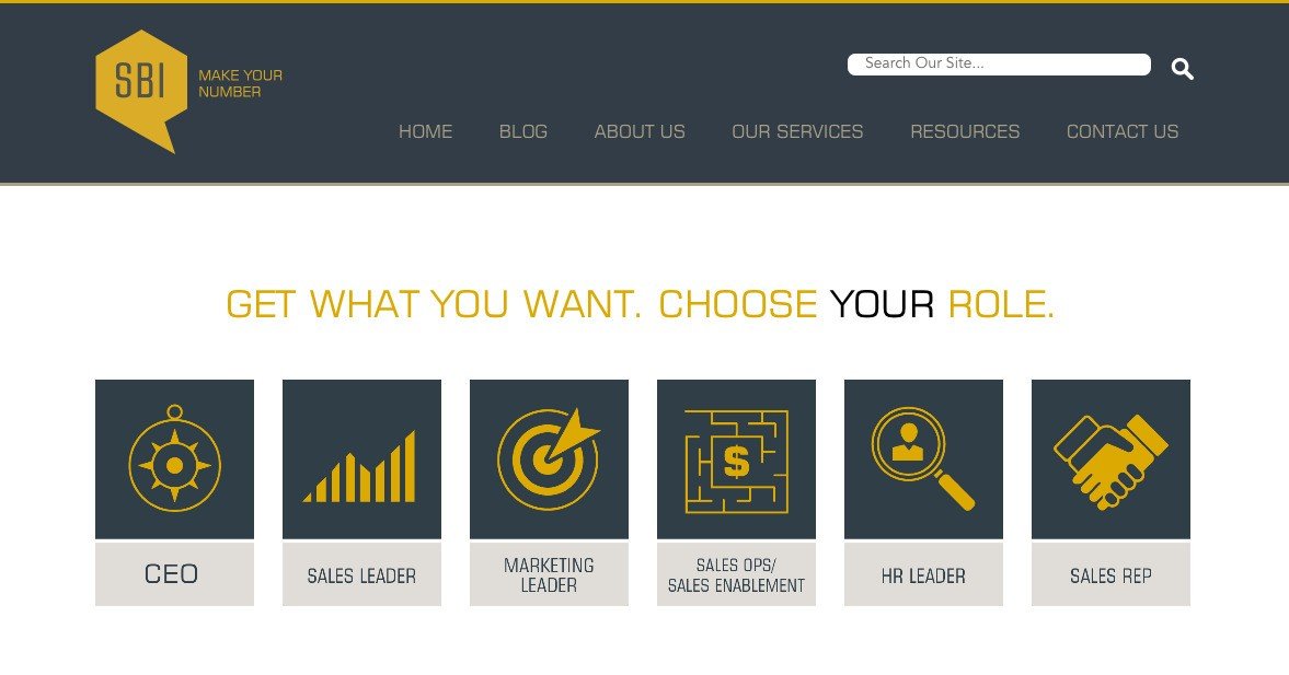
The Sales Benchmark Index Blog takes website personalization a step further. It asks its visitors to choose a persona that suits them the best and then displays relevant content to them.
Similarly, you can offer personalized content to your visitors based on the industries they belong to, or where they lie in your conversion funnel.
Website personalization is especially effective for eCommerce websites, and Amazon is one of the best examples to quote here. The company has inculcated the very essence of personalization in a manner that its visitors are beguiled by its offering every time they pay a visit to their website.
7 Conversion rate optimization challenges to address
CRO is one of the best ways to optimize your website and increase conversions. But it comes with its own set of challenges and misconceptions, which must be addressed to ensure smooth adoption and implementation.
Challenge 1: Politics and people
People and politics make for two main elements that define the culture of an organization. While the former highlights skills and mindset, the latter speaks of influential power. The real challenge surfaces when there’s no democracy amid people. Moreover, when the influential individuals of the organization try to enforce their thoughts over factual data.
Solution:
- Educate people about the real benefits of CRO.
- Present competitive analysis
- Highlight the gaps in your current approach
- Show the data.
Challenge 2: Structure to support CRO
Putting together a structure to support CRO is a huge challenge for most enterprises. A series of questions come up here. Is it worth hiring a dedicated conversion optimization team; would it add to overall organizational expenditure; who will take the responsibility in case of failures; and so on!
Solution:
Before getting into the depth of CRO, it’s important to draft a proper CRO process. Create a dashboard or platform to plan, update and record all your conversion activities. Share the statistics with your employees. Encourage them to contribute to conversion optimization and make smart decisions based on factual data.
Challenge 3: Insufficient budget allocation
Budget plays an important role when it comes to planning and running a CRO campaign. While companies back in 2013, spent as low as only 5% on CRO activities, the trend has improved with organizations increasing their spend on optimization. However, the problem lies in the correct budget allocation.
Solution:
Before zeroing on an amount, organizations must analyze their ROI from CRO. They must invest in conversion optimization tools after thoroughly examining their goals and actual gains.
Challenge 4: Lack of right tools to meet business goals
Marketers have a variety of tools to choose from to meet their business goals. For example, when deciding on an A/B testing tool, they have to make a choice between a:
- Frequentist-based statistical engine
- Bayesian statistical engine
Moreover, there are multiple tools that help marketers accomplish specific objectives. But using a combination of tools can make reporting a pain. So, how should marketers proceed? How to choose the right conversation rate optimization tools?
Solution
For selecting the correct tool, marketers must weigh the pros and cons of their actions. They must evaluate the tool based on how effectively and efficiently it will solve their specific business problems and meet their goals. For enterprises looking to invest in a tool for business growth, here’s a post on what decision-makers need to know before investing in CRO or A/B testing software.
Challenge 5: Ending an A/B test too early
Ending an experiment in between just because your variation isn’t yielding the results as anticipated, doesn’t mean that it won’t stand a chance to win in the end. There are a plethora of tests that take time to showcase necessary results due to a number of factors.
Solution: The first rule of running an A/B test is to let the experiment run its course until it reaches its statistical significance. Give your test some time to breathe. If you still feel your experiment is on the verge of failing, do a deep analysis of the experiment. Look for errors or bugs in the process and check your hypothesis again. Fix these issues, if any, and then run the test again for a significant amount of time to get to a concrete conclusion.
Challenge 6. Giving up optimization after failed tests
When you’re optimizing a crucial page of your conversion funnel, you may develop a hypothesis to improve its conversion rate and run an A/B test. What do you do if the test fails? It will be absurd to leave the page to its original state because the page is crucial and requires optimization.
Solution
The alternative is to learn what the losing variation lacked and why users didn’t find it more appealing. Employ tools like heatmaps and click maps to observe user behavior. Use this information to devise a new and better hypothesis and run more A/B tests, incrementally improving chances for a high-performing test.
The key here is to always expect unexpected results. Many times, even the most logical hypotheses fail. Keep testing!
Challenge 7. Not tracking macro-conversions
So your A/B test result has come in. Your variation has outperformed the control. The result is statistically significant and it has positively improved your conversion rate. Now while you rejoice, did your variation only increase your micro-conversions (e.g. form-submits, blog signups, visits to the next page, etc.), or did it improve your macro conversions (e.g. revenue) as well?
If the answer is “Yes! It increased only micro-conversions,” it’s time to revisit your testing strategy. While these small wins will surely add to your conversion goals, they will not amount to anything in totality.
Solution
The trick here is to carefully decide your A/B testing goals and tie your macro conversion goals to micro-conversions ones. Unless you do it, it’ll become a case of not seeing the wood for the trees.
Note, any optimization is better than no optimization. Acknowledge all the website optimization gains that you can get, no matter how small they are. Learn from your pitfalls and relaunch a better, more data-backed test.
Conclusion
From mapping the importance of website optimization to strategizing the means and ways to improve site performance, conducting A/B tests, and using the results to boost marketing efforts, conversion rate optimization has become a mainstream effort. It not only enables companies to understand how customers think, use, and perceive their brand and its offerings, but also exposes them to an incredible range of data to shape their future business strategies. CRO is not just another tool to enhance your brand’s online performance, it’s ‘the’ tool to make you stand out!