15 eCommerce Conversion Tactics To Fuel Growth For Your Store
With every other blog post talking about eCommerce conversion strategies that can help you boost sales, it can get a tad overwhelming and exhausting to narrow down on ones you must pay attention to. To that end, we have done the heavy lifting for you and shortlisted those we know are sure to make a difference in helping you grab shoppers’ attention and persuade them to purchase from your online store.
In this guide to eCommerce conversions, we will look at 15 actionable tactics you can implement to stand out among the competition and get shoppers to fall in love with your online store.
Download Free: Improve Conversions In 60 Days Guide
1. Reverse engineer the customer journey
The customer journey tracks the steps a potential buyer goes through from getting interested in your niche, becoming aware of your brand, finding out more about your product to making a purchase. Most online depictions of the customer journey make the process appear simple. It is usually represented linearly and consists of 5 stages – from awareness to retention.
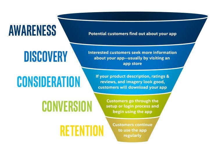
The reality of the customer journey is a lot messier. People skip steps, rush to purchase, or never come back to your website. Yet while the customer journey is messy, there are analytical tools that help you understand where visitors enter your eCommerce store, where they drop-off, and the common paths they take to finally make a purchase.
One of the most used tools for analyzing the on-site customer journey on your website is Google Analytics. You can create custom dashboards in Google Analytics that help you visualize how people move around your eCommerce site, the landing pages through which they discovered your product pages, and where there is a significant drop-off.
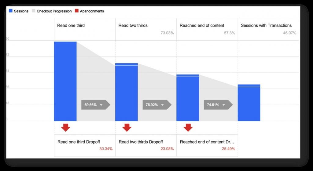
A comprehensive analysis of how visitors move around your eCommerce store and in and out of each stage of the customer journey can help you identify their pain points so you can rightfully tackle them through A/B testing.
2. Optimize your site speed
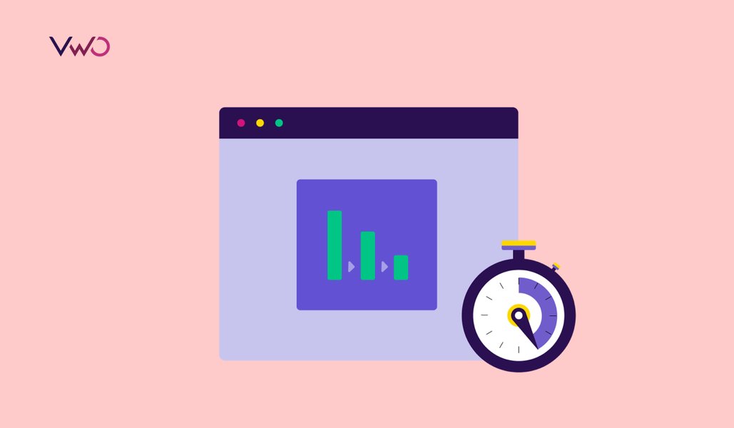
One of the simplest methods to increase conversions is improving the page load time. The reason for this is pretty straightforward; if a page takes a long time to load, your store visitors get impatient and leave the website.
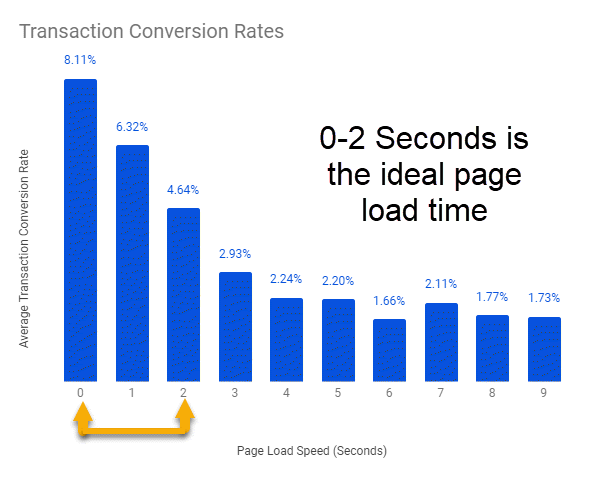
The graphic below precisely illustrates the correlation between page load time and conversion rates.
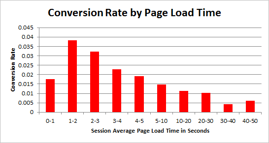
While this chart comes from a study on general conversion rates, there is also a large body of data about how page speed impacts eCommerce conversion rates specifically. Amazon’s study on how even milliseconds of latency affects revenue is probably the most cited example. Every 100 ms of latency costs the company 1% in sales, they claimed.
Portent conducted a study on page speed that revealed some interesting insights for eCommerce store owners. They found that the highest eCommerce conversion rates occur at a page load speed of 0-2 seconds.
When it comes to page load time, some pages are naturally more important than others. The most important ones include the homepage, checkout, product, category, and login pages. For any page where you receive a lot of traffic, you should prioritize optimizing.
3. Simplify navigation on your store
All the best eCommerce stores are flat and extremely easy to navigate. ‘Flat’ means having as few layers as possible to your site design – everything on your site should be accessible within three clicks of the homepage. More importantly, you also want to make it as simple as possible for site visitors to get from the core landing pages to the product pages and checkout page so that making a purchase is as seamless as possible.
Just like longer page load times cause shoppers to walk away from your store, a labyrinthine site design also tends to frustrate them, leading to drop-offs. There are numerous ways to optimize your menu to improve eCommerce site navigation. You could start by including breadcrumbs, simplifying the options on the menu, prioritizing elements, and so on. The ideal solution will be specific to your eCommerce store.
Let’s understand the same with the example of Slideshop. After thoroughly analyzing their data, the teams discovered that shoppers weren’t clicking on the subcategory. To improve usability, they ran an A/B test on the side menu to create a better flow from categories to subcategories. They got rid of the promotional right sidebar and introduced a left navigation bar. Here’s a look at the control and variation from the test:


Image Source: Slideshop.com
The variant with the navigation menu on the left increased the add to cart clicks by 34%. The case study stands testament to the fact that smooth navigation is closely linked to increased sales for any eCommerce store.
4. Offer personalized shopping experiences
Your customers today demand shopping experiences tailored as per their preferences and likes. And the more data you can collect about your customers, the better you can predict and optimize their online shopping experiences. Even if you are just getting started, you can target some low hanging fruits such as showcasing similar/frequently bought together items on product pages.
This is an excellent way to start as it doesn’t require any data collection from a potential customer, only from previous visitors to your site. However, as an eCommerce business, you should look to take it further. For example, user cookies allow you to show product browsing history, while geo-targeting allows you to provide a personalized shopping experience based on the visitor location.
5. Provide clear pricing upfront
The number one reason for cart abandonment is hidden and unexpected costs. Shoppers hate to be bombarded with additional charges that show themselves only during the last stage of the checkout process. While it may be tempting to lure in potential customers with a seemingly low price and then add on extra costs at the point of purchase, this is sure to lose you business.
Whatever you are selling, the best method to increase conversions is to be direct about prices from the first instance. And this includes shipping costs, taxes, and fees. This helps build trust among buyers.
6. Enrich product pages with relevant copy and descriptions
It is widely accepted that effective copywriting and concise, appealing product descriptions are crucial to building trustworthy relationships between businesses and customers. Buyers don’t require an instruction manual on product pages. However, they do want all of the relevant product information to be easily accessible.
You need to find that sweet spot for your product pages. The last thing you want is a customer leaving your site to find out more information about an item elsewhere.
Good copy can be quirky as well if it suits the seller’s brand identity, like the example above from the eCommerce store Woot. When writing copy, use the kind of terms your customers would use, speak to them in their language, take inspiration from positive testimonials to incorporate the same lingo in your copy that your buyers are likely to use.
Download Free: Improve Conversions In 60 Days Guide
7. Use scarcity and urgency to boost sales
Scarcity and urgency are two emotional drivers that are known to boost eCommerce conversions. By highlighting that your stocks are limited and likely to get sold out soon, you immediately attract buyers’ attention and get them excited about your offerings. Shoppers sometimes also go ahead and make a purchase solely because the product is limited edition. You want to create enough buzz around your products so you can leverage that.
Creating a sense of urgency is to highlight that a particular offer or deal is valid only for a short period of time, so shoppers are lured into quickly bagging it before they lose out on the great offer.
8. Add live chat support
Getting your queries resolved is hard enough even when you’re in a store with a salesperson in front of you, ready to answer your questions. Moving the process online only makes it tedious and leads to higher chances of drop-offs due to unresolved queries or unsatisfied shoppers. Did you know that 73% of consumers prefer live chat over any other communication channel to interact with a business?

Offering live chat on your site can help ensure that no customer leaves your store to find answers to their questions, and human interaction is not completely done away with. Live chat offers the potential of an immediate solution to shoppers regarding any kind of issues pertaining to the products, return policy, seller information, and so on. Even if they don’t use it, there is a reassurance that it’s there.
9. Test your pricing strategy
Researchers at the University of Pennsylvania surveyed more than 13,000 people to understand their spending habits. They classified participants into three groups – tightwads, unconflicted, and spendthrifts. Here is how the respondents were grouped according to their answers.

While the overwhelming majority of people feel unconflicted about making a purchase, almost one in four of your potential customers probably fall into the tightwad group. You can use different eCommerce pricing strategies to appeal to these people and convince them to hit ‘Buy Now’ on the product pages. Even offering free shipping and returns can be extremely valuable in persuading customers to make a purchase.
The example from Zalora, an eCommerce site, nicely illustrates this point. They ran an A/B test to see if emphasizing free returns would increase the conversion rate. The answer was yes. The variation, which started with the word “free,” outperformed the control by 12%.
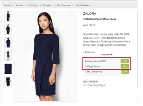

Image Source: Zalora
10. Add product reviews
As per BigCommerce, 69% online shoppers want eCommerce stores to share more product reviews. Therefore, make sure your product pages are sufficiently enriched with customer reviews as buyers tend to look for social proof before making up their minds about a product. Customer reviews improve the credibility of your store and legitimacy of the products and give users the vote of confidence that their shortlisted products have been used and liked by others as well.
11. Work on reducing cart abandonment rate
Cart abandonment is one of the biggest challenges that eCommerce stores face till date. The average cart abandonment rate for the industry ranges from 60-80%, depending on the niche. Since any decrease in your cart abandonment rate can directly translate to an increase in sales, it makes sense to direct a significant amount of your optimization efforts towards battling this issue.
There are many strategies that you should test, which can decrease the rate of cart abandonment. Some of the most straightforward ones include:
- Cart abandonment email sequences that regularly remind shoppers about the items they have left behind
- Having an omnipresent cart icon on your site so visitors are always reminded they have pending items and can navigate to the cart page in a single click
- Cart abandonment push notifications that retarget lost buyers and try to nudge them to complete their purchase
12. Simplify the checkout process
While there is no one size fits all solution, simplifying the checkout process would majorly involve reducing the number of steps, removing all distractions from every page, offering multiple payment options, and providing guest login, so customers don’t have to necessarily input all details to quickly make a purchase. These will help you get started and ensure customers don’t view checkout as a tedious, cumbersome process that they’d rather not take on.
If you want to go further and rely on a structured, step-by-step approach, consider the common problems online shoppers have. Addressing each of these points, either sequentially, or at once, will no doubt help you optimize the eCommerce conversion rate on your checkout page. Here’s a look at some of the most common ones as per Baymard Research.

13. Add relevant trust badges to your site
As the statistics revealed in the graph above, trust is a paramount concern for potential customers while considering making a purchase online. While trust impacts all types and sizes of eCommerce websites, it’s especially problematic for smaller stores that don’t have enough brand recognition as yet.
Using trust signals and badges on your homepage can go a long way in improving your brand credibility and getting more visitors to place their trust in your products. There is a substantial body of evidence that shows that trust badges on a product or checkout page increase eCommerce conversions. If you are still unsure, It’s definitely something you should consider testing. There are two things to keep in mind when running such a test:
- What trust badges you use
- Where you place the trust badge
There are three types of trust badges you are likely to use. The first relates to the payment options. The second is security badges. Lastly, you have industry certification. While all three categories are important, be sure to not overdo it by adding too many badges and leading to a cluttered page that does more harm than good.
14. Provide multiple payment options
As we’ve discussed, the fewer obstacles during your checkout process, the higher your sales. Since everyone has a select few payment options they absolutely trust, providing multiple payment options ensures that you cater to maximum audience, and no one drops off solely because they cannot find a trusted payment method on your store. In fact, providing a plethora of payment options can recoup 30% of sales that would have been lost to declined cards.
Remember that simplicity is key through the checkout process. There is no need to display a whole menu of card types that can be visually unappealing, although it’s certainly in your interest as a business to accept as many different types of payment as possible.
15. Leverage upsell and cross-sell opportunities
Upselling is convincing interested buyers to go for more expensive products or products with upgrades and add-ons. Cross-selling is selling additional, often related, items to a customer along with the item they intended to purchase in the first place. The goal of both upselling and cross-selling strategies is to increase the average order value.
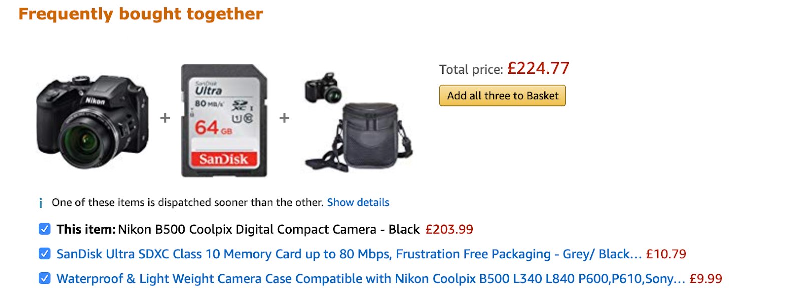
There are numerous ways you can increase your conversion rate and average order value. An obvious example of a company that uses cross-selling to increase customer average order value is Amazon, as illustrated in the image above. You could offer free shipping above a certain price point to incentivize people for adding more items to their cart.
Wrapping up
There is no one-size-fits-all approach to increasing conversions on your eCommerce store. What works for your business will be specific to your vertical, store, target audience, and products. However, the 15 tactics shared above will more likely than not work for most businesses and deliver remarkable results when it comes to uplifting your conversion metrics. As always, the best way to implement an effective strategy is to test every major change before you deploy it universally to measure its impact on your unique business. Sign up for a free trial by VWO to get started with testing on your eCommerce store and rely solely on data for all optimization decisions. On that note, we urge you to put the above strategies to practice and optimize your online store for more sales.


