How to Use Visuals to Increase eCommerce Conversions
You probably already know the human brain is far more quick to grab a visual (picture- or video-based) message than reading through a text-based one. But have you considered the same for improving your eCommerce conversion?
Let’s back up here a bit and see what research has to say. For one, science confirms that visuals communicate information 60,000 times (!) faster than text. And here’s another interesting piece of research: brands using visual content tend to see 7 times higher conversion rates than those that don’t. To figure out which visual content works best for your brand, you can rely on A/B testing solutions like VWO.
Download Free: Advanced CRO Program Guide
It’s all coming together now, isn’t it? You need to up your visuals game to increase your eCommerce conversion. Not only will these visuals catch your target buyer’s eye, but they’d also show what’s under the hood, which helps you gain their trust.
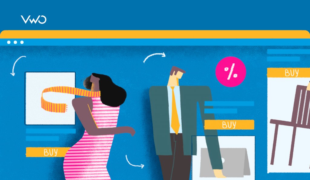
So, in this post, you’ll learn how you can use visual marketing to your advantage in your retail sales channel strategy and the eight different types of visuals to use for boosting conversions.
Ready to grow your sales? Let’s get started:
1. Start off with high-quality, clear pictures
To begin with, you need high-quality pictures of your products. This means you’re going to have to say goodbye to stock images or pictures that you pull out from free internet sources. Why? Because those images don’t reflect what you sell and do very little to gain your buyer’s trust.
If you don’t believe us, you can A/B test this and check for yourself. Create a variation of your landing page with your product images on it, and measure its conversion rate against your original page that contains stock images or other pictures from the internet. You will be able to notice a tangible difference between the two.

Worried you can’t afford a photographer at this point in your business? Don’t worry. A picture from your phone still triumphs stock imagery as it instills trust.
Sticking with stock photos, on the other hand, leaves a potential buyer suspicious as they think that the lack of product images is because there’s something to hide.
Hence, a simple to-get-started task for you: replace all stock photos on your website, newsletter templates, and other places with product images. You can even use these high-quality photos in your website chatbot and more.
Already using product images? Great, follow the next tip.
2. Use larger pictures that let users zoom into the details
How many times have you caught yourself zooming in on the details of a product you’re planning to buy? Chances are several times. Your prospects are the same.
Buyers don’t call the final shots in favor of your product unless they can see the details. Small images fail to offer sufficient details though. If anything, they instill the you-have-something-to-hide thought.
Large images, on the flip side, offer clarity and a scoop into product details. Hard to believe? Here’s proof: a case study in VWO concluded that larger product images can lead to a 9% increase in sales. Optimics, a CRO agency, ran an A/B test for their eCommerce client Mall.cz with the goal of increasing sales. They created two variations:
The first had slightly larger product images and the second had larger images with descriptions showing up on mouseover. Control had the original size of product images along with text description.
Variation 2 with the large images and product description viewable on mouseover was the winner. It resulted in a straight 9.46% increase in revenue for Mall.cz.

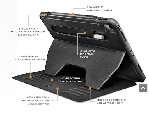
So, a big shout to large images on your eCommerce site for an upward bump in your sales. Plus, here’s an example from Zugu Case that details its features to help inspire action:
3. Capture your product from various angles
When it comes to product details, buyers can never have enough of them. If anything, they need to know how the product looks from the left, right, back, and every other angle.
Since buyers can’t hold and inspect the product when it comes to online shopping, the least you can do is share product shots from various angles. Not only is doing so trust-winning but also comforting for the buyer.
But you don’t have to display all of them at once. Show one picture, followed by the rest given in thumbnails. Here’s what Cutter & Buck does to give you an idea. They display the picture of a model wearing their product with thumbnail images on the side.

There are a variety of different ways you can utilize these photos as well, from social media ads to presentations and even punch cards for return customers.
Download Free: Advanced CRO Program Guide
4. Show your product in context or in use
This sets the mood. 🔥 By showing your product in action, you make it easy for the prospect to understand how it works or how they can use it depending on what you sell.
Generally speaking, there’s a marketing tactic: don’t ever talk about your product features. Instead, talk about your buyer or how exactly your product can help improve their life. This way, your marketing message shifts its focus from being product-centered to customer-centered.
Do the same with your visuals by showing your products in context.
For example, if you sell handbags, a plain picture of a handbag would do little to attract your buyer. However, a picture of your handbag on a cozy couch helps capture the prospect’s imagination. Or, a model carrying the handbag can give your potential buyer an idea of how the handbag would look on them.
Look at this picture from H&M and see how they’ve taken a product shot with the model comfortable in their hoodie:

5. Add 360 degree rotating pictures
These are ones that are widely available on social media, particularly, Facebook. Essentially, 360 degree product images are a series of still product images from various angles. They’re photographed in a sequence on a 360 degree photo turntable that rotates so you can cover the sequenced angles.
But are they any good for your eCommerce business? You bet they are. DueMaternity.com introduced these image types on their site and saw their conversion rate go north by 27%.
Use VWO’s powerful A/B Testing for your online store. Take a free trial and try it out for yourself!
6. Introduce product page videos
Videos are kind of having their aha moment presently. Whether used for a link-building software or on a product page, they tend to increase the conversion rate. Why? Because videos are what your buyers want.
Numbers tell the truth: 55% of consumers watch videos for making their purchase decisions. And, 73% of visitors who watch product videos will end up making a purchase. The reason video content sells so well is simple: they give buyers a better sense of product specs.
In fact, a case study by Treepodia learned that fashion industry retailers witness a 134% increase in their conversions by including product videos.
Interested in making product videos? Here are some bright ideas for you:
- Create videos showing your product in context. Someone modeling a dress that you sell is a good idea, for instance.
- Send over some of your products to influencers in your industry and ask them to review by creating unboxing product videos.
- Request happy customers to film a video of them using your product or, even, unboxing it.
If you’re still double-minded about creating videos, you can try creating product GIFs instead. These make awesome social media content for the eCommerce business and aren’t tough to make as well.
If anything, you can use an animated GIF maker to DIY creating product GIFs. The best part? You don’t need to make them from the scratch. Simply grab a template and customize it to create your own GIF in minutes.
You can easily schedule these visuals to go live on your social profiles using Facebook marketing tools and other social media schedulers.
7. Create 3D images
3D images are those that create an illusion of depth in a picture by manipulating the 2D image into a three-dimensional format.
Again, this image format gives your audience a good peek into your product while removing dust specks and smudges that are all too common in typical pictures. Besides, 3D images help capture a unique angle of your product. This explains why iPhone’s visuals tend to be 3D-natured:

8. Leverage augmented reality in your visuals
Lastly, you can leverage augmented reality to deliver buyers a personalized shopping experience and, therefore, increase your sales. How? Let’s explain with the help of examples.
One: Sephora Virtual Assistant. It lets buyers try on makeup so they can better understand what suits them and shop accordingly.

And, two, Warby Parker’s virtual try-on app that lets buyers try on glasses.

In both cases, augmented reality makes life easy for buyers. They can see what goes with their face by virtually trying on products. Naturally, this can help boost eCommerce conversions by adding an element of personalization and improving buyers’ experience.
Wrap up
Excited to grow your sales? Here’s hoping these eight ways to use visuals for your eCommerce business have left your brain buzzing with ideas.
If you want to track results to see how taking a (visual) step increases your conversion rate, consider conducting eCommerce A/B testing for the visuals you add to your site.
And, remember: it all boils down to improving your buyer’s experience by giving them adequate details of your products so they can decide easily.


