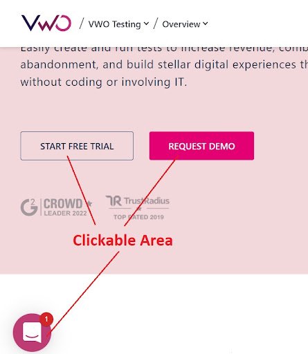
What is click area?
Click area is the clickable or tappable part of links and buttons on websites and apps. It is the area that gets highlighted while hovering over a button or link.
Providing an adequate size to these click areas is critical for easy use of any interface. The click areas should be designed to be functional, easy, and accurate to make it easy for the user to click or tap them.
A small click area may probably make users work harder than they need to. Hence, the click area should be optimized according to the device.

Problematic small click areas
Having smaller or inappropriate click areas around buttons or links can be quite frustrating due to the following reasons:
- Clicking on small things is a lot of work as it requires accurate mouse movements or precise finger touches. Users don’t need such annoyances to use even the basic features.
- It can make the design of the page or app look unappealing.
- Users do not want to pay attention to details while clicking buttons. In the case of small areas, they have to hover over the button to see what action will take place.
Below are some examples of small click areas:


Some tips to fix the click areas
To provide the users with an interactive user experience, the below tips should be kept in mind while designing the touch elements:
- Navigation of any page or app can be improved by expanding the area around the buttons and links and filling the white space around.
- A basic user-centred design is to create a touch target with the user’s physical dimensions in mind. A past study by the MIT Touch Lab established that the average person’s fingertips are 1.6– 2cm (0.6–0.8 in) wide. The thumb has a large impact area — an average of 2.5cm (1 inch) wide!
- Keep the spacing between links and buttons appropriate.
- Maintain the view-tap asymmetry: This occurs when clickable elements are large enough to be seen but too small to select.
- Keep the audience in mind while designing the elements.
- Conduct usability tests to determine if touch targets are large enough and effective. Adhering to guidelines is a good first step, but getting real user feedback is even better.
How to enhance the clickable area
Increasing the clickable area of a link may seem like a small and meaningless task, but it enhances the usability of a website resulting in increased conversions.
Read this article to understand how to increase the clickable area for various elements.
Designing appropriately sized touch targets is important to reduce acquisition times and errors and lessen user frustrations.


