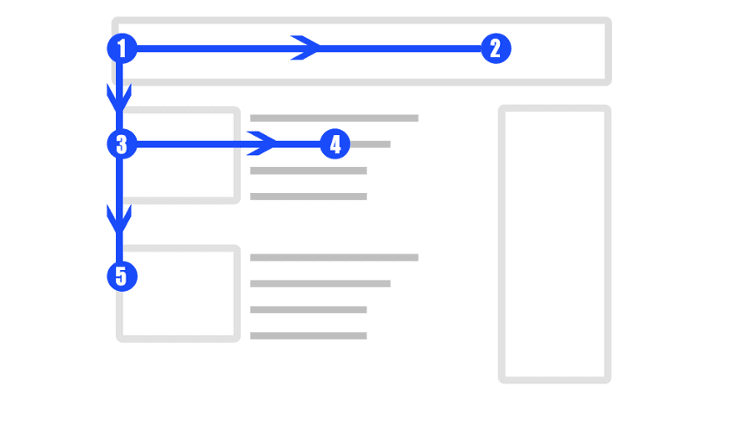
Eye flow is the natural path that eyes take to go through the content. The job of a design team is to create clear communication and seamless flow for the end user, and eye flow tracking plays a crucial role in it.
Eye flow tracking helps create visual cues to guide the end-user through the content and take action. It’s a critical process for achieving goals related to conversion and for personalizing the user experience.
An everyday use case for eye flow tracking is an eCommerce store. The design team at an eCommerce store tracks eye flow and designs the product page such that the visitors get all the necessary information needed to add items to their cart.
With the definition of eye flow and its application highlighted, let’s move on to the types of eye flows.
Types of eye flow
Most users have a typical eye flow while consuming content. There are two common types of eye flow for online content. The F-pattern, and the Z-pattern. Let’s discuss each one of them.
F-pattern

In this pattern, the eye flow starts at the left top end, moves horizontally towards the right end, then moves down to follow the same horizontal movement. The whole flow creates an F-shape. This type of eye flow is seen in text-heavy content like blogs, SERPS, emails, papers, etc.
A user has maximum focus at the left end of the screen, which gradually gets reduced with horizontal and downward movement. This eye flow gives you an idea about the part of the content where users lose interest and start skimming.
The engagement for the content with the F-shaped eye flow can be increased with the following measures:
- Adding an engaging storyline at the start
- Creating shorter paragraphs
- Including visual elements
- Adding bullet points
F-shaped eye flow in text-heavy content is an indication to optimize. It helps in positioning the important elements and text for maximum exposure and engagement from the end user.
Z-pattern

This pattern is seen in visual-dominant content with less text. The eye flow starts at the top-left end of the fold, then moves horizontally to the right end. After it, the eye flow moves diagonally to the bottom-left end of the fold, followed by horizontal movement to the bottom-right end.
The Z-pattern eye flow demands keeping important elements at the corner of the page. Thus, many times the important CTAs are kept at the right corners with a visual element like a hero image in the middle to keep the user engaged. The top-left corner is utilized for the tagline and logo for brand awareness. The bottom-left corner is filled with text to spike interest with information.
Tracking of Z-pattern eye flow plays an important role in designing single-page websites and homepages to generate leads. Also, the pattern gets repeated at each fold of the page, creating a zig-zag pattern.
Z and F patterns are natural eye flows. But designers utilize various visual cues to control the eye flow. So let’s move forward to understand how to control the eye flow.
How to control eye flow in design?
Designers control eye flow to nudge users toward certain parts or elements of the website. The design is created to guide a user to take the desired journey and make a decision based on it. Here are certain ways through which eye flow is controlled:
Arrows
It’s human tendency to look toward the area where the arrow is pointing. So, in a digital space, designers insert arrows beside the elements or areas that need attention from an end-user.
Animation
Animated visuals work because human eyes have a habit of catching a moving object in a fixed background. However, it’s beneficial to have a judicial use of animation for important features, as overuse of animation can ruin the user experience.
Images pointing toward a direction
When an image on a webpage contains something like people looking in a direction, the eye flow naturally moves towards the same. Thus, important elements and texts can be placed in the same direction. It is a simple eye flow control to make a positive impact on the conversion rate.
Lines and curves
Lines and curves direct eye flow as they create a movement between two points. The effect of lines on the eye flow is subtle. Lines and curves help in setting chronology, the distinction between two sections, and creating emphasis on a particular section of a webpage.
White space
It’s the space between elements and text. White spaces help in creating emphasis on an element or text and set the motion and flow of visual content. Optimum white space helps in the gradual flow of information and prevents information bombardment. Whitespace makes the interface friendly for the end-user.


