Micro Focus Compounded Uplifts On Conversion Rates Through Sequential Testing
About Micro Focus
Micro Focus is one of the most sought out names in the Digital Transformation realm. With a rich history of nearly five decades, this FTSE 250 software group has helped thousands of organizations in their quest to succeed in an ever-evolving marketplace. Their key offering involves delivering consultancy and IT solutions that expedite organizational innovation cycles
Micro Focus has been using VWO for their optimization efforts since 2016. Championing their optimization efforts is a team consisting of David, Jessica, Rose, and Vandan. The team is focused on building a culture of experimentation across all their digital properties – the main website (Microfocus.com) and their multiple sub-domains – Community, Tech Beacon (content), and Marketplace (apps, e-learning & add-ons).
Goals
Across the myriad tests that the team has run across the websites, the central theme has always been around the actionability of tests and seeing that they ultimately move the needle.
Hence improving on home page elements, elements across the revenue pages and the overall user experience have been on top of their experimentation itinerary.
Observations
The team at Micro Focus took a deep dive into how users were interacting with the various pages and elements. They utilized VWO Insights’ heatmaps, scrollmaps, and session recordings. Based on the qualitative inputs from these features, they had a few observations that they wanted to work upon:
- Not showing asterisk marks on mandatory fields on the form was probably a cause for low conversion rates.
- The CTA for the Free Trial page was below the fold, probably leading to low conversion rates.
- The marketplace domain did not have product linkage to specific apps and hence was not sending traffic to Micro Focus product pages (revenue pages).
Tests run
After the team identified all the challenges they wanted to work on, they initiated running a few tests to meet their objectives. These tests are elaborated below:
Test 1:
The team hypothesized that following form best practices will result in increased conversions. The variation in this test was the same form with asterisks added to fields that were mandatory for submission with a “Required field” indicator before the form. Here’s how the control and the variation looked:
The test was delivered to 100% of the audience landing on the free trial page and was run as an A/B Test. Traffic was equally split between the control and the variation, and the test ran for 20 days. A 5.89% improvement in form completions was observed with the variation emerging as the winner. The variation was then deployed on the website.
VWO Form Analytics helps you uncover friction points in your forms. Take a free trial to explore its features.
Test 2:
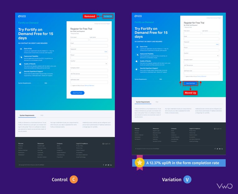
A consequence of the previous test was that the form became slightly bigger with the CTA moving below the fold. The team hypothesized that moving the CTA of their Free Trial button above the fold will improve the overall conversion rates. To achieve this:
- They removed their “Contact Us” button on the top right page. This was also an avenue for page visitors to get distracted and even navigate away from this high-value page.
- The “Start Free Trial!” CTA button was moved into the form block and extra breathing space was removed.
Both of these made the CTA move to above-the-fold, as evident in the below previews:
The test was set up only for desktop traffic, and 100% of the visitors participated, being run as an A/B Test. The test ran for 15 days with traffic split equally between the control and the variation. A 12.37% uplift in the form completion rate was observed through the test. The variation emerged as the winner and is now deployed on the website.
Test 3:
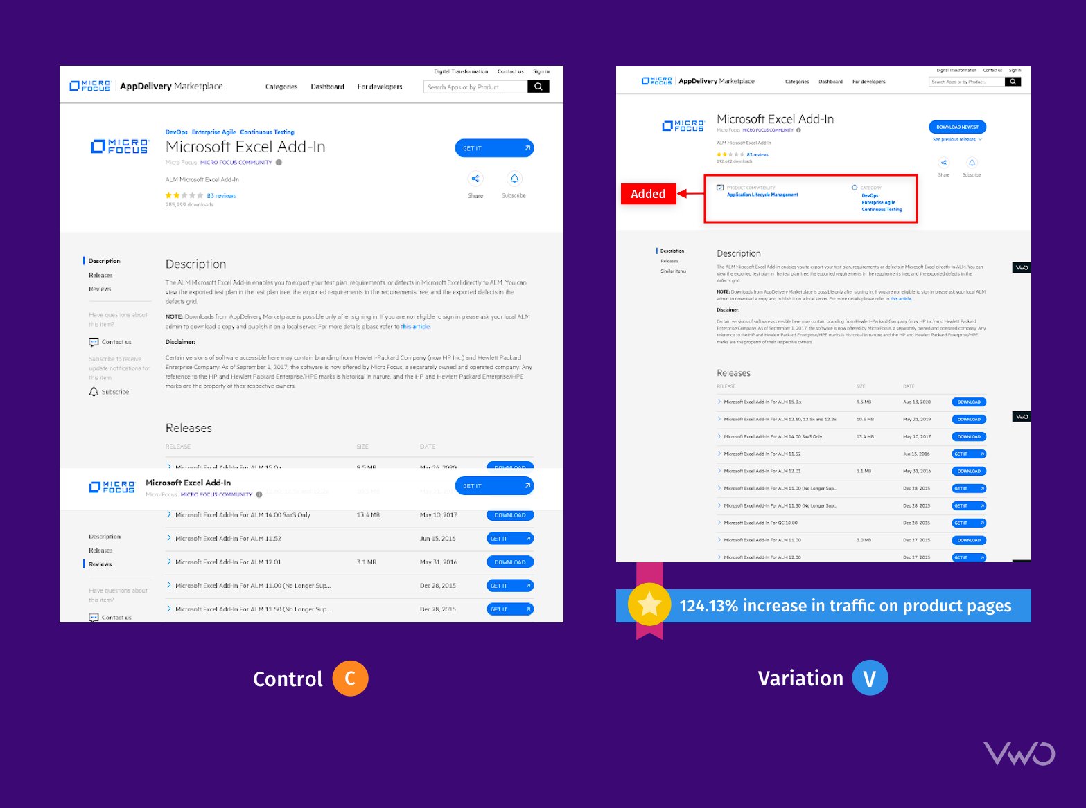
The CRO team at Micro Focus also focuses on their various sub-domains. This test was run on their marketplace sub-domain with the hypothesis that adding Micro Focus product links to related app detail pages will send more traffic to Micro Focus product pages, which are their revenue pages.
This was run as a Split URL Test with 100% of the traffic participating in the test, with equal distribution to the control and the variation. The test ran for 15 days with the variation emerging as the winner by delivering a 124.13% increase in traffic being sent to the product pages from the marketplace. You can test website redesign easily with VWO’s Split URL Testing capabilities. Take a free trial to check out for yourself.
“These VWO tests helped confirm that the new treatment sends more traffic to our revenue-generating product pages.” was the final summation by the Micro Focus product manager.
Conclusion
The conversion rate optimization program at Micro Focus is advanced and sophisticated, and the team is always on top of their game, conducting experiments on all their domains. As observed here, Micro Focus has benefited from compounding uplifts through sequential testing. This holistic approach towards experimentation has helped them see the bigger picture and synergize tests.
With hundreds of tests already conducted using VWO, the team plans to get more robust with their experimentation program, get more data-oriented, and have a steadily growing pipeline which in turn leads to even better business performance.
“VWO has been the most comprehensive testing tool I’ve used, and they have the support and services to back it up.” was the closing remark by a beaming Micro Focus product manager.

Location
USA
Industry
Software
Experiment goals
Increase form completion rate, Increase redirected traffic on product pages
Impact
12.37% increase in Sign-ups


