Slight Improvements Helped Springest Increase Form Submissions Using A/B Testing
About Springest
Small changes can have a big impact on a company’s bottom line. Length, structure, position, or design of forms can have tremendous influence on conversions.
This success story is about an A/B test run by Springest, which is an independent comparison website for training programmes and courses. L&D providers place their learning products here, allowing you to view, compare, and find your ideal course or mode of education.
Eduhub used to be their brand name in The Netherlands.
Their business model involves providing brochures to the visitors who request for them (when they find a suitable course provider). Brochure is free, but the visitors need to fill a lot of information in the form to access it.
They used VWO to create another version of the form and to test it against the current version.
Goals
The aim of the Springest team was to increase form completions on the brochure information request form.
Tests run
The Springest team used VWO to create an alternate version of the form and see if it increased the form completion rate.
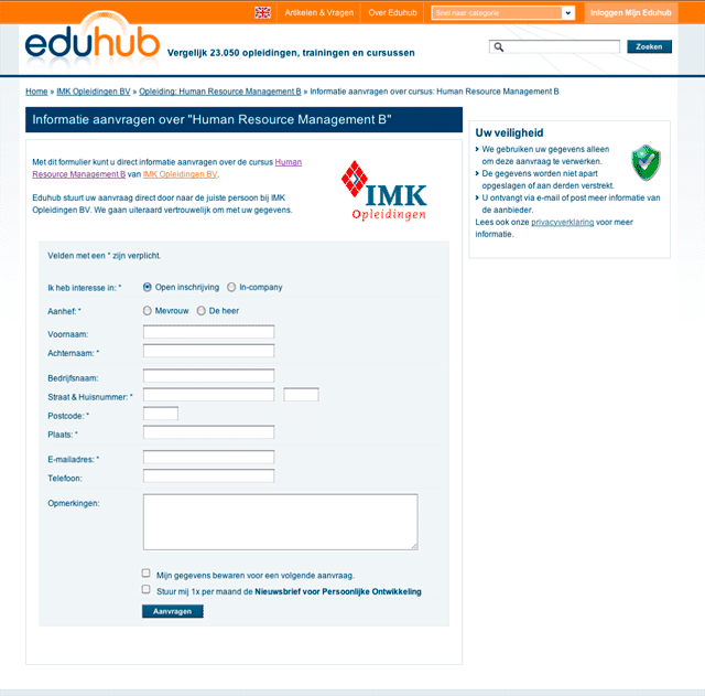
Here’s how their original form looked like:

Original brochure request form
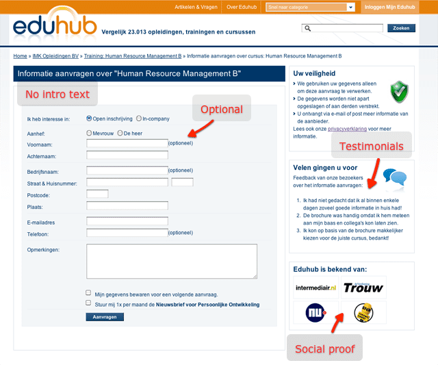
They tested one variation of this form, with some parts changed. They removed the intro text and logo and added social proof to the sidebar—quotes from users and logos from well-known Dutch brands. They also removed the asterisk for required fields and changed it to “optional” text behind fields that are optional.
Here’s how the variation looked like:

Variation (generated additional €50,000 for Springest)
Conclusion
The variation resulted in 5.21% improvement in form completion, with 97% certainty (statistical significance) based on over 2,500 conversions. The team was partly surprised, because the form itself hardly changed. Their changes were mostly about taking away possible obstructions or doubts in the user’s mind and it seems the social proof removed doubt for at least some of the visitors.
Although 5% doesn’t look like much, it adds directly to their bottom-line; they estimate this change to be worth about €50,000 this year alone. Isn’t that a great ROI for doing such a simple A/B test?
Even though Springest are extremely happy about results of this test, they didn’t want to stop improving and they already have extensive plans for follow-up tests. For this form, they want to split it in two parts and also test it with less fields. As soon as they launch a complete new layout of their website, they plan on A/B testing every part of it.

Location
Amsterdam, Netherlands
Industry
eLearning
Impact
5.21% increase in Form submissions


